


The Ulta Beauty logo serves as the visual anchor for one of North America’s largest beauty retailers. It represents a company that has redefined how consumers shop for cosmetics, skincare, haircare, and salon services under one roof.
Within the beauty retail sector, Ulta’s branding sits at an interesting crossroads. The company competes with luxury department stores and drugstore chains simultaneously. This dual positioning required a logo flexible enough to feel premium yet approachable.
The current wordmark was introduced in 2021, marking the brand’s third major visual identity update. Ulta Beauty Inc. was founded in 1990 in Bolingbrook, Illinois. The logo has gone through subtle but meaningful changes across three decades of retail expansion.
What is the Ulta Beauty Logo?

The Ulta Beauty logo is a custom wordmark featuring the brand name in a bold, geometric sans-serif typeface with a distinctive orange color. Introduced in 2021, this refreshed identity was developed by Ulta’s internal creative team. It symbolizes warmth, energy, and accessibility in beauty retail.
Design Specifications
- Design Type: Wordmark (text-based logo without accompanying icon)
- Primary Elements: Custom letterforms spelling “ulta beauty” in lowercase
- Official Introduction Date: 2021 (current version)
- Designer/Agency: Ulta Beauty internal brand team
- Trademark Status: Registered trademark of Ulta Beauty, Inc.
- Color Palette: Ulta Orange (#FF6600), Black (#000000), White (#FFFFFF)
- Usage Context: Storefronts, product packaging, digital platforms, marketing campaigns, loyalty program materials, shopping bags
How Has the Ulta Beauty Logo Evolved Over Time?

The Ulta Beauty logo has transformed from a straightforward retail mark into a refined beauty industry symbol.
Three distinct versions have appeared since 1990.
Each redesign reflected the company’s growth from regional chain to national powerhouse.
Original Ulta3 Logo (1990-1999)
- Years Active: 1990-1999
- Design Description: The original logo featured “Ulta3” as the brand name with a more traditional retail aesthetic. Bold lettering with a numeric suffix distinguished the concept.
- Color Scheme: Orange and black combination
- Designer: Unknown external agency
- Context: Launched when the company opened its first store in Bolingbrook, Illinois. The “3” represented the three product categories: cosmetics, fragrance, and haircare.
- Cultural Significance: Represented an entirely new retail concept combining prestige and mass beauty products
Ulta Logo Refinement (1999-2021)
- Years Active: 1999-2021
- Design Description: Dropped the “3” to become simply “ULTA.” The wordmark used uppercase letters with increased letter spacing. A tagline “The Possibilities are Beautiful” often accompanied the mark.
- Color Scheme: Signature orange remained primary
- Key Changes from Previous: Removal of numeric element, cleaner letterforms, more sophisticated appearance
- Context: Coincided with aggressive national expansion and IPO preparations
- Cultural Significance: Marked the transition from startup concept to established retailer
Current Ulta Beauty Logo (2021-Present)
- Years Active: 2021-present
- Design Description: Lowercase “ulta beauty” with custom geometric letterforms. The typography feels modern and approachable. Rounded terminals soften the overall appearance.
- Color Scheme: Refined orange with updated hex values
- Key Changes from Previous: Shift to lowercase, “beauty” added to wordmark, completely new custom typeface
- Context: Launched alongside broader brand refresh emphasizing inclusivity and joy in beauty
- Cultural Significance: Reflects beauty industry’s shift toward accessibility and self-expression
What Do the Design Elements of the Ulta Beauty Logo Mean?

Every element in the Ulta Beauty logo carries intentional meaning.
The lowercase letters signal approachability rather than luxury exclusivity.
Adding “beauty” to the wordmark clarified the brand’s core identity in an increasingly crowded market.
Why Did Ulta Beauty Choose These Specific Colors?
Orange dominates the Ulta color palette for good reason.
This hue radiates warmth, enthusiasm, and creative energy.
In retail environments, orange logos stand out without feeling aggressive.
The color psychology here is deliberate. Orange encourages action and feels welcoming. It suggests affordability without cheapness.
- Ulta Orange: #FF6600 – Conveys energy, creativity, enthusiasm. Creates visual warmth that invites browsing. Differentiates from competitor color choices.
- Black: #000000 – Provides grounding sophistication. Used for secondary applications and text.
- White: #FFFFFF – Creates breathing room and clean backgrounds.
What Typography Style Is Used in the Ulta Beauty Logo?
The current logo uses a custom geometric sans-serif font.
Rounded letterforms create friendliness.
The consistent stroke width throughout each character gives the wordmark stability.
Lowercase letters were a strategic choice. They feel conversational rather than corporate. The typography reads easily at any size, from storefront signage to mobile app icons.
What Are the Hidden Meanings in the Ulta Beauty Logo?
No obvious hidden symbols exist in the Ulta wordmark.
The design philosophy prioritizes clarity over cleverness.
Some observers note the rounded “u” resembles a smile when viewed independently. The connected letterforms in “ulta” suggest unity and flow. Whether intentional or not, these subtle qualities reinforce brand warmth.
How Does the Ulta Beauty Logo Compare to Competitor Logos?
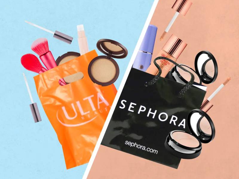
Within beauty retail, Ulta’s branding occupies unique territory.
The orange color immediately separates it from competitors.
Most beauty retailers lean toward black, white, or sophisticated neutrals.
The Sephora logo uses stark black and white with a flame icon. This creates a more premium, editorial feeling. MAC goes bold with all-caps black lettering. Department store beauty counters typically inherit their parent company’s restrained branding.
Ulta’s approach says something different. The orange warmth and lowercase letters communicate: “This is for everyone.” That positioning helped the company capture both prestige beauty shoppers and drugstore customers.
What Are the Technical Specifications of the Ulta Beauty Logo?
Official Color Codes
- Ulta Orange (Primary)
- Hex: #FF6600
- RGB: (255, 102, 0)
- CMYK: (0, 60, 100, 0)
- Pantone: 1505 C
- Black (Secondary)
- Hex: #000000
- RGB: (0, 0, 0)
- CMYK: (0, 0, 0, 100)
- White (Background)
- Hex: #FFFFFF
- RGB: (255, 255, 255)
- CMYK: (0, 0, 0, 0)
Dimensions and Proportions
- Aspect Ratio: Approximately 4:1 (horizontal wordmark)
- Minimum Size: 0.75 inches wide for print, 100 pixels for digital
- Clear Space: Height of the letter “u” on all sides minimum
- Preferred Backgrounds: White primary, orange reversed, black for special applications
What Cultural Impact Has the Ulta Beauty Logo Had?

The Ulta Beauty logo represents a shift in how Americans shop for cosmetics.
Before Ulta, consumers chose between department store prestige or drugstore value.
That orange wordmark on strip mall storefronts signaled a third option.
The brand’s visual identity helped normalize the idea that beauty products at every price point belong together. When you see that logo, you know you can find a $7 mascara next to a $70 serum. That democratization changed retail expectations.
How Does the Ulta Beauty Logo Fit Into the Overall Brand Identity?

The logo anchors a comprehensive visual system.
Ulta’s brand guidelines extend the orange energy across every touchpoint.
Store interiors use warm lighting and clean displays that echo the wordmark’s approachability.
The Ultamate Rewards program, product packaging, shopping bags, and digital presence all connect through consistent color theory application. Even employee uniforms incorporate the signature orange. This creates instant recognition whether you’re scrolling Instagram or walking through a mall.
How Should the Ulta Beauty Logo Be Used?
Official Usage Guidelines
- Do: Maintain minimum clear space around the logo
- Do: Use approved color variations only (orange on white, white on orange, black on white)
- Do: Scale proportionally without distortion
- Don’t: Alter the logo colors
- Don’t: Add effects like shadows, outlines, or gradients
- Don’t: Rotate or skew the wordmark
- Don’t: Place on busy backgrounds that reduce legibility
Accessing Official Assets
Brand partners and media outlets can request official logo files through Ulta Beauty’s corporate communications department. The company maintains strict control over logo usage to protect trademark integrity.
Trademark Information
The Ulta Beauty name and logo are registered trademarks of Ulta Beauty, Inc. Unauthorized commercial use may result in legal action. Editorial and informational use typically falls under fair use provisions.
FAQ on The Ulta Beauty Logo
What Font Does the Ulta Beauty Logo Use?
The Ulta Beauty wordmark uses a custom geometric typeface designed specifically for the brand.
It features rounded terminals and consistent stroke width. The lowercase letters create an approachable feeling that works across storefronts and digital platforms.
What Color Is the Ulta Beauty Logo?
The primary color is Ulta Orange, hex code #FF6600.
This vibrant shade appears on store signage, shopping bags, and marketing materials. Black and white serve as secondary colors for specific applications and backgrounds.
When Was the Ulta Beauty Logo Created?
The current logo launched in 2021 as part of a brand refresh.
Ulta Beauty Inc. was founded in 1990 with a different visual identity. The company has updated its branding three times since opening that first Bolingbrook, Illinois location.
Who Designed the Ulta Beauty Logo?
Ulta’s internal brand team developed the current wordmark.
Unlike some retailers who hire external agencies, Ulta kept creative control in-house. This allowed tight alignment with the company’s evolving corporate identity and retail strategy.
What Does the Ulta Beauty Logo Mean?
The logo represents accessible beauty for everyone.
Lowercase letters signal friendliness rather than luxury exclusivity. Adding “beauty” to the wordmark clarified brand focus. The warm orange conveys energy and creative self-expression.
Can I Download the Ulta Beauty Logo?
Official logo files require authorization from Ulta Beauty’s corporate communications team.
The trademark is protected. Media outlets and brand partners must request vector graphics files directly. Unauthorized commercial use violates trademark law.
Has the Ulta Beauty Logo Changed Over Time?
Yes. Three major versions exist.
The original “Ulta3” mark ran from 1990 to 1999. A refined uppercase “ULTA” followed until 2021. The current lowercase wordmark reflects the beauty retailer’s modern positioning.
What File Formats Are Available for the Ulta Beauty Logo?
Authorized users receive logos in multiple formats.
Vector files (AI, EPS, SVG) work for print design and large-scale signage. Pixel-based formats like PNG support web design and digital marketing applications.
Why Is the Ulta Beauty Logo Orange?
Orange communicates warmth, enthusiasm, and creativity.
It stands apart from competitors using black or neutral tones. The saturation level feels energetic without being aggressive. This supports the brand’s approachable beauty retail positioning.
How Does the Ulta Beauty Logo Appear on Products?
The wordmark adapts across packaging design, receipts, gift cards, and loyalty program materials.
Store signage uses the orange version prominently. The Ulta Beauty Collection private label products feature consistent branding throughout all cosmetics and skincare packaging.
Conclusion
The Ulta Beauty logo does what effective retail branding should do. It communicates brand values instantly.
That orange wordmark signals warmth and accessibility across every touchpoint. Storefronts, mobile app icons, Ultamate Rewards cards, shopping bags. All connected through consistent visual hierarchy.
The 2021 refresh positioned Ulta for continued growth in the cosmetics retail market. Lowercase letters and custom letterforms reflect where the beauty industry is heading.
Simple choices create lasting brand recognition. Sometimes the best logo design principles come down to clarity over complexity.

Renowned for his expertise in logo design and visual branding, Bogdan has developed a multitude of logos for various clients.
His skills extend to creating posters, vector illustrations, business cards, and brochures. Additionally, Bogdan's UI kits were featured on marketplaces like Visual Hierarchy and UI8.
He also wrote in the past years on sites like Design Your Way, WebDesignerDepot, WPDean, Designmodo, Speckyboy, Slider Revolution, and more.
- Jujutsu Kaisen Font Generator - 12 October 2026
- The Windsurf Logo History, Colors, Font, And Meaning - 10 October 2026
- How to Remove Background From Product Photos (No Photoshop) - 10 October 2026

Bogdan Sandu is a seasoned designer who has been designing websites since 2008. Renowned for his expertise in logo design and visual branding, Bogdan has developed a multitude of logos for various clients. His skills extend to creating posters, vector illustrations, business cards, and brochures. Additionally, Bogdan's UI kits were featured on marketplaces like Visual Hierarchy and UI8. He also wrote in the past years on sites like Design Your Way, WebDesignerDepot, WPDean, Designmodo, Speckyboy, Slider Revolution, and more.
You Might Also Like


