


The Sephora logo stands as one of the most recognized symbols in the beauty retail industry. It combines a distinctive flame icon with clean wordmark typography to create an identity that feels both luxurious and approachable.
Within the broader context of cosmetics branding, this logo represents a shift toward minimalist aesthetics that began dominating retail in the 1990s. The current version was introduced in 1995 when the brand underwent a major visual overhaul.
Sephora was founded in 1970 in Limoges, France, by Dominique Mandonnaud. The logo has seen approximately three major iterations since then, each reflecting changes in ownership and market positioning.
What is the Sephora Logo?
The Sephora logo is a combination mark featuring a stylized “S” flame symbol alongside a bold wordmark. It was officially introduced in 1995 after LVMH acquired the company. The flame represents transformation and passion for beauty, while the stark black and white palette signals sophistication.
Design Specifications
- Design Type: Combination mark (icon plus wordmark)
- Primary Elements: Stylized flame/S symbol, sans-serif wordmark
- Official Introduction Date: 1995
- Designer/Agency: Not publicly disclosed
- Trademark Status: Registered trademark of Sephora USA, Inc.
- Color Palette: Black (#000000) and White (#FFFFFF)
- Usage Context: Storefronts, packaging, digital platforms, shopping bags, marketing materials
How Has the Sephora Logo Evolved Over Time?
The Sephora logo has undergone three major design phases since 1970.
Each version reflected the company’s growth from a small French perfumery to a global beauty powerhouse.
The most significant change came in 1995 when LVMH took ownership and repositioned the brand for international expansion.
Original Sephora Logo (1970-1993)
- Years Active: 1970-1993
- Design Description: Simple text-based logo with serif typography
- Color Scheme: Various, inconsistent across locations
- Designer: Unknown
- Context: Introduced when Dominique Mandonnaud founded the original perfume shop in Limoges
- Key Changes from Previous: First official branding for the company
- Cultural Significance: Represented the brand’s humble beginnings as a local French retailer
Transitional Sephora Logo (1993-1995)
- Years Active: 1993-1995
- Design Description: Updated wordmark with early flame concept exploration
- Color Scheme: Black primary
- Designer: Unknown
- Context: Created during the expansion period before LVMH acquisition
- Key Changes from Previous: Moved toward bolder, more modern aesthetics
- Cultural Significance: Marked the transition from regional to national brand ambitions
Modern Sephora Logo (1995-Present)
- Years Active: 1995-Present
- Design Description: Iconic flame symbol paired with bold sans-serif wordmark
- Color Scheme: Black and white with occasional red accents
- Designer: Developed under LVMH creative direction
- Context: Introduced following LVMH acquisition to signal premium positioning
- Key Changes from Previous: Added distinctive flame icon, standardized typography
- Cultural Significance: Became synonymous with prestige beauty retail worldwide
What Do the Design Elements of the Sephora Logo Mean?
The flame symbol carries multiple layers of meaning.
It represents transformation, passion, and the idea that beauty can be empowering.
The curved shape also subtly forms the letter “S” for Sephora.
Why Did Sephora Choose These Specific Colors?
Black dominates the Sephora identity. It signals luxury, sophistication, and timelessness.
White provides contrast and ensures readability across all applications.
This monochrome approach lets products stand out rather than competing with the store’s branding. Pretty smart, actually.
- Black: Hex #000000, symbolizes elegance and authority
- White: Hex #FFFFFF, represents purity and clean beauty
What Typography Style Is Used in the Sephora Logo?
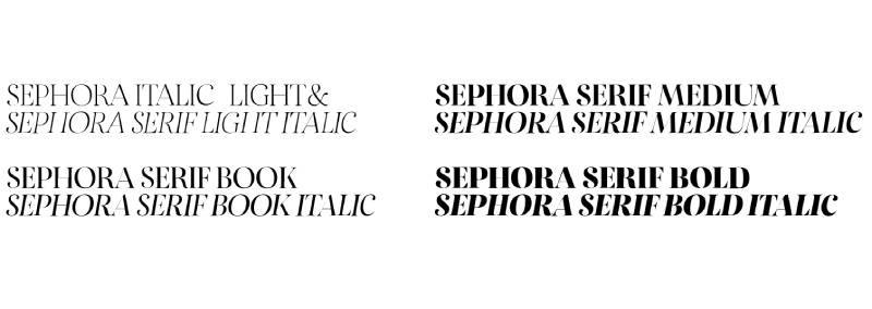
The wordmark uses a custom bold sans-serif typeface.
Letters are spaced generously for easy reading at any size.
The typography has remained consistent since 1995, with only minor refinements to weight and spacing over the years.
What Are the Hidden Meanings in the Sephora Logo?
The flame works on multiple levels. Obvious meaning: passion and transformation.
Less obvious: it doubles as a stylized “S” initial.
Some also see it as representing a torch, which connects to the brand name’s origin. Sephora comes from the Greek word “sephos,” meaning beauty.
How Does the Sephora Logo Compare to Competitor Logos?

Sephora takes a distinctly different approach than most beauty retailers.
While competitors often use softer colors and feminine aesthetics, Sephora went bold with stark black and white.
This creates instant differentiation on any shopping street.
Compare it to the Ulta Beauty logo, which uses orange and a more approachable vibe. Sephora positions itself as the premium option through visual restraint. MAC Cosmetics shares the black aesthetic but lacks the distinctive symbol. Benefit uses playful retro elements. Sephora sits in its own lane with that flame icon doing most of the heavy lifting.
What Are the Technical Specifications of the Sephora Logo?

Official Color Codes
- Primary Color (Black): Hex: #000000, RGB: (0,0,0), CMYK: (0,0,0,100)
- Secondary Color (White): Hex: #FFFFFF, RGB: (255,255,255), CMYK: (0,0,0,0)
- Accent Color (Red): Hex: #E2001A, RGB: (226,0,26), CMYK: (0,100,88,11)
Dimensions and Proportions
- Aspect Ratio: Varies by configuration (horizontal lockup vs. stacked)
- Minimum Size: Flame icon should not appear smaller than 0.5 inches in print
- Clear Space: Minimum padding equal to the height of the “S” in the wordmark
- File Formats: Available in vector formats (AI, EPS, SVG) and raster (PNG, JPEG)
What Cultural Impact Has the Sephora Logo Had?
The Sephora logo changed how beauty retail approached branding.
Before Sephora, most cosmetics stores used soft pinks and golds. That black and white striped shopping bag became a status symbol.
You see someone carrying it, you know they just dropped some money on skincare.
The flame icon shows up everywhere now. Social media, influencer content, beauty tutorials. It transcends language barriers, which helped Sephora expand into over 30 countries without needing to adapt its visual identity.
How Does the Sephora Logo Fit Into the Overall Brand Identity?
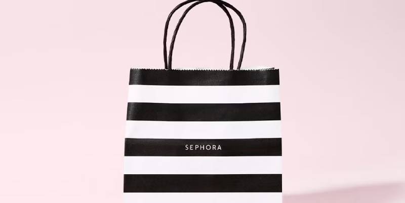
The logo anchors everything Sephora does visually.
Store interiors use the same black and white palette with red accents. Packaging follows strict guidelines to maintain consistency.
Even the Beauty Insider loyalty program cards feature the flame prominently.
Under LVMH, Sephora maintains brand guidelines that rival any luxury fashion house. The logo connects to the broader identity through repeated use of geometric shapes, clean lines, and generous white space.
How Should the Sephora Logo Be Used?
Official Usage Guidelines
- Do: Maintain clear space around the logo at all times
- Do: Use official color values for reproduction
- Do: Scale proportionally without distortion
- Don’t: Add effects like shadows, gradients, or outlines
- Don’t: Change the colors outside approved variations
- Don’t: Separate the flame from the wordmark in unauthorized ways
Access and Licensing
Official logo files are available to authorized partners through Sephora’s brand portal. The logo is a registered trademark, so commercial use requires explicit permission. Unauthorized reproduction can result in legal action. For press and media inquiries, contact Sephora’s corporate communications team directly.
FAQ on The Sephora Logo
What Does the Sephora Logo Look Like?
The Sephora logo features a stylized flame symbol next to a bold wordmark.
The flame curves upward and doubles as an “S” initial. Everything appears in black against white backgrounds.
Clean lines. No unnecessary decoration. The design follows minimalist design principles that work across all retail applications.
What Does the Flame in the Sephora Logo Mean?
The flame represents transformation and passion for beauty.
Think about it. Fire changes everything it touches. That’s the point.
It also connects to the brand’s mission of helping customers discover new looks. The psychology of shapes here suggests energy and forward movement.
What Font Does Sephora Use in Its Logo?
Sephora uses a custom bold font for its wordmark.
The letters are thick with generous spacing between them. This improves readability on storefronts and small packaging alike.
Some say it resembles Optima Bold, but the brand uses a proprietary version.
What Are the Official Sephora Logo Colors?
Black and white dominate the Sephora brand identity.
Primary black uses hex code #000000. White is #FFFFFF. Simple.
Red (#E2001A) appears as an accent in some marketing materials. The color palette stays intentionally limited to maintain sophistication.
When Was the Current Sephora Logo Introduced?
The modern logo launched in 1995.
This happened right after LVMH acquired the company. They wanted a visual identity that could compete globally.
The flame icon and wordmark combination has remained largely unchanged for nearly three decades now.
Who Designed the Sephora Logo?
The designer’s name was never publicly released.
LVMH handled the 1995 rebrand internally through their creative teams. This is common with luxury conglomerates. They keep design credits close.
The original 1970 branding came from founder Dominique Mandonnaud’s early efforts in Limoges, France.
Why Is the Sephora Logo Black and White?
Black signals luxury and authority in color psychology.
Most beauty brands use pinks, golds, and soft tones. Sephora went the opposite direction.
The monochrome approach also lets products be the star. Your lipstick pops against that black branding, not fights with it.
Can I Use the Sephora Logo for My Business?
No. The logo is a registered trademark.
Unauthorized commercial use will get you in legal trouble. Sephora protects its visual identity aggressively.
Partners and press need explicit permission through official channels. Contact their corporate communications team for licensing requests.
What Does the Name “Sephora” Mean?
The name combines Greek and biblical references.
“Sephos” means beauty in Greek. Zipporah (Sephora in Greek) was Moses’s wife, described as exceptionally beautiful in religious texts.
Pretty clever naming. It works across cultures without needing translation or explanation.
Has the Sephora Logo Changed Over Time?
Yes, but not dramatically since 1995.
The original 1970 logo was basic text. A transitional version appeared around 1993.
The current flame icon arrived with the LVMH acquisition. Minor refinements to weight and spacing have happened, but the core logo design principles stayed intact.
Conclusion
The Sephora logo proves that restraint works. A flame, a wordmark, two colors. That’s it.
Yet this combination built one of the most recognizable symbols in beauty retail.
The design creates clear visual hierarchy while maintaining flexibility across storefronts, packaging, and digital platforms. LVMH understood something when they introduced this identity in 1995.
Luxury doesn’t need complexity. The flame icon serves as a focal point that customers recognize instantly worldwide.
For any cosmetics brand studying effective branding, this logo offers a masterclass in how design elements can communicate sophistication without saying a word.

Renowned for his expertise in logo design and visual branding, Bogdan has developed a multitude of logos for various clients.
His skills extend to creating posters, vector illustrations, business cards, and brochures. Additionally, Bogdan's UI kits were featured on marketplaces like Visual Hierarchy and UI8.
He also wrote in the past years on sites like Design Your Way, WebDesignerDepot, WPDean, Designmodo, Speckyboy, Slider Revolution, and more.
- Best Visual Regression Testing Tools for Web and App Design in 2026 - 13 October 2026
- Jujutsu Kaisen Font Generator - 12 October 2026
- The Windsurf Logo History, Colors, Font, And Meaning - 10 October 2026

Bogdan Sandu is a seasoned designer who has been designing websites since 2008. Renowned for his expertise in logo design and visual branding, Bogdan has developed a multitude of logos for various clients. His skills extend to creating posters, vector illustrations, business cards, and brochures. Additionally, Bogdan's UI kits were featured on marketplaces like Visual Hierarchy and UI8. He also wrote in the past years on sites like Design Your Way, WebDesignerDepot, WPDean, Designmodo, Speckyboy, Slider Revolution, and more.