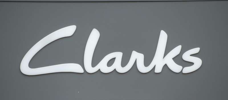
The Clarks Logo represents nearly two centuries of British shoemaking heritage. As a logo, it communicates craftsmanship, comfort, and timeless style through clean wordmark design.
Within the footwear industry, Clarks stands among the oldest continuously operating shoe brands. The company has refreshed its visual identity multiple times since 1825, though always maintaining recognizable elements.
The current logo version uses a refined sans-serif wordmark. It was introduced as part of broader brand updates in recent years. The design has seen approximately five to six significant changes throughout company history.
Founded by Cyrus and James Clark in Street, Somerset, England, the brand built its reputation on innovation. The brothers started by making sheepskin slippers. That humble beginning grew into a global footwear empire.
What Is the Clarks Logo?

The Clarks logo is a clean wordmark featuring the brand name in a custom sans-serif typeface. It was refined in 2021 with simplified letterforms. The design symbolizes British heritage and accessible quality footwear.
Extended Details:
- Design Type: Wordmark (text-only logo)
- Primary Elements: Custom typography spelling “CLARKS” in uppercase letters
- Official Introduction Date: Current version refined circa 2021
- Designer/Agency: In-house design team with external consultants
- Trademark Status: Registered trademark of C. & J. Clark International Ltd
- Color Palette: Primary black (#000000), with white and occasionally brand red for marketing
- Usage Context: Product labels, shoe boxes, retail storefronts, digital platforms, advertising campaigns
How Has the Clarks Logo Evolved Over Time?
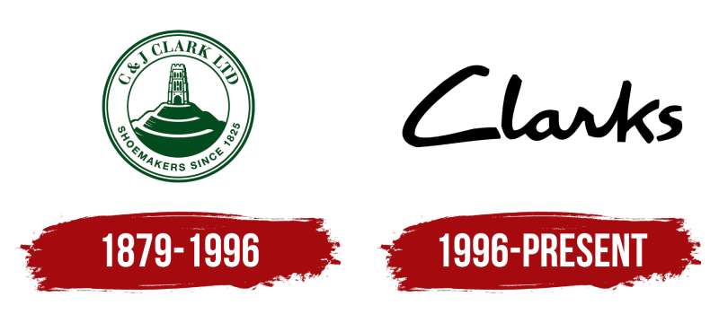
The Clarks logo has transformed from ornate Victorian-era scripts to today’s streamlined wordmark.
Each redesign reflected changing design trends and business strategy.
The brand maintained “Clarks” as the constant element while updating visual execution.
Original Clarks Logo (1825-1900s)
- Years Active: 1825 through early 1900s
- Design Description: Decorative Victorian-style script with flourishes typical of the era
- Color Scheme: Black ink on paper, embossed gold for premium applications
- Designer: Unknown, likely local craftsmen
- Context: Introduced when the Clark brothers formalized their slipper-making business
- Key Changes from Previous: First formal brand mark for the company
- Cultural Significance: Represented quality British craftsmanship during the Industrial Revolution
Mid-Century Clarks Logo (1950s-1980s)
- Years Active: 1950s through 1980s
- Design Description: Cleaner letterforms with reduced ornamentation, sometimes featuring a distinctive leaf or nature symbol
- Color Scheme: Black, occasionally green to reference natural materials
- Designer: Various in-house iterations
- Context: Post-war modernization aligned with the Desert Boot’s rise to fame
- Key Changes from Previous: Simplified from Victorian complexity, added symbolic elements
- Cultural Significance: Connected the brand to the mod and youth culture movements
Modern Clarks Logo (1990s-2010s)
- Years Active: 1990s through 2010s
- Design Description: Bold uppercase wordmark with slightly rounded letterforms
- Color Scheme: Primarily black, red accent for “Clarks Originals” sub-brand
- Designer: Professional branding agencies
- Context: Global expansion required a more universally readable mark
- Key Changes from Previous: Removed nature symbols, focused purely on typography
- Cultural Significance: Positioned Clarks as both heritage and contemporary brand
Current Clarks Logo (2021-Present)
- Years Active: 2021 to present
- Design Description: Refined uppercase wordmark with balanced letter spacing and geometric precision
- Color Scheme: Black primary, white reverse applications
- Designer: In-house team with external consultation
- Context: Brand refresh to appeal to younger consumers while honoring heritage
- Key Changes from Previous: Subtle refinements to letterforms, improved digital readability
- Cultural Significance: Bridges traditional craftsmanship with modern retail expectations
What Do the Design Elements of the Clarks Logo Mean?
The Clarks logo uses simplicity to communicate reliability. Uppercase letters project confidence.
The clean lines suggest precision in manufacturing. Nothing flashy, nothing overdone.
This approach mirrors the brand’s philosophy of comfortable, well-made shoes that don’t need to shout for attention.
Why Did Clarks Choose These Specific Colors?
Black serves as the primary logo color. It represents sophistication and timelessness.
The hex code #000000 works across all media without reproduction issues.
According to color psychology, black communicates authority and quality. For a heritage brand, this choice makes sense.
White (#FFFFFF) functions as the reverse option. Red (#C41E3A) appears in “Clarks Originals” branding to signal the sub-brand’s distinct identity and connection to cultural movements.
What Typography Style Is Used in the Clarks Logo?
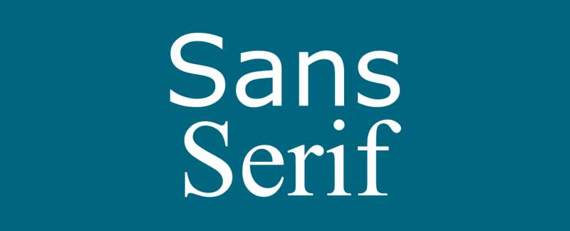
Clarks uses a custom sans-serif typeface. The letters feature consistent stroke widths and geometric foundations.
No serifs. No decorative elements. Just clean, readable letterforms.
The kerning is carefully adjusted for optical balance. Each letter sits at a distance that feels natural rather than mathematically rigid.
This approach improves legibility at small sizes on shoe labels and large scales on storefronts.
What Are the Hidden Meanings in the Clarks Logo?
There isn’t some secret symbol buried in the design. Clarks plays it straight.
The hidden message, if any, is in what’s absent. No gimmicks. No mascots. No abstract shapes.
That restraint itself communicates something. The brand trusts its name and reputation rather than relying on visual tricks.
Some see the sturdy, grounded letterforms as reflecting the solid construction of Clarks footwear.
How Does the Clarks Logo Compare to Competitor Logos?

Among shoe brand logos, Clarks takes a conservative path.
Compare it to the Nike swoosh or the Adidas three stripes. Those marks are instantly recognizable symbols.
Clarks chose words over symbols. This places them closer to brands like New Balance or Timberland, where the name carries the weight.
The Vans logo uses a distinctive script. Converse combines a star with typography. Clarks keeps things simpler.
This works for their market position. Heritage brands don’t always need flashy logos.
What Are the Technical Specifications of the Clarks Logo?
Official Color Codes:
- Primary Black: Hex: #000000, RGB: (0, 0, 0), CMYK: (0, 0, 0, 100), Pantone: Black 6 C
- White (Reverse): Hex: #FFFFFF, RGB: (255, 255, 255)
- Clarks Originals Red: Hex: #C41E3A (approximate), RGB: (196, 30, 58), Pantone: 199 C
Dimensions and Proportions:
- Aspect Ratio: Approximately 4:1 (width to height)
- Minimum Size: 15mm width for print, 80 pixels for digital
- Clear Space: Minimum padding equal to the height of the letter “C” on all sides
- Official Usage: Governed by corporate brand guidelines document
What Cultural Impact Has the Clarks Logo Had?

The Clarks name carries weight in specific subcultures. Jamaican dancehall and British mod scenes both embraced the brand.
In Jamaica, “Clarks” became synonymous with status. Songs reference the brand by name.
The logo appearing on Desert Boots and Wallabees became a cultural marker. It signified belonging to particular communities.
That’s a level of recognition that transcends typical footwear marketing.
How Does the Clarks Logo Fit Into the Overall Brand Identity?
The logo sits at the center of a broader visual system. It connects to packaging, retail environments, and advertising.
Store interiors use natural materials echoing the logo’s understated quality. Wood, leather tones, and clean displays.
Sub-brands like Clarks Originals have their own variations. But the core wordmark remains consistent across touchpoints.
The brand style guide ensures partners and retailers apply the logo correctly worldwide.
How Should the Clarks Logo Be Used?
Official Usage Guidelines:
- Do: Maintain minimum clear space, use approved color versions, scale proportionally
- Don’t: Stretch, rotate, add effects, change colors outside approved palette, place on busy backgrounds
- Access: Official logos available through Clarks’ brand portal for authorized partners
- Licensing: Requires written permission from C. & J. Clark International Ltd for commercial use
- Trademark: Protected mark, unauthorized use subject to legal action
FAQ on The Clarks Logo
What type of logo does Clarks use?
Clarks uses a wordmark logo. This means the design consists entirely of the brand name in a custom typeface.
No symbols. No icons. Just clean lettering.
This approach lets the company name build recognition directly.
When was the current Clarks logo introduced?
The current version was refined around 2021. The British footwear brand updated its visual identity to work better across digital platforms.
Core elements remained consistent with previous versions.
Who designed the Clarks logo?
The in-house design team at C. & J. Clark handled recent refinements. External branding consultants assisted.
Earlier versions from the company’s Somerset, England origins were created by local craftsmen. Specific designer names from the 1800s remain unknown.
What colors are in the official Clarks logo?
Black (#000000) serves as the primary color. White works for reverse applications.
Clarks Originals uses a distinctive red accent. The simple color palette keeps the heritage brand mark versatile.
Has the Clarks logo changed over time?
Yes. The logo evolution spans nearly 200 years.
Victorian-era scripts gave way to mid-century modernization. Today’s version reflects current corporate identity design standards.
Each update matched the era’s visual trends while preserving brand recognition.
What font does the Clarks logo use?
Clarks uses a custom typeface designed specifically for the brand. The letterforms feature geometric foundations with consistent stroke widths.
It’s not available for public download. The shoe company protects its trademark typography.
Why doesn’t Clarks have a symbol in its logo?
The desert boot manufacturer relies on name recognition alone. After 200 years, “Clarks” carries enough weight.
Adding a symbol would clutter the design. The wordmark approach aligns with minimalist design principles popular among heritage brands.
Is the Clarks logo trademarked?
Yes. C. & J. Clark International Ltd holds registered trademarks globally.
Unauthorized commercial use invites legal action. The company actively protects its brand identity across all markets where Clarks shoes are sold.
What does the Clarks Originals logo look like?
Clarks Originals adds a red rectangular background behind the wordmark. This sub-brand covers classic styles like Clarks desert boots and Wallabees.
The red distinguishes it from mainline products while maintaining family resemblance.
Where can I find official Clarks logo files?
Authorized partners access logos through the official brand portal. Public downloads aren’t available.
Retailers and press contacts can request assets directly from Clarks. The company maintains strict control over how its visual identity appears.
Conclusion
The Clarks Logo proves that sometimes less really is more. No flashy symbols. No complicated graphics. Just a name that’s meant something in footwear since 1825.
That kind of brand recognition doesn’t come from clever design tricks. It comes from decades of making shoes people actually want to wear.
The wordmark carries the weight of British shoemaking tradition. From Street, Somerset to stores worldwide, the Clarks brand identity remains consistent.
Whether stamped on Desert Boots or displayed in retail storefronts, the logo does its job. It tells you exactly what you’re getting.

Renowned for his expertise in logo design and visual branding, Bogdan has developed a multitude of logos for various clients.
His skills extend to creating posters, vector illustrations, business cards, and brochures. Additionally, Bogdan's UI kits were featured on marketplaces like Visual Hierarchy and UI8.
He also wrote in the past years on sites like Design Your Way, WebDesignerDepot, WPDean, Designmodo, Speckyboy, Slider Revolution, and more.
- Jujutsu Kaisen Font Generator - 12 October 2026
- The Windsurf Logo History, Colors, Font, And Meaning - 10 October 2026
- How to Remove Background From Product Photos (No Photoshop) - 10 October 2026

Bogdan Sandu is a seasoned designer who has been designing websites since 2008. Renowned for his expertise in logo design and visual branding, Bogdan has developed a multitude of logos for various clients. His skills extend to creating posters, vector illustrations, business cards, and brochures. Additionally, Bogdan's UI kits were featured on marketplaces like Visual Hierarchy and UI8. He also wrote in the past years on sites like Design Your Way, WebDesignerDepot, WPDean, Designmodo, Speckyboy, Slider Revolution, and more.
You Might Also Like