The Rockport Logo History, Colors, Font, and Meaning

Imagine this: You’re strolling downtown, eyes catching glimpses of storefronts, when suddenly, a familiar emblem beckons. It’s the Rockport logo, synonymous with not just footwear, but a legacy of comfort meeting style.
Here’s the scoop, and listen up because this isn’t your average shoe tale. We’re treading deeper, past the rubber soles and into the heart of a visual symbol that’s walked miles across the globe.
What does this icon say about brand identity and corporate branding? And why do those two words, “Rockport shoes,” evoke a sense of assurance to anyone hip to what goes on their feet?
By the end of this read, you’ll have unraveled the threads that stitch together an iconic shoe brand’s image.
No fluff, just the straight goods on how a simple emblem can tap into customer loyalty, and why even the retail outlets laying out these kicks nod in respect.
With an eye for design, we’ll dismantle the elements: from the trademark to the product branding – it’s a full dissect of the visual vibe that screams Rockport. Buckle up, it’s not just a logo; it’s the banner flying high over an empire of style and comfort fusion.
The Meaning Behind the Rockport Logo
Capturing the Spirit of Adventure
Now, let’s take a moment and think about Rockport. What comes to mind? For many, it’s a sense of adventure, exploration, and a love for the great outdoors. That’s what we get from the Rockport logo – a truly artistic representation of that spirit.
It’s more than just an image. It’s a call to action. A nudge to step outside, to breathe in the fresh air, and explore what the world has to offer.
There’s a feeling of being in the wilderness, a sense of exploration, and it really makes us yearn for that next outdoor adventure.
And that, my friends, is the magic of effective logo design.
Strength and Reliability
The Rockport logo isn’t just about inspiring adventure. It also speaks volumes about the brand’s commitment to durability, reliability, and toughness.
The lines are bold and robust, sending a clear message – these products are built to last. Rockport has your back, whether you’re navigating rocky terrain, wading through streams, or strolling through city streets.
The History of the Rockport Logo
Birth of an Icon
Once upon a time, the Rockport logo wasn’t the symbol we know today. It took time, creativity, and a whole lot of refining to get where it is today.
The creators knew they needed something that encapsulated their love for adventure and their commitment to quality. So, they took to their drawing boards and started sketching, conceptualizing, and brainstorming. And over time, the logo we now know and love began to take shape.
Evolution Over Time
Logos, much like the brands they represent, are not static. They evolve, grow, and adapt to the changing times and consumer tastes.
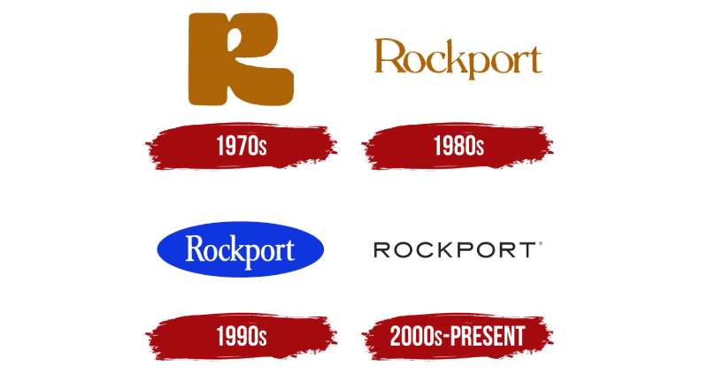
The Rockport logo is no different. Over the years, it has gone through subtle changes, tweaks, and refinements.
The core essence has remained constant – the spirit of adventure and reliability – but the presentation has evolved. The logo of today is a culmination of years of continuous improvement and refinement.
The Colors of the Rockport Logo
The Rockport logo is characterized by its distinct custom font and a vibrant shade of orange that conjures feelings of energy and warmth.
Over the decades, from the 1970s to the present, the logo has experienced various changes in its color schemes.
Moreover, the Rockport Oval Logo Plaque comes in two color options: one in polished black stone and the other in polished sand granite.
The Font Used in the Rockport Logo
Bold and Distinctive
Just like the rest of its elements, the font used in the Rockport logo isn’t chosen at random. It is bold, distinctive, and captures the brand’s personality.
The letters are large, commanding attention. They speak of a brand that is confident, reliable, and ready for any adventure.
Easy to Read
While the font is bold and distinctive, it’s also crucially easy to read. It strikes the perfect balance between style and functionality, ensuring the brand name is clearly visible and legible at a glance.
The Subtle Art of Simplicity in the Rockport Logo
Less is More
The Rockport logo is a masterclass in the power of simplicity. There’s no fuss, no unnecessary frills. Just a clean, well-executed design that communicates its message effectively.
The designers of this logo understood that less really can be more. By stripping back the design elements to the essential, they’ve created something that stands the test of time.
Clarity Above All
Clarity is at the heart of the Rockport logo. Despite its simplicity, it communicates its core values effectively and clearly.
Each element – the colors, the font, the imagery – has been chosen to enhance this clarity. The result is a logo that’s instantly recognizable and leaves a lasting impression.
The Impact of the Rockport Logo on Brand Identity
A Symbol of the Brand
A logo is more than just a pretty picture. It’s the face of a brand. And in the case of the Rockport logo, it does a fantastic job of capturing the essence of the brand.
Every time we see the logo, we’re reminded of what Rockport stands for – adventure, quality, reliability. It’s a powerful symbol of the brand’s identity.
Influence on Consumer Perception
The logo plays a crucial role in shaping how consumers perceive the brand.
Its strong, bold design communicates confidence and reliability. The earthy colors and the nod to the outdoors appeal to the adventurer in us. This powerful imagery helps create a positive and compelling perception of the brand in the minds of consumers.
Through clever design, the Rockport logo has become an integral part of the brand’s identity, helping it stand out in a crowded market and build a loyal customer base.
FAQ On The Rockport Logo
What’s the story behind the Rockport logo?
Well, every emblem has its tale, right? The Rockport logo encapsulates a vibe of durability paired with smart, clean style. It’s a nod to their origins – crafting shoes that don’t just endure but also provide comfort. It’s evolved, sure, but sticks true to its roots, rugged and refined.
Is the Rockport logo trademarked?
Absolutely, and for good reason. The Rockport logo is a registered trademark, fiercely protected to keep the authenticity intact. It’s the company’s symbol of quality – a badge they’ve polished over years. Mess with it, and you’ll have a well-heeled legal team to contend with.
How has the Rockport logo changed over time?
Like a fine wine, the logo’s aged—it’s got history. Initially, it leaned heavily on the heritage aspect. Over the years, though, it shifted, got more modern, sleeker. But at its core, it’s stayed the same: simple, striking, and signaling top-notch footwear.
Why do Rockport logos look different on various products?
Ah, that’s brand strategy for you. Categories like men’s dress shoes and women’s sandals might get a logo tweak to resonate with the vibe of the line. Subtle changes, like color or size, adapt to the design elements but the iconic feel? That sticks.
What do the colors in the Rockport logo represent?
Hues speak volumes, don’t they? The dark, often earthy tones of their logo? That’s all about reliability, comfort, the certainty that comes with a brand that’s stood the test of time. It whispers quality without screaming for attention – classy, understated.
Can I use the Rockport logo for my own store’s advertising?
Tread lightly, my friend. Using that trademarked logo is a no-go zone without permission. Want to advertise Rockport products? Get in touch with their marketing team. They’ll steer you to the right co-branding guidelines, keeping both your creds and theirs shiny.
How does the Rockport logo impact customer perception?
Logos are powerful, tapping right into feelings. Spotting the Rockport emblem? It triggers a mix of trust and familiarity. Think walking shoes that fit like a glove or dress shoes that take on the office then dance through after-work drinks—effortlessly.
What influences did Rockport draw on for their logo design?
Now that’s a cocktail of influences. There’s a nod to New England’s timeless style, a splash of modern minimalism, and a dash of that sensible shoe practicality. It’s less about the bells and whistles, more about that solid feel you trust.
How is the Rockport logo utilized in their branding and marketing?
This is where the logo flexes. It stands front and center on shoes, packaging, ad campaigns—you name it. It’s not just a logo; it’s an ambassador, a story in one look. It’s their statement, their way of saying, “We’re Rockport, and we’re about quality.”
Does the Rockport logo have different versions for international markets?
You bet. Though the essence remains stellar across the board, sometimes there’s a tweak or two. Maybe it’s a size alteration or even a text change to suit the local language. They play smart—ensuring the logo fits the regional scene while still singing Rockport.
Conclusion
Wrapping this up, you’ve now strolled through the arch of the Rockport logo, breezing past its symbolic thresholds. It’s more than design and color. It stands as that firm handshake in a world of fleeting hellos—a brand identity forged from tradition, marching confidently into modernity.
Key takeaways, let’s bookmark them:
- A trademark that’s more shield than sign, guarding against the fray of knock-offs.
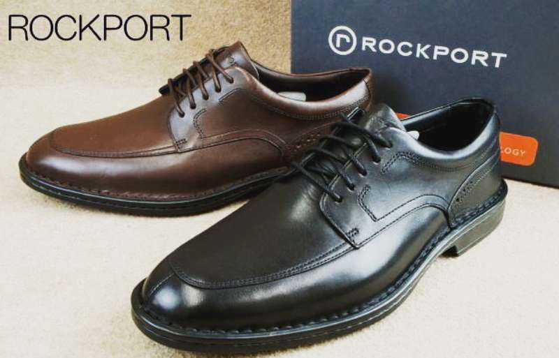
- Walking shoes and dress shoes, each cradling the logo like a crown jewel, testament to durability and style.
- The visual branding is a strategic ace, crafted to connect, convey, and convince.
In essence, every curve and shade in the emblem tells a Rockport story—of comfort, of legacy, of solid footing. Whether etched on leather or lighting up a storefront, it beckons shoe lovers to a world where steps are cushioned and style speaks volumes.
So the next time those eyes lock on the Rockport emblem, know you’re glimpsing a saga—and oh, what a saga it is.
If you liked this article about the Rockport logo, you should check out this article about the TOMS logo.
There are also similar articles discussing the Steve Madden logo, the Clarks logo, the Cole Haan logo, and the Havaianas logo.
And let’s not forget about articles on the Keen logo, the Teva logo, the Merrell logo, and the Sperry logo.
- Purple Color Palettes Fit for Royalty - 16 May 2024
- How To Find A Font: Top Font Finders To Use - 16 May 2024
- The Guinness Logo History, Colors, Font, And Meaning - 15 May 2024


