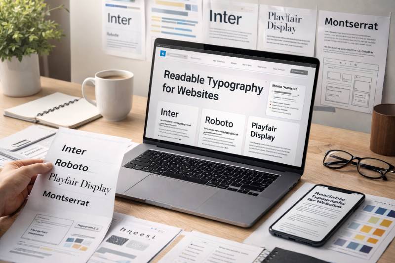
The font you pick for your website does more than set a visual tone. It directly affects how long people stay, how much they trust you, and whether they can read your content at all.
Choosing the best fonts for web design means balancing readability, brand personality, and performance across every screen size and device.
Not every typeface that looks great in Figma holds up at 14px on a mobile screen. That gap between design and reality is where most font decisions go wrong.
This guide covers the top web fonts used by designers in 2025, including the best sans-serif and serif options, with practical notes on screen readability, font pairing, and licensing for each one.
The Best Fonts for Web Design
Inter

A geometric neo-grotesque sans-serif designed by Rasmus Andersson in 2016, built specifically for screen readability. It draws from classic grotesque typefaces like Helvetica and Apple’s San Francisco while adding digital-first details.
Key Characteristics
- Tall x-height for strong legibility at small sizes
- Open counters and contextual alternates
- Slashed zero option to avoid 0/O confusion
- Available as a variable font with weights from Thin (100) to Black (900)
Readability on Screen
Performs well on both retina displays and low-resolution screens. The tall x-height keeps body text sharp at 14–16px. Works cleanly across all major browsers without rendering issues.
Best Use Cases for Web
SaaS interfaces, product documentation, dashboards, and content-heavy blogs. Equally strong as a heading font and body text font, so you can run a single-font system with Inter alone.
Font Pairing Suggestions
- Inter + Playfair Display for editorial contrast
- Inter + Merriweather for blog and long-form content
- Inter + Space Grotesk for developer tools and technical products
License and Availability
Free. Licensed under the SIL Open Font License. Available via Google Fonts, the official CDN at rsms.me/inter, and Adobe Fonts. Safe for personal and commercial use.
Roboto
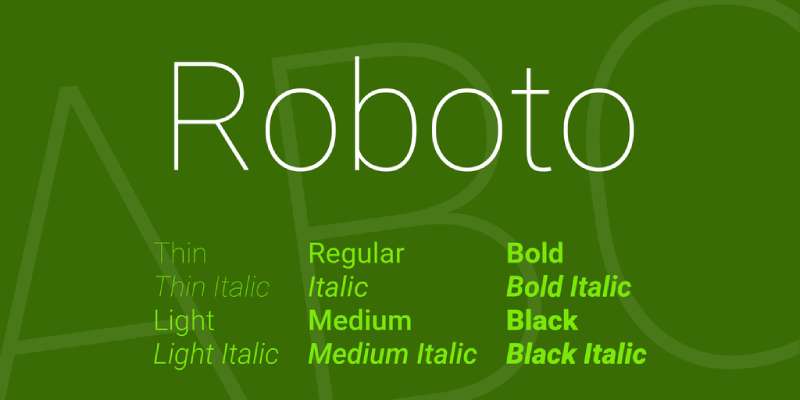
A humanist sans-serif developed by Google in 2011 as the default typeface for Android. It blends geometric structure with natural, open curves, making it one of the most widely used web fonts globally.
Key Characteristics
- Mechanical skeleton with friendly, open letterforms
- Dual-nature design: geometric yet humanist
- 12 styles across 6 weights
- Strong multi-language and CJK support
Readability on Screen
Excellent on mobile screens due to its Android heritage. The slightly wider letterforms improve legibility at body text sizes, and the font renders consistently across Chrome, Safari, and Firefox.
Best Use Cases for Web
Corporate websites, Android apps, tech blogs, and government portals. Also works well for UI elements like navigation menus and buttons where clean letterforms matter most.
Font Pairing Suggestions
- Roboto + Playfair Display for editorial contrast
- Roboto + Lato for a softer, approachable feel
- Roboto + Roboto Slab for a cohesive same-family pairing
License and Availability
Free. Licensed under the Apache License 2.0. Available on Google Fonts. No restrictions for personal or commercial projects.
Montserrat

A geometric sans-serif designed by Julieta Ulanovsky, inspired by urban signage in the Montserrat neighborhood of Buenos Aires. It has a bold, confident character that makes it popular for headings and branding.
Key Characteristics
- 17 weights, one of the widest ranges on Google Fonts
- Large x-height and short descenders
- Wide apertures for strong open counters
- Works well in all caps for navigation and labels
Readability on Screen
Strong for headings and short display text. For long body copy, it can feel stiff at regular weight, so most designers use it at heading sizes and pair it with a warmer body font. At 700–900 weight it creates clear typographic hierarchy.
Best Use Cases for Web
Creative portfolios, modern brand sites, UI headings, and landing pages. Particularly strong for e-commerce and startup sites that need a confident, contemporary look.
Font Pairing Suggestions
- Montserrat + Open Sans for corporate and tech sites
- Montserrat + Lato for a friendly, approachable layout
- Montserrat + Merriweather for editorial contrast
License and Availability
Free. Licensed under the SIL Open Font License. Available on Google Fonts and Adobe Fonts. Cleared for commercial use.
Poppins
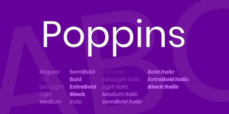
A geometric sans-serif from Indian Type Foundry, released in 2014. Its perfectly circular letterforms and even stroke weight give it a clean, modern personality that works well for both headings and short body text.
Key Characteristics
- Monolinear strokes with circular geometry
- Supports Latin and Devanagari scripts
- 9 weights, each with matching italics
- Proportional spacing that scales well across sizes
Readability on Screen
Comfortable at 16px and above. The round forms improve visual comfort at display sizes. For long-form body text at small sizes, the geometric shapes can feel slightly rigid, so it performs best in short paragraphs, buttons, and headings.
Best Use Cases for Web
Startups, e-commerce, mobile apps, and call-to-action elements. Also a popular choice for SaaS marketing pages where a fresh, modern tone matters. Good for international sites due to its Devanagari support.
Font Pairing Suggestions
- Poppins + Lato for a balanced, friendly layout
- Poppins + Montserrat for a fully geometric look
- Poppins + Merriweather for contrast between modern and classic
License and Availability
Free. Licensed under the SIL Open Font License. Available on Google Fonts. Fully cleared for personal and commercial use.
Lato
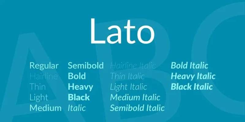
A humanist sans-serif designed by Lukasz Dziedzic in 2010. The name means “summer” in Polish, and the design reflects that: warm, friendly, and easy to read across a wide range of contexts.
Key Characteristics
- Subtle humanist details with a semi-rounded style
- Strong visual difference between large and small text
- 10 styles including hairline and black weights
- Open, generous letter spacing at body sizes
Readability on Screen
One of the most readable fonts on this list for long-form content. The curves soften the reading experience, which reduces fatigue on text-heavy pages. Performs consistently across all modern browsers and mobile devices.
Best Use Cases for Web
Blogs, content marketing sites, professional services, and healthcare. Works well when you need a font that feels professional but not cold. Good for body text from 14px upward.
Font Pairing Suggestions
- Lato + Montserrat for corporate sites and presentations
- Lato + Playfair Display for editorial and luxury brands
- Lato + Roboto for a clean, tech-oriented interface
License and Availability
Free. Licensed under the SIL Open Font License. Available on Google Fonts. No restrictions for commercial web use.
Open Sans
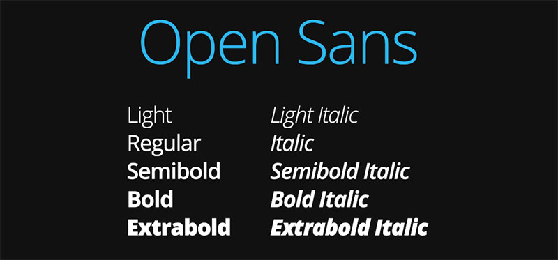
A humanist sans-serif designed by Steve Matteson and commissioned by Google in 2011. It was built with an upright stress and open forms that maximize legibility across print and digital. One of the most downloaded fonts on Google Fonts.
Key Characteristics
- Wide apertures and open counters for high legibility
- Neutral, professional character with a warm undertone
- 5 weights with matching italics
- Extensive character set with broad language support
Readability on Screen
Excellent at all sizes. The open letter shapes make it particularly strong for accessible web design, especially for users with visual impairments. It shares readability goals with Merriweather and works well as a single-font system.
Best Use Cases for Web
Government sites, healthcare, education, documentation, and corporate intranets. Anywhere that clarity and accessibility come before personality. It’s a go-to when you need a font that simply gets out of the way.
Font Pairing Suggestions
- Open Sans + Merriweather for blogs and editorial layouts
- Open Sans + Playfair Display for premium and fashion brands
- Open Sans + Montserrat for clean corporate design
License and Availability
Free. Licensed under the Apache License 2.0. Available on Google Fonts. Cleared for personal and commercial use without restrictions.
Playfair Display
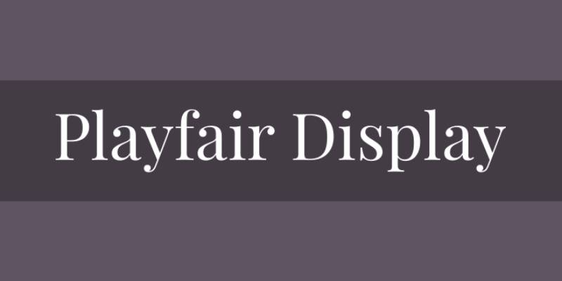
A transitional serif designed by Claus Eggers Sorensen in 2011, influenced by 18th-century European typography, particularly the work of John Baskerville. High-contrast strokes give it a dramatic, editorial quality.
Key Characteristics
- High contrast between thick and thin strokes
- Strong serifs with sharp, unbracketed terminals
- Large x-height for a serif font
- Available in 3 weights with both roman and italic styles
Readability on Screen
Strong at display sizes (32px and above). At smaller body text sizes, the high-contrast strokes can hinder legibility, especially on low-resolution screens. Best used for headings, hero text, and pull quotes rather than long paragraphs.
Best Use Cases for Web
Editorial sites, fashion and luxury brands, portfolios, restaurant sites, and any layout that needs a sophisticated, refined heading font. Pairs naturally with a simple, neutral sans-serif for body text.
Font Pairing Suggestions
- Playfair Display + Lato for editorial and fashion sites
- Playfair Display + Open Sans for a bold contrast pairing
- Playfair Display + Inter for modern editorial layouts
License and Availability
Free. Licensed under the SIL Open Font License. Available on Google Fonts and Adobe Fonts. Cleared for commercial use.
Merriweather
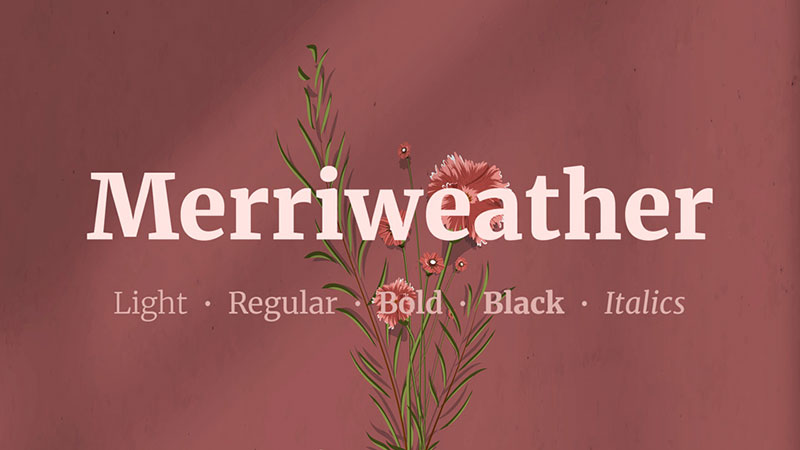
A workhorse serif designed by Eben Sorkin with one specific goal: to be pleasant to read on screens. Released in 2010, it evokes the feeling of old book type while being optimized for digital rendering.
Key Characteristics
- Very large x-height for strong legibility at small sizes
- Slightly condensed letterforms to reduce horizontal spread
- Diagonal stress that adds dynamism to the text
- Available in 4 weights including light and black
Readability on Screen
One of the best serif fonts for long-form content on screen. The thick strokes and large x-height prevent the breakdown that affects high-contrast serifs at small sizes. Government agencies and publishing platforms frequently use it as their primary body font.
Best Use Cases for Web
Blogs, news sites, legal and government publications, digital books, and content-heavy landing pages. Strong choice when you want a serif that communicates trust and authority without sacrificing screen readability.
Font Pairing Suggestions
- Merriweather + Open Sans for accessible, content-first layouts
- Merriweather + Oswald for news and publishing sites
- Merriweather + Montserrat for contrast between classic and modern
License and Availability
Free. Licensed under the SIL Open Font License. Available on Google Fonts. Cleared for personal and commercial use.
DM Sans
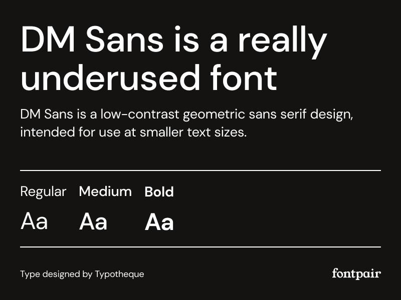
A low-contrast geometric sans-serif designed by Colophon Foundry and released on Google Fonts in 2019. It has minimal styling, soft curves, and an airy feel that fits modern, minimal interfaces well.
Key Characteristics
- Low stroke contrast for a clean, neutral appearance
- Soft, slightly rounded terminals
- Available as a variable font with a wide axis range
- Works well for both headings and body text
Readability on Screen
Excellent for mobile-first layouts. The soft curves and open spacing reduce eye strain on small screens. Performs well at 14–18px for body text and at larger sizes for headings without losing character.
Best Use Cases for Web
Fintech, mobile apps, product pages, and startups that want a clean but not sterile look. Works well for minimalist web design where the font needs to stay in the background and let the content speak.
Font Pairing Suggestions
- DM Sans + Playfair Display for a modern-classic editorial contrast
- DM Sans + Merriweather for content-heavy, trustworthy layouts
- DM Sans + DM Serif Display for a same-family pairing with clear hierarchy
License and Availability
Free. Licensed under the SIL Open Font License. Available on Google Fonts. No restrictions for commercial web use.
Georgia
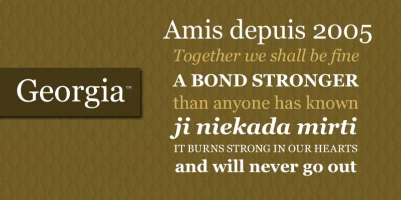
A transitional serif designed by Matthew Carter in 1993, specifically built for legibility on low-resolution screens. It predates most web fonts on this list by decades and remains one of the most reliable web-safe fonts available.
Key Characteristics
- Larger-than-average glyph proportions for screen clarity
- Ball terminals and bracketed serifs for a warm, traditional feel
- Pre-installed on Windows, macOS, iOS, and Android
- No external font request required
Readability on Screen
Still holds up on modern displays. The design was ahead of its time in prioritizing screen hinting, and it reads cleanly at body text sizes even on older monitors. For high-resolution retina displays, it remains a solid choice, though it can look slightly dated compared to newer screen serifs like Merriweather.
Best Use Cases for Web
Long-form articles, legal content, academic publications, and any site where web-safe font reliability matters more than typographic originality. A practical fallback in any serif font stack.
Font Pairing Suggestions
- Georgia + Verdana for a fully system-font, zero-load-time layout
- Georgia + Open Sans for accessible editorial content
- Georgia + Roboto for a classic-meets-modern contrast
License and Availability
Proprietary but pre-installed across all major operating systems and browsers. Free to use as a system font in CSS font stacks with no licensing concerns for standard web use.
What Makes a Font Good for Web Design?
Not every typeface that looks good in print survives contact with a browser.
Web fonts face conditions print fonts never deal with: varying screen resolutions, different operating systems rendering type differently, slow connections, and users on cheap Android phones reading your body text at 13px. A font that passes on all those fronts earns its place in a web project.
| Criterion | Why It Matters | What to Check |
|---|---|---|
| X-height | Taller x-height = better legibility at small sizes | Compare lowercase ‘x’ vs cap height |
| Letter spacing | Tight tracking hurts readability at body sizes | Test at 16px on mobile |
| WOFF2 support | Smaller file size, faster load | Check font provider format options |
| Font weight range | More weights = more design flexibility | Look for at least 4 weights |
| Open apertures | Open counters help distinguish similar letters | Check ‘c’, ‘e’, ‘a’ shapes |
Readability attributes that actually matter
X-height and aperture are the two most practical tests for screen readability.
A tall x-height keeps lowercase letters large relative to capitals, which matters at body size. Open apertures, the openings in letters like ‘c’, ‘e’, and ‘a’, prevent characters from looking identical at small sizes on low-resolution screens.
Font spacing defaults vary dramatically across typefaces. Some fonts ship with tracking that works well at display sizes but feels cramped at 16px body text. Always test at your actual body size before committing.
Nielsen Norman Group data from 2024 indicates well-implemented responsive typography contributes to a 40% reduction in bounce rates.
Format, licensing, and performance basics
WOFF2 is the standard now. It compresses 30% better than WOFF and has 97% browser support as of 2024 (ewebmarketing.au).
Font licensing trips up a lot of people. A font that’s free to download isn’t automatically free for web embedding. Check whether the license covers web use, especially for commercial sites.
- Open source: free for web embedding (Google Fonts, Font Squirrel)
- Desktop license: covers print and local use only
- Web license: specifically covers @font-face embedding
- SIL Open Font License: the most permissive, covers web and apps
Which Google Fonts Work Best for Body Text on Websites?
Over 50 million websites use Google Fonts (Linearity, 2024). For body text specifically, the shortlist is much shorter than the 1,826 available families.
Body text needs one thing above everything else: it needs to disappear. Good body typography is the kind readers don’t notice. They just read.
Inter
Designed for screens from day one. Inter was built specifically for UI and body text in digital environments.
It has a tall x-height, generous letter spacing at small sizes, and sharp rendering on both Retina and standard displays. GitHub, Linear, and thousands of SaaS products use it as their primary typeface. That’s not a coincidence.
Inter is now the most common choice for developer tools and B2B SaaS. Practical for any site where clarity matters more than personality.
Lato
38% of people stop engaging with a website when the content looks hard to read (Sparkmoor, 2024). Lato removes that friction.
Humanist structure, strong at small sizes. The letterforms are warm without being casual, which works for both editorial and corporate contexts.
- Performs well at 14px on mobile
- Six weights available, including the useful 300 (Light)
- Works for body and UI text without needing a second typeface
Source Sans Pro
Adobe’s open-source workhorse. Source Sans Pro was designed specifically for UI interfaces and extended reading.
It has a wider set of weights than most Google Fonts (200 through 900) and handles multilingual character sets well. A solid default for any site with long-form content in multiple languages.
Neutral personality means it pairs easily with almost any heading font. Not exciting, which is the point.
Merriweather
The standard choice when you want a serif font for body text online.
High contrast, optimized for screens. Merriweather was designed with low-resolution display rendering in mind. Its thick/thin stroke contrast is more restrained than classical serifs, which prevents stroke thinning from disappearing on standard monitors.
Used widely on editorial sites, long-form blogs, and any context where serif body text signals depth and credibility.
Inter vs. Roboto for UI-Heavy Websites
Roboto has 28 trillion all-time views on Google Fonts (Photutorial, 2025). It’s the default Android font and has massive usage. But for most web projects, Inter is the better call.
| Inter | Roboto | |
|---|---|---|
| Designed for | Screen UI and web | Android UI |
| X-height | Taller | Slightly shorter |
| Letter distinction | Higher | Moderate |
| Weight range | Variable font available | Static weights only |
| Best for | SaaS, web apps, editorial | Android-first apps, Google products |
Roboto is a safe default when you’re building something that should feel native to Google’s design language. Inter works better when you want your own typographic identity.
Which Google Fonts Are Best for Headings and Display Use?
Heading fonts have different requirements. They need presence at large sizes, a clear personality, and enough weight contrast to establish hierarchy against the body font.
Playfair Display
The editorial serif for web. Playfair Display brings high-contrast strokes and a strong serif font structure designed for large display sizes.
It works well for magazine-style layouts, luxury brands, and any site where you want headings to feel crafted rather than generic. Pair it with a clean sans-serif body font and the contrast is immediate.
Does not work at small sizes. That’s fine because it’s a heading font.
Montserrat
A geometric sans-serif font with a wide range of weights and a confident, modern personality.
Used across thousands of startup and SaaS landing pages. Montserrat at Bold or ExtraBold makes a strong hero heading. Its geometric structure reads as tech-forward and clean without feeling cold.
- Works from 600 to 900 weight for headings
- Clean at very large sizes (80px+)
- Pairs well with Open Sans or Lato for body text
Oswald
Oswald is condensed, heavy, and built for headings that need to fill horizontal space without taking up too many lines.
Tight columns, bold statements. It’s common on news sites and content-heavy platforms where headings need to punch through dense layouts. Less personality than Montserrat, more utility.
According to Monotype’s 2022 neuroscience research with Neurons, typeface choice alone can boost positive brand response by up to 13%. A condensed heading font like Oswald signals directness and confidence.
Geometric vs. Humanist Sans-Serif for Headings
Geometric (Montserrat, Raleway, Nunito): Based on circles and straight lines. Feels modern, clean, tech-forward. Less warmth.
Humanist (what is a humanist font?) (Lato, Open Sans, Source Sans Pro): Based on handwritten letterforms. More approachable, works across more brand tones. Less distinctive.
For SaaS and tech products: geometric. For media, education, or community-focused brands: humanist. There’s no universal right answer here.
When a heading font is being used as a display font at 60px or above, the choice shifts. At that size, personality dominates readability as the primary concern.
How Do Google Fonts Affect Website Performance?
According to the 2025 Web Almanac, 88% of websites use web fonts, loading a median of 4 font files per page. Yet only 12% of sites preload fonts (corewebvitals.io, 2025).
That gap matters. Font loading is one of the most common sources of Largest Contentful Paint (LCP) delays.
The real cost of loading Google Fonts from the CDN
Connecting to Google’s font CDN adds a DNS lookup, TCP connection, and SSL handshake before a single byte of font data downloads.
This extra connection adds between 500ms and 1 second of latency per page load on cold visits (Agence Web Performance, 2023). On subsequent visits, browser caching removes most of that cost. But first-time visitors, especially on mobile, feel it.
Key steps to reduce that cost:
- Add
rel="preconnect"to the Google Fonts domain in your<head> - Add
rel="dns-prefetch"as a fallback for older browsers - Load only the weights you actually use (one weight = one file download)
The Guardian switched to a system font stack in February 2024 and boosted their LCP scores by 24% as a result (ewebmarketing.au).
Self-Hosting Google Fonts vs. Using the Google CDN
Self-hosting means downloading the font files and serving them from your own domain. No third-party DNS lookup. No separate CDN connection. The files load from the same server as everything else.
| Self-hosted | Google CDN | |
|---|---|---|
| Connection overhead | None (same domain) | 500ms–1s on cold visit |
| Privacy compliance | Full control | Google receives user IP |
| Cache behavior | Your server controls | Browser-cached across sites |
| Maintenance | Manual updates needed | Always latest version |
| Setup effort | Moderate | Minimal |
Self-hosting is the better performance choice. For smaller sites where setup complexity matters more than milliseconds, the CDN with preconnect hints is acceptable.
Variable fonts and file size reduction
Variable fonts store a full range of weights, widths, and styles in a single file.
Loading Inter as a variable font instead of four separate weight files (Regular, Medium, SemiBold, Bold) replaces 4 HTTP requests with 1. Unoptimized font setups can add 500–2000ms to page load times, while proper optimization achieves 60–90% file size reduction (font-converters.com, 2026).
Google Fonts now offers about 468 variable font families, roughly 25% of its full library (Photutorial, 2025). Worth checking whether your preferred font has a variable version before loading static weights.
What Are the Best Google Font Pairings for Web Design?
Font pairing works on one rule: contrast. Two similar fonts create visual noise. Two fonts that clearly differ in structure, weight, or personality create hierarchy.
The most reliable approach is pairing a distinctive heading font with a neutral body font. Let the heading carry personality. Let the body carry the reader.
Playfair Display + Source Sans Pro
Classic editorial contrast. High-contrast serif headings against clean, neutral sans-serif body text.
Works immediately for blogs, magazines, and long-form content sites. The contrast is obvious and deliberate. Playfair Display at 36px+ over Source Sans Pro at 17px creates a reading experience that signals seriousness without feeling stiff.
Playfair Display font pairing options extend well beyond Source Sans if you want a warmer body font.
Montserrat + Lato
Both fonts are clean and modern, but they work together rather than competing because they differ where it matters.
Montserrat (geometric, structured) vs. Lato (humanist, warm). The geometric-humanist contrast creates enough visual difference to establish hierarchy while keeping a consistent modern tone. Common on startup sites and portfolio pages.
Good for: SaaS landing pages, creative agency sites, portfolio sites.
A font pairing generator can show these combinations in your actual type sizes before you commit to a direction.
Inter + Merriweather
Modern UI meets editorial warmth. Inter headings feel clean and technical. Merriweather body text feels crafted and readable.
This pairing works particularly well for developer tools, documentation sites, and SaaS products that want to feel both modern and considered. The sans/serif contrast is strong without either typeface being decorative.
A few practical rules when pairing fonts:
- Stick to two families maximum
- Never pair two decorative fonts
- Make hierarchy obvious, not subtle
- Test at your actual body size before finalising
How Does Font Choice Affect User Experience and Brand Perception?
A 2022 Monotype study conducted with applied neuroscience company Neurons tested three contrasting typefaces with 400 participants. Typeface choice alone boosted positive emotional response by up to 13%.
That’s a large swing from a single design decision.
What the research shows about serif vs. sans-serif on screen
Serif fonts (Times New Roman, Garamond) trigger associations with tradition, reliability, and authority. Studies from Wichita State University found they communicate respectability, making them popular for established institutions, law firms, and luxury brands.
Sans-serif fonts communicate modernity, simplicity, and approachability. A PubMed Central study found sans-serif fonts reduce cognitive load in digital environments, making them better suited for screen reading.
The full breakdown of how these two categories compare for web: serif vs. sans-serif fonts.
Research on font psychology shows easier-to-read fonts increase user trust by up to 40%, and appropriate font choices can increase conversion rates by 35% (dot2shape.com).
How real platforms signal intent through font choice
Medium uses Roboto for its interface (a clean, neutral sans-serif) while using a custom serif for long-form article body text. The combination signals: fast, modern interface, but serious, considered reading experience.
Notion uses Inter throughout, which signals productivity, clarity, and functional design. There’s no warmth in the font choice intentionally. The Notion font choice tells users this is a tool, not a publication.
Both choices are deliberate. Font psychology operates below conscious awareness. Readers don’t notice the font. They notice how the site feels.
Fonts for Accessibility and Inclusive Web Design
WCAG standards require a minimum contrast ratio of 4.5:1 for normal body text. The font you choose affects how easily that ratio is achievable.
Fonts with clear letter distinction, open apertures, and consistent stroke width are the baseline for accessible typography. The Illinois test (placing capital I, lowercase l, and number 1 next to each other) is the fastest check: if they look identical, the font will cause confusion for dyslexic readers and low-vision users.
Specific guidance on fonts for accessibility covers the full range of considerations including dyslexia, ADHD, and low-vision users. The short version: Inter, Atkinson Hyperlegible, and APHont lead the field for accessible web typography.
Over 54% of global website traffic comes from mobile devices (Designerly, 2024). A font that reads clearly at 16px on a 360px-wide screen is not optional. It’s the baseline requirement.
FAQ on The Best Fonts For Web Design
What is the best font for web design?
Inter is the top choice for most web designers right now. It was built specifically for screens, handles every weight cleanly, and works equally well for headings and body text. Roboto and Poppins follow closely for UI-heavy projects.
How many fonts should a website use?
Stick to two. One for headings, one for body text. A third accent font is fine if used sparingly, like in a button or pull quote. More than three fonts creates visual noise and slows down font loading speed.
What is the difference between a serif and a sans-serif font for web?
Serif fonts have small strokes at the ends of letterforms. Sans-serif fonts do not. On screen, sans-serifs tend to render more cleanly at small sizes, though modern serifs like Merriweather hold up well for body text.
Are Google Fonts good for web design?
Yes. Google Fonts are free, well-optimized, and cover most design needs. Inter, Montserrat, Poppins, and Merriweather are all available there. Just load only the weights you need to keep page performance tight.
What font size should body text be on a website?
px is the standard starting point for body text. Some designers go to 18px for long-form content. Anything below 14px hurts readability, especially on mobile. Line height around 1.5–1.6 improves comfort significantly.
What is the most readable font for websites?
Inter, Open Sans, and Lato consistently rank highest for screen readability. They share open counters, generous letter spacing, and neutral character shapes that reduce eye strain across long reading sessions.
Do fonts affect website performance?
Yes. Every custom font adds an HTTP request and load time. Using system fonts eliminates that entirely. If you use web fonts, load only the weights you need and use font-display: swap to prevent layout shifts.
What fonts work best for mobile websites?
DM Sans, Poppins, and Inter perform best on mobile. They stay legible at smaller sizes and render cleanly on both standard and high-resolution screens. Avoid thin weights below 300 on mobile as they become hard to read.
Should I use variable fonts for web design?
Variable fonts let you load one font file that covers multiple weights and styles. That reduces HTTP requests and file size. Inter and DM Sans both offer variable font versions, making them strong choices for performance-focused projects.
What is font pairing in web design?
Font pairing is the practice of combining two typefaces that complement each other. A strong heading font paired with a readable body font creates clear visual hierarchy. Contrast between styles, like a serif heading with a sans-serif body, usually works best.
Conclusion
This conclusion is for an article presenting the best fonts for web design, and the core takeaway is simple: typeface selection is a functional decision, not just a visual one.
Inter and DM Sans lead for modern UI work. Merriweather and Georgia hold strong for long-form, content-heavy layouts. Playfair Display brings editorial weight when you need it.
Whatever direction you go, keep tracking, kerning, and typography fundamentals in check. A great font poorly set still reads badly.
Limit your font stack to two typefaces, load only the weights you need, and always test on mobile before you ship.
Get those basics right, and your typography will quietly do its job on every screen.

Renowned for his expertise in logo design and visual branding, Bogdan has developed a multitude of logos for various clients.
His skills extend to creating posters, vector illustrations, business cards, and brochures. Additionally, Bogdan's UI kits were featured on marketplaces like Visual Hierarchy and UI8.
He also wrote in the past years on sites like Design Your Way, WebDesignerDepot, WPDean, Designmodo, Speckyboy, Slider Revolution, and more.
- The Beehiiv Logo History, Colors, Font, And Meaning - 18 September 2026
- Versatile Work Sans Font Pairing for Every Project - 16 September 2026
- Organize Digital Files Like a Pro Before Your Next Client Handoff - 16 September 2026

Bogdan Sandu is a seasoned designer who has been designing websites since 2008. Renowned for his expertise in logo design and visual branding, Bogdan has developed a multitude of logos for various clients. His skills extend to creating posters, vector illustrations, business cards, and brochures. Additionally, Bogdan's UI kits were featured on marketplaces like Visual Hierarchy and UI8. He also wrote in the past years on sites like Design Your Way, WebDesignerDepot, WPDean, Designmodo, Speckyboy, Slider Revolution, and more.
You Might Also Like