Pick the wrong font and half your visitors will never see it the way you intended.
The web safe fonts list exists for exactly this reason. These are typefaces pre-installed on most operating systems, from Windows and macOS to iOS and Android, so they display consistently across every browser and device without a single external file to load.
No custom font requests. No render-blocking. No layout shifts.
In this guide, you will find the 10 most reliable system fonts used in web design today, including serif, sans-serif, and monospace options. Each entry covers its CSS font stack, best use cases, and where it falls short.
Whether you are building a site from scratch or looking for dependable fonts for your website, this list gives you everything you need to make a confident choice.
Web Safe Fonts List
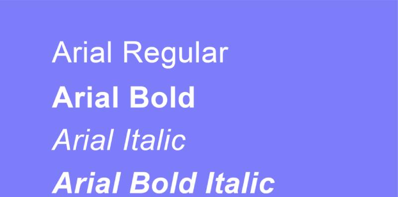
Arial
Font Characteristics
- Category: Sans-serif
- Designer: Robin Nicholas and Patricia Saunders
- Year introduced: 1982
- Default on: Windows, macOS, iOS, Android
Why It Is Web Safe
Arial ships with every major operating system. It was bundled with Windows 3.1 in the early 1990s and has been a browser default ever since. Cross-device font rendering is consistent and reliable.
Best Use Cases
Body text on blogs and news sites, UI labels, email newsletters. It works well at small sizes without losing legibility.
CSS Font Stack
font-family: Arial, Helvetica Neue, Helvetica, sans-serif;
Readability and Performance
Clean and neutral at any size. No external font file needed, so there is zero render-blocking impact on page load.
Limitations
Widely seen as a cheaper Helvetica clone. Not ideal for premium or luxury brand contexts where typographic distinction matters.
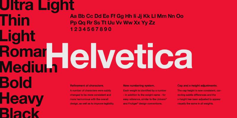
Helvetica
Font Characteristics
- Category: Sans-serif
- Designer: Max Miedinger and Eduard Hoffmann
- Year introduced: 1957 (as Neue Haas Grotesk), renamed Helvetica in 1960
- Default on: macOS, iOS
Why It Is Web Safe
Helvetica comes pre-installed on all Apple devices. On Windows, Arial serves as its metric-compatible fallback, so CSS font stacks using Helvetica degrade cleanly across all platforms.
Best Use Cases
Corporate websites, navigation menus, headings. Its neutral character makes it suitable for almost any context.
CSS Font Stack
font-family: Helvetica Neue, Helvetica, Arial, sans-serif;
Readability and Performance
Exceptionally legible at all sizes. No download needed on Apple devices, and Windows users get Arial as a near-identical fallback.
Limitations
Not natively available on Windows. Designers targeting cross-platform consistency need to always pair it with Arial in the CSS font stack.
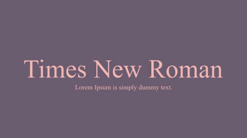
Times New Roman
Font Characteristics
- Category: Serif
- Designer: Stanley Morison and Victor Lardent
- Year introduced: 1931 (commissioned for The Times of London)
- Default on: Windows, macOS, iOS, Android
Why It Is Web Safe
One of the first fonts bundled with Microsoft Windows. It has been a default system font on virtually every operating system for decades, which makes cross-browser typography with this face completely predictable.
Best Use Cases
Long-form reading, academic documents, formal editorial content. It is the go-to for academic papers and legal documents for a reason.
CSS Font Stack
font-family: 'Times New Roman', Times, serif;
Readability and Performance
Strong legibility at small sizes in print. On screens at low resolution it can look slightly cramped, particularly at body text sizes below 14px.
Limitations
Feels dated in modern web contexts. Better suited to formal or editorial design than consumer-facing product interfaces.
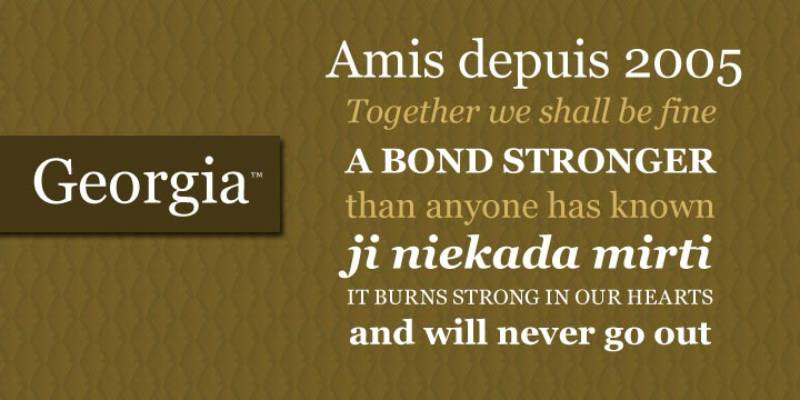
Georgia
Font Characteristics
- Category: Serif
- Designer: Matthew Carter
- Year introduced: 1993 (designed), 1996 (released by Microsoft)
- Default on: Windows, macOS, iOS, Android
Why It Is Web Safe
Released as part of Microsoft’s Core Fonts for the Web initiative. Georgia was purpose-built for screen rendering, so it holds up across all devices and browsers without any font fallback issues.
Best Use Cases
Blog body text, online editorial content, long-form articles. It is arguably the best serif option for screen reading. Pairs well with Verdana for a clean, zero-cost font pairing.
CSS Font Stack
font-family: Georgia, 'Times New Roman', Times, serif;
Readability and Performance
Designed specifically for low-resolution screens. Its generous x-height and open letterforms make it highly readable even at small sizes.
Limitations
Wider character spacing can eat into line length. Worth checking line width on narrow mobile layouts.
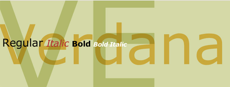
Verdana
Font Characteristics
- Category: Sans-serif
- Designer: Matthew Carter
- Year introduced: 1996
- Default on: Windows, macOS, iOS, Android
Why It Is Web Safe
Also part of Microsoft’s Core Fonts for the Web package. Designed from the ground up for screen display, it renders consistently across all major browsers and operating systems.
Best Use Cases
Body text, UI copy, navigation labels, mobile interfaces. Its wide proportions make it especially useful for small font sizes where clarity matters most.
CSS Font Stack
font-family: Verdana, Geneva, Tahoma, sans-serif;
Readability and Performance
Screen-optimized letterforms and generous letter spacing give it excellent legibility at 8px and above. No performance cost since it loads from the user’s device.
Limitations
Its wide character proportions can make text feel bulky at larger sizes. Not the best choice for display headings or tight layouts.
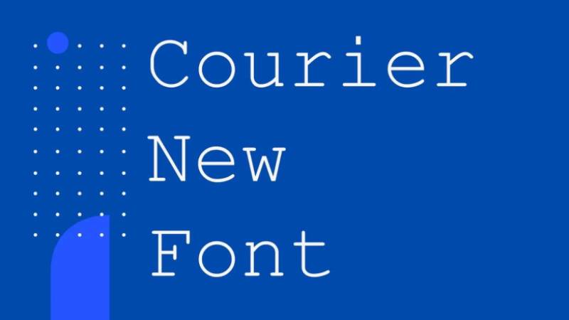
Courier New
Font Characteristics
- Category: Monospace
- Designer: Howard “Bud” Kettler
- Year introduced: 1955 (for IBM typewriters)
- Default on: Windows, macOS, iOS, Android
Why It Is Web Safe
Bundled with Windows and macOS for decades. Its monospaced structure makes it a standard choice for code-related content across all browsers.
Best Use Cases
Code blocks, terminal output, technical documentation, legal documents, and screenplays. Also used in contexts where a typewriter aesthetic is intentional.
CSS Font Stack
font-family: 'Courier New', Courier, monospace;
Readability and Performance
Every character occupies equal horizontal space, which supports clean code alignment. Legible at standard reading sizes, though not optimized for long-form prose.
Limitations
Looks dated in non-technical contexts. For modern coding interfaces, many developers prefer dedicated coding fonts over Courier New.
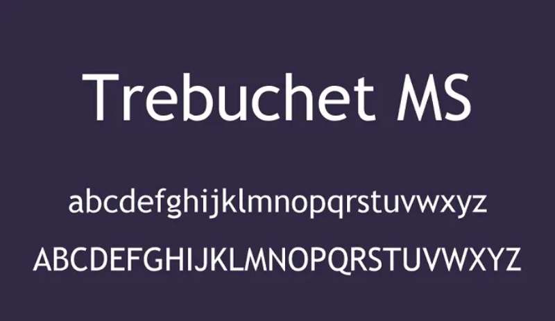
Trebuchet MS
Font Characteristics
- Category: Sans-serif
- Designer: Vincent Connare
- Year introduced: 1996
- Default on: Windows, macOS
Why It Is Web Safe
Released as part of Microsoft’s Core Fonts for the Web set. Widely available on Windows and macOS, though support on some mobile operating systems is inconsistent.
Best Use Cases
Headings, blog titles, personal sites, editorial interfaces. Its slightly quirky geometry makes it feel more expressive than Arial without sacrificing legibility.
CSS Font Stack
font-family: 'Trebuchet MS', Lucida Grande, Lucida Sans Unicode, sans-serif;
Readability and Performance
Good legibility at display sizes. Works well for typographic hierarchy when paired with a neutral body font like Georgia or Verdana.
Limitations
Not reliably available on all Android or iOS versions. Always use a solid sans-serif fallback in the font stack.
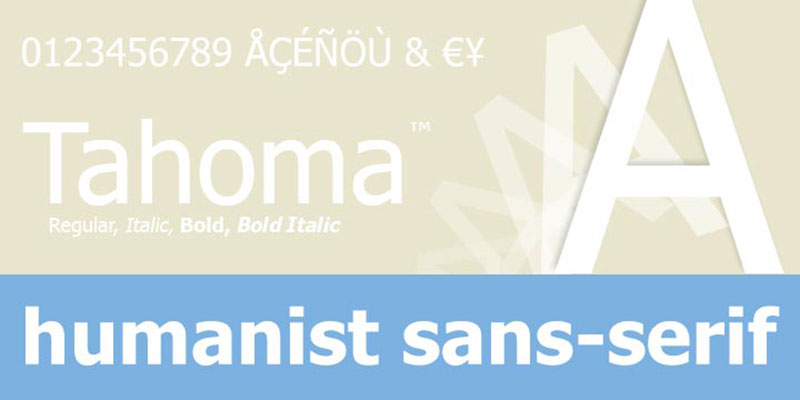
Tahoma
Font Characteristics
- Category: Sans-serif
- Designer: Matthew Carter
- Year introduced: 1999
- Default on: Windows, macOS
Why It Is Web Safe
A standard system font on Windows since Windows 95. Its availability across Windows and macOS makes it a reliable choice for cross-platform font rendering.
Best Use Cases
UI elements, small-size labels, navigation menus. Tahoma is narrower than Verdana, so it fits more text in tight spaces without sacrificing readability.
CSS Font Stack
font-family: Tahoma, Verdana, Segoe, sans-serif;
Readability and Performance
Tight letter spacing and compact proportions make it efficient for interface text. Renders clearly at sizes as small as 10px.
Limitations
Less common on Linux and some mobile systems. Pair with Verdana as a fallback to maintain visual consistency across devices.
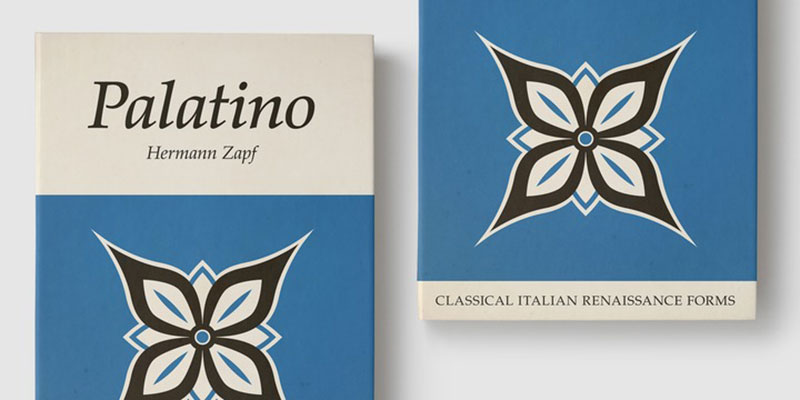
Palatino Linotype
Font Characteristics
- Category: Serif (Old-style)
- Designer: Hermann Zapf
- Year introduced: 1948 (Palatino), digitized as Palatino Linotype for Windows in the 1990s
- Default on: Windows, macOS (as Book Antiqua)
Why It Is Web Safe
The Palatino Linotype version ships with Windows, while macOS includes a variant called Book Antiqua. Combined, this gives it broad coverage across desktop operating systems.
Best Use Cases
Literary content, luxury branding, formal editorial design. Its calligraphic roots give body text a warmth that Times New Roman lacks.
CSS Font Stack
font-family: Palatino Linotype, Palatino, Book Antiqua, Georgia, serif;
Readability and Performance
Elegant at large sizes. At very small sizes the thinner strokes can lose definition on low-resolution screens.
Limitations
Less reliable on mobile operating systems. Not pre-installed on most Android devices, so the fallback to Georgia is important in the font stack.
Impact

Font Characteristics
- Category: Display, sans-serif (condensed)
- Designer: Geoffrey Lee
- Year introduced: 1965
- Default on: Windows, macOS
Why It Is Web Safe
Bundled with Windows and macOS for decades. Its near-universal availability on desktop systems makes it a reliable choice when you need a high-contrast display font without loading an external file.
Best Use Cases
Headlines, posters, banners, and meme-style overlays. Not suitable for body text. Its condensed, ultra-bold design is built for maximum visual weight at large sizes.
CSS Font Stack
font-family: Impact, Charcoal, Helvetica Inserat, sans-serif;
Readability and Performance
Excellent attention-grabbing power at display sizes. Zero load time since it is a pre-installed system font.
Limitations
Coverage on iOS and Android is inconsistent. And honestly, its association with internet memes makes it a risky choice for professional brand contexts.
What Makes a Google Font Worth Using on a Website
Google Fonts has been viewed over 50 trillion times across the web, and over 50 million websites currently use its library (Photutorial, 2024).
But sheer popularity doesn’t mean every font in that library belongs on your site. Most projects only need one or two fonts. Loading more than that, or pulling in weights you don’t actually use, quietly kills your load times.
Here’s what separates a good pick from a bad one:
- Rendering quality across Chrome, Safari, Firefox, and mobile browsers (iOS and Android both matter)
- File size and loading behavior via the Google Fonts CDN or, better, through self-hosting
- License clarity – all Google Fonts use the SIL Open Font License or Apache License, so commercial use is always covered
- Legibility at body text sizes, not just in preview thumbnails
- Pairing potential, because a font that works alone but fights everything else is going to create problems
One thing worth knowing: the “shared CDN cache” argument for Google Fonts is dead. Since Chrome v86 and Safari, browsers partition caches by domain, so every new visitor to your site downloads your fonts from scratch regardless of what other sites they’ve been on (corewebvitals.io, 2025).
Self-hosting is increasingly the smarter move. The 2025 Web Almanac shows 31.5% of desktop sites now exclusively self-host their fonts, up from 28% in 2024.
Best Free Google Fonts for Body Text and Readability
85% of websites analyzed prefer sans-serif fonts for body text (Toner Buzz, 2024). But that leaves real room for serif choices in content-heavy layouts.
The fonts below consistently perform well at paragraph sizes across device types. Most handle multilingual content, which matters more than people plan for.
Sans-Serif Options for Long-Form Content
Inter is probably the most technically optimized sans-serif font for screen reading available right now. Rasmus Andersson built it specifically for computer displays, iterating on every letterform until the balance felt right at small sizes. Its variable font version keeps file sizes lean.
Good picks for this category:
- Inter – open shapes, strong x-height, excellent on mobile
- Lato – geometric simplicity with just enough warmth; highly readable at 14-16px
- Open Sans – among the most-used fonts for websites, built with 897 characters and 13 styles
- Source Sans 3 – Adobe’s first open-source typeface, neutral enough to pair with almost anything
Roboto is worth mentioning too. It’s Google’s default for Android and Chrome OS, which means most mobile users have already rendered it countless times. That familiarity translates to faster perceived reading.
Serif Options for Editorial and Blog Layouts
Merriweather was designed from the start for screen, not print. That shows in how it performs at body text sizes – low contrast, large x-height, and generous line spacing make long articles comfortable.
Merriweather vs. Lora at a glance:
| Font | X-height | Best for | Weight options |
|---|---|---|---|
| Merriweather | Large | News sites, blogs, editorial | 4 (Light to Black) |
| Lora | Medium | Shorter long-form, poetry, literary sites | 2 (Regular, Bold) |
| Source Serif 4 | Large | Multilingual, professional content | Variable |
| Libre Baskerville | Medium | Classic editorial, inspired by ATF Baskerville 1941 | 3 |
Adobe found 65% of users prefer readable text over decorative styles when consuming online content. That stat is a good gut-check when you’re tempted by something with more character.
Best Free Google Fonts for Headings and Display Use
58% of H1 headers across analyzed websites use sans-serif, which is lower than H2 and paragraph usage – suggesting designers lean into more character at larger sizes (Dribbble, via Photutorial).
That makes sense. At 32px or larger, you can afford more personality without sacrificing legibility.
Geometric Sans-Serif Headings
Montserrat is the obvious starting point. It was inspired by signs and painted windows in Buenos Aires, and that origin shows – it has presence without aggression.
Poppins works slightly differently. Its tight, even spacing is good for long headings where you need to be economical with space. The slim letters also take to bolding well.
Both are strong picks when you’re thinking about fonts for branding – geometric structure reads as modern and confident.
High-Contrast Editorial Headings
Playfair Display is the go-to for editorial layouts. High stroke contrast, strong vertical stress – it reads as premium without being stuffy. Pair it with a clean sans-serif body and you get the classic serif font / sans-serif combination that’s hard to get wrong.
Oswald goes in a different direction. Condensed letterforms, strong visual weight. This one shows up constantly in sports, news, and fitness contexts. It’s also one of the top 5 most-downloaded fonts on Google Fonts, alongside Roboto and Montserrat (Photutorial, 2024).
Raleway sits somewhere in between. Distinctive letterforms (especially the crossed “W”), light enough for elegant headings, opinionated enough to be memorable. Works particularly well as a display font for lifestyle brands.
Best Free Google Fonts for Pairing
Well, the thing is – most font pairing advice online is too prescriptive. “Use Playfair Display with Source Sans Pro.” Sure, that works. But understanding why it works is more useful.
The core rule for pairing fonts: contrast in style, similar proportions, ideally from the same historical period or design family.
Serif and Sans-Serif Combinations
These work because the contrast between the two styles creates hierarchy without needing size alone to do that job.
Playfair Display + Source Sans 3
Classic editorial pairing. The high-contrast serif heading reads as authoritative; the neutral sans-serif body keeps reading comfortable.
Merriweather + Inter
Surprisingly versatile. Merriweather’s warmth softens Inter’s technical precision. Good for professional blogs, news, or anything that wants to feel both readable and credible.
Georgia + Open Sans
This one deserves more credit. Georgia is one of the original web safe fonts designed specifically for screens. Paired with Open Sans, it holds up with zero external font requests if you go the system font route.
Two Sans-Serif Combinations That Actually Work
Most pairing guides skip these because “pair a serif with a sans-serif” is easier advice to give. But two sans-serifs can absolutely work when the contrast is in weight and proportion rather than style.
Montserrat + Lato
Bold geometric heading over a calm, warm body font. Clean and modern. This is the pairing Buzzcube ranks as their go-to for general-purpose modern sites (2025).
Inter + Roboto Condensed
A readable body font with a compact, high-impact heading. Particularly useful for dashboards, product interfaces, or anything information-dense. The contrast comes from the condensed proportions rather than any stylistic difference.
A font pairing generator can help you test combinations quickly, but always check the actual rendering in your specific layout before committing.
Best Free Google Fonts by Use Case
93% of paragraph text on websites uses sans-serif, according to an analysis of 1,000 sites (Dribbble, via Photutorial). That tracks – but context still shapes the right choice.
| Use case | Recommended font | Type | Why |
|---|---|---|---|
| Blogs, editorial | Merriweather | Serif | Screen-optimized, fatigue-free |
| Websites, general | Inter or Roboto | Sans-serif | Broad device support, high readability |
| Apps, dashboards | DM Sans or Inter | Sans-serif | Information-dense layouts |
| Branding, marketing | Montserrat or Raleway | Sans-serif | Strong visual presence |
| Coding tools | Inconsolata | Monospaced | Designed for extended code reading |
Fonts for blogs and long-form content sit in a different category from heading choices.
For body text at paragraph sizes, readability takes priority over personality. For headings, you can push further.
Fonts for apps and interfaces lean toward Inter and DM Sans right now. Both are available as variable fonts, meaning a single file handles every weight. Google Fonts has approximately 468 variable font families, about 25% of its full library (Photutorial, 2024).
For fonts for accessibility, Lexend stands out specifically – it was built from research into how letter spacing and font shape affect reading proficiency. The Atkinson Hyperlegible font (also available via Google Fonts) was designed for low-vision users.
How to Add Google Fonts to Your Website or Design Tool
Getting the font on your site matters as much as picking the right one. Poor implementation hurts Core Web Vitals, which directly affects rankings.
Embed via Google Fonts API
The fastest starting point for most projects. Add a <link> tag in your HTML <head>, not @import in CSS.
Why that matters: Using @import creates a render-blocking chain – the browser can’t discover the font request until it’s parsed your entire CSS file. Switching to a <link> tag allows parallel downloading and shaves hundreds of milliseconds off load time.
Always include font-display: swap in your CSS @font-face declarations. This tells the browser to show fallback text immediately rather than hiding content while the font loads.
Self-Hosting for Performance and Privacy
Self-hosting removes the external DNS lookup and TLS handshake, gives you full control over caching, and addresses GDPR concerns (Google Fonts servers in the US may collect visitor IP addresses).
One e-commerce platform boosted its Largest Contentful Paint (LCP) by 30% simply by converting to WOFF2 and subsetting fonts (2024 case study, ewebmarketing.au).
Quick steps for self-hosting:
- Download font files via google-webfonts-helper.herokuapp.com
- Convert to WOFF2 if not already (WOFF2 uses improved compression, roughly 20-30% smaller than WOFF)
- Write
@font-facerules pointing to your own domain - Set
Cache-Control: max-age=31536000, immutableheaders on font files - Preload critical fonts in
<head>withrel="preload" as="font" crossorigin
Adding Google Fonts in Design Tools
Figma – Google Fonts are available directly in the font picker without any installation. Works immediately once you’re logged in.
Canva – Free Google Fonts are included by default. For custom fonts, uploading fonts to Canva is straightforward through the Brand Kit section.
WordPress – Most themes load Google Fonts via their customizer settings. For more control, plugins like OMGF or self-hosted font files give you direct management of font spacing, loading order, and display behavior. For a deeper look at the WordPress font setup options available, theme and plugin documentation varies significantly.
One practical thing that gets overlooked: limit font weights. Load only the weights you actually use – typically Regular (400) and Bold (700) cover most needs. Every additional weight adds HTTP requests.
FAQ on The Web Safe Fonts List
What is a web safe font?
A web safe font is a typeface pre-installed on most operating systems. Because it lives on the user’s device, browsers can render it without downloading anything. That means consistent display across Windows, macOS, iOS, and Android with no extra load time.
Why does font compatibility matter for websites?
If a browser cannot find your chosen font, it falls back to a system default. That can break your layout, change line lengths, and hurt readability. Using a reliable CSS font stack prevents that from happening.
How many web safe fonts are there?
Around 10 to 15 typefaces are consistently available across all major platforms. The core list includes Arial, Helvetica, Georgia, Verdana, Times New Roman, Courier New, Trebuchet MS, Tahoma, Palatino Linotype, and Impact.
What is the difference between web safe fonts and Google Fonts?
Web safe fonts are pre-installed system fonts. Google Fonts are hosted externally and loaded via a request to Google’s servers. System fonts are faster. Google Fonts offer more variety but add a small loading overhead to your page.
Which web safe font is best for body text?
Georgia and Verdana are the strongest options. Both were designed specifically for screen readability. Georgia works well for editorial content. Verdana’s wider proportions make it especially clear at small sizes, which helps with font accessibility.
Are web safe fonts good for SEO?
Font choice does not directly affect rankings, but it affects readability and time-on-page. Faster-loading system fonts support better page experience signals. Google’s core ranking systems factor in how people interact with your content.
What is a CSS font stack?
A CSS font stack is a prioritized list of fonts declared in your stylesheet. The browser works through the list top to bottom, using the first available font. It always ends with a generic family like serif or sans-serif as a final fallback.
Can I use web safe fonts in email newsletters?
Yes, and it is the safest approach. Most email clients block custom web fonts. Sticking to pre-installed typefaces like Arial, Georgia, or Verdana ensures your email typography renders correctly for every recipient, regardless of their email client.
What is the most readable web safe font?
Verdana consistently ranks at the top for screen readability. Matthew Carter designed it specifically for low-resolution displays, with generous letter spacing and a tall x-height. Georgia is the strongest serif option for the same reasons.
Do web safe fonts work on mobile devices?
Most do. Arial, Georgia, Verdana, Times New Roman, and Courier New are available across iOS and Android. Trebuchet MS and Palatino Linotype have inconsistent mobile support, so always include solid fallback fonts in your font stack.
Conclusion
This conclusion is for an article presenting the web safe fonts list, and the takeaway is straightforward: system fonts are still one of the smartest choices you can make for cross-browser typography.
Arial, Georgia, Verdana, and the rest of these pre-installed typefaces give you reliable font rendering across Windows, macOS, iOS, and Android without a single additional HTTP request.
That matters for page load performance, email client compatibility, and overall design consistency.
Serif options like Georgia and Times New Roman handle long-form reading well. Sans-serif fonts like Tahoma and Verdana excel in UI contexts. Courier New remains the default for code and technical layouts.
Whatever your project, a well-structured CSS font stack built on these default system typefaces is a decision you will rarely regret.

Renowned for his expertise in logo design and visual branding, Bogdan has developed a multitude of logos for various clients.
His skills extend to creating posters, vector illustrations, business cards, and brochures. Additionally, Bogdan's UI kits were featured on marketplaces like Visual Hierarchy and UI8.
He also wrote in the past years on sites like Design Your Way, WebDesignerDepot, WPDean, Designmodo, Speckyboy, Slider Revolution, and more.
- Baseball Team Color Codes - 28 July 2026
- How Creators Can Use AI Image Tools to Make Better Visual Content - 28 July 2026
- Canva vs Adobe Express: Which Is Better? - 27 July 2026

Bogdan Sandu is a seasoned designer who has been designing websites since 2008. Renowned for his expertise in logo design and visual branding, Bogdan has developed a multitude of logos for various clients. His skills extend to creating posters, vector illustrations, business cards, and brochures. Additionally, Bogdan's UI kits were featured on marketplaces like Visual Hierarchy and UI8. He also wrote in the past years on sites like Design Your Way, WebDesignerDepot, WPDean, Designmodo, Speckyboy, Slider Revolution, and more.
You Might Also Like