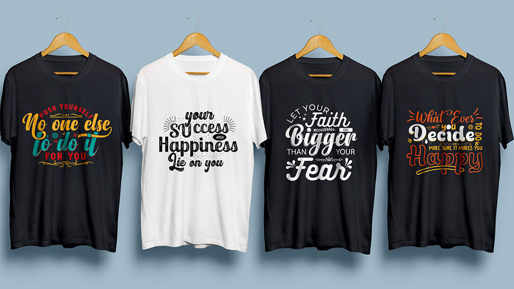
Flyer Flair: The 41 Best Fonts for Flyers

Ever wonder why some flyers just pop while others fade into the background? It’s often down to one critical element: fonts. The right font can turn a simple flyer into a compelling piece of art, capturing attention and conveying your message effortlessly.
In this dive into the world of typography, we’ll explore the best fonts for flyers.
Whether you’re crafting an eye-catching promo or an elegant event announcement, the perfect font makes all the difference. From the crisp clarity of sans-serif beauties to the warm appeal of handwritten styles, each font family has its unique charm.
We’ll unpack secrets like why Helvetica might be your go-to for modern vibes or how a script font like Lucida Handwriting can add a personal touch.
And it’s not just about style; factors like legibility and font weight play a huge role in how your message is received.
The Best Fonts for Flyers
| Font Name | Style | Legibility | Character | Versatility |
|---|---|---|---|---|
| Avenger | Modern, Clean | High | Professional, Sleek | High (Corporate) |
| Retro Star | Retro, Display | Medium | Fun, Nostalgic | Medium (Events) |
| Venditum Typeface | Elegant, Serif | High | Sophisticated | Medium (Luxury) |
| Helios | Sans-serif | High | Modern, Crisp | High (General Use) |
| Ocean Twelve | Script, Handwritten | Low | Artistic, Casual | Low (Art/Leisure) |
| The Shocker | Bold, Display | Medium | Impactful, Strong | Medium (Sales/Promo) |
| Billy Ohio | Brush Script | Medium | Edgy, Informal | Low (Casual Events) |
| Stay High | Script, Casual | Medium | Lively, Playful | Low (Youth Events) |
| Regan Script | Script, Formal | Medium | Elegant, Flowing | Medium (Invites) |
| BERLIN | Sans-serif | High | Minimalist, Clean | High (Modern Events) |
| Maximus Sans | Geometric Sans | High | Contemporary, Bold | High (Corporate) |
| Sunmor Advertisement Font | Retro, Sans-serif | High | Vintage, Versatile | Medium (Advertising) |
| Boldchild Kids Typeface | Display, Fun | High | Whimsical, Friendly | Low (Children) |
| Genuine | Brushed, Handmade | Medium | Authentic, Expressive | Medium (Artisanal) |
| Lovile | Script | Medium | Delicate, Romantic | Low (Weddings) |
| Dazed | Distorted, Display | Low | Abstract, Edgy | Low (Music/Art) |
Categories of Fonts for Different Flyer Themes
Retro and Vintage Fonts
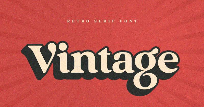
You know when you see a flyer, and it just screams old-school cool? That’s the magic of retro and vintage fonts. These fonts take you back in time, giving your flyer a classic yet timeless vibe. Think of the fonts that make you feel like you’re in a 1950s diner or browsing through a 70s vinyl store.
For example, Rambors – a Retro Font, is a gem for creating that nostalgic feel. Then there’s Avenger – Vintage Display Font, perfect for when you want that old Hollywood glamour.
Shinkoya, a Retro Inspired Poster Font, brings back the golden era of vintage design. And don’t forget Bathern, a Vintage Poster Font that adds a touch of class to any flyer. If you’re looking for a free option, Retro Star is one of the best fonts for flyers, especially when you’re on a budget.
Modern and Futuristic Fonts
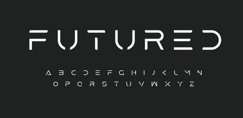
Now, let’s fast-forward to the future. Modern and futuristic fonts are all about sleek lines, crisp edges, and a forward-thinking vibe. They’re the go-to when you’re looking to make a bold, contemporary statement.
Take Venditum Typeface, for example. Its clean lines are perfect for a cutting-edge look. Then there’s Flare – a Futuristic Science Font that feels like it’s straight out of a sci-fi movie. BERLIN, a Clean Modern Poster Font, is great for when you need something straightforward yet impactful. For a more geometric touch, Maximus Sans is a family of fonts that offers versatility and style. Lastly, Helios is a Futuristic Poster Font that’s sure to grab attention.
Handwritten and Brush Style Fonts
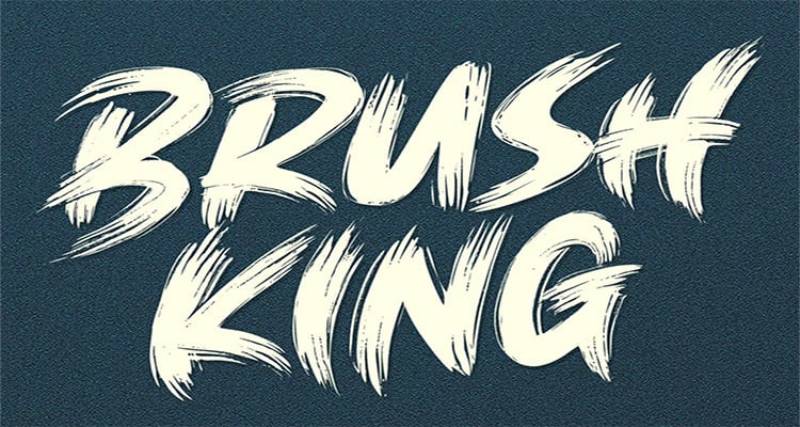
Alright, let’s talk about the fonts that add a personal touch to your flyers. Handwritten and brush style fonts are like that cool, artsy friend who always leaves a lasting impression. They’re perfect when you want your flyer to feel personal, approachable, and full of character.
Take Ocean Twelve for instance. It’s a Handwritten Font that’s just oozing with personality. It’s like each letter was carefully crafted with a personal touch. Then, there’s The Shocker – this Handwritten Brush Font is all about making bold statements. It’s like the graffiti on a city wall, but for your flyer.
Don’t forget about Billy Ohio. It’s a Free Brush Poster Font that gives off a laid-back, casual vibe. It’s like that doodle you made in the margin of your notebook, but way cooler. Rockman – a Creative Brush Font, is another top contender. It’s like the wild child of fonts, unafraid to stand out.
And, of course, Stay High – a Poster Font that’s as unique as its name suggests. It’s like those trendy, hand-lettered signs you see in coffee shops.
Elegant and Stylish Fonts
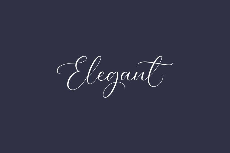
Now, let’s switch gears to the fonts that dress to impress. Elegant and stylish fonts are like the well-tailored suit of the typography world. They bring sophistication and a touch of class to your flyers.
Regan Script is a prime example. This Stylish Flyer Font is like a perfectly penned invitation. It’s elegant without being over the top. Then there’s Benfield – a Script Font that’s all about grace and finesse. It’s like the smooth jazz of fonts.
The Salvador – a Font Trio, offers versatility and style. It’s like having a wardrobe that’s ready for any occasion. Sevastian – a Sans Serif Font, brings modern elegance to the table. It’s clean, it’s sleek, it’s the kind of font that makes everything look more polished.
And let’s not overlook Dulce Chico – a Free Quirky Display Font. It’s the perfect blend of fun and fancy. It’s like wearing a playful bow tie with a sharp suit.
Bold and Impactful Fonts
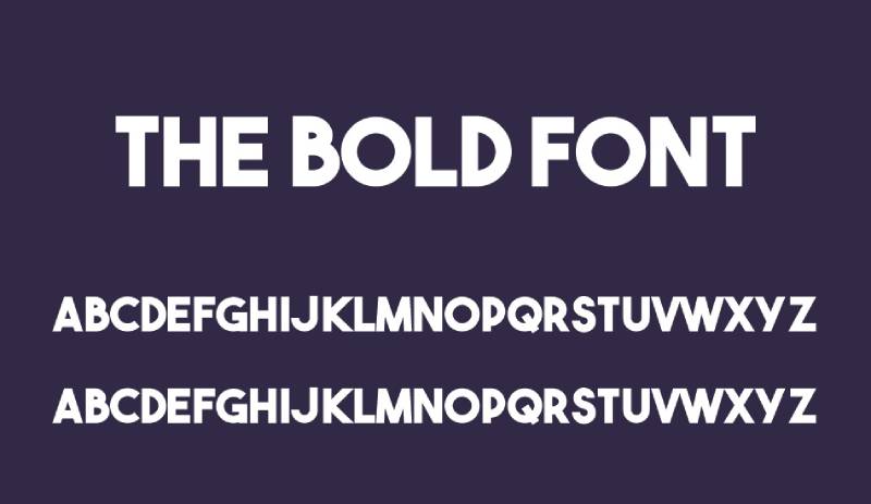
So, you want your flyer to really stand out, right? Bold and impactful fonts are your go-to. They’re like the voice in a crowd that turns heads – they make people stop and pay attention.
Think about Pulse – a Bold Racing Typeface. It’s not just a font; it’s a statement. It’s like putting your flyer on turbo-charge. Then, there’s Boldchild Kids Typeface, playful yet strong, perfect for when you need that extra punch.
Midnight – a Horror Typeface, is a different beast. It’s bold but with a twist of mystery, great for flyers that need a touch of intrigue. Bassline, a Modern Poster Font, blends contemporary style with boldness, like a sleek sports car in font form.
And can’t forget about Genuine – a Free Bold Title Font. It’s like getting the premium stuff without the price tag.
Playful and Fun Fonts
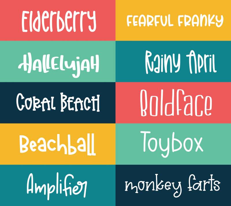
Let’s lighten the mood with some playful and fun fonts. These are for when your flyer needs to be more than just words on a page – it needs personality, it needs life!
Fresh Milky – a Playful Flyer Font, is like a splash of joy. It’s whimsical, it’s fun, it’s everything a lighthearted flyer needs. Lovile, a Handcrafted Typeface, feels like it was made with love and care, perfect for a more personal touch.
Hitchcut – a Quirky Display Font, brings uniqueness to the table. It’s like that one-of-a-kind find at a vintage store. Siggy – a Font Family, offers variety and playfulness, like a box of chocolates, you never know what you’re gonna get.
And then there’s Tuck Shop – a Handmade Chalk Font. It’s nostalgic, it’s cozy, it’s like a warm hug in font form.
Specific Font Recommendations
When you’re in the thick of designing a flyer, sometimes you just need someone to point out the best fonts for flyers, right? Let’s cut through the clutter and zero in on some specific recommendations. These aren’t just fonts; they’re the unsung heroes that can elevate your flyer from ‘meh’ to ‘wow’.
Serif Fonts
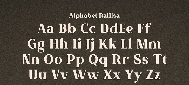
Imagine a font that’s like a classic, well-fitted suit. That’s what a serif font is in the flyer world. These fonts have those little feet at the end of each letter, giving them a traditional, trustworthy vibe.
Rallisa Display Font is a standout here. It’s like that one friend who’s always reliable but never boring. It has just enough flair to be interesting without going overboard.
And let’s talk about Benfield – Script Font. It’s not your everyday serif. It adds a twist, making your flyer feel both classic and fresh.
Sans-Serif Fonts
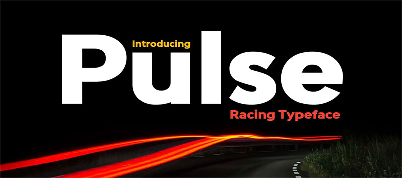
Now, picture a font that’s like your favorite, clean-lined, modern furniture. That’s sans-serif for you. No frills, no fuss, just straight-up clean and readable.
Pulse – Bold Racing Typeface comes to mind. It’s strong, it’s straightforward – it’s like the confident handshake of fonts. Then there’s Sunmor Advertisement Font. It’s sleek, it’s modern, and it just screams professionalism.
Display and Headline Fonts
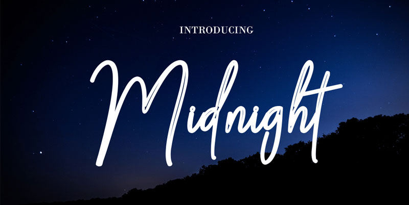
Ever seen a font and thought, “Wow, that’s bold”? That’s what display and headline fonts are all about. They’re the showstoppers, the ones that grab your attention and don’t let go.
Take Midnight – Horror Typeface. It’s not just a font; it’s an experience. It’s like that thrilling movie that keeps you on the edge of your seat. And Boldchild Kids Typeface? It’s playful, it’s fun, and it brings an energy that’s hard to ignore.
Font Selection for Target Audiences
Fonts for Children and Educational Flyers
When you’re whipping up a flyer for the kiddos or for educational stuff, you gotta think like them. Fun, engaging, and easy to read – that’s the golden trio here.
Boldchild Kids Typeface is a winner. It’s like the fun uncle of fonts – everyone loves it. It’s playful without being too goofy. And then, there’s Motteka – Playful Bouncy Font. It’s like a joyride for your eyes, perfect for keeping the young ones hooked.
Fonts for Professional and Business Flyers
Switching gears to the business side of things, you need fonts that mean business – crisp, professional, and to the point.
Mugio – Extended Font is your go-to here. It’s like that sharp business suit that never fails to impress. And for a touch of modern elegance, Exult Typeface – Modern Slab Serif is a solid choice. It’s like the sleek, minimalist office décor that everyone admires.
Creative and Thematic Font Choices
Fonts for Special Occasions and Themes
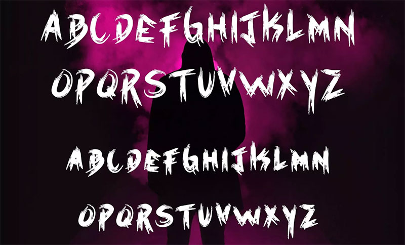
Got a special event or a specific theme? The right font can make all the difference. It’s like choosing the perfect outfit for a party.
Halloweins – Halloween Font is fantastic for spooky vibes. It’s like the haunted house of fonts – thrilling and full of character. And for something with more layers, Kingfisher Layered Font – Engraved Styles is a show-stopper. It’s like that multi-layered cake – complex and delightful.
Unique and Eye-Catching Fonts
Sometimes, you need a font that just jumps off the page. Something that makes people do a double-take.
Rougher – Brush Font is a great pick for this. It’s like that edgy street art that catches your eye. And for a font that spins heads, Dazed – Dizzy Typeface is your ally. It’s like a whirlwind of creativity in every letter.
Practical Tips for Font Pairing and Usage
Let’s get real about making those flyers not just good, but jaw-droppingly great. It’s all about nailing the font game. Sure, knowing the best fonts for flyers is one thing, but pairing them right? That’s where the magic happens.
Combining Fonts for Visual Impact
Think of font pairing like making a killer playlist – it’s all about the harmony. You want your fonts to vibe together, creating a visual rhythm that’s pleasing to the eye.
Using Font Duos Effectively: It’s like a dance duo, each font has to complement the other. Pair a bold font for your headline with a simpler, more readable font for your body text. It’s about balance, like peanut butter with jelly.
Balancing Bold and Subtle Fonts: You don’t want your fonts shouting over each other. If one is loud and proud, let the other be the calm, collected type. It’s like having a lead singer with a cool, understated backup band.
Readability and Legibility Considerations
Now, let’s talk clarity. You want your message to be read, right?
Choosing Fonts for Body Text: Your body text is where the details live. Choose a font that’s easy on the eyes for longer reads. Think clear, legible – the kind of font that doesn’t make your eyes work overtime.
Ensuring Visibility in Various Sizes: Flyers come in all shapes and sizes, and so do fonts. A font that’s a star in a large headline might lose its charm in the fine print. Test your fonts in all sizes to make sure they’re readable across the board.
FAQ On The Best Fonts For Flyers
What Makes a Font Great for Flyers?
Well, it’s all about grabbing attention and making the message clear. A great flyer font needs to be readable, sure, but it’s got to have personality too.
You want something that matches the vibe of your message – be it playful, professional, or anything in between. Think about the mood first, then pick a font that fits.
How Do I Choose Between Serif and Sans-Serif Fonts for Flyers?
Serif fonts, with their little feet, give off a classic, more formal vibe. They’re great for traditional or elegant flyers. Sans-serif fonts are your modern, clean choice, perfect for a sleek, contemporary look. Ask yourself, “What’s the vibe of my flyer?” Your answer will guide you.
Can I Use Script Fonts on Flyers?
Absolutely, but with a bit of caution. Script fonts add a personal, creative touch, great for invitations or special events. Just make sure they’re legible, especially at smaller sizes. Remember, if it’s hard to read, it’s hard to engage with.
What Are the Best Free Fonts for Flyers?
There are gems out there like Google Fonts, offering a wide range of styles. Roboto and Open Sans are versatile choices. For something more unique, try Lobster or Pacifico. Free doesn’t mean low quality – it’s all about how you use them.
How Many Different Fonts Should I Use in a Flyer?
Stick to two or three at most. One for your headline, another for your body text, and maybe a third for accents. More than that, and you risk making your flyer look cluttered. It’s like spices in cooking – too many can overwhelm the dish.
What Are the Best Fonts for a Professional Flyer?
For professional flyers, go for clean and readable. Helvetica, Arial, or Garamond are classics for a reason. They’re like the business suit of fonts – always appropriate and never out of style. They communicate clarity and professionalism.
How Important Is Font Size on a Flyer?
Super important! Your headline should jump out, so go big there. Body text should be easily readable, but not overpowering. It’s like a conversation – your headline shouts across the room to grab attention, and your body text is the chat that follows.
What Are the Best Fonts for a Party or Event Flyer?
For party flyers, you want something fun and energetic. Fonts like Bebas Neue or Poppins can add that playful vibe. Think of your font as the party’s dress code – it sets the tone for the event.
Can I Use Bold and Italic Fonts on Flyers?
Definitely! Bold fonts are great for headlines or to highlight key info. Italics can add emphasis or a subtle touch of style. Just use them sparingly – like a dash of hot sauce, a little goes a long way.
What’s the Best Way to Test How a Font Looks on a Flyer?
Mock it up! Put your text in the font on a sample flyer layout. Print it out, look at it on different screens. Show it to a friend or two. Getting a feel for how it reads in context is key – it’s like trying on clothes before buying.
Conclusion
Wrapping it up, when it comes to the best fonts for flyers, it’s all about striking that perfect balance. You’ve got your headline grabbing attention like a neon sign with bold choices like Pulse or Bebas Neue. Then, the body text comes in, smooth and clear like a calm conversation, with fonts like Arial or Open Sans.
Remember, the key is to make your flyer not just a piece of paper but a message that speaks. It’s like being a DJ at a party; you’re mixing different styles to create the right vibe. Whether it’s for a corporate event or a backyard bash, your font choice sets the tone.
So, the next time you’re drafting a flyer, think of it as a blank canvas. You’ve got this arsenal of amazing fonts at your fingertips. Go on, experiment with them. Mix and match. Play around until you find that perfect combo. After all, the best fonts for flyers are the ones that tell your story the loudest and clearest.
If you liked this article about the best fonts for flyers, you should check out this article about the best fonts for business cards.
There are also similar articles discussing the best fonts for banners, the best fonts for ebooks, the best fonts for small text, and the best fonts for branding.
And let’s not forget about articles on the best fonts for laser cutting, fonts for ads, the best fonts for TikTok, and the best fonts for labels.
- Luxury Fonts: What Font Does Dior Use? - 17 May 2024
- The Dos Equis Logo History, Colors, Font, And Meaning - 16 May 2024
- Purple Color Palettes Fit for Royalty - 16 May 2024


