The Replit logo is the visual identity for Replit Inc., a browser-based coding platform founded in 2016 that has grown into an AI-powered software creation tool.
The current mark, a three-dot symbol inspired by the command-line prompt, is paired with a monospace-style wordmark and a signature orange that sets it apart from the sea of blue and green in the developer tools space.
Replit has gone through three distinct logo phases since launch, each one tied to a meaningful shift in what the company was building and who it was building for.
In the broader history of tech company logos, Replit’s mark is unusual. Most developer tool brands default to abstract geometry or safe, corporate wordmarks. Replit went the opposite direction with an icon that came directly from its own product interface, which is a smarter move than it might seem on the surface.
What is the Replit Logo?
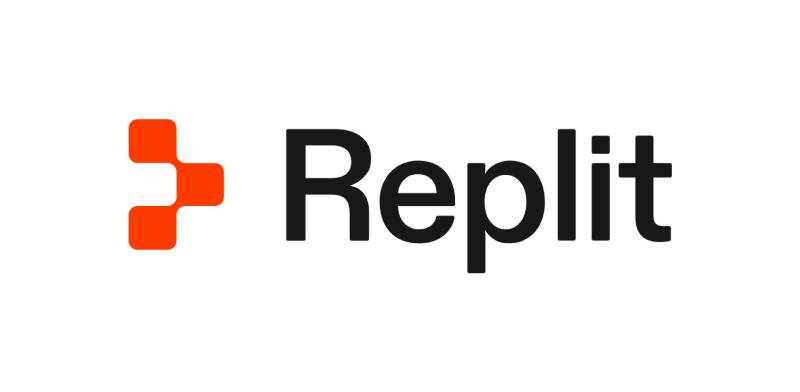
The Replit logo is a combination mark consisting of a three-dot icon (called “the prompt”) and a grotesque wordmark. The current version was introduced in October 2022, designed by Mackey Saturday in collaboration with Replit’s internal design team, and expanded with a full brand refresh in August 2024. It uses Replit Orange as its primary brand color.
- Design Type: Combination mark (icon + wordmark)
- Primary Elements: Three-dot prompt symbol, grotesque typography wordmark
- Official Introduction Date: October 2022 (prompt mark and combination mark); August 22, 2024 (full brand refresh)
- Designer/Agency: Mackey Saturday and Replit internal design team (2022 logo); Haya Odeh, co-founder and VP of Design, led the 2024 rebrand
- Trademark Status: Replit Inc. holds trademark rights; logo use governed by official brand guidelines
- Color Palette: Replit Orange (#F26207), deep black (#0B1419)
- Usage Context: Product UI, marketing materials, social media, merchandise, digital platforms, press kits
Background and Design History
Replit was founded in 2016 by Amjad Masad, Faris Masad, and Haya Odeh. Odeh designed the first version of the Replit logo and UI at the company’s founding, and has served as co-founder and VP of Design throughout the company’s evolution (Reach Capital, 2026; Wikipedia).
The 2022 logo introduction replaced an earlier mark. According to Replit’s own blog post announcing the change, the team explored many visual directions, including keyboard keys, the “run” button, pixels, and the cloud, before settling on the prompt symbol. The rationale: “The prompt already has equity, people already know it and are using it… The prompt gives you an empty canvas, full of possibility, for you to start creating. We want Replit to be the same for your programming journey” (Replit, 2022).
The 2024 brand refresh, authored by Haya Odeh, was driven by the scale of AI’s impact on Replit’s product and positioning. The blog post describes working from “two parallel histories: The history of Replit and the progress we’ve made helping software creators go from idea to software, and the history of computer science” (Replit, August 22, 2024). The refresh updated the broader visual system while retaining the prompt mark introduced in 2022.
How Has the Replit Logo Evolved Over Time?
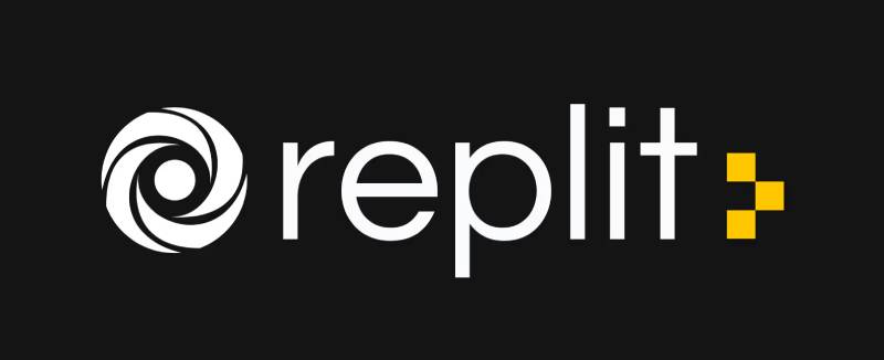
Replit has used three logo iterations since 2016. The original swirl mark lasted roughly six years before giving way to the prompt-based icon in 2022. A deeper brand overhaul followed in 2024, tightening the typography and visual system without changing the core mark.
Original Replit Logo (2016-2022)
- Years Active: 2016-2022
- Design Description: An abstract looping swirl symbol, sometimes described by users as a hurricane or ripple, paired with the “Replit” wordmark
- Color Scheme: Blue-toned palette
- Designer: Created internally; precise designer credit not publicly documented
- Context: Launched with the platform when Replit was primarily a browser-based IDE targeting students and hobbyists
- Key Changes from Previous: N/A (first logo)
- Cultural Significance: Represented the early, education-focused era of Replit before the platform expanded into professional development and AI tooling
Prompt Mark Logo (2022-2024)
- Years Active: October 2022-August 2024
- Design Description: Three dots arranged to represent a command-line prompt, a symbol already in use within the Replit interface itself. Paired with a cleaner, monospace-influenced wordmark.
- Color Scheme: Replit Orange on dark backgrounds; black and white variants for other contexts
- Designer: Mackey Saturday with Replit’s internal design team (Haya Odeh, Tyler, Omar, Moudy, Joe, Tiga)
- Context: The old swirl had become visually inconsistent, difficult to reproduce, and similar to other logos in the market. The team needed something iconic and scalable.
- Key Changes from Previous: Replaced complex, imperfect swirl with a three-shape geometric mark; introduced orange as primary brand color; shifted to monospace-style wordmark
- Cultural Significance: Users adopted the three-dot prompt as a personal symbol on social platforms before it became the official logo, which is pretty rare in brand history
Rebranded Logo (2024-Present)
- Years Active: August 2024-present
- Design Description: The prompt mark is retained but recontextualized within a more sophisticated visual system. The speech-bubble-like shapes “connect in uninterrupted dialogue” per the official brand guide. Diatype replaces the earlier monospace wordmark.
- Color Scheme: Replit Orange (#F26207) as anchor, deep black (#0B1419), with a broader supporting palette derived from the core orange
- Designer: Haya Odeh (co-founder and designer) led the 2024 rebrand
- Context: The AI pivot required a brand update. Replit had become something genuinely different from a code editor, and the visual identity needed to reflect that.
- Key Changes from Previous: Switched to Diatype typeface by Dinamo; expanded the visual system with pixel-based illustrations and a hand-drawn pixelated font; deeper connection between brand story and software history
- Cultural Significance: Positioned Replit as a serious platform at the intersection of AI and software creation, not just a student coding tool
What Do the Design Elements of the Replit Logo Mean?
Every element in the current Replit logo connects back to either the product itself or the broader history of computing. The three-dot mark is not arbitrary geometry; it is literally the prompt symbol from Replit’s own console interface, which is where users type commands to start creating.
The orange was chosen as a deliberate break from the blues and greens dominating developer tool branding. It references early plasma displays on PLATO, one of the first networked computing systems, connecting the brand to hacking culture origins.
The wordmark uses Diatype, described by Dinamo as “a warm yet sharp grotesque,” which works harder than a standard monospace would. It avoids the cliche of a pure monospace font while still reading as technical.
Why Did Replit Choose These Specific Colors?
Replit Orange
- Hex: #F26207
- RGB: (242, 98, 7)
- Pantone (approximate, unverified): Close to Bright Orange C, though no official Pantone match has been published by Replit
- Symbolic meaning: Energy, creativity, accessibility. Most importantly, a deliberate reference to the early plasma displays of the PLATO computing system, the birthplace of hacking culture.
- Source: Replit’s own 2022 logo blog post states directly: “We drew inspiration from stories of the advent of hacking culture: the PLATO system and its early plasma displays. Computing has had enough blues and greens!” (Replit, 2022)
- Historical context: PLATO (Programmed Logic for Automatic Teaching Operations) was an educational computing system developed at the University of Illinois beginning in the 1960s. Its terminals used neon-discharge plasma display panels that produced a distinctive orange-on-black glow. The plasma display was co-invented in 1964 by Donald Bitzer, H. Gene Slottow, and Robert Willson. By the 1970s, the Magnavox PLATO IV terminal’s orange plasma display was iconic in early computing culture. The book “The Friendly Orange Glow” by Brian Dear documents the PLATO system’s lasting influence on cyberculture.
- Psychological impact: Orange is energetic without being aggressive. It reads as approachable, which fits a platform trying to make coding accessible to non-programmers.
- Brand connection: The color stands out in a market dominated by blue (blue logos are everywhere in tech). It also references a specific, real moment in computing history rather than being decorative.
Deep Black
- Hex: #0B1419
- Symbolic meaning: Terminal screens, command-line interfaces, developer culture authenticity
- Psychological impact: Grounds the orange and gives the mark weight without being flat or cold
- Brand connection: Connects to the dark-mode IDEs most developers actually use day-to-day. Also reinforces the PLATO reference: the plasma displays showed orange characters on a black background, so the black-and-orange pairing is historically grounded, not arbitrary.
What Typography Style Is Used in the Replit Logo?
The current wordmark uses Diatype, a grotesque typeface designed by Dinamo Typefaces. It is warm but precise, which is an unusual combination for a developer tool brand.
Earlier versions used a monospace-style wordmark to reinforce the coding connection. The 2024 rebrand moved away from that because monospace fonts tell an overly narrow story about software development, per Replit’s own documentation.
Diatype semi-mono is reserved for footnotes and labels in the broader brand system. The typography in the logo itself stays with the full grotesque version, optimized for screen readability.
What Are the Hidden Meanings in the Replit Logo?
The three-dot mark started as a functional UI element inside the Replit console before becoming the logo. That backstory is not hidden exactly, but most people seeing the icon for the first time would not know it.
The speech-bubble interpretation (noted in the official 2024 brand guide) frames the shapes as a conversation between user and AI, which is a layer of meaning added during the rebrand. The pixel-forward visual system in the broader brand also positions the dot as an atomic unit of digital creation, not just a prompt symbol.
Replit’s design team has been open about all of this, which is less common than you might think. Most brand redesigns stay vague about intent. Replit published detailed essays explaining every decision.
How Does the Replit Logo Compare to Competitor Logos?
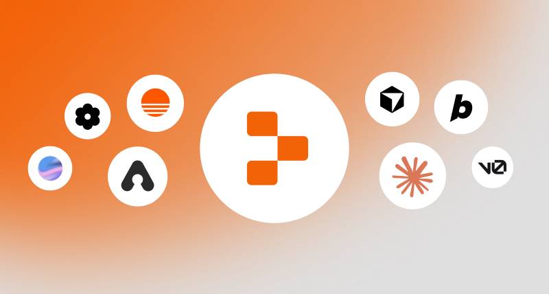
Most browser-based IDE and developer tool brands default to abstract geometry or wordmarks in safe blue tones. Replit’s three-dot orange mark reads immediately as different, which is both a risk and a strength in a crowded market.
The GitLab logo uses a fox mascot in a warm orange-red, which is the closest color comparison in the space. But GitLab’s mark is illustrative and complex. Replit’s is minimal and three shapes.
The Figma logo is another useful comparison. Figma uses a four-segment geometric mark that signals modularity and combination. Replit’s prompt dots signal a starting point and an action, which is different positioning entirely.
Cursor and Bolt are newer AI coding tools. Cursor’s logo is a simple cursor-arrow mark in blue-gray. Bolt uses a lightning bolt icon. Both are functional but fairly generic.
Replit sits apart because the icon has a story behind it and that story connects directly to how the product works.
What Are the Technical Specifications of the Replit Logo?
Official Color Codes
Primary Color: Replit Orange
- Hex: #F26207
- RGB: (242, 98, 7)
- CMYK: (0, 60, 97, 5) (approximate)
- Pantone: Bright Orange C (approximate)
Secondary Color: Deep Black
- Hex: #0B1419
- RGB: (11, 20, 25)
- CMYK: (56, 20, 0, 90) (approximate)
Dimensions and Proportions
- Aspect ratio: The lockup follows standard horizontal proportions with the icon to the left of the wordmark
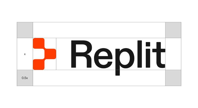
- Minimum size: The three-dot icon scales down well given its simple construction; Replit’s brand guidelines specify a “safe zone” of clear space surrounding the lockup
- Clear space: Required on all sides of the lockup to maintain breathing room from surrounding graphics
- Official usage guidelines: Do not alter the logo colors, do not distort proportions, do not place on conflicting backgrounds. Logo files are available via the official Replit brand kit at replit.com/brandkit.
- Available formats: SVG and bitmap formats (PNG) available in the official press kit
What Cultural Impact Has the Replit Logo Had?
One of the more interesting things about the Replit logo is that the community adopted the three-dot symbol before it became official. Users were putting the Unicode character U+2815 (Braille Pattern Dots-135) in their Twitter usernames to reference the Replit prompt long before the 2022 rebrand.
That kind of organic adoption is rare. It usually means the symbol had real meaning to people, not just visual appeal.
The 2024 rebrand generated substantial discussion in the design and developer communities specifically because Replit published detailed essays explaining the concept. That level of transparency is uncommon and gave the rebrand more cultural traction than a typical logo swap would.
The orange mark has become immediately recognizable in developer spaces on social media, conference materials, and educational content. For a platform competing against tools backed by Microsoft and Google, that recognition matters.
How Does the Replit Logo Fit Into the Overall Brand Identity?
The logo sits at the center of a visual system built around pixels, characters, and the history of software development. Every element connects: the dot symbol, the Diatype typeface, the pixel-based illustration style, the orange color referencing early computing displays.
The brand guidelines explicitly position the logo as “a shift from code to natural conversation,” tying it to Replit’s AI-first product direction. The speech-bubble interpretation of the three dots reinforces that narrative.
The brand identity also draws from color psychology, using orange as an energetic, approachable anchor that separates Replit from the colder blues of most enterprise developer tools.
The hand-drawn pixelated font used in broader brand materials connects back to the logo’s pixel-unit concept. There is a human behind the machine, which is something Replit’s team kept repeating throughout the rebrand documentation. That idea runs through everything, including the mark itself.
Related entities in the brand network include: Replit Agent (the AI product), Ghostwriter (the earlier AI coding assistant), Diatype typeface (brand typography), and the PLATO computing system (color inspiration source).
How Should the Replit Logo Be Used?
Official Do’s
- Use logo files downloaded directly from replit.com/brandkit
- Maintain the required safe zone (clear space) around the lockup on all sides
- Use on backgrounds that provide sufficient contrast for legibility
- Use the approved color versions: full-color, all-black, or all-white depending on context
Official Don’ts
- Do not alter the logo colors outside of approved variants
- Do not distort, rotate, or modify the proportions
- Do not place the logo on conflicting or low-contrast backgrounds
- Do not use outdated logo versions (the pre-2022 swirl mark in particular)
- Do not recreate the logo from scratch; always use official files
Where to Access Official Logos
Official logo files, including SVG and PNG versions, are available at replit.com/brandkit. The brand guide with full usage guidelines is at replit.com/brand.
Licensing and Trademark
The Replit logo is proprietary to Replit Inc. Use in editorial, educational, or press contexts is generally permitted with proper attribution. Commercial use or any use that implies an official partnership requires direct permission from Replit. When in doubt, the Replit brand team contact is available through their official site.
FAQ on The Replit Logo
What does the Replit logo represent?
The three-dot mark is called “the prompt,” taken directly from Replit’s own console interface.
It represents a starting point for creation. The logo signals where users begin building, which ties the visual identity directly to the product experience.
When did Replit change its logo?
The original swirl mark was replaced in October 2022 with the current prompt-based icon.
A deeper Replit brand identity overhaul followed in August 2024, updating the typography and visual system without replacing the core three-dot mark.
Who designed the Replit logo?
The 2022 prompt mark was designed by Mackey Saturday working alongside Replit’s internal team.
Co-founder Haya Odeh led the 2024 rebrand. Both projects involved close collaboration between external designers and the people who actually built the product.
What font does the Replit logo use?
The current wordmark uses Diatype, a grotesque typeface by Dinamo Typefaces.
It replaced an earlier monospace-style wordmark. Diatype reads as warm but precise, which fits a platform trying to appeal to both developers and non-technical users.
What are the official Replit logo colors?
The primary color is Replit Orange, hex #F26207, with RGB values of (242, 98, 7).
The secondary color is a deep black at #0B1419. Both appear in the official Replit brand color download available at replit.com/brandkit. No official color palette Pantone code has been confirmed publicly.
Why did Replit choose orange for its logo?
Orange was a deliberate break from the blues and greens that dominate developer tool branding.
The Replit logo color draws from the early plasma displays of the PLATO computing system, one of the first networked computers. It is a historical reference, not just an aesthetic choice. The hue also reads as approachable rather than corporate.
Where can I download the Replit logo PNG or SVG?
Official Replit logo files, including vector graphics in SVG format and high-resolution PNG, are available at replit.com/brandkit.
Do not use third-party sources for logo downloads. The brand guide at replit.com/brand covers correct usage, clear space rules, and which color versions are approved.
How has the Replit logo changed over time?
Three versions exist: the original swirl mark (2016-2022), the prompt icon (2022-2024), and the current rebranded system (2024-present).
Each Replit logo update matched a shift in the platform itself, from student IDE to professional tool to AI-powered software creation. The core orange-and-black visual mark has stayed consistent since 2022.
How does the Replit logo compare to other coding platform logos?
Most competitors default to abstract marks or wordmarks in blue. The emphasis on orange and a product-native symbol makes Replit stand out immediately.
The Cursor logo uses a simple arrow in blue-gray. The Bolt logo is a lightning bolt. Neither has the backstory or community adoption that the Replit prompt mark has built.
Can I use the Replit logo on my website or project?
Editorial, educational, and press use is generally fine with proper attribution.
Commercial use or anything implying an official partnership requires direct permission from Replit Inc. Always use files from the official brand kit and follow the brand style guide clear space and color rules. Do not modify the logo.
Conclusion
The Replit logo has done something most brand redesigns fail at: it got more honest with each version, not just more polished.
The three-dot prompt mark connects the Replit visual identity directly to how the product works, which is rare in the developer tools space.
From the original swirl to the current Diatype wordmark and Replit Orange system, every logo update tracked a real shift in the platform.
The logo color code #F26207, the prompt symbol, the pixel-forward brand assets – none of it is arbitrary.
If you are downloading logo files or referencing the mark, always go to replit.com/brandkit for the official high-resolution SVG and PNG versions.

Renowned for his expertise in logo design and visual branding, Bogdan has developed a multitude of logos for various clients.
His skills extend to creating posters, vector illustrations, business cards, and brochures. Additionally, Bogdan's UI kits were featured on marketplaces like Visual Hierarchy and UI8.
He also wrote in the past years on sites like Design Your Way, WebDesignerDepot, WPDean, Designmodo, Speckyboy, Slider Revolution, and more.
- Refined Baskerville Font Pairing for Editorial Design - 18 October 2026
- How to Design an Album Cover That Still Works as a Tiny Thumbnail - 18 October 2026
- Why Final Rendering Becomes a Bottleneck in 3D Design Projects - 17 October 2026

Bogdan Sandu is a seasoned designer who has been designing websites since 2008. Renowned for his expertise in logo design and visual branding, Bogdan has developed a multitude of logos for various clients. His skills extend to creating posters, vector illustrations, business cards, and brochures. Additionally, Bogdan's UI kits were featured on marketplaces like Visual Hierarchy and UI8. He also wrote in the past years on sites like Design Your Way, WebDesignerDepot, WPDean, Designmodo, Speckyboy, Slider Revolution, and more.
You Might Also Like