The DataRobot logo represents one of the most recognizable visual identities in the enterprise AI industry. Founded in Boston in 2012, DataRobot has built its brand around democratizing access to machine learning and predictive analytics.
The company was started by Jeremy Achin and Tom de Godoy, two data scientists who met at the University of Massachusetts. Their vision was simple: make AI accessible to businesses without requiring armies of specialists.
The DataRobot logo has gone through multiple iterations since launch. Each version reflects the company’s growth from scrappy startup to a $6.3 billion unicorn serving Fortune 500 clients worldwide.
Understanding what makes a logo work requires looking at several factors. Color choices, shape language, and typography all contribute to brand perception. The DataRobot visual identity checks many boxes that tech company logos typically aim for.
What is the DataRobot Logo?
The DataRobot logo is a combination mark featuring an abstract geometric symbol alongside the company wordmark. Introduced in its current iteration in 2025, the design uses building block shapes that represent simplifying AI complexity into actionable business insights. The visual identity communicates innovation, technical precision, and approachability for enterprise clients.
Design Attributes
- Design Type: Combination mark (symbol plus wordmark)
- Primary Elements: Geometric building block icon, custom sans-serif wordmark
- Official Introduction Date: Original logo launched 2012, major rebrand in March 2025
- Designer/Agency: Internal brand team with external agency collaboration
- Trademark Status: Registered trademark in the United States and internationally
- Color Palette: Primary Blue (#2d8fe2), Pure Orange (#ff5600), supporting grays and secondary tones
- Usage Context: Enterprise software platform, marketing materials, partner integrations, digital products, corporate communications
How Has the DataRobot Logo Evolved Over Time?
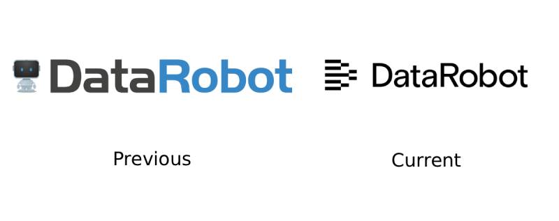
DataRobot has updated its visual identity multiple times since 2012. The brand started with a clean, tech-forward look that has matured alongside the company’s market position.
Each redesign reflected strategic shifts. Early versions prioritized simplicity and approachability. Later versions added more sophistication as DataRobot moved upmarket.
Original DataRobot Logo (2012-2018)
- Years Active: 2012-2018
- Design Description: Simple wordmark with robot icon element, clean lines
- Color Scheme: Predominantly blue with white backgrounds
- Designer: Founding team, identity refined over early years
- Context: Startup phase, establishing credibility in emerging AutoML market
- Key Changes from Previous: First iteration, no predecessor
- Cultural Significance: Represented the democratization of data science tools
Updated DataRobot Logo (2018-2024)
- Years Active: 2018-2024
- Design Description: Refined robot icon, updated wordmark with sharper edges
- Color Scheme: Transitioned to black and bold orange accents alongside blue
- Designer: Updated with agency support including Receptor Design
- Context: Rapid growth phase, Series D through G funding rounds
- Key Changes from Previous: More aggressive color palette, robot icon became more central
- Cultural Significance: Signaled maturity and enterprise readiness
Current DataRobot Logo (2025-Present)
- Years Active: 2025-Present
- Design Description: Building block geometric symbol, fresh typography system
- Color Scheme: Bright new palette emphasizing clarity and energy
- Designer: Internal brand team
- Context: New leadership, focus on business outcomes over technical features
- Key Changes from Previous: Completely new symbol language, updated typography approach
- Cultural Significance: Represents AI integration into business processes, not just technical implementation
What Do the Design Elements of the DataRobot Logo Mean?
The current DataRobot logo uses building blocks as its core visual metaphor. These shapes communicate several ideas at once: simplifying complexity, connecting systems, and assembling solutions.
According to the company, the blocks represent teams, processes, and technology coming together. That’s a lot of meaning packed into a simple geometric form.
Why Did DataRobot Choose These Specific Colors?
The psychology behind color choices in branding matters more than most people realize.
DataRobot’s palette has evolved, but certain colors remain consistent.
- Bright Blue (#2d8fe2): Trust, reliability, technical competence. Blue dominates tech branding for good reason. It signals stability without feeling cold.
- Pure Orange (#ff5600): Energy, innovation, action. Orange adds warmth and suggests forward momentum. It stands out against the sea of blue in enterprise software.
- Black: Sophistication, authority, premium positioning. The shift toward black in recent years signals enterprise seriousness.
- White: Clarity, simplicity, breathing room. White space lets other elements pop.
The use of blue connects DataRobot to a broader tradition in tech branding. Meanwhile, orange accents help the brand stand apart from competitors.
What Typography Style Is Used in the DataRobot Logo?
DataRobot uses a custom sans-serif font in its wordmark. The letterforms balance technical precision with approachability.
Clean lines and consistent stroke weights create a modern feel. The x-height is optimized for digital readability.
Recent updates introduced what the company calls a new typography system. This balances technical innovation with warmth, moving away from the cold, clinical look common in enterprise software.
What Are the Hidden Meanings in the DataRobot Logo?
The building block motif does more than look nice. The interlocking shapes suggest modularity and flexibility.
You could read the blocks as data points connecting. Or as AI components assembling into larger solutions.
The geometry also implies precision. These aren’t organic shapes. They’re calculated, intentional, engineered. That aligns with what DataRobot sells: systematic approaches to machine learning.
How Does the DataRobot Logo Compare to Competitor Logos?

Enterprise AI has become crowded. Companies like Databricks, H2O.ai, and Dataiku all compete for similar clients. Their visual identities reflect different positioning strategies.
DataRobot’s building block approach differs from competitors who lean toward more abstract or technical imagery. Some rivals use neural network visualizations. Others go minimal with simple wordmarks.
The Anthropic logo takes a different approach to AI branding with a simpler, more restrained aesthetic. Meanwhile, Scale AI’s visual identity emphasizes data infrastructure.
DataRobot sits somewhere in the middle. Technical enough to feel credible, but approachable enough for business users who aren’t data scientists.
What Are the Technical Specifications of the DataRobot Logo?
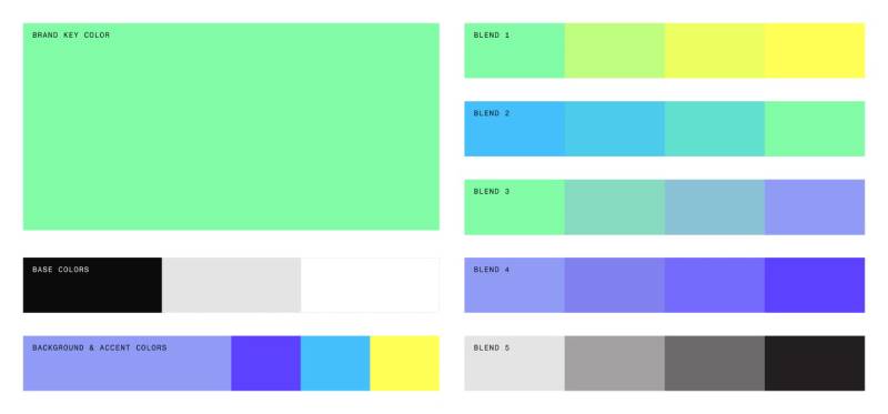
Official Color Codes
- Primary Blue: Hex: #2d8fe2, RGB: (45, 143, 226)
- Pure Orange: Hex: #ff5600, RGB: (255, 86, 0)
- Soft Blue: Hex: #559ee6, RGB: (85, 158, 230)
- Vivid Orange: Hex: #ff712f, RGB: (255, 113, 47)
- Grayish Blue: Hex: #53718f, RGB: (83, 113, 143)
For print applications, CMYK conversions are specified in official brand guidelines.
Dimensions and Proportions
- Aspect Ratio: Varies by lockup (horizontal, stacked, icon-only)
- Minimum Size: Specified to maintain legibility across applications
- Clear Space: Defined margins around the logo to prevent crowding
- File Formats: Available in vector formats (SVG, AI, EPS) and raster (PNG, JPG)
What Cultural Impact Has the DataRobot Logo Had?
DataRobot helped define what enterprise AI branding looks like. When the company launched in 2012, machine learning was still niche. Now it’s everywhere.
The robot iconography that DataRobot used for years became somewhat iconic in the AutoML space. Other companies followed with their own robot-adjacent imagery.
The 2025 rebrand signals a shift. As AI becomes mainstream, the visual language is maturing. Building blocks feel more business-oriented than robot mascots.
How Does the DataRobot Logo Fit Into the Overall Brand Identity?
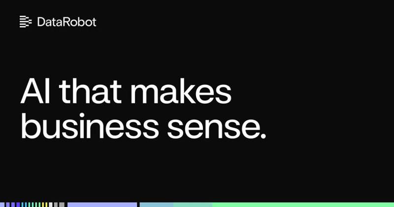
The logo anchors a broader visual system. Colors, typeface choices, imagery styles, and graphic elements all connect back to the core mark.
DataRobot’s brand style documentation specifies how these elements work together.
Marketing materials, product interfaces, partner collateral, and event presence all draw from the same visual language. Consistency builds recognition over time.
The building block motif extends beyond the logo into presentations, website design, and product UI. That repetition reinforces brand memory.
How Should the DataRobot Logo Be Used?
Official Usage Guidelines
- Do: Use approved logo files from official sources
- Do: Maintain clear space requirements
- Do: Use appropriate color versions for different backgrounds
- Don’t: Stretch, rotate, or distort the logo
- Don’t: Change the colors outside approved variations
- Don’t: Add effects like drop shadows or gradients
Where to Access Official Logos
DataRobot provides logo files through their press kit and partner portals. Media contacts can request assets directly from the communications team.
Licensing and Trademark Protection
The DataRobot name and logo are registered trademarks. Use by third parties requires written permission or falls under specific partner agreements.
Unauthorized use can result in legal action. If you’re a partner or vendor, work with your DataRobot contact to get approved assets and usage guidelines.
FAQ on The DataRobot Logo
Where Can I Download the Official DataRobot Logo?
You can get DataRobot brand assets through their official press kit and media resources page.
Partner portals also provide access to approved logo files. The DataRobot logo download options include PNG, SVG, and vector formats for different use cases.
Contact their communications team directly for high resolution versions.
What Are the Official DataRobot Logo Colors?
The DataRobot color palette centers on Bright Blue (#2d8fe2) and Pure Orange (#ff5600).
Earlier branding used predominantly blue with white backgrounds. The company later added black and orange for a bolder look.
Supporting tones include various blue and gray shades for building a complete palette.
Who Designed the DataRobot Logo?
The original DataRobot visual identity was created internally when Jeremy Achin and Tom de Godoy founded the company in 2012.
External agencies like Receptor Design contributed to later refinements. The 2025 rebrand came from their internal brand team.
What Does the DataRobot Logo Symbolize?
The current DataRobot symbol uses building blocks to represent simplifying AI complexity into actionable insights.
These geometric shapes communicate teams, processes, and technology coming together. The design reflects how the enterprise AI platform helps businesses integrate machine learning into operations.
What File Formats Are Available for the DataRobot Logo?
DataRobot provides logos in multiple formats. SVG and AI files work best for scalable applications.
PNG files with transparent backgrounds handle most web design needs. EPS formats suit print design projects.
Always use vector versions when possible for maximum clarity at any size.
Can I Use the DataRobot Logo for My Project?
The DataRobot trademark is protected. Unauthorized use is not permitted without written approval.
Partners and vendors receive usage rights through formal agreements. Media outlets can request assets for editorial coverage through standard channels.
When Did DataRobot Update Its Logo?
DataRobot launched its original logo in 2012 alongside the company founding in Boston.
The brand evolved around 2018 with updated colors and a refined robot icon. March 2025 brought a complete rebrand with the building block motif replacing earlier imagery.
What Font Does the DataRobot Logo Use?
The DataRobot wordmark uses a custom sans-serif font designed for their brand.
The letterforms balance technical precision with approachability. Clean lines and consistent stroke weights create readability across digital and print applications.
Is There a Transparent DataRobot Logo Available?
Yes. The DataRobot transparent logo comes in PNG format with no background.
This version works on colored backgrounds, images, and varied layouts. Dark mode and light mode variations exist for different contexts. Check DPI requirements before selecting file sizes.
How Has the DataRobot Logo Changed Over the Years?
The DataRobot logo history spans three major phases. The 2012 original featured a simple wordmark with robot iconography.
Around 2018, black and orange entered the palette. The robot icon became more prominent.
The 2025 version introduced building blocks as the core symbol, signaling a shift toward minimalist design principles and business-focused messaging.
Conclusion
The DataRobot logo tells the story of a company that grew from a 2012 Boston startup into an enterprise AI leader valued at $6.3 billion.
Each iteration of the DataRobot brand identity reflects strategic shifts. Blue for trust. Orange for energy. Building blocks for integration.
Whether you need the DataRobot PNG for a presentation or the vector version for print, official assets are available through their media resources.
The visual identity works because it follows solid logo design principles. Simple. Memorable. Scalable.
That’s what makes the DataRobot icon recognizable across the machine learning platform landscape.

Renowned for his expertise in logo design and visual branding, Bogdan has developed a multitude of logos for various clients.
His skills extend to creating posters, vector illustrations, business cards, and brochures. Additionally, Bogdan's UI kits were featured on marketplaces like Visual Hierarchy and UI8.
He also wrote in the past years on sites like Design Your Way, WebDesignerDepot, WPDean, Designmodo, Speckyboy, Slider Revolution, and more.
- The Windsurf Logo History, Colors, Font, And Meaning - 10 October 2026
- How to Remove Background From Product Photos (No Photoshop) - 10 October 2026
- How Designers can Build a Stronger Online Creative Identity - 9 October 2026

Bogdan Sandu is a seasoned designer who has been designing websites since 2008. Renowned for his expertise in logo design and visual branding, Bogdan has developed a multitude of logos for various clients. His skills extend to creating posters, vector illustrations, business cards, and brochures. Additionally, Bogdan's UI kits were featured on marketplaces like Visual Hierarchy and UI8. He also wrote in the past years on sites like Design Your Way, WebDesignerDepot, WPDean, Designmodo, Speckyboy, Slider Revolution, and more.
You Might Also Like