Not all wide-looking text comes from a wide font. That distinction matters more than most people think.
An extended font is a typeface with characters that are intentionally wider than the standard width, built that way by the type designer, not stretched after the fact.
Font width classification sits inside a broader system of glyph proportions, OpenType axes, and CSS properties that most designers only partially understand.
This article covers what extended fonts actually are, how they fit into the typographic width scale, where they work, and where they consistently fail.
What Is an Extended Font
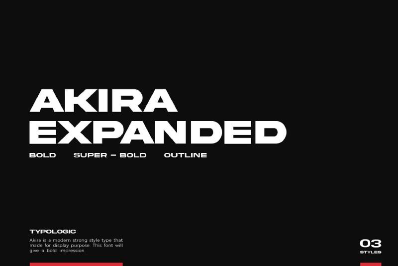
An extended font is a typeface variant where each character is wider than the standard design. The horizontal proportions of every glyph are expanded, resulting in letterforms that take up more horizontal space.
This isn’t the same as stretching a regular font in Photoshop or CSS. A true extended font has those wider proportions built into the design itself, with stroke weights and spacing adjusted to match.
“Extended,” “expanded,” and “wide” are often used interchangeably across different type foundries. The meaning is the same. The naming just varies depending on who made the font.
Monotype’s 2024 Font Use Survey found that 83% of designers acknowledge typography as critical to brand communication. Width variants like extended fonts play a direct role in that, especially for display and headline work.
How Font Width Classification Works
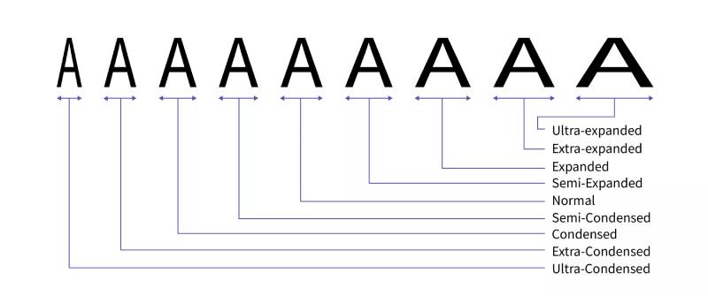
Typography uses a structured width scale. Extended sits toward the wider end, not at the extreme. Here’s how the full range maps out:
| Width Class | CSS Keyword | % Value |
| Ultra Condensed | ultra-condensed |
50% |
| Condensed | condensed |
75% |
| Normal | normal |
100% |
| Expanded | expanded |
125% |
| Ultra Expanded | ultra-expanded |
200% |
The font-stretch CSS property maps directly to these categories. CSS Fonts Level 4 also accepts percentage values, giving more precise control over glyph width when working with variable fonts.
For OpenType and variable fonts, the wdth axis handles width variation. Any value above 100% pushes the design into expanded territory. Values below map to condensed.
Extended vs. Condensed vs. Regular
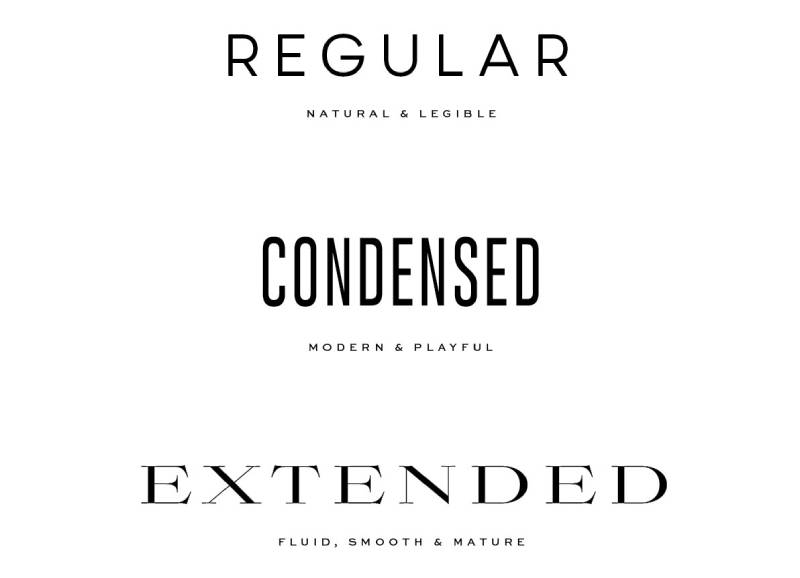
The difference comes down to how each glyph fills horizontal space. A condensed font fits more characters per line. A regular font is the baseline. An extended font spreads out, giving each character room to breathe.
This isn’t just about spacing. The actual letterform shapes change. Bowls get wider. Crossbars stretch. Capital letters in particular look noticeably different across width classes.
Key difference: these are separate font files (or variable font axis positions), not the result of scaling. Scaling distorts stroke proportions. A properly designed extended font preserves them.
What Extended Fonts Look Like
Wider glyph bodies are the obvious tell. But the details matter more than the overall silhouette.
A few characteristics that identify an extended typeface at a glance:
- Horizontal stroke width feels lighter relative to the overall glyph size
- Capital letters look notably broad, especially B, E, F, H
- The counter spaces (open areas inside letters like O and D) are wider
- Text set in extended reads slower per line, with fewer characters fitting
Trade Gothic Extended is a textbook example. Set it next to Trade Gothic Regular and the width difference is immediately obvious, but the stroke weights and proportions stay consistent. That consistency is what separates a designed extended variant from a scaled version.
Where Extended Fonts Are Used
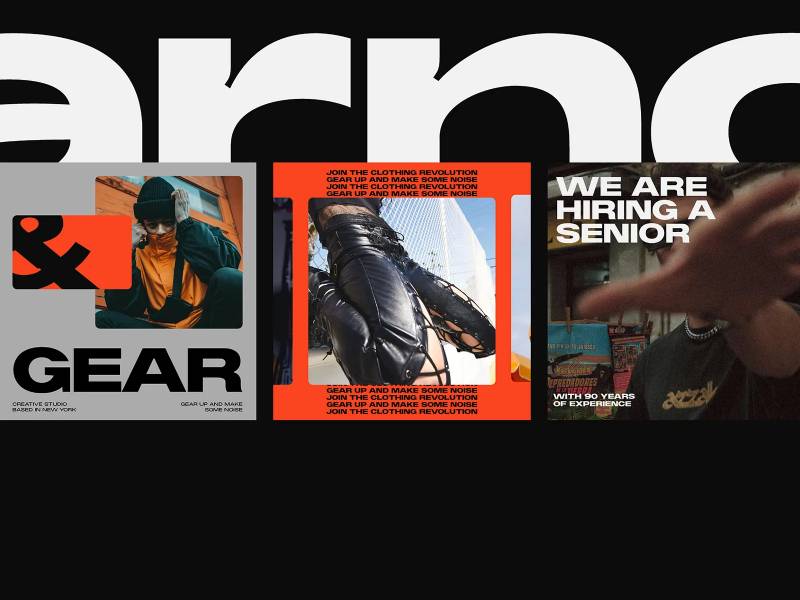
Extended fonts show up wherever horizontal space is available and a wide, commanding presence is needed.
Headline and display typography is the primary use case. Posters, banners, magazine covers, outdoor advertising. Anywhere the text is large, short, and meant to stop someone mid-scroll or mid-walk.
Branding and logo design also pull from extended styles when the goal is authority or scale. A wide typeface in a brand identity reads as confident and spacious. Less approachable than a rounded sans, but more commanding.
Print layouts use extended fonts in specific contexts:
- Poster design with short headlines
- Editorial design for section headers and pull quotes
- Packaging design where product names need horizontal emphasis
- Outdoor signage with wide physical formats
Body text is where extended fonts fall flat. Long reading passages in an extended face are tiring. Fewer characters per line means more line breaks, more eye movement, worse readability overall.
Extended Fonts in CSS and Web Design
The HTTP Archive’s 2024 Web Almanac found that variable fonts now appear on 34% of mobile pages, up from 29% in 2022. That growth matters for extended fonts specifically, since variable fonts with a wdth axis remove the need to load separate extended font files.
Two ways to apply extended width in CSS:
Option 1 – font-stretch keyword:
p { font-stretch: expanded; }
Option 2 – variable font axis (more precise):
p { font-variation-settings: "wdth" 125; }
The font-stretch property scores a perfect browser compatibility rating across all modern browsers, according to cross-browser compatibility data. Chrome, Firefox, Safari, Edge, and Opera all support it fully. No fallback needed for any current browser.
Loading Extended Fonts Without the Performance Hit
Loading a separate extended font file adds weight. A dedicated extended .woff2 file on top of a regular weight file means two separate requests and potentially 50-100KB of extra font data, sometimes more.
Using a variable font with a width axis solves this. One file covers the full range from condensed to extended. The HTTP Archive’s 2025 data shows roughly 88% of websites now use web fonts, and the trend toward self-hosted variable fonts continues to grow.
Font subsetting matters too. If you only need the extended variant for headlines, subset it to just the characters you actually use. That can cut file size significantly.
Artificially Stretched vs. True Extended
This is worth flagging because it’s a common mistake. Setting transform: scaleX(1.3) on text is not the same as using a proper extended font variant.
Artificial horizontal scaling distorts stroke proportions. Vertical strokes get thicker relative to horizontal ones. The typography looks off, even if you can’t immediately say why.
A designed extended variant keeps everything in balance. The type designer adjusted every stroke, spacing value, and proportion for that wider width. The result holds up at any size.
Extended Font Families Worth Knowing
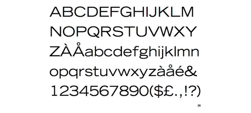
Not all extended fonts are display-only or heavy. The range is wider than most people expect.
| Font | Style | Best For | License |
| Trade Gothic Extended | Gothic sans-serif | Editorial, print headlines | Commercial |
| Barlow Expanded | Geometric sans-serif | Web, branding, UI | Free (Google Fonts) |
| Univers Extended | Neutral sans-serif | Corporate identity, wayfinding | Commercial |
| Bebas Neue | All-caps display | Posters, sports branding | Free (Google Fonts) |
Barlow Expanded is the easiest starting point for most web design projects. It’s free, well-made, and pairs cleanly with Barlow’s other width variants. Took me a while to find a free extended option this solid, honestly.
Trade Gothic Extended is the classic choice for editorial work. It’s been used in magazine layouts for decades. The display typeface quality holds up well at large sizes, and the commercial license covers most typical use cases.
One thing to always check before using any of these commercially: font licensing terms vary a lot. Free for personal use doesn’t always mean free for client work or commercial products.
When Not to Use an Extended Font
Extended fonts have a clear job. Outside of that job, they get in the way fast.
A UCF Readability Consortium study found that switching to a more appropriate typeface for a specific context boosted reading speed by 35% while keeping comprehension intact. Width is one of those context-dependent factors. The wrong width choice costs readers real time.
Body Text and Long-Form Reading
The core problem: wider characters mean fewer words per line, which means more line breaks, more eye movement back to the left margin, and faster reading fatigue.
The U.S. Web Design System recommends a target of 45 to 90 characters per line for readable body text. An extended font at standard body text sizes will push you well below that range.
That creates short, choppy lines that disrupt reading flow. Fine for a three-word poster headline. A problem for anything longer than a pull quote.
Narrow Containers and Responsive Layouts
MIT typography research confirms that tracking and character width directly affect reading efficiency. Extended fonts need horizontal room. Narrow columns don’t have it.
On mobile, this gets worse. A wide-character font set at a normal body size on a 375px screen will either overflow its container, force excessive line breaks, or look noticeably squeezed once the browser tries to fit it.
The HTTP Archive 2025 data shows roughly 88% of websites use web fonts, with mobile usage now at parity with desktop. Any font choice you make gets tested on small screens whether you plan for it or not.
Artificially Stretched Text
Worth separating out from the rest because it comes up constantly. Using CSS transform: scaleX() or manually dragging text wider in a design tool is not extended typography.
What actually happens: vertical strokes inflate while horizontal strokes stay the same. The font’s internal proportions break. The x-height relationship shifts. It looks wrong even when you can’t name exactly why.
A proper extended variant is drawn wide from the start. Every stroke weight, curve, and spacing value is built for that width. No amount of CSS scaling replicates that.
Multilingual and Mixed-Script Layouts
Extended Latin fonts rarely have matching extended variants for non-Latin scripts. If your layout includes Arabic, Cyrillic, CJK, or other scripts alongside the extended Latin text, the width mismatch creates jarring visual inconsistency.
The HTTP Archive 2025 Web Almanac notes that roughly 61-62% of web fonts now include at least one OpenType feature table, but extended width support across multiple scripts remains limited outside of major commercial type families.
Check available glyph coverage before committing an extended font to any multilingual project. Most free extended options cover Latin only.
Small Sizes and Low-Resolution Screens
NNG research found that condensed text required 11.2% more reading time than regular-width text in glanceable reading tasks. Extended fonts solve this specific problem at small sizes. But that advantage disappears below roughly 14-16px, where individual letterform details become hard to distinguish regardless of width.
At caption sizes or in UI labels with tight spacing, an extended font’s wider characters create crowding rather than clarity.
| Scenario | Extended Font | Better Choice |
| Long body text | Avoid | Regular or condensed |
| Mobile body copy | Avoid | Regular width |
| UI labels under 14px | Avoid | Regular or humanist sans |
| Multilingual layouts | Check coverage first | Neutral width with full script support |
| Short headlines, wide containers | Good fit | Extended or expanded |
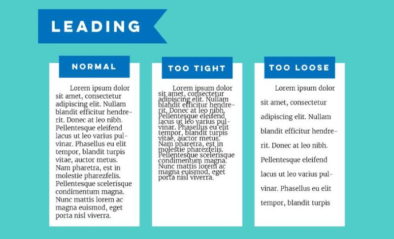
Knowing when to skip extended fonts matters as much as knowing when to use them. The leading, container width, and reading context all need to support the width choice before it becomes a good one.
One thing I keep seeing in client work: extended fonts used for subheadings in tight sidebar columns. It looks compressed, the lines break awkwardly, and the whole typographic hierarchy falls apart. Check your column width before you commit to an extended variant anywhere outside the main hero area.
FAQ on Extended Fonts
What is an extended font?
An extended font is a typeface variant where each character is wider than the standard design. The wider glyph proportions are built into the font itself, not applied afterward through scaling or CSS transforms.
What is the difference between an extended and a condensed font?
A condensed font has narrower characters that fit more text per line. An extended font has wider characters that take up more horizontal space. Both are part of the same font width classification scale, sitting at opposite ends.
Is “extended” the same as “expanded”?
Mostly yes. Different type foundries use different naming conventions. “Extended,” “expanded,” and “wide” all describe the same concept: character width above the standard baseline. The CSS font-stretch property uses “expanded” as its keyword.
Does CSS font-stretch actually stretch a font?
No. The font-stretch property selects a pre-designed width variant from a font family. It does not distort or scale glyphs horizontally. If the font has no extended variant, the browser falls back to the default width.
What is the wdth axis in a variable font?
The wdth axis is an OpenType variable font axis that controls character width. Values above 100 push the design toward extended. It works through font-stretch in CSS or directly via font-variation-settings: “wdth” 125.
Can I use an extended font for body text?
Generally no. Wider characters reduce the number of words per line, causing more frequent line breaks and faster reading fatigue. Extended fonts work best for short headlines, display text, and poster design, not long-form reading.
What are some free extended fonts?
Barlow Expanded and Bebas Neue are both available free on Google Fonts. Barlow Expanded is the more versatile option for web design projects. Always check the license terms before using any font commercially.
How is an extended font different from just scaling text wider in CSS?
Scaling text with transform: scaleX() distorts stroke proportions. Vertical strokes get thicker while horizontal ones stay the same. A true extended font is drawn wide from scratch, keeping all stroke weights and font spacing balanced.
Do extended fonts affect page load performance?
They can. Loading a separate extended font file adds an extra HTTP request and extra file weight. Using a variable font with a width axis is more efficient. One file covers the full width range without multiple separate requests.
Where are extended fonts most commonly used?
Display typography is the primary home for extended fonts: posters, billboards, magazine covers, packaging, and brand headlines. They also show up in visual identity work where a wide, authoritative character is part of the brand direction.
Conclusion
This conclusion is for an article presenting what is an extended font, and the core takeaway is straightforward: extended fonts are a specific tool with a specific job.
Font width classification, the wdth axis, and the font-stretch` CSS property all exist to give designers precise control over horizontal glyph proportions.
Used right, an extended typeface adds authority to headlines, strengthens brand typography, and fills wide display formats with confidence.
Used wrong, it fights legibility, breaks layouts, and undermines the kerning and stroke proportions the original type designer worked to balance.
Width is one of the quieter decisions in typography, but it shapes how readers experience every line of text you set.

Renowned for his expertise in logo design and visual branding, Bogdan has developed a multitude of logos for various clients.
His skills extend to creating posters, vector illustrations, business cards, and brochures. Additionally, Bogdan's UI kits were featured on marketplaces like Visual Hierarchy and UI8.
He also wrote in the past years on sites like Design Your Way, WebDesignerDepot, WPDean, Designmodo, Speckyboy, Slider Revolution, and more.
- Versatile Georgia Font Pairing for Timeless Layouts - 24 October 2026
- How to Turn Inconsistent UI into One Design System (Without a Full Redesign) - 24 October 2026
- Beautiful Fonts Similar to Poppins You Should Try - 22 October 2026

Bogdan Sandu is a seasoned designer who has been designing websites since 2008. Renowned for his expertise in logo design and visual branding, Bogdan has developed a multitude of logos for various clients. His skills extend to creating posters, vector illustrations, business cards, and brochures. Additionally, Bogdan's UI kits were featured on marketplaces like Visual Hierarchy and UI8. He also wrote in the past years on sites like Design Your Way, WebDesignerDepot, WPDean, Designmodo, Speckyboy, Slider Revolution, and more.
You Might Also Like