The Las Vegas Raiders Logo History, Colors, Font, and Meaning
Emblazoned on memorabilia and etched into the hearts of sports enthusiasts, a logo stands as a beacon of identity—none more so than the Las Vegas Raiders logo.
Beyond mere graphic elements, it encapsulates a narrative steeped in history, from the gridiron glory to a city that never sleeps, adopting a team and enshrining it within its glittering horizon.
Within these lines, a journey unfolds; a dissection not only of aesthetic significance but the very soul of branding in the realm of NFL sports marketing.
One will traverse the evolution from Oakland to Las Vegas, examining how symbols morph and cultural threads intertwine, yielding an insignia synonymous with commitment to excellence.
Expect a deep dive into aesthetic nuances and an exploration into how this iconic symbol garners instant recognition.
A story of sports team branding revealing itself, where design, heritage, and passion collide, creating a legacy witnessed on jerseys, hats, and the pulse of Raider Nation.
The Meaning Behind the Las Vegas Raiders Logo
![]()
Oh man, let’s dive deep into this one!
Symbolism Overload!
You know, every logo is like an iceberg. What we see on the surface is a tiny bit of the massive thought process submerged beneath. The Las Vegas Raiders logo? It’s no different!
It exudes fierceness, dedication, and a never-give-up attitude. That shield and pirate emblem represent a warrior’s spirit, resilience, and a nod to the old sea raiders.
The Modern Day Raider
The Las Vegas touch? It brings glam, unpredictability, and that ‘go big or go home’ feel. This is not just a sports logo. It’s a lifestyle. It’s about rallying behind your crew, being bold, and chasing those big dreams, Vegas style.
The History of the Las Vegas Raiders Logo
Before Vegas Came Knocking
Before they danced under the dazzling lights of Las Vegas, the Raiders had a life in Oakland and Los Angeles. Throughout these shifts, the logo pretty much remained consistent, a testament to its timeless design.
Evolution, But Not Really
While the Raiders logo has seen minor tweaks here and there, its essence has remained. It’s like that favorite pair of jeans that you just can’t part with. The team and the brand understood the value of legacy, ensuring the modern iterations paid homage to the original.
The Colors of the Las Vegas Raiders Logo
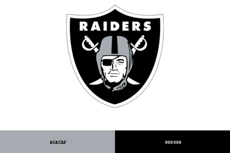
Black as the Night
The predominant black in the logo? Man, it’s not just a color. It’s an attitude. It speaks volumes about strength, authority, and power.
Silver Streaks
Now, where there’s black, there’s also that beautiful, shining silver. It adds a touch of sophistication and represents purity and perfection. The combination is just impeccable, don’t you think?
The Font Used in the Las Vegas Raiders Logo
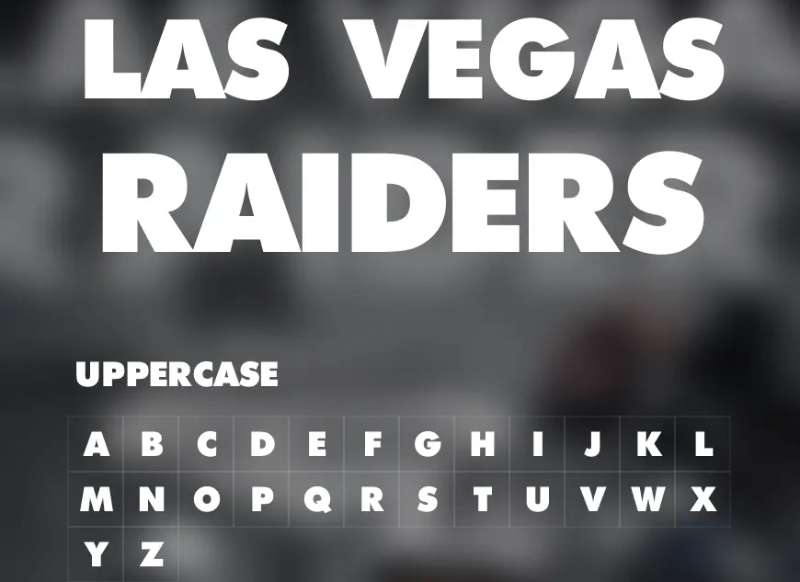
Bold and Assertive
Fonts, they’re the unsung heroes. The font in the Raiders logo is all about making a statement. It’s bold, upright, and assertive. Just like the team on the field. No room for subtleties here!
The Reception of the Las Vegas Raiders Logo
Fan Fever
Fans have a deep connection with team logos, and the Raiders logo has always been iconic. That pirate guy isn’t just a mascot; for many, he’s a symbol of pride and passion. Moving to Las Vegas didn’t dampen this fervor; if anything, it added some extra glam and dazzle!
A Global Icon
Over the years, the Las Vegas Raiders logo has gone beyond just football enthusiasts. From hip-hop culture to fashion, its impact is undeniable.
Design Inspiration and Influence
Influence from the Pirates of Yore
Let’s get real, that pirate figure? Definitely borrowed some vibes from those ancient sea raiders. It’s a nod to the rebellious spirit and raw courage.
Modern Pop Culture
Beyond the historic influences, the Las Vegas touch to the Raiders logo adds a level of flamboyance that’s relevant today. It resonates with today’s pop culture and symbolizes a harmonious blend of legacy and modernity.
FAQ On The Las Vegas Raiders Logo
What is the significance of the Las Vegas Raiders logo?
The Las Vegas Raiders logo is a symbol of resilience and iconic tradition within the NFL. It transcends sports marketing boundaries, embedding itself into the fabric of both Oakland’s and Las Vegas’ culture—representing a storied history of football, unity among Raider Nation, and the team’s commitment to excellence.
How has the Raiders logo evolved over time?
From its Oakland roots to the flashy Las Vegas stage, the logo has maintained its core design—a buccaneer with a football helmet.
The team’s dedication to preserving its heritage while embracing a modern brand identity is evident through subtle updates in the logo’s graphic design.
What do the colors of the Raiders logo represent?
The silver and black are more than just colors; they symbolize the Raiders’ rugged and rebellious spirit. Silver reflects sophistication and commitment, while black exudes the power and mystery synonymous with the Raiders’ corporate identity in professional football.
Who designed the original Raiders logo?
The original Raiders logo was crafted by a renowned illustrator in the 1960s, embodying the team’s edgy and competitive nature. It set the stage for sports franchise branding that many teams now follow—a nod to creating a reputable sports identity that resonates with fans.
Is the Las Vegas Raiders logo trademarked?
Yes, the logo is a protected trademark, ensuring the integrity and exclusivity of the team’s branding. This logo licensing secures the identity against unauthorized uses, solidifying its place in the sports memorabilia market and NFL merchandise offerings.
Can the public use the Las Vegas Raiders logo?
Use of the logo by the public is strictly regulated due to its trademark status. Only with official permission or under specific fair use conditions, such as commentary or parody, can the logo be utilized without infringing on the NFL’s intellectual property rights.
What do fans think of the Las Vegas Raiders logo?
Fans, a group as dynamic as Raider Nation, generally revere the logo for its tough and stylish look, emblematic of the team’s character. They proudly wear it on authentic Raiders apparel, weaving the emblem into their personal identities and fan gear collections.
How often has the Las Vegas Raiders logo changed?
The logo has seen minimal changes since its inception. It’s a testament to the team’s commitment to tradition and consistent brand recognition in a rapid-evolution industry.
Occasional tweaks reflect technical and aesthetic shifts while honoring the historical achievements and logo evolution.
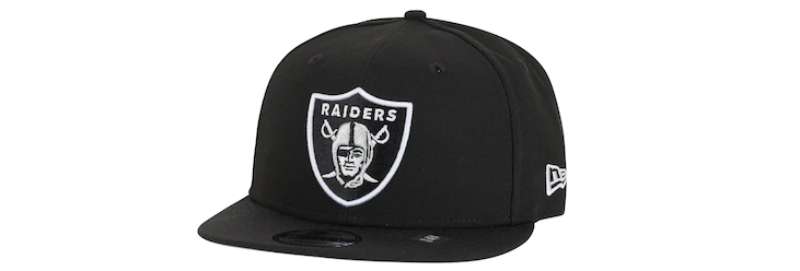
Where is the Raiders logo used the most?
The emblem is ubiquitously splashed across Raiders merchandise, from jerseys to hats, and even massive billboards around Allegiant Stadium.
Its usage extends to digital realms—gracing social media, official NFL platforms, and as a unifier among football memorabilia aficionados.
What impact does the Raiders logo have on Las Vegas’s identity?
Since the relocation, the logo has swiftly integrated into Las Vegas’s identity, becoming an inherent part of the city’s vibrant sports scene.
It stands as a beacon for regional pride, blending the allure of professional American football with the city’s storied entertainment legacy.
Conclusion
In essence, the Las Vegas Raiders logo stands as a paragon of brand permanence in the ever-shifting sands of sports identities. It’s remarkable, really. A symbol that captures American football’s essence, meshing Las Vegas’s exuberance with the Raiders‘ defiant spirit—Silver and Black coursing through the city’s veins.
- It reverberates within Allegiant Stadium.
- It unites a Raider Nation.
- It brands each piece of merchandise with more than a team’s crest; it’s a stamp of undying allegiance.
Reflecting on the intricacies of this logo’s design journey casts a spotlight on the power of visual storytelling in the context of professional sports. Whether one bleeds the team’s colors or not, there’s respect here, a nod to the logo’s iconic stature in the NFL’s panorama. As Las Vegas continues to weave its narrative around this emblem, let us not forget the historical depth each curve and shade on the logo’s buccaneer face carries.
If you liked this article about the Las Vegas Raiders logo, you should check out this article about the Cleveland Browns logo.
There are also similar articles discussing the Jacksonville Jaguars logo, the Tampa Bay Buccaneers logo, the New York Giants logo, and the Cincinnati Bengals logo.
And let’s not forget about articles on the Miami Dolphins logo, the Los Angeles Rams logo, the Baltimore Ravens logo, and the Detroit Lions logo.
Bogdan Sandu, a seasoned designer with 15 years of diverse experience, has been designing websites since 2008.
Renowned for his expertise in logo design and visual branding, Bogdan has developed a multitude of logos for various clients.
His skills extend to creating posters, vector illustrations, business cards, and brochures. Additionally, Bogdan's UI kits were featured on marketplaces like Visual Hierarchy and UI8.
Latest posts by Bogdan Sandu (see all)
- Rainbow Color Palettes for Joyful Designs - 29 April 2024
- The Bethesda Logo History, Colors, Font, And Meaning - 28 April 2024
- Out of This World: Space Color Palettes for Cosmic Designs - 28 April 2024