The Baltimore Ravens logo stands as one of the most recognizable emblems in professional football. It combines aggressive imagery with regional pride in a way that few NFL logos manage to achieve.
The current primary mark debuted in 1999, replacing the original design from the franchise’s 1996 founding. Created by NFLProperties, this emblem features a stylized raven’s head rendered in purple, black, and metallic gold.
Baltimore itself has a deep connection to ravens through Edgar Allan Poe, who died in the city and wrote his famous poem “The Raven.” The team has used three main logo versions since its establishment as a 1996 NFL expansion franchise.
What is the Baltimore Ravens Logo?
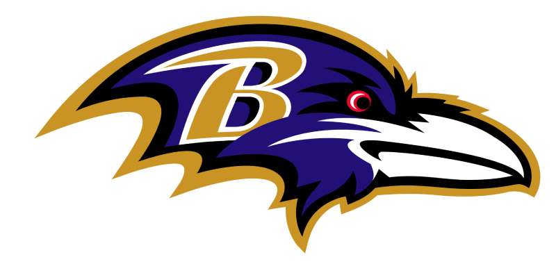
The Baltimore Ravens logo is a combination mark featuring an aggressive purple and black raven head with a stylized “B” letterform. Introduced in 1999, it was designed by NFL Properties to represent Baltimore’s literary connection to Edgar Allan Poe while projecting athletic power and intensity.
Design Type: Combination mark (mascot-based emblem with integrated letterform)
Primary Elements: Stylized raven head facing right, letter “B” incorporated into design, shield-like framing
Official Introduction Date: 1999 (current primary version)
Designer/Agency: NFL Properties
Trademark Status: Registered trademark of the Baltimore Ravens and NFL Enterprises
Color Palette:
- Ravens Purple: #241773
- Black: #000000
- Metallic Gold: #9E7C0C
- White: #FFFFFF (accent)
Usage Context: Helmets, jerseys, merchandise, M&T Bank Stadium signage, digital platforms, broadcast graphics, and official team communications
How Has the Baltimore Ravens Logo Evolved Over Time?
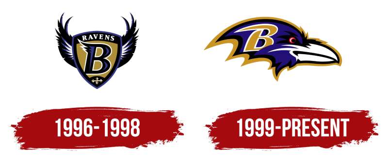
The Ravens have maintained a consistent visual identity since 1996, with one major redesign in 1999.
That update refined the original concept rather than abandoning it completely.
The team has kept the same color scheme throughout its history, showing unusual restraint compared to other franchises that chase trends.
Original Baltimore Ravens Logo (1996-1998)
Years Active: 1996-1998
Design Description: The first Ravens logo featured a more realistic raven illustration with outstretched wings. The bird appeared more naturalistic and less stylized than later versions.
Color Scheme: Purple, black, and gold (same palette as today)
Designer: NFL Properties
Context: Created when Art Modell moved the Cleveland Browns franchise to Baltimore. The city needed a fresh identity that honored local culture while distancing itself from Cleveland’s history.
Key Changes from Previous: N/A (original design)
Cultural Significance: Established the Poe connection immediately. Baltimore residents voted to name the team “Ravens” through a fan poll, making the logo choice obvious.
Revised Primary Logo (1999-Present)
Years Active: 1999-Present
Design Description: A more aggressive, angular raven head in profile. The bird’s eye appears fierce, and the overall shape suggests forward movement. A “B” letterform integrates into the design.
Color Scheme: Ravens Purple (#241773), Black (#000000), Metallic Gold (#9E7C0C), White accents
Designer: NFL Properties (refinement of original concept)
Context: Introduced as the team prepared to move into PSINet Stadium (now M&T Bank Stadium). The franchise wanted a bolder look for the new era.
Key Changes from Previous: More geometric and angular. Less realistic bird, more mascot-like. Integrated “B” element. Stronger shield shape framing.
Cultural Significance: This version appeared on helmets during both Super Bowl victories (XXXV and XLVII). It became synonymous with the team’s defensive identity and championship success.
What Do the Design Elements of the Baltimore Ravens Logo Mean?
The raven symbolizes intelligence, mystery, and a connection to Baltimore’s most famous literary resident.
Every element serves a purpose. The angular lines suggest speed and aggression.
The shield shape conveys protection and strength, fitting for a team built on defensive excellence.
Why Did the Ravens Choose These Specific Colors?
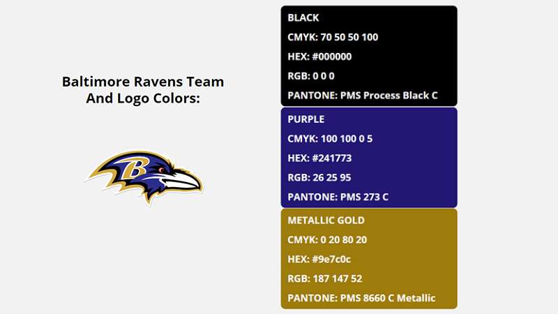
Purple stands out in a league dominated by blue and red. It was a deliberate choice to differentiate Baltimore from other AFC teams.
The psychology behind color choices in sports branding runs deep. Purple suggests royalty, ambition, and uniqueness.
Brands that use purple in their logos often want to communicate luxury or distinction.
Ravens Purple (#241773): A deep, dark purple that photographs as almost black under certain lighting. Conveys power, ambition, and distinction. Rare in NFL branding.
Black (#000000): Adds intimidation and pairs with purple for a gothic aesthetic matching the Poe theme. Teams with black-dominant logos often project toughness.
Metallic Gold (#9E7C0C): Provides contrast and suggests championship aspirations. The use of gold in logo design typically signals prestige and success.
What Typography Style Is Used in the Baltimore Ravens Logo?
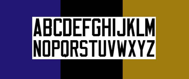
The Ravens wordmark uses a custom typeface with sharp, angular serifs.
The letters lean slightly forward, suggesting motion and aggression.
It matches the angular quality of the bird illustration. The “R” and “A” feature particularly distinctive treatments with pointed terminals.
This custom approach means the font works nowhere else. It belongs entirely to the Ravens brand.
What Are the Hidden Meanings in the Baltimore Ravens Logo?
The “B” integrated into the raven’s head isn’t immediately obvious to everyone. It takes a second look.
The bird faces right, which in Western design convention suggests forward progress.
Understanding the psychology behind shape choices explains why the angular design feels aggressive.
Some fans see a shield outline in the overall composition, though this wasn’t explicitly confirmed by designers.
How Does the Baltimore Ravens Logo Compare to Competitor Logos?
The Ravens logo holds its own against AFC North rivals. It projects more aggression than the Pittsburgh Steelers logo, which relies on heritage over intimidation.
The Cincinnati Bengals logo matches its fierceness but uses a completely different color strategy.
Among bird-themed NFL teams, the Ravens chose a darker path. The Philadelphia Eagles logo and Atlanta Falcons logo use cleaner, more streamlined bird imagery.
The Seattle Seahawks logo takes a more abstract approach with its Pacific Northwest tribal influence.
Baltimore’s raven feels heavier, more gothic. That’s intentional. It creates strong visual hierarchy that makes the logo memorable even at small sizes.
What Are the Technical Specifications of the Baltimore Ravens Logo?
Official Color Codes:
Ravens Purple
Black
- Hex: #000000
- RGB: (0, 0, 0)
- CMYK: (0, 0, 0, 100)
- Pantone: Black C
Metallic Gold
- Hex: #9E7C0C
- RGB: (158, 124, 12)
- CMYK: (0, 22, 92, 38)
- Pantone: 8385 C (metallic)
Dimensions and Proportions:
- Aspect ratio: Approximately 1:1 (primary mark)
- Minimum size: 0.5 inches for print, 50 pixels for digital
- Clear space: Equal to the height of the “B” element on all sides
- The logo works best as vector graphics to maintain sharpness at any scale
What Cultural Impact Has the Baltimore Ravens Logo Had?
The Ravens logo became a symbol of Baltimore’s football rebirth. After losing the Colts in 1984, the city waited twelve years for a new team.
This emblem represented that return. It showed up everywhere during the Super Bowl XXXV run in 2000.
The purple and black color combination influenced Maryland culture beyond football. High schools adopted similar palettes. Local businesses incorporated the colors.
Ray Lewis wearing that logo became one of the most iconic images in NFL history.
How Does the Baltimore Ravens Logo Fit Into the Overall Brand Identity?
The primary logo anchors a broader visual system. The team uses alternate marks, including a standalone “B” shield and full-body raven illustrations.
Everything connects through color and angular styling. The brand guidelines maintain strict consistency across all applications.
M&T Bank Stadium incorporates the purple throughout its architecture. Player uniforms, staff apparel, and merchandise all follow the same visual language.
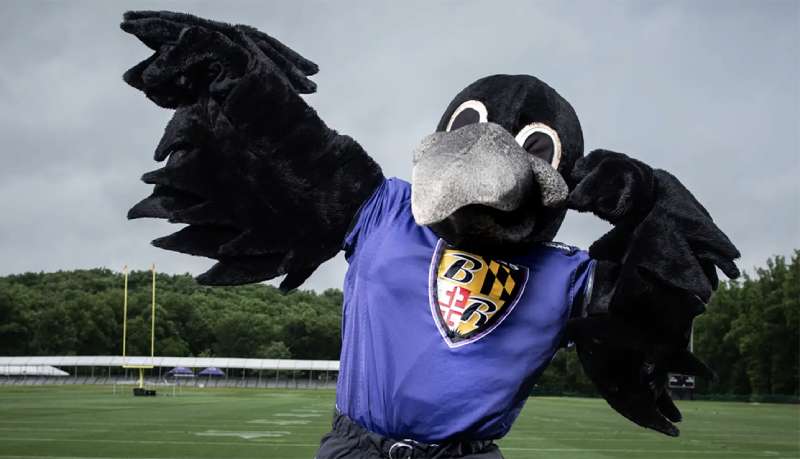
The Ravens also maintain the three live raven mascots (Rise, Conquer, and previously Poe) that bring the logo to life at home games.
How Should the Baltimore Ravens Logo Be Used?
Official Usage Guidelines:
- Never stretch or distort the logo proportions
- Maintain required clear space around the mark
- Use only approved color versions (full color, single color, or reversed)
- Never place the logo on busy backgrounds that reduce legibility
- The gold elements require metallic inks for premium applications
Where to Access Official Logos: Media members can request assets through the Baltimore Ravens official website media portal. Licensed manufacturers receive files directly from NFL Properties.
Licensing Information: All commercial use requires licensing through NFL Properties. The Ravens and NFL actively protect against unauthorized merchandise. Fan art exists in a gray area, with the team generally tolerating non-commercial creative works.
Trademark Protection: The logo, wordmarks, and color combinations hold registered trademark protection. The NFL maintains aggressive enforcement to protect franchise values across all 32 teams.
FAQ on The Baltimore Ravens Logo
What Does the Baltimore Ravens Logo Represent?
The Ravens logo represents Baltimore’s connection to Edgar Allan Poe and his famous poem.
The aggressive raven head symbolizes power and intimidation. It reflects the team’s defensive identity built during their Super Bowl XXXV and Super Bowl XLVII championship runs.
Who Designed the Baltimore Ravens Logo?
NFL Properties designed both versions of the Ravens emblem.
The original 1996 mark and the 1999 revision came from the league’s in-house design team. They applied core logo design principles to create a lasting franchise identity.
When Was the Current Baltimore Ravens Logo Introduced?
The current primary logo debuted in 1999. It replaced the original 1996 design.
The AFC North franchise wanted a bolder look before moving into their new stadium. That version has remained unchanged for over two decades.
What Are the Official Colors of the Baltimore Ravens Logo?
The official color palette includes Ravens Purple (#241773), Black (#000000), and Metallic Gold (#9E7C0C).
White appears as an accent. These team colors create strong contrast and help the purple and black scheme stand out among NFL team branding.
Has the Baltimore Ravens Logo Changed Since 1996?
Yes, but only once. The franchise updated their logo design in 1999.
The revision made the raven head more angular and geometric. Designers integrated a “B” letterform into the bird. The color scheme stayed identical throughout both logo iterations.
Why Is There a Letter “B” Hidden in the Ravens Logo?
The “B” represents Baltimore. It’s a subtle design element that rewards closer inspection.
This creates a strong focal point while connecting the abstract bird mascot directly to the city. Not everyone notices it immediately.
What Is the Connection Between the Ravens and Edgar Allan Poe?
Poe died in Baltimore, Maryland in 1849. His poem “The Raven” inspired the team name.
Fans voted for the name in 1996 when Art Modell relocated the franchise. The gothic imagery in the logo honors that literary heritage directly.
Can I Use the Baltimore Ravens Logo for Personal Projects?
Personal, non-commercial fan art typically gets tolerated. Commercial use requires licensing.
The NFL and Ravens organization actively protect their trademark. Selling merchandise with the team emblem without permission violates intellectual property law. Always check official guidelines first.
Where Can I Download the Official Baltimore Ravens Logo?
Media professionals access official files through the Ravens website media portal.
Licensed manufacturers receive assets from NFL Properties directly. Fan sites offer unofficial versions, but these lack the proper DPI specifications for quality printing.
What Font Does the Baltimore Ravens Wordmark Use?
The Ravens use a custom typeface designed specifically for the franchise.
The angular serif font features sharp terminals that match the aggressive bird illustration. You won’t find this font available for public download anywhere.
Conclusion
The Baltimore Ravens logo succeeds because it balances aggression with meaning. Every element works together.
From the angular raven head to the hidden “B” letterform, the design reflects both M&T Bank Stadium’s home team identity and the city’s literary connection to Poe.
The purple and black color scheme set Baltimore apart from other NFL franchises in 1996. It still does today.
Championship moments with players like Ray Lewis and Lamar Jackson cemented this emblem in football history. The Ravens brand proves that thoughtful sports logo design creates lasting fan loyalty.

Renowned for his expertise in logo design and visual branding, Bogdan has developed a multitude of logos for various clients.
His skills extend to creating posters, vector illustrations, business cards, and brochures. Additionally, Bogdan's UI kits were featured on marketplaces like Visual Hierarchy and UI8.
He also wrote in the past years on sites like Design Your Way, WebDesignerDepot, WPDean, Designmodo, Speckyboy, Slider Revolution, and more.
- Minecraft Font Generator - 8 October 2026
- How Top Meta Ad Creative Is Designed for E-commerce Brands - 8 October 2026
- How photo recovery software works and when to use it - 7 October 2026

Bogdan Sandu is a seasoned designer who has been designing websites since 2008. Renowned for his expertise in logo design and visual branding, Bogdan has developed a multitude of logos for various clients. His skills extend to creating posters, vector illustrations, business cards, and brochures. Additionally, Bogdan's UI kits were featured on marketplaces like Visual Hierarchy and UI8. He also wrote in the past years on sites like Design Your Way, WebDesignerDepot, WPDean, Designmodo, Speckyboy, Slider Revolution, and more.
You Might Also Like