


The Indianapolis Colts Logo History, Colors, Font, and Meaning
Imagine the fierce energy of a galloping stallion—power, agility, and spirit encapsulated in a single emblem: the Indianapolis Colts logo. A symbol that transcends mere visual identity, evoking the rich tapestry of NFL history and the relentless pursuit of victory.
In the realm of sports branding, logos often tell deeper stories. This article plunges into the heart of what makes the Colts’ horseshoe emblem an iconic beacon within the NFL fraternity and beyond, in the bustling city of Indianapolis.
You’ll unravel the threads of this logo’s narrative, grasping how it reflects an inherent sense of belonging for Colts Nation and resonates with echoes of legendary moments—each yard gained under the watchful eyes of legends like Peyton Manning and in the hallowed grounds of Lucas Oil Stadium.
By this article’s end, an understanding of how the blue and white team colors fuse with larger elements, such as sports team visual identity and football logo design, will be yours, along with insights into how such symbols impact sports fan culture and foster team loyalty.
Lean in closer—let’s dissect the anatomy of this spirited symbol and its enduring influence on the fabric of American football.
The Meaning Behind the Indianapolis Colts Logo
![]()
Ah, the Indianapolis Colts logo. You’ve seen it, haven’t you? It’s not just some random graphic. There’s a vibe, a story, an essence behind it.
Power in Simplicity
What makes the Colts’ logo so darn cool? It’s its simplicity. That iconic horseshoe? It’s not just any horseshoe. It’s symbolic of luck, and maybe, just maybe, it brings a sprinkle of fortune to the team every game. But it’s more than just luck.
Horses are known for their strength, stamina, and spirit. So, when you look at that horseshoe, you’re peeking into the soul of the team – strong, relentless, and always pushing forward.
An Emblem of Tradition
Tradition, man. It’s what binds fans, generations, the young and the old. The horseshoe is a nod to that tradition.
Rooted in football culture, it represents commitment and perseverance. It’s more than a logo; it’s an emblem that bridges past glory with future aspirations.
The History of the Indianapolis Colts Logo
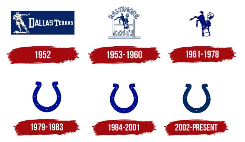
From Baltimore to Indy
It’s a journey, right? The Colts didn’t just magically appear in Indianapolis. They migrated from Baltimore in the mid-80s, and with them, they carried the horseshoe emblem, embedding it deeply into the heart of Indianapolis.
Evolution Over Time
Now, logos aren’t static. They change, adapt, and evolve. The Colts logo? It’s had its tweaks, its shifts.
The horseshoe has been repositioned, and resized, but never lost its essence. It’s like that one outfit in your wardrobe that always feels right. Timeless.
The Colors of the Indianapolis Colts Logo
Royal Blue: The Color of Kings
Blue isn’t just blue. It’s royal blue. A color of elegance, majesty, and nobility. It mirrors the passion, depth, and dedication of the team and its fan base.
A Splash of White
Then there’s the crisp white. Pure, bold, and assertive. White in logos often symbolizes clarity and perfection. With the Colts, it complements the blue, adding a touch of sophistication.
The Font Used in the Indianapolis Colts Logo
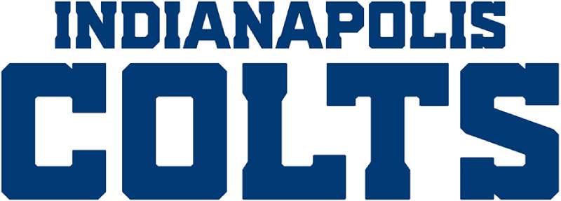
Ever looked closely at the word “Colts” on some of the branding? The font isn’t just chosen haphazardly.
Modern Yet Classic
The font used for “Colts” is contemporary but carries a classic feel. It’s assertive, making a statement, but not in your face.
Balanced and Sleek
It’s well-balanced, sleek, and super legible. And in the world of design, balance and legibility are everything. It complements the logo, ensuring the entire brand vibe is on point.
Impact on Pop Culture
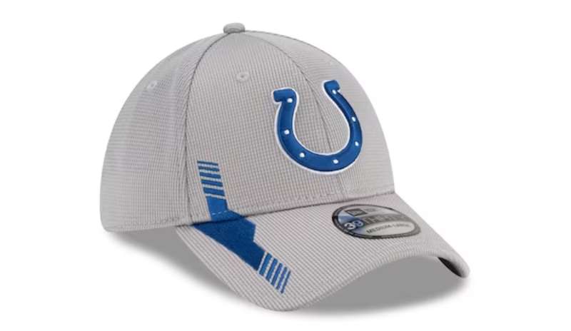
From Jerseys to Tattoos
Ever seen someone with a Colts tattoo? The logo has transcended sports, making its mark on pop culture. It’s on jerseys, caps, and yes, even skin. It’s become a symbol of loyalty, passion, and undying support.
Featured in Art and Design
Beyond tattoos and apparel, the logo’s design aesthetics have influenced a range of artists and graphic designers. Its simple yet profound visual appeal serves as inspiration in various creative works.
Connection with the Fans
An Identity for the Masses
For fans, the logo isn’t just a symbol; it’s an identity. It binds them, connects them, and gives them something to rally behind.
Emotional Attachment
Ask any Colts fan. There’s an emotional layer to it. That horseshoe isn’t just a design; it’s memories, tears, joy, and anticipation of what’s next.
FAQ On The Indianapolis Colts Logo
Who designed the Indianapolis Colts logo?
The creator’s identity of the iconic horseshoe emblem often gets lost in the mists of NFL history. It emerged in the 1950s, an era less documented than today, but its design is credited to the organization rather than a single artist, a piece of heritage defining Colts Nation.
When was the Indianapolis Colts logo first used?
The Indianapolis Colts logo made its debut in 1953 when the team was still known as the Baltimore Colts. This emblem has evolved but maintained the core horseshoe element, representing the team’s storied past as it transitioned to Indianapolis.
What is the significance of the horseshoe in the Indianapolis Colts logo?
Ah, the horseshoe, a symbol steeped in folklore! It’s considered a token of good fortune and victory—a fitting representation for a team striving for NFL glory. The Colts embrace the horseshoe, hoping it brings fortuity both on the field and off.
Has the Indianapolis Colts logo changed over the years?
Indubitably. Although alterations have been subtle rather than drastic, reflecting the brand identity’s timeless nature.
These tweaks reflect contemporary design trends while paying homage to tradition, ensuring the logo remains a modern, recognizable sports insignia.
Why are the colors of the Indianapolis Colts logo blue and white?
Chosen for their crisp, clean contrast, blue and white resonate with the no-nonsense, bold spirit of the team. These colors symbolize loyalty and integrity, qualities emblematic of the heart of Indianapolis and the fervor of professional football.
Can the Indianapolis Colts logo be used for personal or commercial purposes?
Tread carefully here; the logo is trademark protected. Usage for personal, non-commercial purposes is typically fine, but any commercial intent requires express permission from the NFL. Always best to play by the legal playbook to avoid any trademark infringement flags.
What do fans think of the Indianapolis Colts logo?
Ask the fans, and you’ll find affectionate pride. The Colts’ logo is more than just branding; it’s a beacon of unity and identity for supporters in Lucas Oil Stadium and afar—a cherished emblem representing both team and community.
How is the Indianapolis Colts logo incorporated in team merchandise?
From jerseys to fan cave essentials, the Colts logo punctuates merchandise, symbolizing fandom allegiance. Authentic gear always features the official emblem, a visual shoutout to AFC South affiliation and solidarity with the Colts family.
Can the Indianapolis Colts logo be found in the city of Indianapolis?
Absolutely, it’s an inherent thread in the Indianapolis cultural fabric. The logo marks its territory throughout the city, from murals to signages, infusing local pride and a sports-centric identity into the metropolis’s very being.
What are the rules for creating fan art involving the Indianapolis Colts logo?
Creating fan art is a celebration of fandom. However, respect for the trademark means avoiding income-generating ventures unless authorized.
Celebrate, create, share your fandom, but remember—when it comes to trademarks, liberty always plays within boundaries.
Conclusion
In this exploration, we’ve danced through the transformational journey of the Indianapolis Colts logo, from a simple mark of athleticism to a profound emblem woven into the fabric of Indianapolis. A symbol that bleeds blue and white, reflecting the spirit of a city and its unyielding football fans.
- We have seen how a horseshoe can be more than metal; it’s luck, legacy, passion.
- We’ve dived into the storied past, imbued with legends like Manning, where an emblem symbolizes more than victory—it represents home.
Before the parting whistle blows, let it be said: This logo isn’t merely inked on merchandise, slapped on helmets, or flashed across Lucas Oil Stadium. It’s tattooed on the hearts of a community. Peel back its layers and find a narrative deeper than any playbook stratagem. It’s a totem, an icon—a heritage that echoes in the cheer of Colts Nation.
If you liked this article about the Indianapolis Colts logo, you should check out this article about the Pittsburgh Steelers logo.
There are also similar articles discussing the Los Angeles Chargers logo, the Minnesota Vikings logo, the San Francisco 49ers logo, and the Seattle Seahawks logo.
Bogdan Sandu, a seasoned designer with 15 years of diverse experience, has been designing websites since 2008.
Renowned for his expertise in logo design and visual branding, Bogdan has developed a multitude of logos for various clients.
His skills extend to creating posters, vector illustrations, business cards, and brochures. Additionally, Bogdan's UI kits were featured on marketplaces like Visual Hierarchy and UI8.
Latest posts by Bogdan Sandu (see all)
- The Activision Blizzard Logo History, Colors, Font, And Meaning - 29 April 2024
- Rainbow Color Palettes for Joyful Designs - 29 April 2024
- The Bethesda Logo History, Colors, Font, And Meaning - 28 April 2024