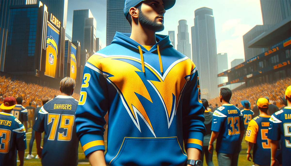
The Los Angeles Chargers logo stands as one of the most recognizable marks in professional football. That lightning bolt. You know it when you see it.
The franchise traces back to 1960 as a founding member of the American Football League. They started in Los Angeles, moved to San Diego for decades, then returned to LA in 2017.
Throughout this journey, the team has used variations of the same core symbol. The current version debuted in 2020 with the team’s fresh start in a new stadium. Seven distinct logo versions have existed since the franchise began.
The bolt remains constant. Everything else shifts around it.
What Is the Los Angeles Chargers Logo?
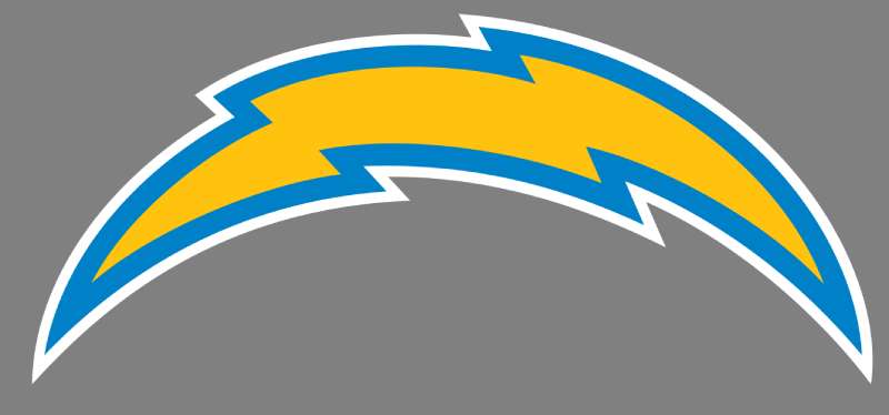
The Los Angeles Chargers logo features a stylized lightning bolt in powder blue with gold and white accents. Introduced in 2020, this combination mark was developed as part of the team’s SoFi Stadium era rebrand, symbolizing energy, speed, and the electrical charge that inspired the franchise name.
Logo Attributes
- Design Type: Combination mark (symbol with wordmark used separately)
- Primary Elements: Angled lightning bolt, curved shape, dimensional shading
- Official Introduction Date: March 2020
- Designer/Agency: NFL Creative in collaboration with the Chargers organization
- Trademark Status: Registered trademark of the Los Angeles Chargers, protected under NFL licensing
- Color Palette: Powder Blue (#0080C6), Sunshine Gold (#FFC20E), White (#FFFFFF)
- Usage Context: Helmets, uniforms, merchandise, digital platforms, stadium signage, broadcast graphics
How Has the Los Angeles Chargers Logo Evolved Over Time?
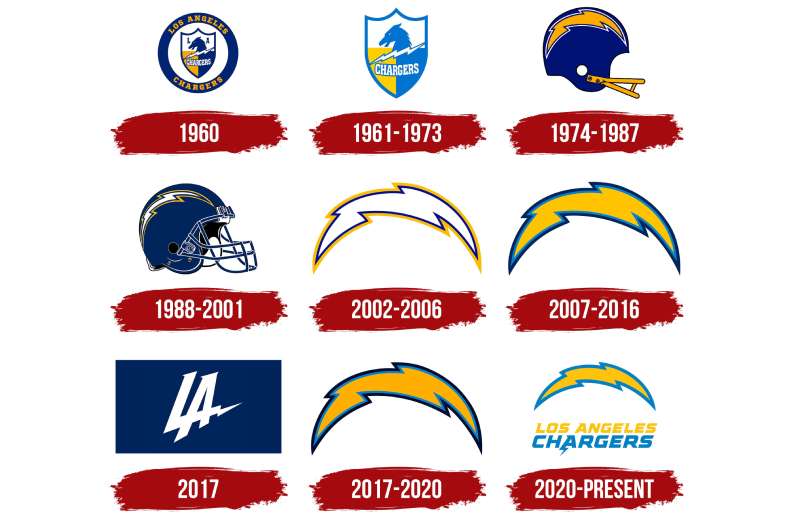
The Chargers lightning bolt has gone through seven major versions since 1960. Each redesign kept the core bolt shape while adjusting colors, angles, and styling details.
The most dramatic shifts happened during relocations and league changes.
Original Los Angeles Chargers Logo (1960)
- Years Active: 1960 (one season)
- Design Description: A simple royal blue lightning bolt with a white outline, angled diagonally
- Color Scheme: Royal blue, white
- Designer: Unknown (AFL original design)
- Context: Created for the team’s inaugural AFL season in Los Angeles before the move to San Diego
- Key Changes from Previous: Original design, no predecessor
- Cultural Significance: Established the lightning bolt as the franchise’s permanent identity element
San Diego Chargers Logo (1961-1973)
- Years Active: 1961-1973
- Design Description: Lightning bolt with a darker navy blue shade, thicker outline, more aggressive angle
- Color Scheme: Navy blue, white, gold accents introduced
- Designer: Team internal design
- Context: Marked the franchise’s move to San Diego and AFL championship years
- Key Changes from Previous: Darker blue tone, added gold trim elements
- Cultural Significance: Associated with the team’s AFL dominance and early Super Bowl era
San Diego Chargers Logo (1974-1987)
- Years Active: 1974-1987
- Design Description: Refined bolt with sharper edges, introduction of the “Chargers” wordmark beneath
- Color Scheme: Navy blue, gold, white
- Designer: NFL Properties collaboration
- Context: Post-AFL/NFL merger standardization period
- Key Changes from Previous: Cleaner lines, modernized proportions
- Cultural Significance: The Air Coryell era identity, associated with Dan Fouts and high-scoring offenses
San Diego Chargers Logo (1988-2001)
- Years Active: 1988-2001
- Design Description: Darker navy bolt with gold interior lightning effect, shield-like framing
- Color Scheme: Dark navy, gold, white
- Designer: NFL Properties
- Context: League-wide modernization trend in the late 1980s
- Key Changes from Previous: Added depth and dimensionality, more complex shading
- Cultural Significance: Junior Seau era, 1994 Super Bowl appearance identity
San Diego Chargers Logo (2002-2016)
- Years Active: 2002-2016
- Design Description: Return to powder blue as primary color, streamlined bolt shape
- Color Scheme: Powder blue, navy, gold, white
- Designer: Chargers internal with NFL approval
- Context: Throwback movement embracing team heritage and fan nostalgia
- Key Changes from Previous: Powder blue returned after decades, cleaner modern aesthetic
- Cultural Significance: LaDainian Tomlinson and Philip Rivers era, connected to franchise’s most successful regular seasons
Los Angeles Chargers Logo (2017-2019)
- Years Active: 2017-2019
- Design Description: Same bolt design carried from San Diego, minor color adjustments
- Color Scheme: Powder blue, navy, gold
- Designer: Retained existing design
- Context: Relocation to Los Angeles, temporary stadium years
- Key Changes from Previous: Minimal changes, focus on geographic transition
- Cultural Significance: Transitional identity during controversial relocation
Current Los Angeles Chargers Logo (2020-Present)
- Years Active: 2020-present
- Design Description: Curved, dimensional lightning bolt with gradient shading and rounded edges
- Color Scheme: Powder blue, sunshine gold, white
- Designer: NFL Creative and Chargers organization
- Context: SoFi Stadium opening, complete brand refresh for LA market
- Key Changes from Previous: Softer curves, brighter gold tone, more modern dimensional look
- Cultural Significance: Justin Herbert era, represents franchise’s permanent return to Los Angeles
What Do the Design Elements of the Los Angeles Chargers Logo Mean?
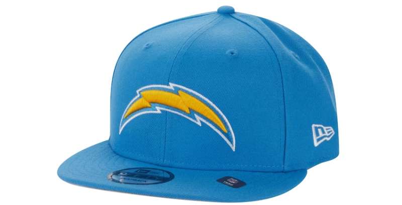
The lightning bolt carries direct meaning. It references the electrical charge that powers the team’s name and symbolizes explosive speed on the field.
The angled shape suggests forward motion.
Every curve and color choice connects to decades of franchise history and California identity.
Why Did the Los Angeles Chargers Choose These Specific Colors?
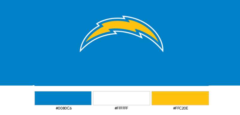
Powder blue connects directly to Southern California’s coastal identity. The sky, the ocean, the relaxed vibe. That’s what this hue represents.
The gold adds warmth and speaks to championship aspirations. According to color psychology, gold creates feelings of success and prestige.
Together, these colors separate the Chargers from darker, more aggressive NFL palettes. The combination feels uniquely West Coast.
- Powder Blue (#0080C6): Represents California skies, ocean proximity, and franchise heritage dating to the 1960s AFL era
- Sunshine Gold (#FFC20E): Symbolizes excellence, California sunshine, and connects to the state’s golden imagery
- White (#FFFFFF): Provides contrast and clarity, allows primary colors to pop on merchandise and broadcasts
What Typography Style Is Used in the Los Angeles Chargers Logo?
The Chargers use a custom sans-serif font for their wordmark. It’s bold, italicized, and built for impact.
The letters lean forward, suggesting speed and aggression.
Sharp angles on characters like the “A” and “R” mirror the lightning bolt’s energy. The typography works equally well on jerseys, billboards, and mobile screens.
Readability stays strong even at small sizes.
What Are the Hidden Meanings in the Los Angeles Chargers Logo?
The bolt’s curve in the current design isn’t random. It mirrors the shape of California’s coastline, particularly the stretch from San Diego to Los Angeles.
Some see this as intentional. Others call it coincidence.
The dimensional shading creates depth that wasn’t present in earlier flat versions. This technique makes the logo feel more premium, more suited to high-definition broadcasts and digital applications.
How Does the Los Angeles Chargers Logo Compare to Competitor Logos?
Within the AFC West, the Chargers logo stands apart through color alone. The Kansas City Chiefs logo uses red and gold. The Denver Broncos logo features orange and navy. The Las Vegas Raiders logo sticks to silver and black.
Powder blue makes the Chargers instantly identifiable.
Among all NFL logos, the lightning bolt ranks as one of the most abstract. Most teams use animal mascots, geographic symbols, or letter-based marks. The Chargers chose a natural phenomenon instead.
This decision keeps the logo timeless. Lightning bolts don’t go out of style.
What Are the Technical Specifications of the Los Angeles Chargers Logo?
Official Color Codes
- Powder Blue (Primary)
- Hex: #0080C6
- RGB: (0, 128, 198)
- CMYK: (100, 35, 0, 22)
- Pantone: PMS 2995 C
- Sunshine Gold (Secondary)
- Hex: #FFC20E
- RGB: (255, 194, 14)
- CMYK: (0, 24, 95, 0)
- Pantone: PMS 123 C
- White (Accent)
- Hex: #FFFFFF
- RGB: (255, 255, 255)
- CMYK: (0, 0, 0, 0)
Dimensions and Proportions
- Aspect Ratio: Approximately 1:1.5 (width to height) for the bolt mark alone
- Minimum Size: 0.5 inches for print applications, 50 pixels width for digital
- Clear Space: Minimum clearance equal to 25% of logo height on all sides
- File Formats: Available in vector graphics (AI, EPS, SVG) and raster formats (JPEG, PNG)
What Cultural Impact Has the Los Angeles Chargers Logo Had?
The lightning bolt transcends football in Southern California. You see it on beach towels, bar signs, and bumper stickers throughout San Diego and Los Angeles.
It became a regional symbol during the team’s 56 years in San Diego.
The powder blue colorway influenced fashion trends. Vintage Chargers gear remains popular even among people who don’t follow football. That’s rare for sports merchandise.
How Does the Los Angeles Chargers Logo Fit Into the Overall Brand Identity?
The logo anchors a complete visual system. It connects to the team’s brand guidelines, uniform designs, stadium graphics, and digital presence.
The bolt appears everywhere. Helmets, end zones, social media profiles, mobile apps.
Secondary marks include a shield emblem and various wordmark treatments. These support the primary logo without competing against it. The entire system works because every element shares the same color palette and design language.
How Should the Los Angeles Chargers Logo Be Used?
Official Usage Guidelines
- Do: Maintain proper clear space, use official color values, preserve aspect ratios when scaling
- Don’t: Stretch or distort the logo, apply unapproved color combinations, place on busy backgrounds that reduce visibility
Accessing Official Logos
- Media members can request assets through the NFL Media Portal
- Licensed partners receive files through NFL Properties
- Fan use is limited to personal, non-commercial applications
Licensing Information
- Commercial use requires NFL licensing agreement
- Merchandise production goes through authorized manufacturers only
- Broadcast graphics follow league-wide standards
Trademark Protection
- The lightning bolt design is a registered trademark
- The “Chargers” name and associated marks carry federal protection
- Unauthorized reproduction faces legal enforcement through NFL legal teams
FAQ on The Los Angeles Chargers Logo
What Does the Lightning Bolt in the Chargers Logo Represent?
The lightning bolt symbol represents electrical energy and explosive speed. It connects directly to the team name.
Barron Hilton chose “Chargers” in 1960. The bolt became the visual translation of that concept, serving as the franchise’s focal point ever since.
When Was the Current Los Angeles Chargers Logo Introduced?
The current version launched in March 2020. It coincided with the SoFi Stadium opening in Inglewood.
This franchise rebranding marked the team’s permanent return to Los Angeles. The redesign updated the bolt with modern curves and brighter gold tones.
Why Are the Chargers Colors Powder Blue and Gold?
Powder blue reflects Southern California’s coastal identity. Sky, ocean, laid-back lifestyle. Gold represents championship aspirations and California sunshine.
This color palette separates the Chargers from darker NFL team schemes. The combination feels distinctly West Coast.
Who Designed the Los Angeles Chargers Logo?
NFL Creative developed the 2020 logo alongside the Chargers organization. The original 1960 bolt came from AFL-era designers whose names weren’t documented.
Each logo iteration involved collaboration between team leadership and league design standards.
How Many Times Has the Chargers Logo Changed?
Seven distinct versions exist. The logo evolution timeline spans from 1960 to present.
Major changes happened during the San Diego years (1961, 1974, 1988, 2002) and after the LA relocation (2017, 2020). The core bolt shape remained constant throughout.
What Font Does the Chargers Wordmark Use?
The team uses a custom typeface built specifically for the brand. It’s bold, italicized, and angled forward.
Sharp edges on letters mirror the lightning bolt’s energy. The font spacing stays tight for a compact, aggressive look.
Can I Use the Chargers Logo for Personal Projects?
Personal, non-commercial use is generally tolerated. Selling merchandise or commercial reproduction requires NFL licensing.
The trademark symbol carries federal protection. Unauthorized commercial use faces legal action from NFL Properties.
Why Did the Chargers Keep the Lightning Bolt After Moving to LA?
Brand recognition. The bolt built 60 years of equity across both cities.
Changing it would have abandoned decades of team visual identity. Smart franchises understand that logo design principles favor evolution over revolution.
What’s the Difference Between the San Diego and LA Chargers Logos?
The 2020 LA version features softer curves and brighter sunshine gold. San Diego-era bolts had sharper angles and darker navy accents.
The current design uses gradient shading for depth. Earlier versions were flat.
Where Can I Download the Official Chargers Logo?
Media members access files through the NFL Media Portal. Licensed partners receive assets from NFL Properties directly.
Fan sites offer unofficial versions, but DPI quality varies. For professional use, always request official high-resolution files from authorized sources.
Conclusion
The Los Angeles Chargers logo proves that strong logo design endures. Seven versions over six decades, yet the lightning bolt symbol remains instantly recognizable.
That’s rare in professional sports branding.
The powder blue and gold combination connects fans across generations. From the AFL championship years to Justin Herbert’s current squad at SoFi Stadium, the bolt ties everything together.
Good graphic design principles show here. Simple shape. Distinctive colors. Clear meaning.
The Chargers understood something early: don’t overcomplicate your team visual identity. Let the bolt do the work.

Renowned for his expertise in logo design and visual branding, Bogdan has developed a multitude of logos for various clients.
His skills extend to creating posters, vector illustrations, business cards, and brochures. Additionally, Bogdan's UI kits were featured on marketplaces like Visual Hierarchy and UI8.
He also wrote in the past years on sites like Design Your Way, WebDesignerDepot, WPDean, Designmodo, Speckyboy, Slider Revolution, and more.
- Minecraft Font Generator - 8 October 2026
- How Top Meta Ad Creative Is Designed for E-commerce Brands - 8 October 2026
- How photo recovery software works and when to use it - 7 October 2026

Bogdan Sandu is a seasoned designer who has been designing websites since 2008. Renowned for his expertise in logo design and visual branding, Bogdan has developed a multitude of logos for various clients. His skills extend to creating posters, vector illustrations, business cards, and brochures. Additionally, Bogdan's UI kits were featured on marketplaces like Visual Hierarchy and UI8. He also wrote in the past years on sites like Design Your Way, WebDesignerDepot, WPDean, Designmodo, Speckyboy, Slider Revolution, and more.
You Might Also Like