The Pittsburgh Steelers Logo History, Colors, Font, and Meaning
Imagine an emblem so robust that it instantly evokes the spirit of a city and its unwavering passion for sports. The Pittsburgh Steelers logo, more than mere branding, is an iconic tapestry woven from the city’s industrial heartbeat and the glory of gridiron legends.
Stepping into the vibrant kaleidoscope of American football symbols, the Steelers’ insignia stands tall as an archetype of powerful sports identities.
It is a beacon that narrates the team’s ironclad narrative through its distinctive hypocycloids and the emblematic steelmark symbol.
In this article, we delve into the anatomy of this legendary logo. Unpacking the history that shaped its design and the elements that have fortified its presence in the NFL.
The journey through the Steelers’ branding saga unveils a tale of tradition, community, and the steely tenacity that defines the illustrious AFC North contenders.
By the final sentence, a clear understanding of the narratives interwoven within the black and gold emblem of the Pittsburgh Steelers will enrich your appreciation for one of sports’ most outstanding logos.
Get ready to explore the Steelers emblem’s origins, its evolution, and its impact on the realms of merchandise, fan culture, and the steel city’s enduring legacy.
The Meaning Behind the Pittsburgh Steelers Logo
![]()
Man, when you glance at the Pittsburgh Steelers emblem, it’s not just some random design. It’s a statement piece, loaded with meaning.
Symbols Speak Louder Than Words
The Steelers’ logo is pretty iconic. It has these three colored hypocycloids – those swirly star-like things. Not only do they pop visually, but each one tells a story of its own.
- The blue one? Represents steel scrap. It’s kind of like the essence, the raw stuff you need to make steel.
- The yellow (or gold, if you want to get fancy)? That’s all about coal. Think of it as the fuel firing up the steelmaking process.
- And that red? Yep, you guessed it. That one’s for the ore. That’s the other prime ingredient you need.
The Core Essence
So why all this fuss about steel? Well, Pittsburgh wasn’t nicknamed “Steel City” for nothing. The emblem mirrors the soul of the city – tough, resilient, and hard-working.
This logo does not just represent a football team. It’s like an homage to the hard-hat workers who powered Pittsburgh.
The History of the Pittsburgh Steelers Logo
Dive deep into the annals of time, and you’ll discover the intriguing story of this emblem.
Early Beginnings
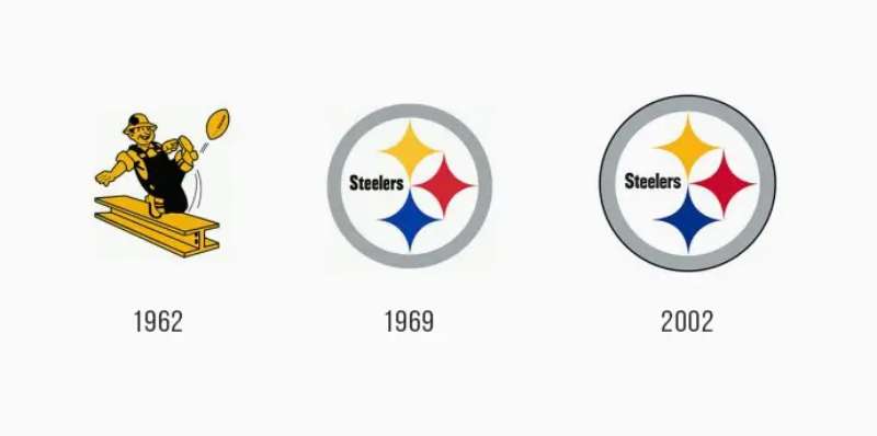
Back in the day – like, 1962 – the Steelers didn’t even have a logo on their helmets.
Wild, right?
They just rocked this plain gold helmet. But then, they were gifted this design by the American Iron and Steel Institute. It was a nod to the Steelmark logo.
Evolutionary Path
The logo caught on pretty quick. But did you know they initially slapped it on just one side of the helmet? Crazy, but it stuck. Now, it’s like their signature look.
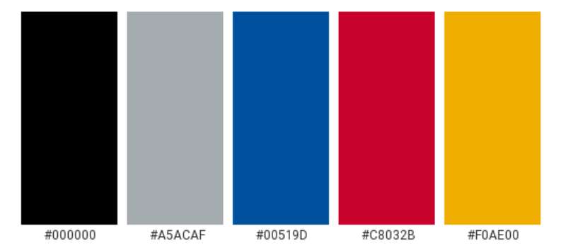
The Colors of the Pittsburgh Steelers Logo
Colors ain’t just colors. Not when it comes to branding.
Deep Dive into the Palette
- Black: Beyond being super sleek, black symbolizes strength, power, and determination. Qualities any football team would kill for.
- Gold: This color oozes warmth, illumination, and passion. A reflection of the city’s glowing spirit.
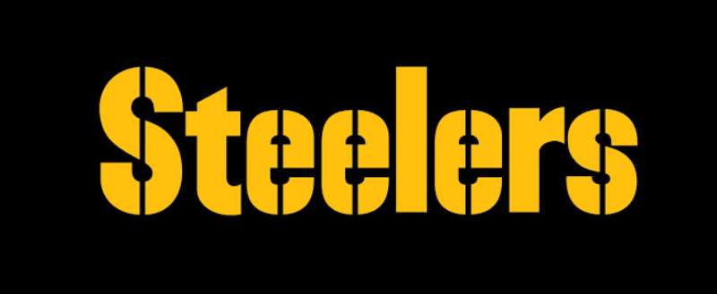
The Font Used in the Pittsburgh Steelers Logo
You might think, “It’s just letters.” But oh, friend, typography is an art.
Typeface Tells a Tale
The Steelers’ logo font is bold, assertive, and instantly recognizable. It’s got this modern touch but feels timeless, too. It’s kinda like how Pittsburgh is – a mix of history and modernity.
Symbols and Iconography
The Steelers’ logo isn’t the only symbol attached to this epic team.
The Terrible Towel
Not directly part of the logo, but still iconic. Waving that yellow towel? It’s like a badge of honor for fans.
Steel Beam Integration
There’s this idea floating around – integrating steel beams into the design. I mean, it’s pure Pittsburgh, right? Though not official, it resonates with the roots.
The Influence of the Pittsburgh Steelers Logo on Pop Culture
Beyond the gridiron, this logo’s made some waves.
Fashion and Merchandise
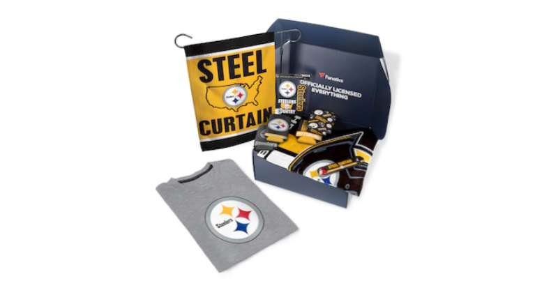
Snapback hats, jerseys, mugs, even tattoos – this logo’s everywhere. It’s not just merch. It’s a lifestyle.
In Movies and TV
Spotted the emblem in a film? Or maybe a TV show? You wouldn’t be the first. This logo has made its cameo in many places, subtly staking its claim in popular culture. It’s kind of the universe’s way of shouting out to Pittsburgh.
FAQ On The Pittsburgh Steelers Logo
What’s the history behind the Pittsburgh Steelers logo?
The Steelers logo is a badge of honor, steeped in the city’s industrial might. Its inception dates back to the 1950s, inspired by the Steelmark of the American Iron and Steel Institute: three hypocycloids emblematic of steel lightens your work, brightens your leisure, and widens your world. Pittsburgh adopted this, forging an identity reflective of its soul.
Why are there only three diamonds in the Steelers logo?
Those aren’t just any diamonds; they’re astute hypocycloids symbolic of the Steelmark’s triumvirate tenets: yellow for lightening work, orange to brighten leisure, and blue to widen the world.
The Steelers logo carries this trifecta, echoing Pittsburgh’s harmony with the steel industry, while also aligning with the team’s sturdy values.
Does the logo represent anything specific to Pittsburgh?
Absolutely. It’s a nod to the city’s proud steel industry heritage. Each hypocycloid, a meticulous detail, mirrors steel’s intrinsic properties, while collectively, they underscore Pittsburgh’s narrative of resilience and industry.
Donning garments bearing the Steelers emblem means carrying a piece of the steel city’s enduring legacy.
Have there been changes to the Steelers logo over the years?
Surprisingly minimal. A testament to timeless branding, the logo stands almost identical to its original form— a rarity in the ever-evolving NFL franchise imagery.
Its resilience captures the consistent excellence of the Steelers, serving as a steadfast symbol throughout generations of American football’s storied history.
Is the Pittsburgh Steelers logo trademarked?
Firmly so. The logo is not just a symbol but an asset, meticulously trademarked to safeguard its iconic status.
Official NFL apparel emblazoned with this crest isn’t merely fan attire; it’s an authenticated piece of the Steelers’ identity, protected vigorously against unsanctioned use in the domain of team merchandising.
Why does the Pittsburgh Steelers helmet only have the logo on one side?
An accidental quirk turned iconic tradition, the logo embellishes only one side of the helmet—a unique design choice stemming from a tentative 1962 testing.
Its striking singularity became a logo placement that added to Steeler’s visual character, distinguishing it within the NFL’s ensemble of helmet designs.
What do the colors of the Pittsburgh Steelers logo stand for?
Bound to the original Steelmark, the colors resonate with distinct meanings: yellow for innovation, orange for energy, and blue for corporate integrity.
The Steelers, in their adoption, have woven these hues into the fabric of their team ethos, channeling these pillars into their gameplay and community presence.
Can anyone use the Pittsburgh Steelers logo?
No, the logo is fiercely protected. Businesses and individuals must tread carefully—unauthorized use invites legal challenge.
Its utilization is meticulously regulated, geared towards maintaining the sanctity of a revered emblem, and ensuring that the Steelers brand remains uncompromised in its representation.
Are the Steelers the only NFL team with a logo on their helmet?
A solitary phenomenon. They stand unique with their asymmetrical aesthetic— a lone logo emblazoned upon a sea of gold.
It’s a quiet rebellion against the norm, a whisper of individuality that speaks volumes in the roaring stadiums where the drama of the NFL unfolds.
What’s the significance of the Steelers logo during Super Bowl events?
Come Super Bowl, the logo transcends branding. It becomes a battle standard, a visual rallying cry denoting high stakes and expectations.
Adorning jerseys, helmets, and the Terrible Towel, it signifies more than team spirit—it’s the embodiment of championship aspirations that Steelers Nation, and the Rooney Family, hold dear.
Conclusion
In the panorama of sports branding, the Pittsburgh Steelers logo stands as an unyielding beacon. It’s more than a mark—it’s an emblem that echoes from the steel forges of Pittsburgh to the spirited chants in Heinz Field.
- This journey through the Steelers’ visual saga has unveiled the emblem’s rich narrative and the tenacity that has solidified its place in the NFL.
- We’ve dissected its inception, celebrated its steady design, and grasped the weight it carries—both in Pittsburgh and across the realms of merchandise and fan culture.
The logo’s simplicity belies its complexity; its hypocycloids and steelmark allegiance—a masterclass in branding that resonates with loyalty, community, and the historical backbone of a city shaped by steel.
Concluding this odyssey, one realizes that donning a piece adorned with this symbol is to drape oneself in history—a story of excellence, identity, and above all, unbreakable pride.
If you liked this article about the Pittsburgh Steelers logo, you should check out this article about the Los Angeles Chargers logo.
There are also similar articles discussing the Minnesota Vikings logo, the San Francisco 49ers logo, the Seattle Seahawks logo, and the Chicago Bears logo.
And let’s not forget about articles on the New Orleans Saints logo, the Houston Texans logo, the New York Jets logo, and the Indianapolis Colts logo.
Bogdan Sandu, a seasoned designer with 15 years of diverse experience, has been designing websites since 2008.
Renowned for his expertise in logo design and visual branding, Bogdan has developed a multitude of logos for various clients.
His skills extend to creating posters, vector illustrations, business cards, and brochures. Additionally, Bogdan's UI kits were featured on marketplaces like Visual Hierarchy and UI8.
Latest posts by Bogdan Sandu (see all)
- The Bethesda Logo History, Colors, Font, And Meaning - 28 April 2024
- Out of This World: Space Color Palettes for Cosmic Designs - 28 April 2024
- The Bungie Logo History, Colors, Font, And Meaning - 27 April 2024