The Houston Texans logo stands as one of the most recognizable marks in professional football. It features a stylized bull head rendered in deep steel blue, battle red, and liberty white.
This logo entered the NFL landscape in 2002 when Houston received an expansion franchise. The team needed a visual identity that could compete with established NFL logos while honoring Texas heritage.
The current version remains unchanged since its introduction. NFL Properties worked with the franchise to develop the mark. Houston itself was founded in 1836, but the Texans organization began operations in 1999 with this being their only logo iteration.
What is the Houston Texans Logo?
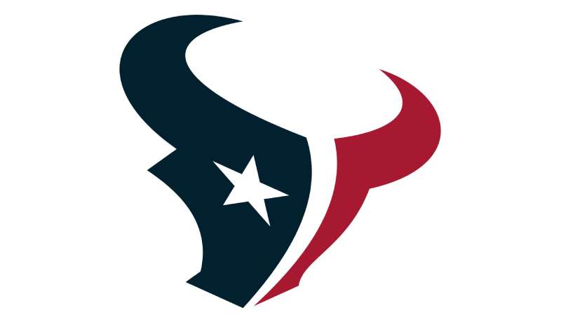
The Houston Texans logo is a stylized abstract bull head facing right, officially introduced on September 6, 2000. The design was created in collaboration with NFL Properties and symbolizes Texas strength, pride, and the state’s cattle ranching heritage.
Design Specifications
- Design Type: Abstract mascot-based emblem
- Primary Elements: Stylized bull head with integrated star shape, angular horns, aggressive eye detail
- Official Introduction Date: September 6, 2000 (team began play January 2002)
- Designer/Agency: NFL Properties in collaboration with Houston Texans ownership
- Trademark Status: Registered trademark of the Houston Texans and NFL
- Color Palette: Deep Steel Blue (#03202F), Battle Red (#A71930), Liberty White (#FFFFFF)
- Usage Context: Helmets, jerseys, merchandise, NRG Stadium signage, digital platforms, broadcast graphics
How Has the Houston Texans Logo Evolved Over Time?
The Houston Texans logo has not evolved at all. It represents a rare case of design stability in professional sports.
Since its 2000 unveiling, the franchise has maintained the identical mark. No redesigns. No tweaks. No modernization attempts.
This consistency sets them apart from teams that rebrand every decade or so.
Original Houston Texans Logo (2000-Present)
- Years Active: 2000 to present day
- Design Description: Abstract bull head with sharp angular lines, integrated five-pointed star within the profile, aggressive forward-facing stance
- Color Scheme: Deep Steel Blue as primary, Battle Red as secondary accent, Liberty White for highlights and details
- Designer: NFL Properties design team
- Context: Created for Houston’s NFL return after the Oilers relocated to Tennessee in 1997. The city desperately wanted football back.
- Key Changes from Previous: Not applicable. This is the franchise’s first and only logo.
- Cultural Significance: Represents Houston’s resilience and determination to remain an NFL city. The bull imagery connects to Texas ranching culture while avoiding confusion with the relocated Oilers brand.
What Do the Design Elements of the Houston Texans Logo Mean?
The bull head represents Texas strength and the state’s ranching heritage. Every angle in this design was intentional.
The forward-facing direction suggests aggression and forward momentum. That star embedded in the profile? Pure Texas pride, plain and simple.
Why Did the Houston Texans Choose These Specific Colors?
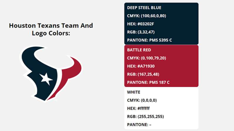
The team’s color palette carries specific meaning. Deep Steel Blue references Houston’s industrial economy and energy sector dominance.
Battle Red brings aggression and passion. It connects to the competitive fire expected from any NFL franchise.
Liberty White completes the patriotic trio. Together, these colors create an American feel that resonates with fans.
- Deep Steel Blue (#03202F): Industrial strength, Houston’s energy sector, trustworthiness, stability
- Battle Red (#A71930): Aggression, passion, competitive intensity, Texas pride
- Liberty White (#FFFFFF): Purity, patriotism, clean contrast, American identity
The color psychology here works on multiple levels. Red demands attention. Blue builds trust. White keeps everything readable.
What Typography Style Is Used in the Houston Texans Logo?

The wordmark uses a custom sans-serif font with sharp angular characteristics. It matches the aggressive geometry of the bull head.
The letters feature pointed terminals and thick strokes. This creates consistency between symbol and text.
Readability stays strong at any size. The typography works on everything from stadium signage to mobile screens.
What Are the Hidden Meanings in the Houston Texans Logo?
Look closely at the bull’s profile. There’s a five-pointed star integrated into the design.
This represents Texas, the Lone Star State. It’s subtle enough that some fans miss it entirely.
The bull’s eye appears almost flame-like. Some interpret this as a nod to Houston’s energy industry. Whether intentional or not, it works.
How Does the Houston Texans Logo Compare to Competitor Logos?
Within the AFC South, the Texans logo holds its own. The Jacksonville Jaguars logo also uses an animal mascot but with a more literal interpretation.
The Indianapolis Colts logo takes a completely different approach with its simple horseshoe mark.
Compared to the Dallas Cowboys logo (the other Texas NFL team), the Texans chose complexity over simplicity. Dallas uses a single star. Houston went with an entire bull head containing a star.
Both approaches work, honestly. The Cowboys star is more versatile. The Texans bull is more distinctive.
What Are the Technical Specifications of the Houston Texans Logo?
Official Color Codes
- Deep Steel Blue
- Hex: #03202F
- RGB: (3, 32, 47)
- CMYK: (100, 57, 35, 67)
- Pantone: 289 C
- Battle Red
- Hex: #A71930
- RGB: (167, 25, 48)
- CMYK: (19, 100, 79, 10)
- Pantone: 187 C
- Liberty White
- Hex: #FFFFFF
- RGB: (255, 255, 255)
- CMYK: (0, 0, 0, 0)
Dimensions and Proportions
- Aspect Ratio: Approximately 1.2:1 (width to height)
- Minimum Size: 0.5 inches for print applications
- Clear Space: Minimum padding equal to the height of the star element on all sides
- File Formats Available: Vector graphics (AI, EPS, SVG), JPEG, PNG with transparency
What Cultural Impact Has the Houston Texans Logo Had?
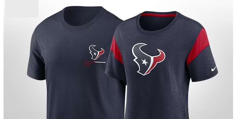
The logo gave Houston its football identity back. After losing the Oilers, the city needed something new.
Fans embraced the bull immediately. It represented a fresh start, not a continuation of the past.
The Battle Red has become iconic at NRG Stadium. Home games feature seas of red that television broadcasts capture beautifully.
Merchandise sales consistently rank in the top half of NFL teams. That bull head moves product.
How Does the Houston Texans Logo Fit Into the Overall Brand Identity?
The logo anchors everything. Jersey designs build around it. Stadium architecture references its angular shapes.
Marketing materials maintain strict adherence to brand guidelines. The three-color palette appears across all touchpoints.
Even the team’s mascot, Toro, reflects the logo’s bull imagery. Secondary marks and wordmarks complement rather than compete with the primary logo.
The visual hierarchy keeps the bull head dominant in all applications.
How Should the Houston Texans Logo Be Used?
Official Usage Guidelines
- Do: Maintain original proportions when scaling
- Do: Use official color values only
- Do: Preserve required clear space around the logo
- Do: Download assets from official NFL or team sources
- Don’t: Rotate, stretch, or distort the logo
- Don’t: Add effects like shadows, gradients, or outlines
- Don’t: Place on busy backgrounds that reduce readability
- Don’t: Recreate or modify the design elements
Accessing Official Logos
Media outlets can request assets through NFL Media. Licensed vendors receive files through NFL Properties.
Fans should purchase only officially licensed merchandise. The logo is a registered trademark with full legal protection.
Unauthorized commercial use will result in legal action. The NFL actively protects team intellectual property.
FAQ on The Houston Texans Logo
What Does the Houston Texans Logo Represent?
The bull head symbol represents Texas strength and the state’s cattle ranching heritage.
The embedded star honors the Lone Star State. Together, these elements create a team visual identity that connects Houston football to Texas pride and regional culture.
When Was the Houston Texans Logo Created?
The franchise unveiled the logo on September 6, 2000. This was nearly two years before the team’s first NFL game.
Houston needed time to build brand identity and sell merchandise. The early reveal helped generate excitement for the expansion team.
Who Designed the Houston Texans Logo?
NFL Properties created the design in collaboration with team ownership. No individual designer has been publicly credited.
This is common for professional sports branding. The logo design principles followed league standards while capturing Houston’s character.
What Are the Official Houston Texans Team Colors?
Deep Steel Blue, Battle Red, and Liberty White make up the official palette.
These choices reflect color theory basics. The combination creates strong contrast while maintaining a patriotic American football aesthetic that resonates with fans.
Has the Houston Texans Logo Ever Changed?
No. The franchise has used the same logo since 2000.
This makes them unusual in professional football. Most NFL teams have undergone at least minor updates. The Texans’ logo evolution simply doesn’t exist.
What Is the Hidden Star in the Houston Texans Logo?
Look at the bull’s profile carefully. A five-pointed star shape is integrated into the design.
It’s subtle. The psychology of shapes here reinforces Texas identity without being obvious. Many fans never notice it.
Where Can I Download the Official Houston Texans Logo?
Media professionals can request files through NFL Media services. Licensed vendors receive assets from NFL Properties.
Fans should avoid unofficial sources. The team trademark requires proper licensing for any commercial use.
Can I Use the Houston Texans Logo for My Business?
Not without permission. The logo is a registered trademark.
The NFL actively protects team intellectual property. Unauthorized commercial use results in legal action. Personal, non-commercial fan use falls into a gray area.
Why Did Houston Choose a Bull Instead of Keeping Oilers Branding?
The Oilers brand belonged to Tennessee after the 1997 relocation.
Houston needed something fresh. The Texas bull symbol connected to state heritage while creating distance from the painful Oilers departure. It worked.
What Font Does the Houston Texans Wordmark Use?
The team uses a custom typeface with angular characteristics.
Sharp terminals match the bull head’s aggressive geometry. The font psychology communicates strength and intensity, fitting for an NFL franchise identity.
Conclusion
The Houston Texans logo stands as a case study in sports branding done right. No redesigns. No second-guessing. Just one solid mark that has represented the franchise since day one.
That stylized bull head with its hidden star captures Texas identity perfectly.
The deep steel blue and battle red complementary color scheme creates instant recognition at NRG Stadium and on NFL broadcasts.
For an expansion team that needed to establish credibility fast, this football helmet logo delivered. It gave Houston fans something to rally behind after losing the Oilers.
Twenty-plus years later, the team emblem remains unchanged. That says everything.

Renowned for his expertise in logo design and visual branding, Bogdan has developed a multitude of logos for various clients.
His skills extend to creating posters, vector illustrations, business cards, and brochures. Additionally, Bogdan's UI kits were featured on marketplaces like Visual Hierarchy and UI8.
He also wrote in the past years on sites like Design Your Way, WebDesignerDepot, WPDean, Designmodo, Speckyboy, Slider Revolution, and more.
- Minecraft Font Generator - 8 October 2026
- How Top Meta Ad Creative Is Designed for E-commerce Brands - 8 October 2026
- How photo recovery software works and when to use it - 7 October 2026

Bogdan Sandu is a seasoned designer who has been designing websites since 2008. Renowned for his expertise in logo design and visual branding, Bogdan has developed a multitude of logos for various clients. His skills extend to creating posters, vector illustrations, business cards, and brochures. Additionally, Bogdan's UI kits were featured on marketplaces like Visual Hierarchy and UI8. He also wrote in the past years on sites like Design Your Way, WebDesignerDepot, WPDean, Designmodo, Speckyboy, Slider Revolution, and more.
You Might Also Like