The Jacksonville Jaguars logo stands as one of the more distinctive marks in professional football. A snarling jaguar head rendered in teal, black, and gold. It captures aggression and regional identity in a single image.
When the NFL awarded Jacksonville an expansion franchise in 1993, the team needed a visual identity from scratch. The current primary logo debuted in 2013 after a major rebrand under owner Shad Khan. That redesign marked only the second significant overhaul in franchise history.
The Jaguars organization launched in 1995 alongside the Carolina Panthers. Since then, the team has cycled through three primary logo versions. Each iteration refined the jaguar imagery while maintaining the core teal color that defines the franchise.
What is the Jacksonville Jaguars Logo?
![]()
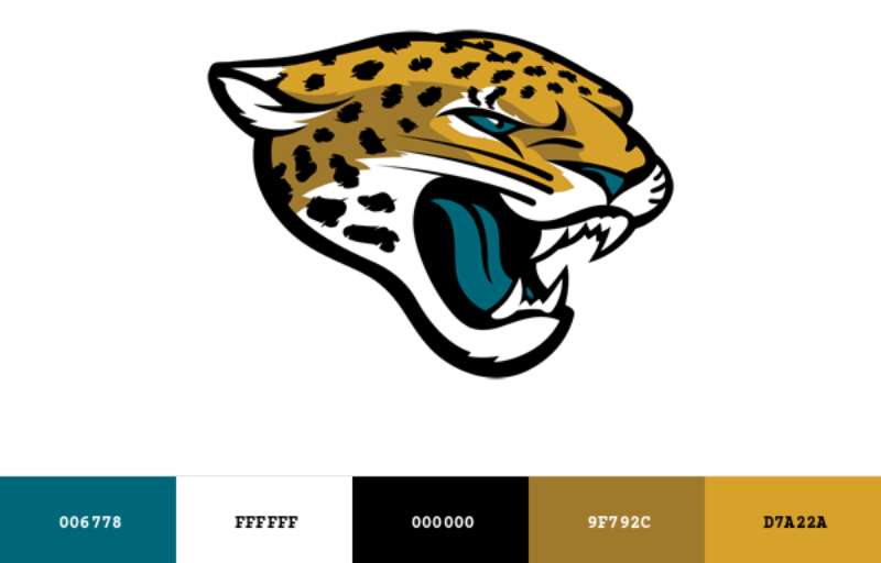
The Jacksonville Jaguars logo features a fierce jaguar head facing left with an open mouth displaying sharp teeth. Introduced in 2013, the mark was created as part of a complete brand overhaul by Nike. It symbolizes power, speed, and the predatory nature of the big cat native to the Americas.
Key attributes of the current logo:
- Design Type: Mascot-based primary mark with combination wordmark
- Primary Elements: Stylized jaguar head profile, exposed fangs, angular linework
- Official Introduction Date: April 2013
- Designer/Agency: Nike in collaboration with the Jaguars organization
- Trademark Status: Registered trademark of the Jacksonville Jaguars, LLC
- Color Palette: Teal (#006778), Black (#101820), Gold (#9F792C)
- Usage Context: Helmets, uniforms, merchandise, stadium signage, digital platforms, broadcast graphics
How Has the Jacksonville Jaguars Logo Evolved Over Time?
![]()
The Jaguars have undergone two major logo redesigns since entering the league in 1995.
The original leaping jaguar gave way to a more aggressive head-focused design.
Each change reflected shifting trends in professional football branding and new ownership priorities.
Original Jacksonville Jaguars Logo (1995-2012)
- Years Active: 1995-2012
- Design Description: A full-body leaping jaguar in mid-pounce, facing right with claws extended. The cat appeared ready to strike, with spotted fur details and a gold tongue.
- Color Scheme: Teal, gold, black, and white accents
- Designer: NFL Properties design team
- Context: Created for the expansion franchise launch. The leaping pose conveyed athleticism and energy appropriate for a new NFL team.
- Key Changes from Previous: N/A (original mark)
- Cultural Significance: Represented Jacksonville’s arrival on the national sports stage. The spotted jaguar became synonymous with the late-90s playoff runs.
Transitional Jacksonville Jaguars Logo (2009-2012)
- Years Active: 2009-2012
- Design Description: A modified version retaining the leaping jaguar but with updated proportions and cleaner lines
- Color Scheme: Same teal, gold, and black palette
- Designer: Internal Jaguars design staff
- Context: A subtle refresh while the team explored more dramatic changes
- Key Changes from Previous: Streamlined fur details, adjusted muscle definition
- Cultural Significance: Bridge between the classic and modern eras of Jaguars branding
Current Jacksonville Jaguars Logo (2013-Present)
- Years Active: 2013-present
- Design Description: An angular jaguar head in profile with exposed fangs, sharp geometric lines, and an aggressive expression
- Color Scheme: Teal, black, gold (with two-tone gold helmet introduced in 2013, later modified)
- Designer: Nike NFL Design Team
- Context: New owner Shad Khan wanted a complete rebrand. Nike had just taken over as the league’s uniform supplier.
- Key Changes from Previous: Shifted from full-body to head-only design. Removed spots. Added sharper angles throughout.
- Cultural Significance: Signaled a new era under Khan’s ownership. The aggressive styling matched broader NFL trends toward fiercer imagery.
What Do the Design Elements of the Jacksonville Jaguars Logo Mean?
The jaguar head communicates predatory instinct and athletic dominance.
Every angle and line serves a purpose.
The open mouth suggests a battle cry, while the forward-facing eye maintains focus on prey (or opponents).
Why Did Jacksonville Choose These Specific Colors?
Teal distinguishes the Jaguars from every other NFL franchise. No other team uses this specific hue as a primary color.
It references the waters surrounding Jacksonville, from the St. Johns River to the Atlantic coast.
- Teal: Hex #006778, Pantone 3155 C. Represents regional waterways and Florida wildlife. Creates calm authority balanced with uniqueness.
- Black: Hex #101820, Pantone Black 6 C. Adds power and sophistication. Grounds the brighter teal.
- Gold: Hex #9F792C, Pantone 874 C. Conveys excellence and championship aspirations. Many brands use gold tones to signal prestige.
The psychological impact of these colors works together. Teal feels fresh and distinctive. Black brings intensity. Gold adds aspiration.
What Typography Style Is Used in the Jacksonville Jaguars Logo?
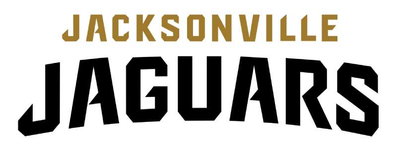
The Jaguars wordmark uses a custom sans-serif typeface with sharp, angular terminals.
The letters feature pointed edges that mirror the jaguar’s teeth and claws.
Readability stays high even at small sizes due to generous letter spacing.
The type treatment evolved from a more traditional block style in 1995 to the current aggressive custom lettering.
What Are the Hidden Meanings in the Jacksonville Jaguars Logo?
Look closely at the jaguar’s eye. The angular shape creates an intense, focused stare.
Some fans see a “J” shape formed by the negative space around the ear. (The team has never confirmed this was intentional.)
The gold tongue and teeth create a visual focal point drawing attention to the center.
Designer intentions centered on forward motion and aggression rather than hidden imagery.
How Does the Jacksonville Jaguars Logo Compare to Competitor Logos?
Among NFL cat logos, the Jaguars take the fiercest approach.
The Carolina Panthers emblem uses a sleeker, more stylized panther.
Detroit and Cincinnati feature their cats in different poses with distinct personalities.
Jacksonville’s head-on snarl stands out as the most directly aggressive of the bunch. The angular treatment also feels more modern than the Panthers’ curved lines or the Bengals’ traditional striping.
Within the AFC South, the Jaguars logo contrasts sharply with the Texans’ bull, the Colts’ horseshoe, and the Titans’ flaming thumbtack (as fans call it). Only Jacksonville uses an animal head as its primary mark in the division.
What Are the Technical Specifications of the Jacksonville Jaguars Logo?
Official Color Codes:
- Teal (Primary): Hex #006778, RGB values (0, 103, 120), CMYK values (100, 14, 0, 53), Pantone 3155 C
- Black (Secondary): Hex #101820, RGB (16, 24, 32), CMYK (50, 25, 0, 87), Pantone Black 6 C
- Gold (Accent): Hex #9F792C, RGB (159, 121, 44), CMYK (0, 24, 72, 38), Pantone 874 C
Dimensions and Proportions:
- Aspect Ratio: Primary logo approximately 1:1 (square safe zone)
- Minimum Size: 0.5 inches for print, 50 pixels for digital
- Clear Space: Minimum padding equal to the height of the “J” in the wordmark on all sides
- File Formats: Available in vector format (AI, EPS, SVG) and raster (PNG, JPG)
What Cultural Impact Has the Jacksonville Jaguars Logo Had?
The Jaguars logo helped establish Jacksonville as a legitimate NFL city.
Before 1995, many questioned whether the market could support professional football.
That teal jaguar became a symbol of civic pride.
The 2013 rebrand sparked heated debate among fans. Some loved the aggressive update. Others missed the leaping jaguar from their childhood. The gold helmets especially divided opinion (the team eventually revised them).
How Does the Jacksonville Jaguars Logo Fit Into the Overall Brand Identity?
The logo anchors a complete visual system.
The official brand standards dictate how every piece of Jaguars media should look.
From stadium signage to social posts, the jaguar head maintains consistency.
Secondary marks include a prowling jaguar silhouette and the “Jags” abbreviated wordmark. The shield-shaped alternate logo appears on merchandise. Everything connects through the teal, black, and gold color system.
How Should the Jacksonville Jaguars Logo Be Used?
Official Usage Guidelines:
- Do: Maintain clear space around the logo. Use approved color combinations. Scale proportionally.
- Don’t: Stretch or distort the logo. Place on busy backgrounds without contrast. Alter colors outside approved palettes.
- Access: Official logos available through NFL Media and the Jaguars press portal for credentialed media
- Licensing: Commercial use requires NFL licensing agreement. Fan art exists in a gray area.
- Trademark: The logo and all variations are protected intellectual property of the Jacksonville Jaguars and NFL
For merchandise and commercial purposes, all usage must go through NFL Properties licensing. The league strictly enforces trademark protection across all 32 teams.
FAQ on The Jacksonville Jaguars Logo
What Do the Jacksonville Jaguars Logo Colors Mean?
The teal and black color scheme connects to Jacksonville’s coastal identity.
Teal represents the St. Johns River and Atlantic waters. Black adds intensity. Gold signals championship aspirations.
This Florida football team chose colors no other NFL franchise uses.
When Was the Current Jacksonville Jaguars Logo Created?
The current jaguar head symbol launched in April 2013.
Owner Shad Khan commissioned a complete rebrand after purchasing the team. Nike handled the redesign alongside their NFL uniform takeover.
The original leaping jaguar icon served the franchise from 1995 to 2012.
Who Designed the Jacksonville Jaguars Logo?
Nike’s NFL design team created the 2013 version in partnership with the Jaguars organization.
The original 1995 logo came from NFL Properties designers working on expansion team branding.
Neither project credits a single named designer publicly.
How Many Times Has the Jaguars Logo Changed?
The franchise has used three primary logo versions since the NFL expansion in 1995.
A minor refresh happened in 2009. The major overhaul came in 2013.
That logo evolution timeline shows increasingly aggressive team mascot imagery with each update.
What Font Does the Jacksonville Jaguars Logo Use?
The Jaguars use a custom typeface designed specifically for the brand.
Sharp, angular terminals mirror the jaguar’s teeth. The letterforms feature pointed edges throughout.
You won’t find this exact font available for download anywhere.
Can I Use the Jacksonville Jaguars Logo for Personal Projects?
Fan art exists in a gray area. The NFL strictly protects all trademark sports logos.
Commercial use requires licensing through NFL Properties. Personal, non-commercial use rarely gets pursued legally.
Always check official team merchandise guidelines first.
Where Can I Download the Official Jaguars Logo?
Credentialed media can access high resolution logo files through the Jaguars press portal.
The NFL Media site offers official assets for approved partners. Fan sites often host unofficial versions.
For print projects, you need proper licensing.
Why Did the Jaguars Change Their Logo in 2013?
Shad Khan wanted a fresh start after buying the AFC South franchise.
The old leaping jaguar felt dated compared to modern NFL team branding trends. Nike’s league-wide uniform redesign provided the perfect opportunity.
EverBank Stadium also got updated signage.
What Does the Jaguar Symbolize in the Logo?
The jaguar represents power, speed, and predatory dominance.
It’s the only big cat native to the Americas still found in the wild. The angular shapes communicate aggression and forward momentum.
That snarl says this team came to compete.
Is the Jacksonville Jaguars Logo Trademarked?
Yes. The logo and all variations are registered trademarks of Jacksonville Jaguars, LLC and the National Football League.
This includes the primary mark, wordmark, and alternate logos.
Unauthorized commercial use can result in legal action from NFL Properties.
Conclusion
The Jacksonville Jaguars logo tells the story of a franchise finding its identity. From the 1995 leaping cat to today’s fierce head design, each version reflects where the team stands.
That teal and gold combination remains unique across all 32 NFL teams.
Strong logo design principles show throughout. The angular lines create visual emphasis on aggression and speed.
Whether you’re a Duval County native or a casual fan, this emblem captures what professional football branding should do. It makes you feel something.
The snarling jaguar isn’t just a helmet decal. It’s Jacksonville’s statement to the league.
Renowned for his expertise in logo design and visual branding, Bogdan has developed a multitude of logos for various clients.
His skills extend to creating posters, vector illustrations, business cards, and brochures. Additionally, Bogdan's UI kits were featured on marketplaces like Visual Hierarchy and UI8.
He also wrote in the past years on sites like Design Your Way, WebDesignerDepot, WPDean, Designmodo, Speckyboy, Slider Revolution, and more.
- The Best Fonts for Real Estate Branding and Marketing - 15 July 2026
- Hosting in the USA: How to Choose Dedicated Servers for the North American Market - 15 July 2026
- NHL Team Color Codes - 14 July 2026
Bogdan Sandu is a seasoned designer who has been designing websites since 2008. Renowned for his expertise in logo design and visual branding, Bogdan has developed a multitude of logos for various clients. His skills extend to creating posters, vector illustrations, business cards, and brochures. Additionally, Bogdan's UI kits were featured on marketplaces like Visual Hierarchy and UI8. He also wrote in the past years on sites like Design Your Way, WebDesignerDepot, WPDean, Designmodo, Speckyboy, Slider Revolution, and more.