The New Orleans Saints logo stands as one of the most recognizable symbols in professional football. It features a gold fleur-de-lis on a black background, representing the team’s deep connection to Louisiana’s French heritage and the city of New Orleans itself.
Within NFL logos, the Saints emblem holds a unique position. Most teams use animal mascots or aggressive imagery. The Saints went a completely different direction.
The current logo has remained virtually unchanged since the franchise’s founding in 1967. That’s nearly six decades of brand consistency. The original designer remains unconfirmed, though the symbol was chosen to honor New Orleans’ French Catholic roots.
The team itself was established on November 1, 1966 (All Saints’ Day, hence the name). Only minor refinements have touched the logo since then, making it one of the most stable visual identities in professional sports.
What is the New Orleans Saints Logo?
The New Orleans Saints logo is a stylized gold fleur-de-lis symbol, officially adopted when the franchise launched in 1967. It represents French heritage, the city’s Catholic traditions, and Louisiana’s historical connection to France. The design functions as both a cultural emblem and sports brand identifier.
Design Specifications
- Design Type: Symbol/icon (no wordmark in primary logo)
- Primary Elements: Fleur-de-lis, a stylized lily flower motif
- Official Introduction Date: 1967
- Designer/Agency: Unconfirmed, likely internal NFL design team
- Trademark Status: Registered trademark of the New Orleans Saints and NFL Properties
- Color Palette: Old Gold (#D3BC8D), Black (#101820), White (#FFFFFF)
- Usage Context: Helmets, jerseys, merchandise, stadium signage, digital platforms, marketing materials
How Has the New Orleans Saints Logo Evolved Over Time?
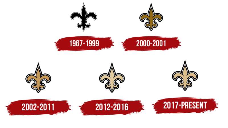
The Saints logo has barely changed since 1967. This makes it an outlier among professional sports franchises.
Most NFL teams have gone through three, four, or even five major redesigns. The Saints? They stuck with what worked.
Minor color adjustments happened over the decades. The gold shade shifted slightly. But the core fleur-de-lis shape remained identical.
Original New Orleans Saints Logo (1967-1999)
- Years Active: 1967-1999
- Design Description: Gold fleur-de-lis with slightly muted coloring
- Color Scheme: Vegas Gold, Black, White
- Designer: Unknown
- Context: Introduced when the NFL awarded New Orleans an expansion franchise
- Key Changes from Previous: N/A (original design)
- Cultural Significance: Connected professional football to New Orleans’ unique cultural identity
Refined New Orleans Saints Logo (2000-2001)
- Years Active: 2000-2001
- Design Description: Slightly adjusted proportions, cleaner edges
- Color Scheme: Brighter gold introduced
- Designer: NFL Properties design team
- Context: League-wide modernization effort
- Key Changes from Previous: Sharper lines, more defined shape
- Cultural Significance: Maintained tradition while updating for modern reproduction
Current New Orleans Saints Logo (2002-Present)
- Years Active: 2002-Present
- Design Description: Refined fleur-de-lis with current Old Gold shade
- Color Scheme: Old Gold (#D3BC8D), Black (#101820)
- Designer: NFL Properties
- Context: Final refinement establishing current brand standards
- Key Changes from Previous: Standardized color values, optimized for digital media
- Cultural Significance: Became symbol of city resilience, especially post-Hurricane Katrina
What Do the Design Elements of the New Orleans Saints Logo Mean?
The fleur-de-lis carries centuries of meaning. It’s not just a pretty shape.
This symbol connects to French royalty, Catholic spirituality, and Louisiana’s colonial past. All packed into one clean graphic.
The Saints organization chose it deliberately to honor New Orleans’ unique cultural position in America.
What Does the Fleur-de-Lis Symbol Represent?
The fleur-de-lis means “flower of the lily” in French. It served as a royal emblem for French monarchs for centuries.
Louisiana was French territory until 1803. The symbol appears throughout New Orleans architecture, flags, and civic emblems.
For the Saints, it represents local pride and historical roots that run deeper than football.
Why Did the New Orleans Saints Choose These Specific Colors?
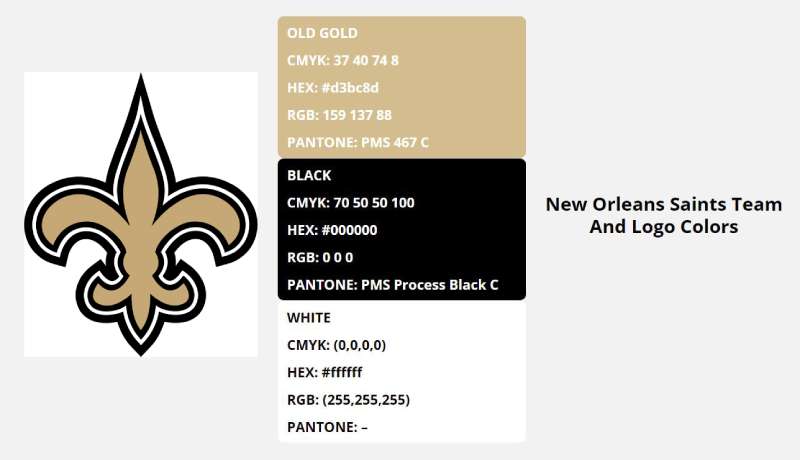
Understanding the psychology behind color choices reveals why the Saints selected their specific palette.
- Old Gold (#D3BC8D)
- Symbolic meaning: Royalty, excellence, achievement
- Psychological impact: Creates feelings of prestige and tradition
- Brand connection: Ties to French royal heritage and fleur-de-lis history
- Black (#101820)
- Symbolic meaning: Power, sophistication, strength
- Psychological impact: Commands authority and respect
- Brand connection: Provides strong contrast, common among brands using black in their logos
- White (#FFFFFF)
- Symbolic meaning: Purity, spirituality (fitting for “Saints”)
- Psychological impact: Clean, accessible
- Brand connection: Accent color for versatility
What Typography Style Is Used in the New Orleans Saints Logo?
The primary Saints logo contains no typography. It’s purely symbolic. That’s actually pretty rare for professional sports.
When text appears in secondary marks, the team uses custom block lettering. Bold, strong, readable from stadium distances.
The wordmark “SAINTS” appears in a modified sans-serif style on merchandise and promotional materials.
What Are the Hidden Meanings in the New Orleans Saints Logo?
Some fans see religious imagery in the fleur-de-lis shape. The three petals supposedly represent the Holy Trinity.
Others point to the lily’s association with the Virgin Mary in Catholic tradition. The team name “Saints” reinforces this connection.
Whether intentional or not, these layers add depth to what seems like a simple design.
How Does the New Orleans Saints Logo Compare to Competitor Logos?
Most NFL teams feature aggressive animals or fierce characters. The Saints stand apart with their elegant, historically-rooted symbol.
NFC South rivals take completely different approaches. The Atlanta Falcons logo shows a stylized bird. The Carolina Panthers logo features a snarling cat. The Tampa Bay Buccaneers logo displays a pirate flag.
The Saints fleur-de-lis communicates differently. It suggests heritage and class rather than intimidation.
Among all brands featuring gold in their logos, the Saints logo demonstrates how the color conveys prestige without appearing flashy.
What Are the Technical Specifications of the New Orleans Saints Logo?
Official Color Codes
- Old Gold (Primary)
- Hex: #D3BC8D
- RGB: (211, 188, 141)
- CMYK: (16, 21, 47, 0)
- Pantone: PMS 7503 C
- Black (Secondary)
- Hex: #101820
- RGB: (16, 24, 32)
- CMYK: (100, 90, 60, 60)
- Pantone: PMS Black 6 C
- White (Accent)
- Hex: #FFFFFF
- RGB: (255, 255, 255)
- CMYK: (0, 0, 0, 0)
Dimensions and Proportions
- Aspect Ratio: Approximately 1:1.15 (height to width)
- Minimum Size: 0.5 inches for print, 50 pixels for digital
- Clear Space: Minimum padding equal to 25% of logo height on all sides
- File Formats: Available in vector formats (AI, EPS, SVG) and raster formats (PNG, JPG)
What Cultural Impact Has the New Orleans Saints Logo Had?
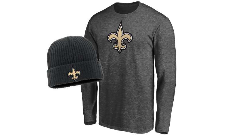
After Hurricane Katrina in 2005, the fleur-de-lis became more than a sports logo. It transformed into a symbol of city resilience and community identity.
People got it tattooed. They painted it on rebuilt homes. The symbol unified a devastated population.
When the Saints won Super Bowl XLIV in 2010, the logo represented recovery and triumph. It was bigger than football at that point.
How Does the New Orleans Saints Logo Fit Into the Overall Brand Identity?
The logo anchors everything the Saints organization does visually. Merchandise, stadium design, digital presence, marketing campaigns. All flow from that single fleur-de-lis.
The Caesars Superdome features the symbol prominently. Player uniforms display it on helmets. Every touchpoint reinforces brand recognition.
The “Who Dat” slogan pairs with the logo to create a complete brand ecosystem that fans connect with emotionally.
How Should the New Orleans Saints Logo Be Used?
Official Usage Guidelines
- Do: Maintain proper color values and proportions
- Do: Use official files from NFL Properties
- Do: Respect minimum clear space requirements
- Don’t: Alter colors or add effects
- Don’t: Stretch, rotate, or distort the symbol
- Don’t: Place on busy backgrounds that reduce visibility
Accessing Official Logos
Licensed vendors receive official assets through NFL Properties. The team website offers limited downloads for personal use.
Commercial use requires licensing agreements. The NFL strictly enforces trademark protection across all 32 teams.
Following proper brand guidelines matters when working with any professional sports identity.
FAQ on The New Orleans Saints Logo
What Does the New Orleans Saints Logo Look Like?
The Saints logo features a gold fleur-de-lis symbol on a black background. Simple. Elegant.
Unlike most NFL team logos, it contains no text or mascot imagery. Just the iconic French lily shape that represents Louisiana’s heritage and the city of New Orleans.
When Was the New Orleans Saints Logo Created?
The National Football League granted New Orleans a franchise on November 1, 1966. The logo debuted the following year when the team started playing.
That means the Saints logo design has represented the franchise for nearly six decades. Few professional sports emblems last that long unchanged.
Who Designed the Original New Orleans Saints Logo?
The original designer remains unconfirmed. NFL Properties likely handled the initial logo development internally.
What we know: the team chose the fleur-de-lis deliberately. It wasn’t random. The symbol already appeared throughout New Orleans on flags, buildings, and civic emblems.
What Does the Fleur-de-Lis Mean in the Saints Logo?
The fleur-de-lis translates to “flower of the lily” in French. It served French royalty for centuries.
Louisiana was French territory until 1803. The symbol honors that French heritage and connects the football team to deeper cultural roots in the Gulf Coast region.
What Are the Official Colors of the New Orleans Saints Logo?
Old Gold and Black. That’s the core color palette.
The specific Old Gold shade uses hex code #D3BC8D. Black is #101820. White (#FFFFFF) serves as an accent on uniforms and Saints merchandise.
These black and gold colors create strong contrast and instant recognition.
Has the New Orleans Saints Logo Ever Changed?
Barely. The Saints logo evolution is remarkably minimal compared to other professional logos.
Minor refinements happened around 2000 and 2002. Slightly sharper edges. Adjusted gold tones. But the fundamental fleur-de-lis shape? Identical since 1967.
Why Did the Saints Choose the Fleur-de-Lis as Their Logo?
Location and timing. The franchise was announced on All Saints’ Day, giving the team its name.
The fleur-de-lis already symbolized New Orleans everywhere. Using it connected the Louisiana football team to local identity instantly. Smart branding before branding was even a buzzword.
Where Can I Download the Official New Orleans Saints Logo?
The team website offers limited downloads for personal use. Commercial applications require licensing through NFL Properties.
Licensed vendors receive official assets in multiple formats. The league protects its trademarks strictly, so using unofficial versions for business purposes creates legal risk.
What Is the Saints Logo Called?
Most people just call it the Saints fleur-de-lis. Or simply “the fleur-de-lis.”
There’s no fancy official name. The team identity graphics include this primary mark plus secondary wordmarks, but the symbol itself needs no elaborate title. Everyone recognizes it.
How Is the New Orleans Saints Logo Used on Merchandise?
The fleur-de-lis appears on everything. Helmets. Jerseys. Hats. Flags.
The Caesars Superdome displays it prominently. The Who Dat fanbase wears it proudly. From official Saints apparel to stadium signage, the logo anchors the entire visual brand identity.
Conclusion
The New Orleans Saints logo proves that simplicity works. Nearly six decades without a major redesign says everything.
That gold fleur-de-lis connects the NFL franchise to Louisiana history, Catholic tradition, and the Who Dat nation’s fierce loyalty.
After Super Bowl XLIV and the post-Katrina recovery, this symbol meant more than football. It represented an entire city’s resilience.
The Saints helmet design remains instantly recognizable across the NFC South and beyond. No mascot needed. No wordmark required.
Sometimes the best logo design principles come down to one thing: knowing what to leave out.

Renowned for his expertise in logo design and visual branding, Bogdan has developed a multitude of logos for various clients.
His skills extend to creating posters, vector illustrations, business cards, and brochures. Additionally, Bogdan's UI kits were featured on marketplaces like Visual Hierarchy and UI8.
He also wrote in the past years on sites like Design Your Way, WebDesignerDepot, WPDean, Designmodo, Speckyboy, Slider Revolution, and more.
- Canva vs PowerPoint: Which Is Better for Presentations? - 22 September 2026
- How to Install Fonts on Mac (Step-by-Step Guide) - 20 September 2026
- From Mockup to Code: How AI-Augmented Development Speeds Up the Design Handoff - 19 September 2026

Bogdan Sandu is a seasoned designer who has been designing websites since 2008. Renowned for his expertise in logo design and visual branding, Bogdan has developed a multitude of logos for various clients. His skills extend to creating posters, vector illustrations, business cards, and brochures. Additionally, Bogdan's UI kits were featured on marketplaces like Visual Hierarchy and UI8. He also wrote in the past years on sites like Design Your Way, WebDesignerDepot, WPDean, Designmodo, Speckyboy, Slider Revolution, and more.
You Might Also Like