The San Francisco 49ers logo stands as one of the most recognized symbols in professional football. It features a distinctive red oval shape with “SF” lettering that has represented the franchise since 1968.
Among NFL logos, the 49ers emblem holds a unique position. It connects directly to California’s Gold Rush history while maintaining a clean, modern appearance.
The current version has remained largely unchanged for over five decades. Only minor refinements have occurred since its introduction. The team was founded in 1946, and this marks the fourth major logo iteration in franchise history.
What Is the San Francisco 49ers Logo?
The San Francisco 49ers logo is a red oval emblem containing the letters “SF” in white with gold trim, officially introduced in 1968. The design symbolizes San Francisco’s connection to the 1849 Gold Rush prospectors who shaped California’s identity.
Design Specifications
- Design Type: Combination mark (letterform within emblem)
- Primary Elements: Oval shape, interlocking “SF” letters, pointed edges
- Official Introduction Date: 1968
- Designer/Agency: Not publicly attributed to a specific designer
- Trademark Status: Registered trademark of the San Francisco 49ers and NFL Properties
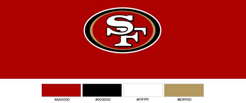
- Color Palette: 49ers Red (#AA0000), 49ers Gold (#B3995D), White (#FFFFFF)
- Usage Context: Helmets, jerseys, stadium signage, merchandise, digital platforms, broadcast graphics
How Has the San Francisco 49ers Logo Evolved Over Time?
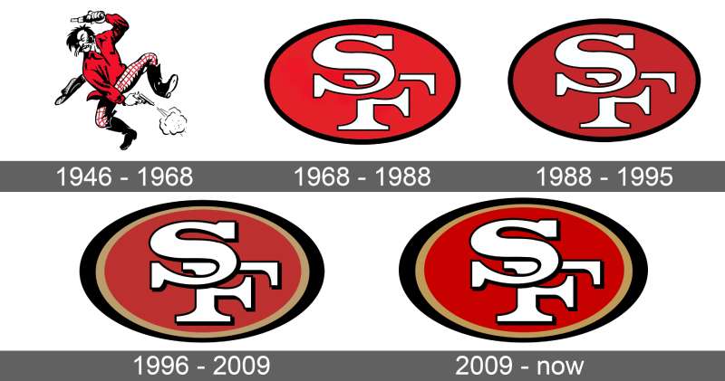
The 49ers have used four distinct logos since 1946. Each version reflected different design trends and branding priorities of its era.
The team started with a literal gold miner illustration. They eventually shifted toward the abstract lettermark we see today.
Original San Francisco 49ers Logo (1946-1967)
- Years Active: 1946-1967
- Design Description: A cartoon prospector character wearing a plaid shirt, holding two pistols. The figure stood in a crouched, action-ready pose.
- Color Scheme: Red, gold, black, and flesh tones
- Designer: Unknown
- Context: Created when the team joined the All-America Football Conference. The Gold Rush theme was obvious and literal.
- Cultural Significance: Represented the rough, adventurous spirit of the gold miners who came to California in 1849
Transitional Logo (1962-1967)
- Years Active: 1962-1967
- Design Description: Simplified prospector figure with cleaner lines. Less detailed than the original cartoon.
- Color Scheme: Red and gold with black outlines
- Key Changes from Previous: Streamlined artwork, reduced detail for better reproduction
- Context: The team began modernizing its visual identity during this period
Current San Francisco 49ers Logo (1968-Present)
- Years Active: 1968 to present
- Design Description: Red oval with white “SF” letters featuring gold trim and pointed serifs extending beyond the oval boundary
- Color Scheme: 49ers Red, 49ers Gold, White
- Key Changes from Previous: Complete departure from illustrative approach. Adopted abstract lettermark style.
- Context: Part of a broader trend in sports where teams moved toward cleaner, more reproducible designs
- Cultural Significance: Became synonymous with the dynasty years of the 1980s and 1990s under Bill Walsh, Joe Montana, and Jerry Rice
What Do the Design Elements of the San Francisco 49ers Logo Mean?
The oval shape creates a sense of completeness and unity. It also resembles a football when viewed at certain angles.
The pointed serifs extending outward suggest speed, aggression, and forward momentum. These sharp elements give the logo its distinctive edge.
Why Did the San Francisco 49ers Choose These Specific Colors?
Red represents passion, energy, and competitive intensity. It grabs attention and creates strong emotional responses from fans and opponents alike.
Gold connects directly to the Gold Rush of 1849. It symbolizes the prospectors (called “49ers”) who flooded California seeking fortune. The color also conveys excellence, achievement, and championship aspirations.
Understanding color psychology explains why these choices work so well together.
- 49ers Red: Hex #AA0000, Pantone 187 C. Represents power, aggression, and team spirit.
- 49ers Gold: Hex #B3995D, Pantone 729 C. Represents heritage, excellence, and the Gold Rush connection.
- White: Hex #FFFFFF. Provides contrast and ensures readability.
What Typography Style Is Used in the San Francisco 49ers Logo?
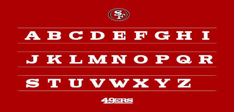
The “SF” letterforms use a custom serif design. The letters feature thick strokes with dramatic pointed serifs that extend beyond the oval boundary.
This custom typeface was designed specifically for the team. You won’t find it in any standard font library.
The interlocking nature of the letters creates visual cohesion. Both letters share the same weight and height for balance.
What Are the Hidden Meanings in the San Francisco 49ers Logo?
The pointed serifs shooting outward can be interpreted as pick axes. This subtle nod references the tools gold miners used during the Gold Rush era.
Some fans see the oval as representing a gold nugget. Others interpret the aggressive points as representing the team’s competitive mentality.
The designers never officially confirmed these interpretations. But they’ve become part of the logo’s mythology among the 49ers Faithful.
How Does the San Francisco 49ers Logo Compare to Competitor Logos?
The 49ers logo takes a different approach than most NFC West rivals. While the Seattle Seahawks logo uses a detailed bird illustration, San Francisco relies on simple letterforms.
The Los Angeles Rams logo features an animal mascot. The Arizona Cardinals logo does the same.
San Francisco’s abstract approach makes it stand out. It’s one of the few NFL teams that doesn’t depict a literal representation of its name.
This positions the 49ers alongside teams like the Green Bay Packers logo and Pittsburgh Steelers logo that favor typography-based designs over mascot illustrations.
What Are the Technical Specifications of the San Francisco 49ers Logo?
Official Color Codes
- Primary Color (49ers Red): Hex: #AA0000, RGB: (170, 0, 0), CMYK: (0, 100, 100, 33), Pantone: 187 C
- Secondary Color (49ers Gold): Hex: #B3995D, RGB: (179, 153, 93), CMYK: (0, 15, 48, 30), Pantone: 729 C
- Accent Color (White): Hex: #FFFFFF, RGB: (255, 255, 255), CMYK: (0, 0, 0, 0)
Dimensions and Proportions
- Aspect Ratio: Approximately 1.2:1 (width to height)
- Minimum Size Requirements: 0.5 inches for print, 50 pixels for digital
- Clear Space: Maintain padding equal to the height of the “S” letter on all sides
- Official Guidelines: Available through NFL Properties and team brand resources
What Cultural Impact Has the San Francisco 49ers Logo Had?

The logo became a symbol of excellence during the team’s dynasty years. Five Super Bowl victories between 1982 and 1995 cemented its place in sports history.
Fans worldwide recognize the red and gold oval instantly. It represents not just a football team, but San Francisco itself.
The logo appears on merchandise sold across the globe. It’s become a fashion statement beyond just game days. Celebrities and musicians regularly wear 49ers gear as a cultural signifier.
How Does the San Francisco 49ers Logo Fit Into the Overall Brand Identity?
The logo serves as the anchor for the entire 49ers visual system. Every element in their brand guidelines connects back to it.
Jersey designs incorporate the same red and gold palette. Stadium signage at Levi’s Stadium uses matching colors and complementary typography.
The team’s secondary marks (like the helmet logo and wordmark) all share design DNA with the primary logo. This creates visual unity across all touchpoints.
How Should the San Francisco 49ers Logo Be Used?
Official Usage Guidelines
- Do: Use official logo files from NFL Properties or team resources
- Do: Maintain minimum clear space around the logo
- Do: Use approved color variations (full color, white, black)
- Don’t: Stretch, rotate, or distort the logo
- Don’t: Change the official colors
- Don’t: Add effects like shadows or gradients without approval
Where to Access Official Logos
Media professionals can request logo files through the San Francisco 49ers media relations department. NFL Properties handles licensing for commercial applications.
Licensing Information
Commercial use requires licensing through NFL Properties. This includes merchandise, advertisements, and promotional materials. Unauthorized use may result in trademark infringement claims.
Trademark Protection
The 49ers logo is a registered trademark. The NFL aggressively protects team marks from unauthorized reproduction. Fan-made items for personal use typically fall under fair use, but selling merchandise requires proper licensing.
FAQ on The San Francisco 49ers Logo
What Does the San Francisco 49ers Logo Mean?
The SF 49ers emblem represents the gold miners who rushed to California in 1849. The red oval contains interlocking letters symbolizing San Francisco.
Gold coloring honors prospector heritage. The pointed serifs suggest pick axes used during the Gold Rush era.
When Was the Current 49ers Logo Created?
The current team logo debuted in 1968. It replaced the original cartoon prospector design that the franchise used since joining the NFL.
Minor refinements occurred over the decades. But the core design has remained consistent for over 55 years.
Who Designed the San Francisco 49ers Logo?
The specific designer remains unknown. The San Francisco football team never publicly credited an individual or agency for creating the 1968 redesign.
This was common practice for sports team branding during that era. Many famous graphic designers worked anonymously on professional sports projects.
Why Are the 49ers Colors Red and Gold?
Gold directly references the Gold Rush of 1849. Red represents energy, passion, and competitive fire on the football field.
These official team colors create strong contrast. The combination stands out in stadium environments and on television broadcasts.
Has the 49ers Logo Changed Over the Years?
Yes. The franchise has used four distinct logos since 1946. The original featured a cartoon gold miner holding pistols.
The logo evolution moved from illustrative to abstract. Today’s clean lettermark replaced detailed mascot imagery entirely.
What Font Is Used in the 49ers Logo?
The 49ers use a custom serif font designed specifically for the team. You cannot download this font anywhere.
The letterforms feature thick strokes with dramatic pointed serifs. These extend beyond the oval boundary for a distinctive look.
What Are the Official 49ers Logo Color Codes?
49ers Red uses hex code #AA0000. 49ers Gold uses hex code #B3995D. White (#FFFFFF) provides accent and contrast.
These precise values ensure consistent reproduction across jerseys, merchandise, and digital platforms like the team website.
Can I Use the 49ers Logo for Personal Projects?
Personal, non-commercial use typically falls under fair use. But selling merchandise requires licensing through NFL Properties.
The National Football League aggressively protects team trademarks. Unauthorized commercial use may result in legal action.
Why Is the Team Called the 49ers?
The name honors prospectors who came to California during the 1849 Gold Rush. These fortune seekers were nicknamed “49ers” after the year.
San Francisco served as a major hub for this migration. The team adopted this regional history as its identity.
Where Can I Download the Official 49ers Logo?
Media professionals can request files from the 49ers media relations department. High-resolution vector graphics are available for approved uses.
Fan sites offer unofficial versions. But for commercial or professional applications, always use official sources through NFL licensing.
Conclusion
The San Francisco 49ers logo remains one of the most iconic symbols in professional football. Its red and gold color scheme connects five Super Bowl championships to Bay Area pride.
Few NFL team emblems have stayed this consistent since 1968. The Niners kept what works.
From Levi’s Stadium signage to fan merchandise worn worldwide, this design delivers. The 49ers Faithful recognize it instantly.
Simple letterforms. Bold colors. A direct link to Gold Rush history. That’s what makes sports branding last for generations.

Renowned for his expertise in logo design and visual branding, Bogdan has developed a multitude of logos for various clients.
His skills extend to creating posters, vector illustrations, business cards, and brochures. Additionally, Bogdan's UI kits were featured on marketplaces like Visual Hierarchy and UI8.
He also wrote in the past years on sites like Design Your Way, WebDesignerDepot, WPDean, Designmodo, Speckyboy, Slider Revolution, and more.
- Canva vs PowerPoint: Which Is Better for Presentations? - 22 September 2026
- How to Install Fonts on Mac (Step-by-Step Guide) - 20 September 2026
- From Mockup to Code: How AI-Augmented Development Speeds Up the Design Handoff - 19 September 2026

Bogdan Sandu is a seasoned designer who has been designing websites since 2008. Renowned for his expertise in logo design and visual branding, Bogdan has developed a multitude of logos for various clients. His skills extend to creating posters, vector illustrations, business cards, and brochures. Additionally, Bogdan's UI kits were featured on marketplaces like Visual Hierarchy and UI8. He also wrote in the past years on sites like Design Your Way, WebDesignerDepot, WPDean, Designmodo, Speckyboy, Slider Revolution, and more.
You Might Also Like