The Atlanta Falcons logo stands as one of the most recognizable symbols in professional football. Since the franchise joined the NFL in 1966, this falcon emblem has represented Georgia’s only NFL team through wins, losses, and everything between.
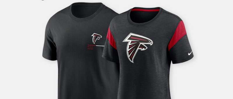
The current version features a stylized falcon head rendered in red and black. It was introduced in 2003 and designed to project aggression and forward motion. The team has used three primary logo versions throughout its history.
Atlanta businessman Rankin Smith founded the franchise after the NFL awarded an expansion team to the city. A local schoolteacher suggested the “Falcons” name through a fan contest. The bird of prey fit perfectly for a Southern team looking to build a fierce identity.
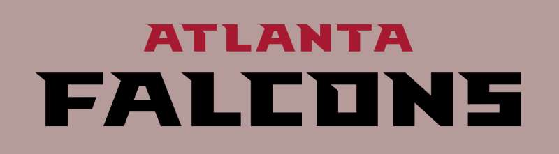
What Is the Atlanta Falcons Logo?
The Atlanta Falcons logo is a stylized falcon head facing left, designed to convey speed and aggression. Introduced in 2003, the current mark was created by the NFL’s internal design team. The falcon silhouette doubles as the letter “F” for Falcons.
Design Type: Mascot-based combination mark
Primary Elements:
- Stylized falcon head in profile view
- Sharp angular lines suggesting motion
- Hidden “F” letterform within the shape
- Pointed beak and aggressive eye detail
Official Introduction Date: 2003 NFL season
Designer/Agency: NFL Properties design team
Trademark Status: Registered trademark owned by Atlanta Falcons Football Club LLC and licensed through NFL Properties
Official Color Palette:
- Falcons Red (Primary)
- Falcons Black (Primary)
- White (Secondary)
- Silver (Accent)
Usage Context: Helmets, jerseys, merchandise, digital platforms, stadium signage, and all official team communications
How Has the Atlanta Falcons Logo Evolved Over Time?
The Atlanta Falcons have used three distinct logos since 1966. Each redesign reflected broader trends in sports branding while maintaining the falcon as the central symbol.
The original design lasted 24 years. Then came a more aggressive version in 1990. The current iteration arrived in 2003 with sharper lines and bolder presence.
Original Atlanta Falcons Logo (1966-1989)
Years Active: 1966-1989
Design Description: A black falcon in a diving position, wings swept back, forming a rough “F” shape. The design showed the bird attacking downward with talons extended.
Color Scheme: Solid black falcon on white background. Red accents appeared on uniforms but not the primary logo mark.
Designer: Not publicly credited
Context: Created for the franchise’s inaugural 1966 season. The NFL was expanding rapidly, and new teams needed instant visual identities. This falcon captured the aggressive spirit ownership wanted.
Key Changes from Previous: N/A (original design)
Cultural Significance: This mark represented Atlanta’s entry into major professional sports. It became associated with the team’s early struggles and eventual rise to competitiveness in the 1970s and 1980s.
Second Atlanta Falcons Logo (1990-2002)
Years Active: 1990-2002
Design Description: An updated falcon with more detail and dimension. The bird appeared more realistic with defined feathers and a fiercer expression. Still positioned in a diving stance.
Color Scheme: Black primary with red and white accents. More color integration than the original.
Designer: NFL Properties
Context: Part of a league-wide rebranding effort in the early 1990s. Many NFL logos received updates during this period. The Falcons wanted a more modern look as they moved toward a new stadium era.
Key Changes from Previous: Added dimensional shading, more feather detail, refined proportions, and integrated team colors directly into the logo mark.
Cultural Significance: This version accompanied the team’s Super Bowl XXXIII appearance in 1999. Many fans still associate it with the Dirty Birds era and the excitement of that season.
Current Atlanta Falcons Logo (2003-Present)
Years Active: 2003-present
Design Description: A streamlined falcon head in profile. Sharp geometric angles replace the realistic feather details. The design uses negative space effectively. The hidden “F” becomes more prominent.
Color Scheme: Red falcon head with black outline and white accents. Reversed versions use black as primary.
Designer: NFL Properties design team
Context: Introduced alongside new uniforms emphasizing speed and modernity. The team wanted a cleaner mark that would work better across digital platforms and merchandise.
Key Changes from Previous: Shifted from full-body falcon to head only. Removed realistic details for geometric styling. Made the embedded “F” more visible. Simplified for better scalability.
Cultural Significance: This logo has seen Super Bowl LI, the move to Mercedes-Benz Stadium, and the Matt Ryan era. It represents the modern Falcons franchise.
What Do the Design Elements of the Atlanta Falcons Logo Mean?
The falcon symbolizes speed, precision, and predatory instinct. These traits align with football’s competitive nature.
The leftward-facing orientation suggests forward motion. Falcons attack. They don’t wait.
Every element serves a purpose. Nothing decorative. Pure function.
Why Did Atlanta Falcons Choose These Specific Colors?
Red communicates passion, energy, and aggression. It grabs attention and signals danger to opponents.
Black adds power, sophistication, and intimidation. It grounds the red and prevents visual overload.
The combination creates strong contrast and instant recognition from stadium distances.
Falcons Red
- Hex: #A71930
- Pantone: 187 C
- Meaning: Aggression, passion, energy
- Psychological impact: Raises heart rate, demands attention
Falcons Black
- Hex: #000000
- Pantone: Black 6 C
- Meaning: Power, authority, elegance
- Psychological impact: Creates sophistication and intensity
Silver/White
- Hex: #A5ACAF (silver), #FFFFFF (white)
- Meaning: Precision, technology, cleanliness
- Psychological impact: Provides visual relief and highlighting
What Typography Style Is Used in the Atlanta Falcons Logo?
The primary logo mark contains no typography. It relies entirely on the falcon symbol.
Wordmarks accompanying the logo use custom sans-serif lettering. Sharp angles echo the falcon’s geometric design.
The letterforms lean forward slightly. This suggests speed and movement.
Team communications use proprietary fonts licensed through the NFL. These maintain consistency across all materials.
What Are the Hidden Meanings in the Atlanta Falcons Logo?
The most obvious hidden element is the letter “F” formed by the falcon’s body. Look at the negative space. You’ll see it immediately once you know.
The beak points forward at a sharp angle. This suggests attacking mentality.
Some fans see the shape as resembling the state of Georgia. This interpretation wasn’t intentional but adds local meaning.
The eye position creates a focused, determined expression. Not angry. Determined. There’s a difference.
How Does the Atlanta Falcons Logo Compare to Competitor Logos?
The Falcons logo holds its own against NFC South rivals. Each team takes a different approach to visual identity.
The Carolina Panthers logo also uses a fierce animal but with more curves and flow. The New Orleans Saints logo chose abstract symbolism over literal representation. The Tampa Bay Buccaneers logo went full pirate aesthetic.
Among bird-themed NFL teams, the Falcons stand out. The Philadelphia Eagles logo and Baltimore Ravens logo both feature avian mascots, but with completely different styling approaches.
The Falcons’ geometric simplicity reads better on screens. That matters more now than it did in 1966.
What Are the Technical Specifications of the Atlanta Falcons Logo?
Official Color Codes:
Primary Red:
Primary Black:
- Hex: #000000
- RGB: (0, 0, 0)
- CMYK: (0, 0, 0, 100)
- Pantone: Black 6 C
Silver Accent:
- Hex: #A5ACAF
- RGB: (165, 172, 175)
- CMYK: (6, 2, 0, 31)
- Pantone: 877 C (metallic)
Dimensions and Proportions:
- Aspect ratio: Approximately 1:1 (square bounding box)
- Minimum size: 0.5 inches for print, 50 pixels for digital
- Clear space: Minimum of 10% logo width on all sides
- The logo must not be stretched, rotated, or altered in color
What Cultural Impact Has the Atlanta Falcons Logo Had?
The Falcons logo represents more than football. It symbolizes Atlanta’s identity as a major American city.
During the 1996 Olympics, the logo appeared throughout Atlanta. It connected local sports to the global stage.
The Dirty Birds era made the logo iconic for a generation. Fans remember that 1998 season whenever they see the mark.
Super Bowl LI, despite the outcome, cemented the logo in NFL history. Sometimes losing makes you more memorable.
How Does the Atlanta Falcons Logo Fit Into the Overall Brand Identity?
The logo anchors everything. Uniforms, stadium design, merchandise, social media. All flow from this central mark.
Mercedes-Benz Stadium incorporates falcon imagery throughout. The roof design even suggests wings from certain angles.
The “Rise Up” slogan pairs with the ascending falcon shape. Words and image reinforce each other.
Team brand guidelines ensure consistency. Every use follows strict standards set by NFL Properties.
How Should the Atlanta Falcons Logo Be Used?
Official Usage Guidelines:
Do:
- Use official logo files from NFL or team sources
- Maintain minimum clear space around the logo
- Use approved color combinations only
- Scale proportionally without distortion
Don’t:
- Alter colors outside approved palette
- Add effects like shadows, gradients, or outlines
- Place on busy backgrounds that reduce legibility
- Stretch, compress, or rotate the mark
- Use for commercial purposes without licensing
Official Logo Access: Licensed retailers and media partners receive official assets through NFL Properties. Fan use for personal, non-commercial purposes is generally tolerated but not officially authorized.
Licensing Information: Commercial use requires licensing agreements through NFL Properties or Atlanta Falcons LLC. This includes merchandise, advertising, and media production.
Trademark Protection: The logo is a registered trademark. Unauthorized commercial use can result in legal action. The NFL actively enforces trademark protection across all member teams.
FAQ on The Atlanta Falcons Logo
What Does the Atlanta Falcons Logo Represent?
The falcon head silhouette represents speed, aggression, and predatory instinct.
These traits match football’s competitive nature perfectly.
The design also forms a hidden letter “F” through clever use of negative space. This connects the bird symbol directly to the Falcons name and Georgia football identity.
When Was the Current Atlanta Falcons Logo Introduced?
The current version debuted in 2003. It replaced a more detailed falcon that had been used since 1990.
NFL Properties handled the sports logo design update.
The redesign coincided with new uniforms emphasizing a modern, streamlined look for the franchise.
Who Designed the Atlanta Falcons Logo?
NFL Properties’ internal design team created the current mark. Individual designers weren’t publicly credited.
This is common for professional football logos.
The league maintains creative control over team visual identities to ensure consistency across all NBA logos, NFL marks, and other sports branding.
What Are the Official Atlanta Falcons Logo Colors?
The official team colors are Falcons Red and Falcons Black. Understanding color psychology explains why.
Red signals passion and energy. Black adds power and intimidation.
Silver and white serve as accent colors for highlights and backgrounds on helmets and merchandise.
Is There a Hidden Message in the Atlanta Falcons Logo?
Yes. The falcon shape doubles as the letter “F” when viewed as a whole.
This wasn’t accidental. The psychology of shapes played into every decision.
Some fans also see Georgia’s state outline in the silhouette, though designers never confirmed this intention.
How Many Times Has the Atlanta Falcons Logo Changed?
Three main versions exist. The original 1966 design showed a diving falcon.
A 1990 update added more detail and dimension to the bird of prey imagery.
The 2003 redesign simplified everything into the geometric falcon emblem used today.
Can I Use the Atlanta Falcons Logo for Personal Projects?
Personal, non-commercial use is generally tolerated. But it’s not officially authorized.
Commercial use requires licensing through NFL Properties. The team trademark is actively protected.
Fan gear and merchandise must come from licensed retailers only.
Why Does the Falcon Face Left in the Logo?
Left-facing orientation suggests forward motion in Western design conventions. We read left to right.
The falcon appears to be moving into action, attacking what lies ahead.
This creates a strong focal point and aggressive visual impression on helmets.
What Makes the Falcons Logo Different From Other NFL Bird Logos?
Geometric simplicity sets it apart. The Eagles and Ravens use more detailed, realistic approaches.
Atlanta’s version relies on sharp angles and clean lines.
This makes the Falcons brand identity more adaptable for digital platforms and vector graphics applications.
Where Can I Find Official Atlanta Falcons Logo Files?
Media partners receive assets through NFL Properties directly. Fans cannot download official files.
The team website shows the logo but doesn’t offer downloads.
Licensed merchandise and red logos collections online display approved versions of the NFC South team’s mark.
Conclusion
The Atlanta Falcons logo has grown into one of the most recognized marks in professional sports branding. Three versions. Nearly six decades. One consistent identity.
From the original 1966 falcon to today’s geometric design, each iteration reflected its era while honoring the franchise’s roots.
The current falcon head works everywhere. Mercedes-Benz Stadium. Helmets. Digital platforms. It scales without losing impact.
Whether you’re a Dirty Birds fan from the 1998 Super Bowl run or discovered the team during the Rise Up era, this emblem connects generations of Georgia football supporters under one powerful symbol.
Renowned for his expertise in logo design and visual branding, Bogdan has developed a multitude of logos for various clients.
His skills extend to creating posters, vector illustrations, business cards, and brochures. Additionally, Bogdan's UI kits were featured on marketplaces like Visual Hierarchy and UI8.
He also wrote in the past years on sites like Design Your Way, WebDesignerDepot, WPDean, Designmodo, Speckyboy, Slider Revolution, and more.
- The Airtable Logo History, Colors, Font, And Meaning - 12 July 2026
- How to Blur Background in Canva: A Quick Tutorial - 11 July 2026
- Typography Trends - 10 July 2026
Bogdan Sandu is a seasoned designer who has been designing websites since 2008. Renowned for his expertise in logo design and visual branding, Bogdan has developed a multitude of logos for various clients. His skills extend to creating posters, vector illustrations, business cards, and brochures. Additionally, Bogdan's UI kits were featured on marketplaces like Visual Hierarchy and UI8. He also wrote in the past years on sites like Design Your Way, WebDesignerDepot, WPDean, Designmodo, Speckyboy, Slider Revolution, and more.