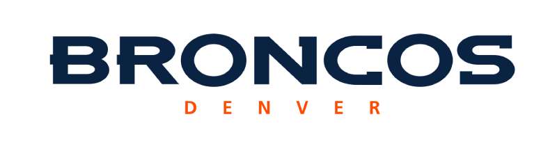
The Denver Broncos Logo History, Colors, Font, and Meaning
Imagine a silhouette of a galloping horse, its mane flowing against a backdrop of orange and blue—this icon not only captures the spirit of a storied franchise but also embodies the energy and aspirations of a city.
As a graphic designer, I find the Denver Broncos logo a fascinating study of history, identity, and visual persuasion within the sports world.
Delving into the emblem’s journey, we uncover how it reflects decades of Denver’s storied past, a testament to fan gear and the quintessence of the team’s brand.
In the pages ahead, discover the evolution of this sports logo and how it encapsulates team spirit, influences merchandising, and stands as an unwavering symbol for legions of supporters.
You are set to explore the anatomy of an effective sports logo design, untangle the nuances of team brand identity, and grasp the impact beyond the field—insights beneficial for aficionados and design enthusiasts alike.
Unpacking each layer, from inception to the helmets donning the design, witness the Denver Broncos logo in its full glory.
The Meaning Behind the Denver Broncos Logo
Symbols Speak Louder
Ever glance at a logo and feel a deep connection? Like it’s telling you a tale? The Denver Broncos logo is that kind of story-teller.
Picture this: A fierce horse, breaking out in a dash. That’s power. That’s passion. The symbol is more than just a fancy drawing; it signifies the strength, tenacity, and speed of the Denver Broncos team.
The Horse’s Power
The horse represents a force, a galloping power that doesn’t know how to quit. It stands for the team’s relentless spirit, their commitment to the game, and their thirst to win. It’s a nod to their location too, connecting the wild spirit of the West.
The History of the Denver Broncos Logo
A Walk Down Memory Lane
Logos evolve, right? Just like our tastes in music (Remember that band you loved five years ago?). The Denver Broncos logo is no exception. Over the years, this iconic emblem has undergone changes, each signifying a specific era in the team’s journey.
Vintage Vibe
The earliest logos had a more laid-back feel. Imagine a player riding a Bronco with a football in hand. A bit literal, maybe? But it had a quirky charm. It encapsulated the true essence of football in Denver in those early days.
The Colors of the Denver Broncos Logo
A Palette of Power
Colors ain’t just colors, pal. They’ve got meanings. For the Broncos, it’s navy blue and orange. That navy blue? It’s the depth, the maturity, the grit. The orange? Energy, enthusiasm, and a burning passion.
Together, they perfectly encapsulate what the Denver Broncos are all about.
Orange Is the New Attack
The orange hue in particular, it’s like the burst of energy just as the sun rises. It’s the embodiment of the team’s offensive onslaughts and fiery gameplay.
The Font Used in the Denver Broncos Logo
Sleek & Strong
Ever seen a font and thought, “That’s bold!”? The font in the Broncos logo is just that. It’s modern, dynamic, and carries an athletic vibe. It complements the powerful imagery of the bronco, creating a harmonious yet bold visual.
Evolution of Typography
Just like the logo, the typography has seen its changes. From rounded to sharp-edged, each tweak aligns with the times and the evolving brand image of the team.
The Emotion Evoked by the Logo
A Fan’s Perspective
When you’re a die-hard fan, the logo isn’t just an image. It’s an emotion. For the Broncos’ faithful, it’s pride, anticipation, and sometimes, the thrill of victory or the agony of defeat. It’s that flutter in the stomach before a big game, or the camaraderie shared among fans.
The Player’s Connection
For the players, that emblem on their helmets is more than just decoration. It’s a badge of honor, a symbol of the legacy they’re a part of, and a reminder of the expectations riding on them.
The Influence on Merchandise
Wear It with Pride
Merch is like a canvas that showcases fans’ devotion. And the Denver Broncos logo, with its striking imagery and colors, makes for some rad designs. From jerseys to caps, it’s not just about sporting a brand, but a declaration of loyalty.
Beyond the Usual
It’s not just the typical gear. The logo has found its way into various products – think mugs, wall arts, or even car decals. It’s the kind of design that makes you wanna flaunt it, everywhere!
FAQ On The Denver Broncos Logo
Who Designed the Denver Broncos Logo?
Originally, the logo echoes the creative pulse of an era, born from an unknown visionary. The modern mark, however, owes its form to artists at NFL Properties in 1997, pivotal in steering the team’s image into the contemporary compass of sports brand identity.
What Does the Denver Broncos Logo Symbolize?
Symbolism runs deep; the bronco embodies agility, freedom, and competitive spirit—traits synonymous with the game of football.
The fervent mix of orange and blue speaks to Denver’s sunsets and clear skies, carving an iconography that resonates with the city and its fans.
When Was the Denver Broncos Logo First Introduced?
The Broncos rode into the NFL stage in 1960, brandishing a logo that has since traversed epochs. The current dynamic horsehead design made its debut in 1997, an update signifying the team’s evolution and its preparedness to face the modern era head-on.
Has the Denver Broncos Logo Ever Changed?
Indeed, transformation is part of any enduring legacy—from the original “barrel-man” emblem to the sleek, current incarnation. Each redesign ripples through merchandising, echoing the times and the winds of change that shape the game and the team’s journey.
What are the Official Colors Inside the Denver Broncos Logo?
On the palette, orange and blue reign supreme—specifically, a vibrant orange complemented by a deep navy blue. These shades represent the team within the canvas of the NFL, infusing the essence of the Broncos’ identity into fabric and fans alike.
How Many Times Has the Denver Broncos Logo Been Updated?
Numbers tell a story of growth—twice has the logo undergone a major overhaul. The switch from a wordmark to a horse’s visage in 1968, and the significant leap in ’97, show a brand in sync with an evolving sports landscape.
Where Can I Buy Official Denver Broncos Logo Merchandise?
Official Broncos merchandise proliferates—both online at the team’s shop and at brick-and-mortar retail locations. Any fan poised for authenticity should steer clear of counterfeit goods, ensuring the logo’s integrity on their memorabilia remains intact.
How Can I Legally Use the Denver Broncos Logo?
Use of the trademarked logo demands respect and permission—usually outlined for official partners or media purposes. For personal use, be mindful of copyright laws; for commercial intent, licensing agreements with the NFL are a non-negotiable checkpoint.
Is the Denver Broncos Logo Considered One of the Best in the NFL?
Subjective, of course, but it proudly stands in the pantheon of classic NFL team logos. Critics and fans alike laud its modern flair and the encapsulation of team spirit, often placing it high on lists of exceptional sports design work.
What Impact Does the Denver Broncos Logo Have on the Team’s Brand?
The impact is seismic. A potent logo amplifies brand recognition, weaving the visual narrative that partners with American football lore.
It carries the weight of championships and the whispers of defeat, a beacon for a heritage and a future painted in competitive zeal.
Conclusion
The journey through the visual tapestry of the Denver Broncos logo concludes here, but the emblem’s saga continues. Standing as a beacon within the NFL, this logo transcends the ordinary—each curve and hue a testament to Denver, its team, and the fans who wear it not just on apparels but etched in their fervor.
- Closing Threads:
- The emblem’s narrative, woven from orange to blue, evokes the spirit of a city and its warriors on the gridiron.
- Its evolution charts a course through the team’s history, a chronicle of change reflecting the sports landscape of the era.
- The logo, embedded in merchandise and memories, remains a sigil of identity—for both the team and its legion of admirers.
As the sun dips behind the Rocky Mountains, the blue and orange in the sky seem to salute the teams’ insignia—forever a symbol of triumph, passion, and an unyielding commitment to excellence.
If you liked this article about the Denver Broncos logo, you should check out this article about the Dallas Cowboys logo.
There are also similar articles discussing the Green Bay Packers logo, the Buffalo Bills logo, the New England Patriots logo, and the Philadelphia Eagles logo.
And let’s not forget about articles on the Kansas City Chiefs logo, the Carolina Panthers logo, the Arizona Cardinals logo, and the Atlanta Falcons logo.
Bogdan Sandu, a seasoned designer with 15 years of diverse experience, has been designing websites since 2008.
Renowned for his expertise in logo design and visual branding, Bogdan has developed a multitude of logos for various clients.
His skills extend to creating posters, vector illustrations, business cards, and brochures. Additionally, Bogdan's UI kits were featured on marketplaces like Visual Hierarchy and UI8.
Latest posts by Bogdan Sandu (see all)
- Out of This World: Space Color Palettes for Cosmic Designs - 28 April 2024
- The Bungie Logo History, Colors, Font, And Meaning - 27 April 2024
- After Dark: Night Color Palettes for Mysterious Designs - 27 April 2024