The Arizona Cardinals Logo History, Colors, Font, and Meaning

Visual storytelling: a craft honed over decades, unfurling across fields as vast as the National Football League (NFL)—a dominion where the Arizona Cardinals logo stands as not merely an emblem but a beacon of heritage and identity.
As a narrative forged in hues and shapes, this insignia carries the weight of a storied franchise, its wings spread across the heart of every jersey, whispering tales of gridiron glories past and aspirations of triumphs yet to be seized.
In this exploration, delve into the elements of design that coalesce to form the Cardinals’ visual saga.
Unraveling the threads of team branding, one witnesses the blend of tradition and innovation, the sports marketing strategies that elevate a mere symbol to a rallying cry for a fan base as fervent as Arizona’s sun.
What awaits is not just a chronicle of a logo’s lifecycle but insights into the pivotal role of sports team branding, the intricacies of fostering brand recognition, and the secrets behind engaging a legion of football fans.
Immerse in an odyssey through aesthetics and allegiance, and emerge with a richer understanding of the emblem that beats at the pulse of the Arizona Cardinals.
The Meaning Behind the Arizona Cardinals Logo

Man, when you look at the Arizona Cardinals logo, you might think, “It’s just a bird, right?” But nah, there’s way more to it than meets the eye.
The Bird’s Attitude
Have you ever seen a cardinal looking all fierce and ready to tackle? Probably not in your backyard. The way the bird in the logo is stylized – sharp, determined, and intense – it’s like a reflection of how the team plays on the field.
That bird ain’t just representing a species; it’s embodying the spirit of a team that’s ready to take on any challenge.
The Connection to the Desert
While the cardinal bird isn’t exclusive to Arizona, its presence in the logo gives it a home in the desert. It’s like saying, “Hey, we belong here, and we own it.” It’s a cool way to connect the team with its home turf.
The History of the Arizona Cardinals Logo

Ah, a trip down memory lane! Let’s take a stroll.
Early Days
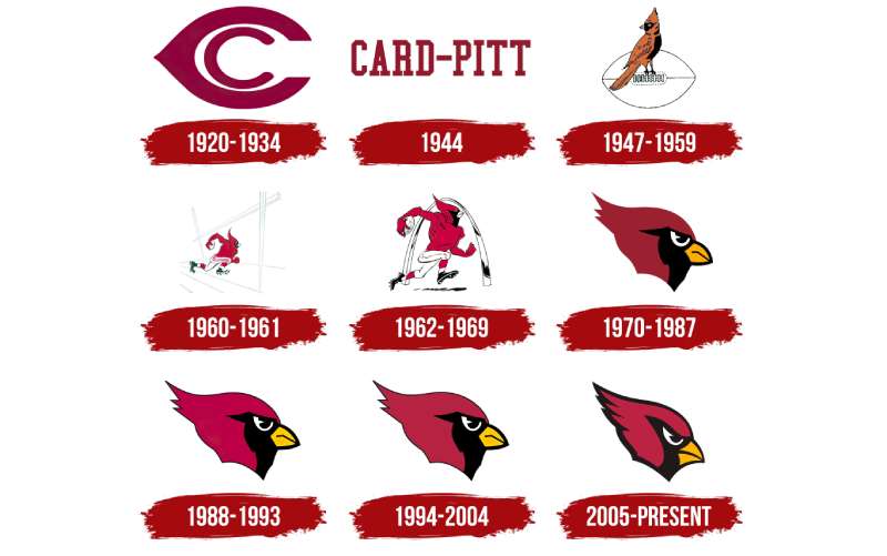
Back in the day, the logo wasn’t even a bird. Imagine that! The team’s original identity was tied to their origin city, Chicago, and the logos from way back reflect that.
Evolution into the Bird
As the team migrated and evolved, so did its identity. The bird started making its appearance, but it wasn’t the sleek, modern cardinal we see today. It underwent a few tweaks, tune-ups, and changes before landing on the current design.
The Colors of the Arizona Cardinals Logo

Dude, colors aren’t just for looking pretty. They tell a story.
Cardinal Red
Obvious choice, right? It’s not just because of the bird’s name but also the fiery spirit and passion the team embodies. Plus some yellow.
Black & White
Not just there for contrast. They add depth and dimension to the logo, making the cardinal pop out. Plus, it gives a classic touch, doesn’t it?
The Font Used in the Arizona Cardinals Logo

Fonts speak, bro. Seriously!
Modern and Bold
The typography they’ve chosen is bold and direct. It doesn’t mess around. Just like the team, it’s straightforward and means business.
Why Not Cursive?
Cursive fonts have a classic charm, for sure. But the chosen font for the Cardinals reflects their modern approach and aggressive gameplay.
The Emblem’s Aesthetics
You might not notice at first glance, but the logo’s design ain’t random.
Balance and Symmetry
The cardinal looks to the right, symbolizing forward movement and progress. The tilt, the curves, everything creates a sense of motion.
Not Overly Complex
Despite the rich details, the logo isn’t overly complicated. It’s clean, making it easily recognizable and memorable.
How Fans Relate to the Logo
The logo ain’t just for the players.
A Symbol of Pride

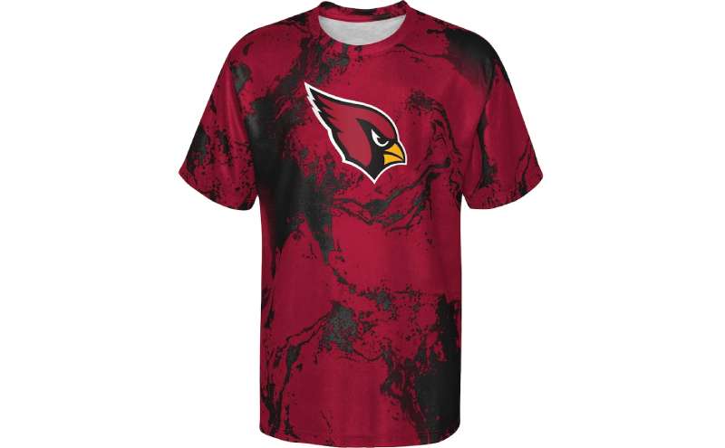
Ask any Cardinals fan, and they’ll tell ya. When they rock merchandise with that logo, it’s more than fan gear; it’s pride, it’s identity.
Tattoos and Art
You won’t believe the number of fans that have the Cardinals logo inked. It’s like the ultimate declaration of love and loyalty to the team.
FAQ On The Arizona Cardinals Logo
What is the history behind the Arizona Cardinals logo?
The Arizona Cardinals’ emblem unfolds a rich tapestry of heritage. Originally just a cardinal head, it has evolved with time—adding sharp beak details and bolder hues, encapsulating team history and identity to resonate with fans and reflect modern design aesthetics.
How has the logo changed over the years?
In an odyssey of shapes and shades, the Cardinals logo has softly metamorphosed since its inception.
Each iteration echoed contemporary graphic design trends, subtly shaping the cardinal’s visage to embody a more dynamic, aggressive spirit, paralleling the team’s on-field evolution.
What do the colors of the logo represent?
Robust red and black: these hues not only mirror the plumage of a Northern Cardinal but also symbolize vitality and resilience. Chiefly, the color red stands for energy, capturing the essence of the Arizona sports symbol with a fierce, fiery spirit.
Is the Arizona Cardinals logo trademarked?
Indeed, the logo is shielded under the trademarked team logos mantle. This legal fortification ensures exclusive rights, protecting the team’s branding—a significant asset in a competitive sphere like the NFL where visual identity is paramount.
How often do the Arizona Cardinals update their logo?
Unlike gliding through whims of frequent change, the Cardinals approach logo updates with measured intent. Tweaks occur rarely, carefully calculated to preserve continuity in branding while staying abreast of contemporary graphic design sensibilities within sports.
Can the logo be used on merchandise?
Absolutely, the logo graces an array of merchandise branding, a key player in the sports memorabilia game. Each authentic item—be it jerseys or caps—wears it as a badge of honor while navigating the tightrope of logo licensing agreements.
Which elements of the Cardinals’ branding are most distinct?
The Cardinal head profile captures the gaze first—red bird logo design striking against any backdrop. Then, the chosen typeface muscles its own recognition. Together, they sail the sea of sports brand identity as a unique, unmistakable symbol.
How does the team’s branding compare to other NFL teams?
The Cardinals hold their own in a league bustling with iconic insignias. Their logo, teeming with brand equity, holds a lantern up to the storied past, all while warranting respect in the present—the true essence of lasting sports team branding.
What was the rationale behind the design of the current logo?
A compelling narrative woven into the visual threads—Cardinals branding sought to manifest the raw vigor and agility of the team.
The design aims to portray motion and tenacity, cornerstones of the Arizona Cardinals’ identity, fortified through sleek lines and potent colors.
Does the logo influence fan engagement?
By encapsulating the soul of the franchise, the Arizona Cardinals logo fosters team loyalty and branding. A timeless symbol around which fan gear revolves—the logo spellbinds, transforming the ordinary into a conduit for passion and fan base allegiance.
Conclusion
Nestled within the visual tapestry of the NFL, the Arizona Cardinals logo stands as a testament to brand evolution—unfolding stories that transcend the confines of a mere sports emblem. We’ve journeyed through its legacy, tracing the lines that curve to form the sleek, resolute cardinal defining NFL team emblem uniqueness across eras.
Bold and brimming with intent, this icon captivates, rallying together a fan base as diverse as the Sonoran Desert. It’s more than an image on merchandise; it’s a symbol enveloping team identity and embodying the spirit of Arizona’s gridiron warriors. Crafting the future, the logo carries forward traditions, aspirations, and the undying zest of fans clad in red.
And so, as the sun dips beyond the horizon, painting skies with the Cardinals’ fiery hues, we close this chapter on a logo that isn’t merely seen but felt—a beacon of communal pride that will forever soar high in the hearts of aficionados.
If you liked this article about the Arizona Cardinals logo, you should check out this article about the Dallas Cowboys logo.
There are also similar articles discussing the Denver Broncos logo, the Green Bay Packers logo, the Buffalo Bills logo, and the New England Patriots logo.
And let’s not forget about articles on the Philadelphia Eagles logo, the Kansas City Chiefs logo, the Carolina Panthers logo, and the Atlanta Falcons logo.
- Inspiration For Furniture Website Design: 14 Sites - 1 May 2024
- The Columbia University Logo History, Colors, Font, And Meaning - 30 April 2024
- Seamlessly Blended: Gorgeous Gradient Color Palettes - 30 April 2024


