- A shoe that TIME once named one of the worst inventions ever now anchors a $4.1 billion brand. The advertising did that.Crocs ads span 21 years, 6 agencies and 5 brand platforms, from “Ugly Can Be Beautiful” in 2005 to “Wonderfully Unordinary” in 2026.Every campaign runs the same play: name the insult, then keep the foam clog silhouette exactly as it is.
This page covers each Crocs ad campaign with its agency, year and market, plus the layout and typography behind the work.
- Print ads, TV commercials and the Croctober fan drops
- Palette, wordmark and Jibbitz composition analysis
- Collaboration campaigns with Balenciaga, Post Malone and KFC
Crocs advertising spans 21 years, 6 named agencies and 5 brand platforms, from “Ugly Can Be Beautiful” in 2005 to “Wonderfully Unordinary” in 2026. The work runs on a single device: turning ridicule of the foam clog silhouette into proof of belonging.
Print, national TV, out of home and paid social all carry it. This page covers each Crocs ad campaign with its agency, year and market, plus the composition, palette and typography decisions behind the layouts.
Crocs Advertising at a Glance
Crocs has advertised since 2005, working with TDA Boulder, Cramer-Krasselt, McKinney, Hey Honey, Digitas and Flower Shop. Its best-known campaigns are “Ugly Can Be Beautiful,” “Come As You Are” and “Croctober.” The visual signature combines lime green, a rounded lowercase wordmark and one hero clog.
Attribute Value First major campaign “Ugly Can Be Beautiful,” 2005, TDA Advertising & Design (Boulder) Lead agencies TDA Boulder, Cramer-Krasselt, McKinney, Hey Honey, Digitas, Flower Shop Best-known taglines “Get a Grip” (2002), “Ugly Can Be Beautiful” (2005), “Feel the Love” (2010), “Come As You Are” (2017), “Wonderfully Unordinary” (2026) Primary media Print, national TV, digital and social, out of home, in-store, influencer Awards The Drum Awards for Content (UGC category, Croctober with Digitas), The Drum Awards for Marketing Americas (Social Media Gold) Visual signature Lime green #75b709, Duke the crocodile mascot, rounded lowercase wordmark close to Gotham Rounded Bold, product on flat colour Primary markets United States, China, South Korea, Japan, India, UK, Germany, France Measurable results Record annual revenue of $4.1 billion in 2024, up 4% on 2023 (Crocs, Inc.) Which Crocs Ad Campaigns Are the Most Famous?
Five Crocs ad campaigns define the brand’s advertising design record: “Ugly Can Be Beautiful” (2005), “Feel the Love” (2010), “Come As You Are” (2017 to 2025), “Croctober” (2017 to present) and “Wonderfully Unordinary” (2026). Each one moved the clog from utility object to identity object.
Ugly Can Be Beautiful (2005 to 2007)
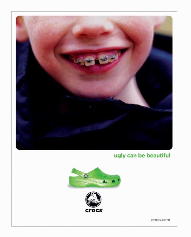
“Ugly Can Be Beautiful” ran nationally in the United States from 2005, created by TDA Advertising & Design in Boulder. The print campaign paired the clog with other things people find ugly and lovable at once. Art director Alex Rice and writer Jonathan Schoenberg built it around stock imagery.
The layouts are almost embarrassingly simple. A single subject sits centred on a plain ground, the line runs small underneath, and the logo lock-up drops to the bottom edge.
Executions included a child in dental braces and a pug, both shot flat and unretouched (Communication Arts).
By the close of its fifth fiscal year in 2006, Crocs had sold nearly 30 million pairs of clogs.
Feel the Love (2010 to 2011)
Agency: Cramer-Krasselt, with chief creative officer Marshall Ross leading.
Medium: Crocs’ first national TV campaign, supported by print and web.
Device: Croslite mascots, small clog-shaped characters named after the brand’s proprietary resin, who massage aching feet.
Product scope: More than 20 new styles including heels, loafers and peep-toe sling backs.
The mascots gave Crocs a mnemonic for comfort that print alone could not carry. Ross framed the goal to NBC News as moving the brand off a “cheeky, quirky look” and onto its comfort truth.
Come As You Are (2017 to 2025)

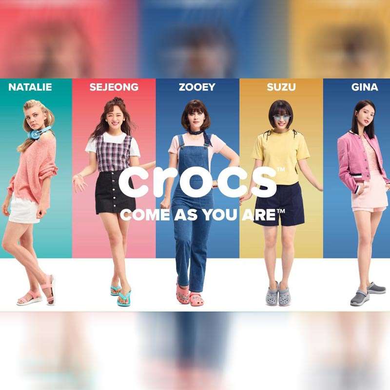
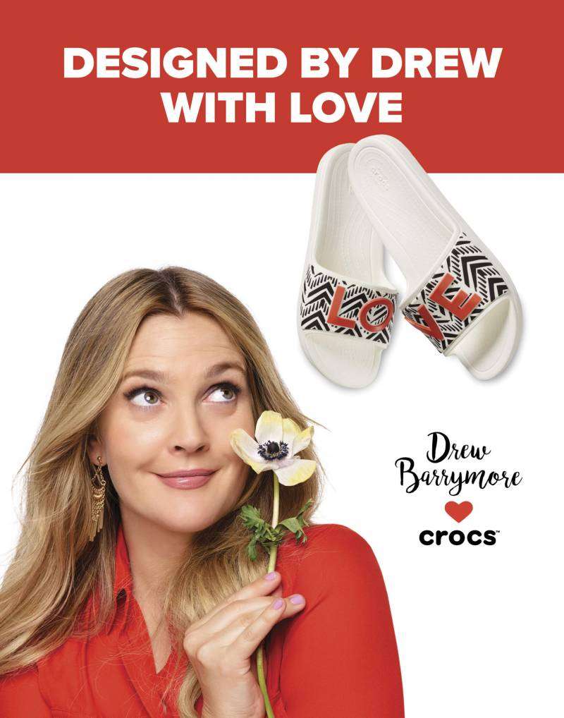
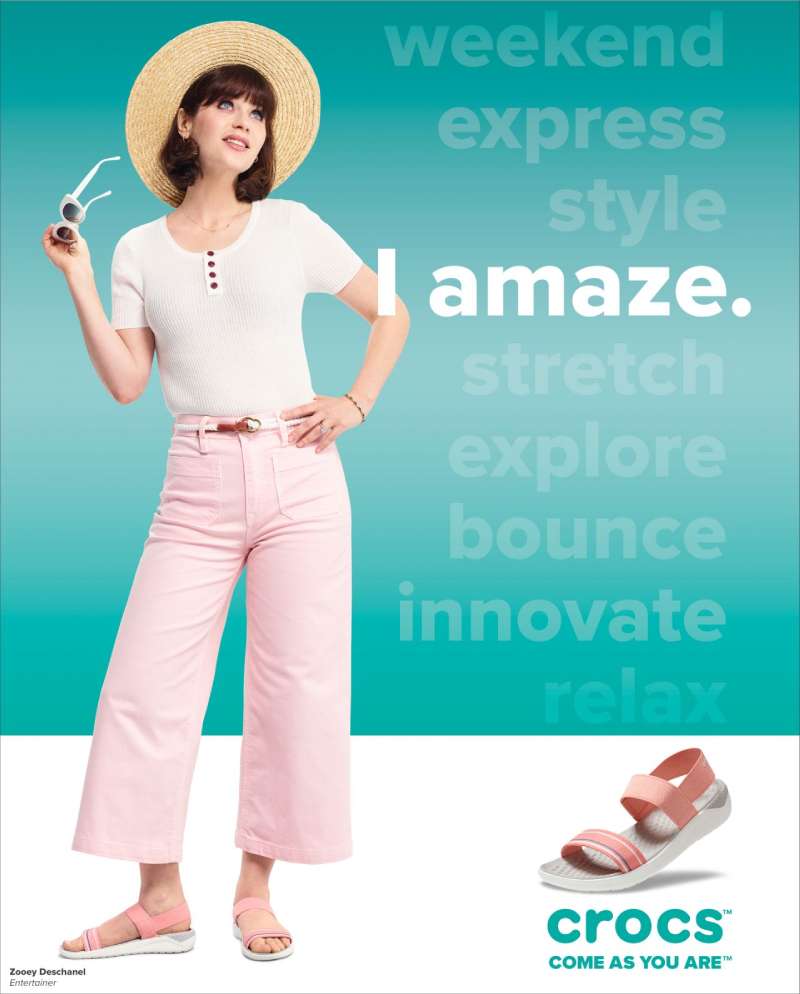
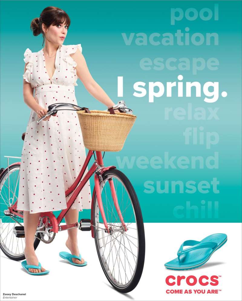
Crocs ran “Come As You Are” for 8 consecutive years across the United States, China, Japan, South Korea, India and Western Europe. The platform recruited celebrity ambassadors region by region rather than casting one global face. McKinney handled media, Hey Honey took EMEA social from 2020, and the in-house team took creative in 2022.
Year Ambassadors Market focus 2018 Drew Barrymore US, global 2019 Zooey Deschanel, Natalie Dormer, Gina Jin, Kim Se-Jeong, Suzu Hirose US, UK, China, South Korea, Japan 2020 Priyanka Chopra Jonas India, global 2022 In-house “We Must Create” theme Global The 2022 art direction leaned on punk DIY and early-internet nostalgia, a deliberate break from the clean studio look of 2019 (Tote Bag Creative Studio).
Croctober (2017 to present)

Croctober is the only Crocs campaign fans invented first.
Crocs joined a fan celebration of National Crocodile Day, renamed October 23 as Croc Day, and turned the whole month into a product-drop calendar. Digitas built the user-generated content engine.
- 417 million impressions from the Douyin “Dongmen Challenge” in China during Croctober 2023
- 200,000 UGC submissions and 33.6 million engagements from that single activation
- Crocs Star fan videos passed 17 million views and 33 million engagements
- 2024 drop: Pet Clogs with BARK; 2025 drop: the 35.4-inch Classic Unfurgettable Leopard Knee High Boot carrying 17 Jibbitz charms
The campaign won The Drum Awards for Content in the user-generated content category and Social Media Gold at The Drum Awards for Marketing Americas.
Wonderfully Unordinary (2026)
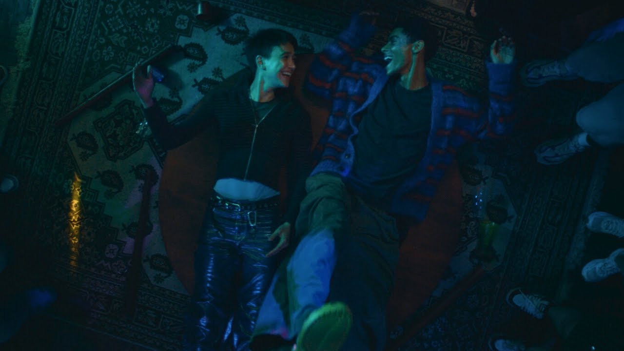
Crocs launched “Wonderfully Unordinary” on January 28, 2026, its first global omnichannel platform in nearly a decade. Flower Shop created the work. SMUGGLER director Adam Berg shot the 90-second hero film in Sao Paulo, Brazil.
The film opens on featureless store mannequins that grow progressively human once they are put in Classic Clogs. Read as brand narrative, it is a direct answer to what Crocs called a culture saturated in imitation and algorithmic sameness.
Chief marketing officer Carly Gomez fronted the launch. The spot went live in the US first, with out of home and retail activations rolling through 2026.
Crocs Collaboration Drop Campaigns (2017 to 2024)

Collaboration drops function as Crocs’ paid media substitute. The product is the ad.
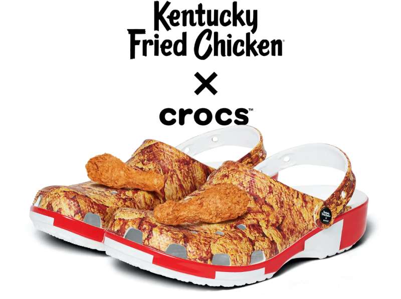
Partner Year Result Balenciaga (Demna Gvasalia) 2017, 2021, 2022 $850 platform clog, then the $950 HardCrocs Post Malone 2018 to 2020 First drop sold out in 10 minutes; 5 editions total KFC 2020 Fried-chicken Jibbitz charms, resale above $300 Salehe Bembury (Pollex Clog) 2021 $75 retail, permanent sell-out Crocs designed the drops so the shoe photographs as a poster on its own. That decision is why so much of the campaign creative is a single product shot on flat colour with no headline at all.
How Do Crocs Print Ads Work Visually?
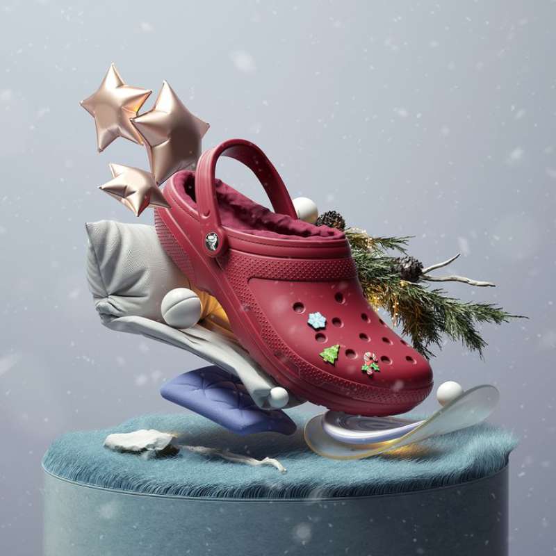
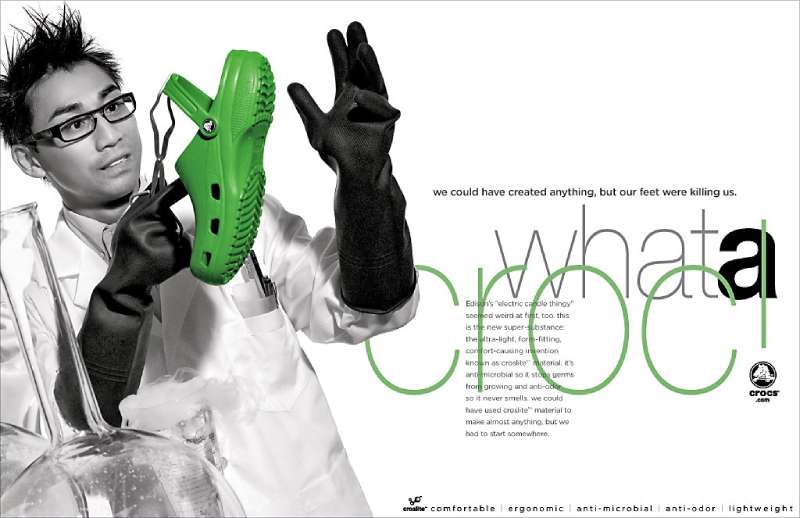
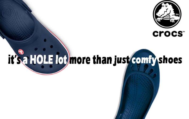
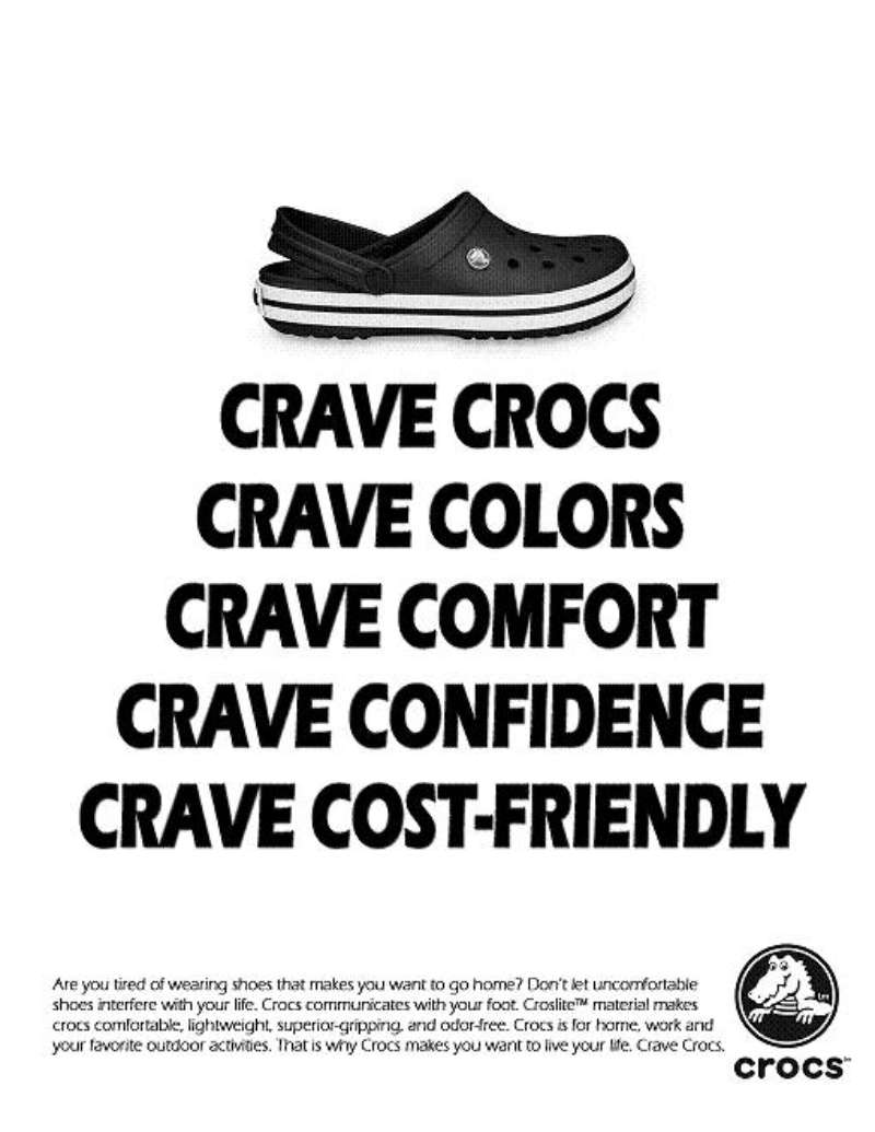
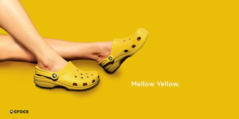
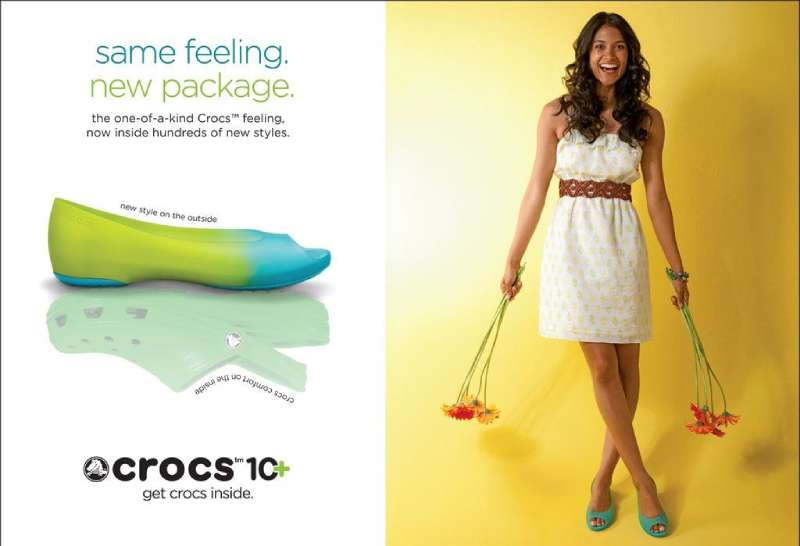
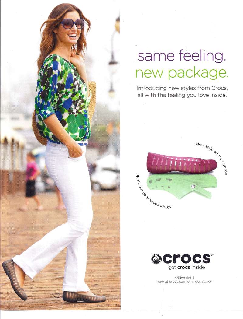
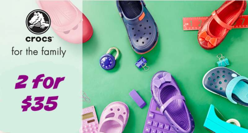
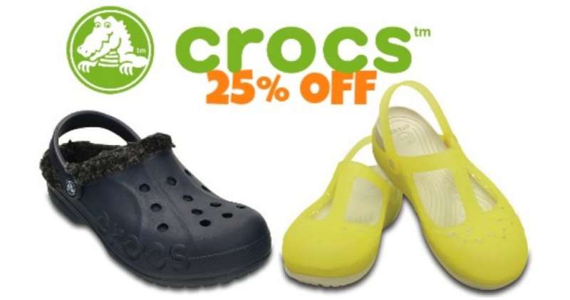
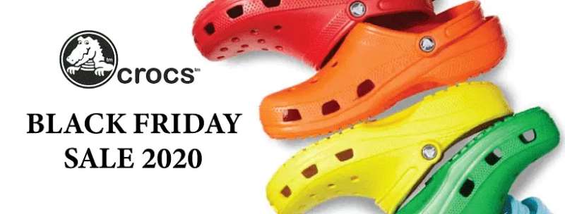
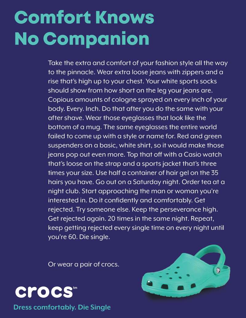
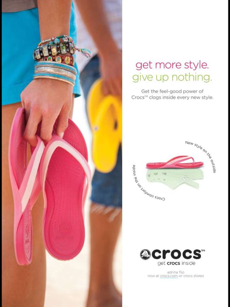
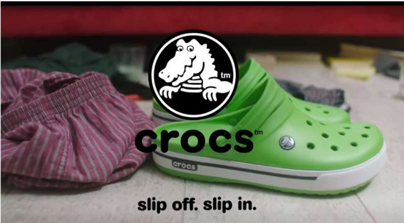
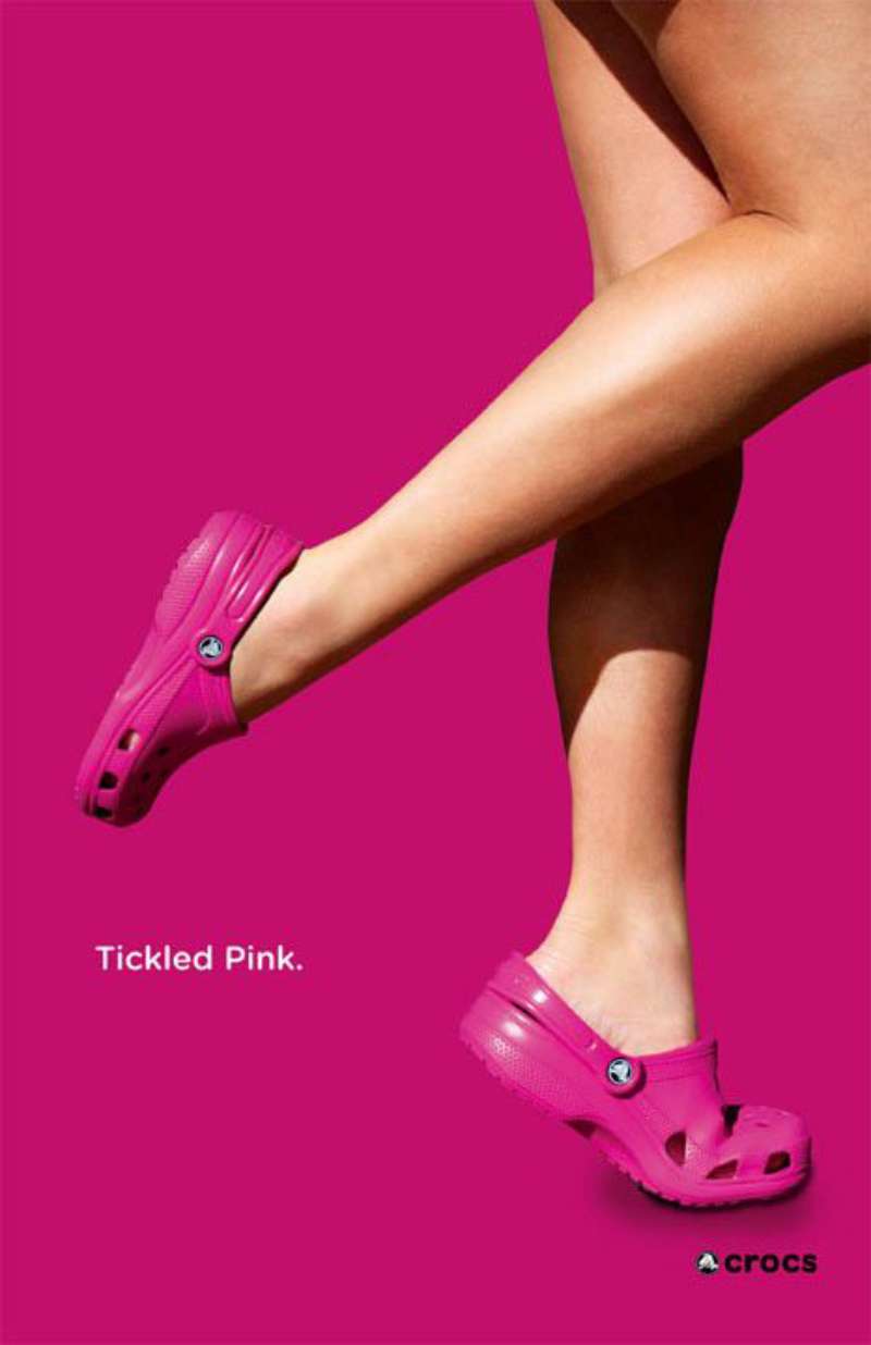
Crocs print ads put one clog at the optical centre of a flat, saturated field, set the copy in a rounded lowercase sans-serif, and drop the wordmark to the bottom edge. Image-to-text ratio sits near 80:20. Nothing competes with the silhouette.
Palette and colour behaviour
The brand’s lime green sits at #75b709, a hue chosen for shelf visibility rather than taste. Crocs treats it as a background field as often as a product colour.
Campaign layouts usually run a two-colour colour palette plus black: one saturated ground, one product colour, black type. The high-chroma grounds do the work that a headline would do in most footwear poster design.
That reliance on saturation over imagery is straightforward colour psychology: warmth and play read faster than a product claim.
Typography and lock-up
The Crocs wordmark uses a custom lowercase sans-serif font closest to Gotham Rounded Bold, with rounded terminals that echo the clog’s blunt toe box.
One weight, one size, bottom-anchored. Crocs almost never sets the tagline larger than the wordmark, which keeps the product as the entry point in the visual hierarchy.
Kerning stays loose. Tight tracking would fight the rounded glyphs and the letters would start to collide at billboard scale, which is the same reasoning behind most decisions about fonts for billboards.
Composition and charm clustering
Jibbitz charms give the art direction its only pattern device.
Clustered charms across a toe box create repetition inside an otherwise empty frame, and the eye reads the cluster as texture before it reads individual charms.
Generous white space around the clog is not restraint for its own sake. It isolates a silhouette that most viewers already have an opinion about.
How Do Crocs TV Commercials Differ From Its Print Ads?
Crocs TV commercials add narrative and character where the print ads add nothing at all. Print sells the silhouette. TV sells the feeling of wearing it, using mascots, music and cast rather than product isolation. Running times sit between 15 and 90 seconds.
Dimension Print TV and film Subject One clog, isolated People, mascots, mannequins Copy load One line or none Voiceover, lyrics, dialogue Colour Flat saturated ground Location and set lighting Job Recognition Storytelling “Feel the Love” Croslite mascot spots (2010)
Cramer-Krasselt built Crocs’ first national TV flight around two small foam creatures who arrive to rub tired feet. The spots are shot like sitcom scenes, with the mascots animated as inserts, an early example of Crocs using motion graphics to explain a material property.
“Come As You Are” ambassador films (2018 to 2022)
Drew Barrymore sings and dances through the 2018 launch film. Later cuts featuring Zooey Deschanel, John Cena and YOONA follow the same structure: single cast member, colour-blocked set, product close-up in the last three seconds.
Crocs distributed these primarily through digital and social rather than broadcast, which is why the framing sits square and the product hits inside the first five seconds.
“Wonderfully Unordinary” anthem film (2026)
Adam Berg’s 90-second spot tracks mannequins gaining skin, expression and movement as they are dressed in Classic Clogs. It is the most cinematic thing Crocs has ever put on air, and the first Crocs film built for a theatrical-length edit rather than a six-second social cutdown.
How Has Crocs Advertising Evolved Since 2005?
Crocs advertising moved through 4 strategic phases in 21 years: utility (2002 to 2009), comfort technology (2010 to 2016), identity (2017 to 2021) and fan authorship (2022 to 2026). Each phase changed the creative device, not the silhouette.
2002 to 2009: utility and defiance
Crocs sold its first 200 pairs at the Fort Lauderdale Boat Show in 2002 with no advertising at all. “Ugly Can Be Beautiful” arrived in 2005 as the first paid push.
The 2008 crash ended it. Crocs lost $185 million that year and the stock fell to roughly $1.
2010 to 2016: comfort technology
“Feel the Love” tried to reposition Crocs as a full footwear range rather than a clog company. Croslite mascots carried the message. The pivot did not hold, and the brand faded from storefront displays into clearance bins.
2017 to 2021: identity and collaboration
Christopher Kane put Crocs on a London runway for spring/summer 2017. Demna Gvasalia’s Balenciaga platform clog followed in October 2017.
“Come As You Are” launched the same year. Crocs revenue hit a record $1.23 billion in 2019 on 67 million pairs, then $1.4 billion in 2020, up 13% while global footwear retail shrank more than 13% (MarketLine).
2022 to 2026: fan authorship
Revenue: $4.1 billion in 2024, up from $1.2 billion in 2014 (Crocs, Inc.).
Marketing spend: $377.5 million in selling and marketing expenses for 2024.
Footprint: 390 stores worldwide in 2024, with 95 in South Korea, 51 in China and 21 in Japan.
Croctober became the anchor campaign in this phase, which is unusual: the calendar moment came from fans, and Crocs handed social media design decisions to them.
Which Agencies Created Crocs Advertising?
Six agencies built the Crocs advertising record. TDA Advertising & Design created “Ugly Can Be Beautiful” in 2005. Cramer-Krasselt created “Feel the Love” in 2010. Flower Shop created “Wonderfully Unordinary” in 2026. Crocs’ in-house team led creative in 2022.
Agency Work Years TDA Advertising & Design (Boulder) “Ugly Can Be Beautiful” print 2005 to 2007 Cramer-Krasselt “Feel the Love,” first national TV 2010 to 2011 McKinney “Come As You Are” media 2018 to 2020 Hey Honey “Come As You Are” EMEA social 2020 Digitas Croctober user-generated content 2023 to 2024 Flower Shop “Wonderfully Unordinary” with SMUGGLER 2026 Terence Reilly served as chief marketing officer through the “Come As You Are” era and set its casting logic. Carly Gomez took the CMO role ahead of the 2026 relaunch. Andrew Rees has run Crocs, Inc. as chief executive across both platforms.
James Gardner led the 2022 in-house creative team as creative director, with Chris Skiles as associate creative director and Youri Zaragoza as art director of brand. That in-house structure is why Crocs’ brand guidelines tolerate more visual drift than most footwear brands allow.
What Can Designers Learn From Crocs Ads?
Crocs ads offer 5 transferable decisions: lead with silhouette, cap the palette, anchor type at one weight, let charms carry pattern, and hand the frame to fans. Each one is cheap to execute and hard to copy.
- Lead with the product silhouette, not the logo
- Limit the ground to one saturated colour plus black
- Set the tagline in the brand typeface at a single weight, below the wordmark
- Cluster small accessories to build texture instead of adding a background image
- Name the objection in the headline before the audience does
The last one is the hardest sell to a client and the most useful. “Ugly Can Be Beautiful” worked because it repeated back what people were already saying in airports, which is a form of emphasis most brands avoid.
Crocs also treats scale and proportion as a headline device. A 35.4-inch knee-high clog boot needs no copy line at all.
How Do Crocs Ads Compare to Birkenstock and Skechers Ads?
Crocs, Birkenstock and Skechers all sell comfort, and all three advertise it differently. Crocs sells self-expression through colour and collaboration. Birkenstock sells anatomy and orthopaedic authority. Skechers sells price, celebrity volume and retail reach.
Birkenstock’s “Ugly for a Reason” campaign opened with a documentary series on foot evolution and put its CEO on record about foot health. The creative is muted, editorial, and built on contrast between clinical language and lifestyle photography. Crocs runs the opposite play: no science, maximum saturation.
Set Birkenstock ads beside Skechers ads and the split is clear. Skechers buys reach with high celebrity density and product grids; Crocs buys cultural permission with scarce drops.
UGG ads sit closest to Crocs in strategy, since both brands turned mockery into a fashion asset. The difference is that UGG moved upmarket through material and campaign photography, while Crocs moved through Balenciaga ads and a fried-chicken clog that borrowed equity straight from KFC ads.
What Makes Crocs Advertising Work?
Crocs advertising works because it never argues with the audience.
Every platform the brand has run, from 2005 to the current one, takes the strongest objection to the product and repeats it back louder. That removes the only real barrier to purchase, which was never comfort or price.
The design system supports that position instead of decorating it. One clog, one saturated ground, one weight of rounded lowercase type, logo at the bottom edge.
The layouts stay this plain on purpose. A silhouette that people already have opinions about does not need a headline, and Crocs figured that out two decades before most footwear brands stopped adding one.
Crocs Ads Examples
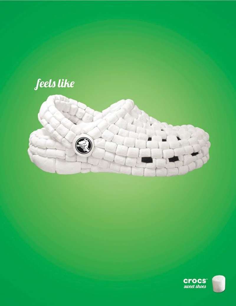
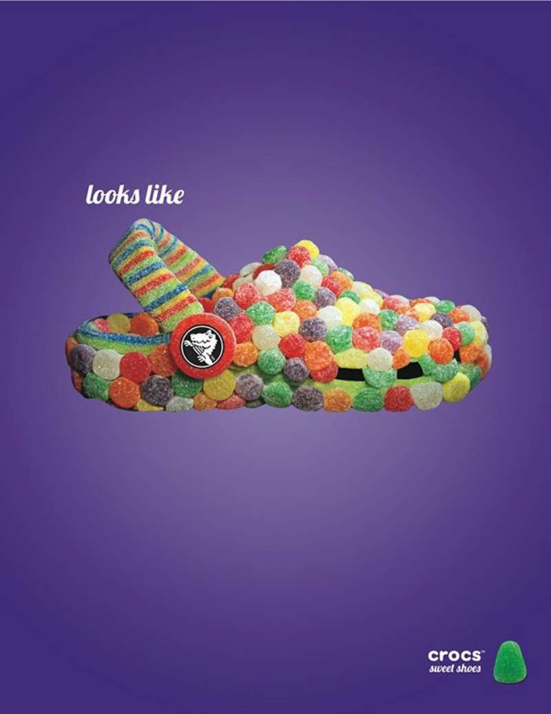
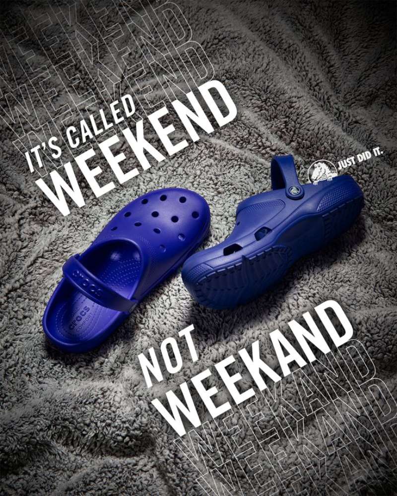








FAQ on Crocs Ads
What was the first Crocs ad campaign?
“Ugly Can Be Beautiful,” launched in 2005 by TDA Advertising & Design in Boulder. Before that, Crocs sold clogs on word of mouth alone, starting with 200 pairs at the 2002 Fort Lauderdale Boat Show.
Who makes Crocs ads?
Flower Shop created the 2026 global platform with SMUGGLER director Adam Berg. Earlier work came from Cramer-Krasselt, McKinney, Hey Honey and Digitas, though Crocs runs much of its creative through a 103-person internal marketing team.
What is the Crocs tagline?
“Wonderfully Unordinary” is the current one, live since January 2026. Previous taglines: “Get a Grip” (2002), “Ugly Can Be Beautiful” (2005), “Feel the Love” (2010) and “Come As You Are” (2017 to 2025).
Has Crocs ever run a Super Bowl commercial?
No Crocs Super Bowl spot appears in the public ad record. The brand puts its money into social, influencer partnerships and limited drops instead, where a single Croctober release generates coverage a 30-second buy would not.
How much does Crocs spend on advertising?
Marketing expenses hit roughly $317.4 million in 2023, up from $59.1 million in 2017 (Statista). Selling and marketing costs reached $377.5 million in 2024, with under $100 million tracked in measured digital, print and national TV.
Where can I watch old Crocs commercials?
The official Crocs YouTube channel holds campaign films from about 2010 onward. iSpot.tv archives US broadcast spots, Communication Arts carries the 2005 print scans, and Ads of the World indexes international executions.
Why do Crocs ads call the shoe ugly?
Because customers said it first. Crocs’ creative team heard the same line in airports and restaurants, then built a campaign around it rather than defending the clog silhouette. CMO Heidi Cooley later called the brand confidently ugly.
Which celebrities have appeared in Crocs ads?
Drew Barrymore (2018), Zooey Deschanel, Natalie Dormer, Suzu Hirose and Kim Se-Jeong (2019), then Priyanka Chopra Jonas (2020). John Cena and YOONA also fronted regional cuts of the same platform.
What font do Crocs ads use?
A custom lowercase rounded sans-serif, closest to Gotham Rounded Bold. Crocs sets taglines at one weight below the wordmark, which is why its fonts for ads never compete with the product for attention.
Do Crocs ads run outside the United States?
Yes. International sales hit 44.1% of Crocs Brand revenue in 2024, and campaigns run in China, South Korea, Japan, India and Western Europe with locally cast ambassadors and separate social creative.
Conclusion
Crocs ads work because the brand stopped apologising for the Croslite clog and started printing the insult on the poster.
TDA Boulder set that tone in 2005. Cramer-Krasselt, McKinney, Hey Honey, Digitas and Flower Shop have each rebuilt it since, and the underlying move has not changed once.
The visual system stayed just as stubborn: one hero product shot, a two-colour ground, a rounded lowercase wordmark parked at the bottom edge.
What designers can take from it is uncomfortable but useful.
- Let the silhouette carry recognition instead of the wordmark
- Answer the objection in the headline, not the body copy
- Treat Jibbitz clusters and limited drops as layout devices, not merchandise
Twenty-one years of that discipline produced a $4.1 billion footwear business built on a shoe nobody defended.

Renowned for his expertise in logo design and visual branding, Bogdan has developed a multitude of logos for various clients.
His skills extend to creating posters, vector illustrations, business cards, and brochures. Additionally, Bogdan's UI kits were featured on marketplaces like Visual Hierarchy and UI8.
He also wrote in the past years on sites like Design Your Way, WebDesignerDepot, WPDean, Designmodo, Speckyboy, Slider Revolution, and more.
- The Windsurf Logo History, Colors, Font, And Meaning - 10 October 2026
- How to Remove Background From Product Photos (No Photoshop) - 10 October 2026
- How Designers can Build a Stronger Online Creative Identity - 9 October 2026

Bogdan Sandu is a seasoned designer who has been designing websites since 2008. Renowned for his expertise in logo design and visual branding, Bogdan has developed a multitude of logos for various clients. His skills extend to creating posters, vector illustrations, business cards, and brochures. Additionally, Bogdan's UI kits were featured on marketplaces like Visual Hierarchy and UI8. He also wrote in the past years on sites like Design Your Way, WebDesignerDepot, WPDean, Designmodo, Speckyboy, Slider Revolution, and more.
You Might Also Like