

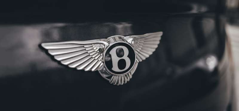
The Bentley Logo stands as one of the most recognized emblems in luxury automotive history. A winged “B” that has graced some of the world’s finest vehicles since 1919.
Within the broader landscape of automotive branding, Bentley’s emblem holds a unique position. It predates many modern car logos and has influenced how luxury manufacturers approach visual identity.
The current version features the signature wings and centered “B” letterform, refined most recently in 2022. W.O. Bentley founded the company in 1919, and the logo has seen approximately six major iterations since then.
What is the Bentley Logo?
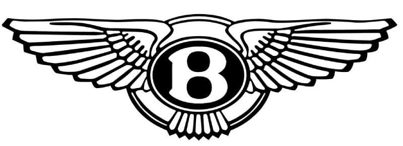
The Bentley Logo is a winged emblem featuring a stylized capital “B” at its center, flanked by symmetrical wings. Introduced in 1919 and designed by artist F. Gordon Crosby, it symbolizes speed, elegance, and British automotive craftsmanship.
Design Attributes
- Design Type: Combination mark (emblem with letterform)
- Primary Elements: Winged “B” symbol, feathered wings extending horizontally, circular or oval badge frame
- Official Introduction Date: 1919
- Designer: F. Gordon Crosby (automotive artist and illustrator)
- Trademark Status: Registered trademark owned by Bentley Motors Limited, a subsidiary of Volkswagen Group
- Color Palette: Silver/Chrome (#C0C0C0), British Racing Green (#004225), Black (#000000), White (#FFFFFF)
- Usage Context: Vehicle badges, hood ornaments (Flying B mascot), dealership signage, marketing materials, merchandise, digital platforms
How Has the Bentley Logo Evolved Over Time?

The Bentley emblem has undergone six significant redesigns since 1919. Each version refined the wings and typography while preserving the core identity.
The most dramatic changes happened during ownership transitions. Derby, Rolls-Royce, and eventually Volkswagen each left their mark on the design.
Original Bentley Logo (1919-1931)
- Years Active: 1919-1931
- Design Description: Hand-drawn winged “B” with detailed feathering, enclosed in a circular frame. The wings featured intricate linework typical of the era.
- Color Scheme: Primarily silver and black, occasionally rendered in enamel blue and white
- Designer: F. Gordon Crosby
- Context: W.O. Bentley launched the brand focusing on racing performance. The wings represented speed and freedom. This was the golden age of Bentley’s Le Mans victories.
- Cultural Significance: Established the winged motif that would define the brand for over a century
Rolls-Royce Era Logo (1931-1998)
- Years Active: 1931-1998
- Design Description: Streamlined wings with cleaner lines. The “B” became more refined and the overall shape more standardized.
- Color Scheme: Chrome silver, black, with British Racing Green backgrounds on certain applications
- Designer: Rolls-Royce design team
- Context: Rolls-Royce acquired Bentley during the Depression. The logo needed to fit alongside the Spirit of Ecstasy while maintaining distinct identity.
- Key Changes from Previous: More geometric wing structure, simplified feather details, standardized proportions
- Cultural Significance: Represented Bentley’s survival and evolution into a luxury touring brand rather than pure racing marque
Volkswagen Era Logo (1998-2022)
- Years Active: 1998-2022
- Design Description: Modernized wings with enhanced three-dimensional rendering. Digital-ready design with cleaner edges.
- Color Scheme: Polished chrome, deep black, with expanded color options for special editions
- Designer: Bentley design team under Volkswagen Group direction
- Context: Volkswagen acquired Bentley, investing heavily in brand revival. The Continental GT launch required a logo that worked across new marketing channels.
- Key Changes from Previous: Sharper wing definition, updated “B” letterform, improved scalability for digital applications
- Cultural Significance: Marked Bentley’s return to global prominence and younger luxury buyer demographics
Current Bentley Logo (2022-Present)
- Years Active: 2022-Present
- Design Description: Refined minimal approach with subtle wing adjustments. Enhanced for electric vehicle era communications.
- Color Scheme: Simplified silver and black primary palette
- Designer: Bentley in-house design team
- Context: Bentley’s “Beyond100” strategy and commitment to full electrification by 2030 prompted the subtle refresh.
- Key Changes from Previous: Cleaner lines, optimized for digital-first applications, subtle wing angle adjustments
- Cultural Significance: Bridges traditional luxury heritage with sustainable future positioning
What Do the Design Elements of the Bentley Logo Mean?
The wings represent speed, freedom, and technical excellence. Birds of prey inspired the original design.
The centered “B” anchors everything. It creates a focal point that draws the eye immediately.
Together, these elements tell a story of British engineering ambition and luxury craftsmanship.
Why Did Bentley Choose These Specific Colors?
Silver dominates because it suggests precision engineering and premium materials. Chrome finishes on vehicles naturally led to metallic badge treatments.
British Racing Green (Hex: #004225) connects to the brand’s motorsport heritage. Bentley racers wore this color at Le Mans.
Black provides contrast and sophistication. It makes the silver wings pop while adding depth to the emblem.
The color psychology here is straightforward. Silver equals innovation. Green equals heritage. Black equals luxury. Simple formula, but it works.
What Typography Style Is Used in the Bentley Logo?
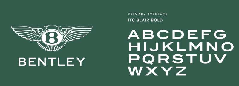
The “B” uses a custom serif font with elegant curves and weighted strokes. It feels classic without being stuffy.
The letterform has been refined multiple times. Each update improved legibility at various sizes while keeping the essential character.
On vehicles and marketing materials, Bentley pairs the emblem with a proprietary typeface called “Bentley.” It shares DNA with the logo’s “B” for visual consistency.
What Are the Hidden Meanings in the Bentley Logo?
The wing count matters. Original designs featured different feather numbers on each side. Some enthusiasts believe this was intentional asymmetry representing hand-crafted imperfection.
Gordon Crosby reportedly based the wings on specific bird species known for speed and agility. The exact reference has been debated by historians.
The symmetry of the design speaks to balance and engineering precision. Everything feels intentional and measured.
How Does the Bentley Logo Compare to Competitor Logos?
Bentley operates in a rarefied space. Direct competitors include Rolls-Royce, Aston Martin, and to some extent, Maybach.
The Rolls-Royce Logo uses the Spirit of Ecstasy figure rather than wings. Different approach, similar luxury positioning.
The Aston Martin Logo also features wings. However, Bentley’s version feels more classic and heraldic while Aston Martin reads sportier.
The Maybach Logo takes a completely different route with interlocking “M” letterforms. More minimal, less heritage-focused.
What sets Bentley apart is how the winged “B” works at any scale. Hood ornament or app icon, it reads clearly.
What Are the Technical Specifications of the Bentley Logo?
Official Color Codes
- Primary Silver: Hex: #C0C0C0, RGB: (192, 192, 192), CMYK: (0, 0, 0, 25)
- British Racing Green: Hex: #004225, RGB: (0, 66, 37), CMYK: (100, 0, 44, 74), Pantone: 3425 C
- Primary Black: Hex: #000000, RGB: (0, 0, 0), CMYK: (0, 0, 0, 100)
- Accent White: Hex: #FFFFFF, RGB: (255, 255, 255), CMYK: (0, 0, 0, 0)
Dimensions and Proportions
- Aspect Ratio: Approximately 3:1 (width to height) for the full winged emblem
- Minimum Size: 25mm width for print applications to maintain feather detail legibility
- Clear Space: Minimum clearance equal to the height of the “B” on all sides
- Digital Minimum: 80 pixels width for screen applications
The logo works as vector graphics for infinite scalability. Most official assets come in SVG, EPS, and high-resolution JPEG formats.
What Cultural Impact Has the Bentley Logo Had?
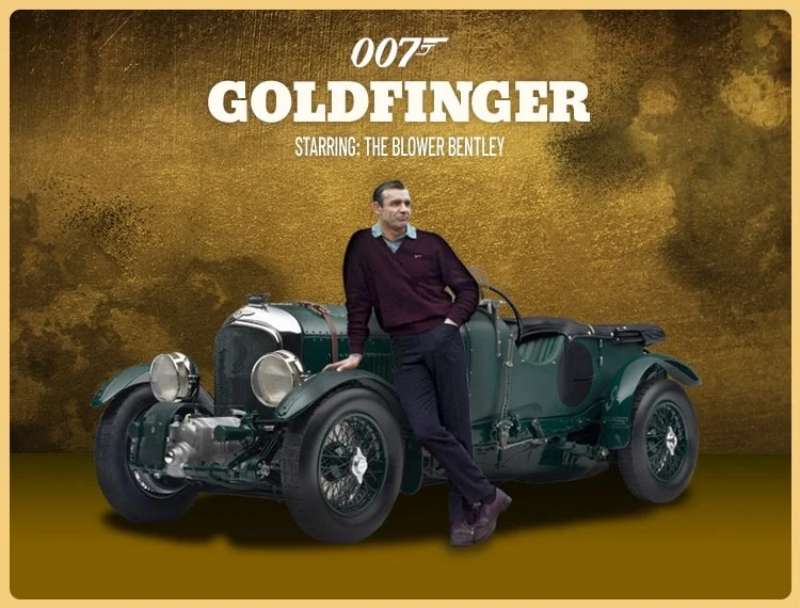
The winged B transcends automotive circles. It appears in films, music videos, and fashion collaborations.
Hip-hop culture adopted Bentley as a success symbol in the early 2000s. The logo became shorthand for achievement.
In design education, the Bentley emblem often serves as a case study. It demonstrates how logo design principles can create lasting brand equity.
The Flying B hood ornament has become collectible. Vintage examples fetch significant prices at auction.
How Does the Bentley Logo Fit Into the Overall Brand Identity?
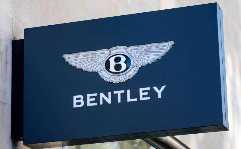
The logo anchors everything Bentley does. Showroom architecture echoes the wing motifs. Marketing photography emphasizes the badge.
Bentley’s brand guidelines specify exactly how the emblem interacts with other visual elements. Nothing is left to chance.
Interior design cues reference the wings too. Dashboard vents, seat stitching patterns, and even speaker grilles incorporate the winged aesthetic.
The Mulliner customization division extends this further. Bespoke vehicles feature the emblem in precious metals and unique finishes.
How Should the Bentley Logo Be Used?
Official Usage Guidelines
- Do: Maintain minimum clear space around the emblem
- Do: Use official color specifications for consistent reproduction
- Do: Scale proportionally without distortion
- Don’t: Rotate or skew the logo
- Don’t: Apply unapproved color treatments
- Don’t: Place on busy backgrounds that reduce legibility
- Don’t: Recreate or modify the wing structure
Accessing Official Assets
Authorized dealers and partners access logo files through Bentley’s brand portal. Media representatives can request assets through the press office.
Trademark Information
The Bentley name and winged B emblem are registered trademarks of Bentley Motors Limited. Unauthorized commercial use is prohibited and actively enforced.
The Flying B hood ornament design carries additional design patent protections in most major markets.
FAQ on The Bentley Logo
What Does the Bentley Logo Represent?
The Bentley logo represents speed, luxury, and British automotive excellence.
The winged B emblem symbolizes the brand’s racing heritage from its Le Mans victories in the 1920s.
Those wings aren’t just decorative. They communicate freedom, power, and technical precision that defines every Bentley vehicle.
Who Designed the Original Bentley Logo?
F. Gordon Crosby designed the original Bentley emblem in 1919. He was a renowned automotive artist and illustrator of that era.
Crosby worked closely with founder W.O. Bentley to create the winged design.
His artistic background brought an Art Deco sensibility to the emblem that still resonates today.
Why Does Bentley Use Wings in Its Logo?
Wings symbolize speed and flight. Perfect for a brand built on racing success.
The psychology of shapes tells us wings evoke freedom and aspiration. Bentley understood this instinctively.
Many luxury car manufacturers adopted similar motifs. But Bentley got there first in 1919.
What Is the Flying B Hood Ornament?
The Flying B mascot is a three-dimensional hood ornament featuring a stylized letter “B” with swept-back wings.
It sits atop the radiator grille on select Bentley models.
Some versions retract automatically for safety. Others remain fixed as a permanent display of the brand’s heritage.
How Old Is the Bentley Logo?
The Bentley logo dates back to 1919. That makes it over a century old.
Bentley Motors Limited was founded that same year in Cricklewood, London. The emblem has been there from day one.
Few automotive insignias have survived this long with their core identity intact.
What Colors Are Used in the Official Bentley Logo?
Silver and black dominate the official color palette. British Racing Green appears in heritage applications.
The chrome finish on physical badges reflects the brand’s commitment to premium materials and craftsmanship.
These colors work together to communicate prestige without being flashy. Understated luxury, basically.
Is the Bentley Logo Trademarked?
Yes. The winged B emblem is a registered trademark of Bentley Motors Limited.
Volkswagen Group, the parent company since 1998, actively protects this intellectual property worldwide.
Unauthorized commercial use will get you a cease and desist letter. They don’t mess around with brand protection.
What Font Does Bentley Use in Its Branding?
Bentley uses a proprietary typography system developed specifically for the brand.
The “B” in the logo features custom typography elements with elegant serifs and weighted strokes.
Marketing materials use a companion font that shares DNA with the emblem’s letterform.
How Has the Bentley Logo Changed Over Time?
The logo has seen six major revisions since 1919. Each update refined the wings and typography.
Ownership changes drove most redesigns. Rolls-Royce ownership from 1931, then Volkswagen from 1998.
The 2022 refresh prepared the Bentley brand identity for the electric vehicle era. Subtle changes, same soul.
How Is the Bentley Logo Different from Other Luxury Car Emblems?
Bentley’s winged design predates most competitors. The Ferrari Logo uses a prancing horse instead.
The Bugatti Logo opts for an oval with initials. Different approach entirely.
What sets Bentley apart is the perfect balance between heritage and modern application. The emblem scales beautifully from hood ornament to mobile app.
Conclusion
The Bentley Logo remains one of the most iconic emblems in automotive history. Over a century of refinement, and it still works.
From Crewe, England to showrooms worldwide, the winged B emblem communicates luxury brand recognition instantly.
Few prestige car brands have maintained such consistent visual hierarchy across generations. The Flying B hood ornament, the chrome badge, the storytelling behind every curve.
Bentley Motors Limited understood something early. Great design transcends trends. The logo proves it every day on Continental GTs and Bentaygas rolling off the line.

Renowned for his expertise in logo design and visual branding, Bogdan has developed a multitude of logos for various clients.
His skills extend to creating posters, vector illustrations, business cards, and brochures. Additionally, Bogdan's UI kits were featured on marketplaces like Visual Hierarchy and UI8.
He also wrote in the past years on sites like Design Your Way, WebDesignerDepot, WPDean, Designmodo, Speckyboy, Slider Revolution, and more.
- The Windsurf Logo History, Colors, Font, And Meaning - 10 October 2026
- How to Remove Background From Product Photos (No Photoshop) - 10 October 2026
- How Designers can Build a Stronger Online Creative Identity - 9 October 2026

Bogdan Sandu is a seasoned designer who has been designing websites since 2008. Renowned for his expertise in logo design and visual branding, Bogdan has developed a multitude of logos for various clients. His skills extend to creating posters, vector illustrations, business cards, and brochures. Additionally, Bogdan's UI kits were featured on marketplaces like Visual Hierarchy and UI8. He also wrote in the past years on sites like Design Your Way, WebDesignerDepot, WPDean, Designmodo, Speckyboy, Slider Revolution, and more.
You Might Also Like


