


The Jeep Logo History, Colors, Font, and Meaning
Imagine cruising the rugged backroads, the wind tousling your hair – that’s the spirit of Jeep. But what captures this essence even when stationary? The Jeep logo.
Dive into a narrative beyond a mere emblem; here lies a tapestry woven with adventure, heritage, and an unyielding zest for the great outdoors.
From the iconic 4×4 iconography to the storied Willys MB heritage, the Jeep badge is a symbol etched in history, signifying more than just an automotive brand.
This piece takes you on a journey through time, unraveling the threads of the Jeep brand identity.
Discover the secrets whispered by the seven-slot grille, reminisce about the Jeep advertising campaigns that shaped an era, and explore how the Jeep community symbols resonate with enthusiasts around the globe.
By the end, emerge enlightened about this emblematic marque’s visual saga – armed with insights sure to enrich your design lexicon, whether you’re sketching for screens or crafting for concepts.
Key takeaways
- Utility and Freedom: The Jeep logo stands for robustness, reliability, and adventure. It is also a symbol of freedom, representing the brand’s ability to tackle any terrain and weather, embodying the go-anywhere, do-anything spirit.
- Wartime Origins: The logo originated during World War II, symbolizing the ruggedness of Jeep’s military vehicles. Post-war, the brand and logo transitioned to appeal to civilian consumers while maintaining its tough image.
- Color Significance: The logo’s forest green color is a tribute to Jeep’s military past and its connection to the outdoors, symbolizing endurance and nature. The contrast with white enhances visibility and readability.
- Font and Legibility: The Jeep logo uses a straightforward, bold sans-serif font to convey strength and simplicity, with wide and evenly spaced letters for optimal legibility and immediate brand recognition.
The Meaning Behind the Jeep Logo
Roots in Utility
Now, let’s dig into what the Jeep logo really stands for. It’s not just a fancy set of lines and shapes. Nope, it’s a badge of honor that whispers tales of robustness and reliability. It embodies a spirit of adventure and a promise of utility.
Symbol of Freedom
Not to mention, the logo is a potent symbol of freedom. After all, what could be more liberating than a vehicle that’s game to tackle any terrain, any weather? The logo is a shorthand for that freedom, a visual cue that communicates the go-anywhere, do-anything spirit of the brand.
The History of the Jeep Logo
Born in Wartime
The Jeep logo has a history that’s as rugged as the vehicles it represents. It was born during World War II, when the brand’s all-terrain vehicles became the backbone of the Allied forces.
Post-war Transformation
Post-war, Jeep transformed itself from a military vehicle manufacturer to a maker of civilian cars. The logo changed too, reflecting the brand’s new focus. The wartime toughness stayed, but it was complemented by a more consumer-friendly appeal.
Modern Iterations
Through the years, the logo has undergone multiple iterations, each time gaining more sophistication, yet never straying from its core identity. The logo we see today is a result of this evolutionary process, a symbol that resonates with Jeep’s past and present.
The Colors of the Jeep Logo
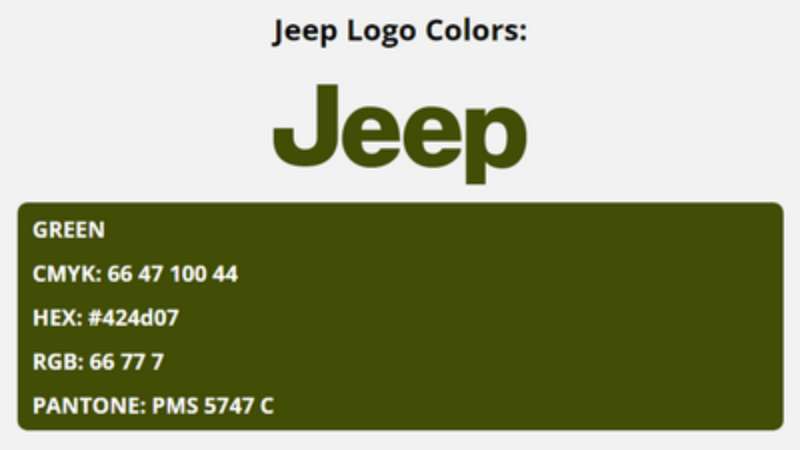
The Power of Green
The logo is typically rendered in a deep, forest green. It’s a nod to the brand’s military heritage and its connection with the outdoors. Green symbolizes endurance, stability, and a bond with nature, perfectly mirroring Jeep’s brand values.
Contrast with White
The green is often contrasted with white, giving the logo a clean, sharp look. The white brings a sense of clarity and simplicity, ensuring the logo’s visibility and readability.
The Font Used in the Jeep Logo
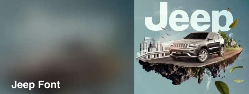
Strength in Simplicity
The typeface used in the logo is as straightforward as it gets. It’s a clean, bold sans-serif font that exudes strength and simplicity. This choice of typeface reinforces the brand’s straightforward, no-nonsense personality.
Legibility Above All
The font is designed for optimal legibility, whether it’s splashed across a billboard or embossed on a vehicle’s grille. The letters are wide and evenly spaced, allowing for easy recognition at a glance.
The Uniqueness of the Jeep Logo
A Distinctive Emblem
What sets the Jeep logo apart is its unique combination of simplicity and expressiveness. It’s not just about good looks; the logo carries a sense of purpose and a promise of performance.
Every aspect, from the choice of color to the typography, works together to create an emblem that’s as distinctive as the vehicles it represents.
An Icon of Adventure
The logo has become an icon of adventure, a badge that signifies a love for the outdoors and a readiness for exploration. It is instantly recognizable and universally associated with durability and reliability, traits that have come to define the Jeep brand.
The Impact of the Jeep Logo
A Catalyst for Brand Loyalty
The logo plays a significant role in fostering brand loyalty. It’s a symbol that Jeep owners proudly display, a mark of their membership in a community of adventure seekers and outdoor enthusiasts.
A Visual Storyteller
The logo is also a visual storyteller. It encapsulates the brand’s history, its values, and its promise to its customers.
Every time someone sees the logo, it tells a story of ruggedness, freedom, and adventure, reinforcing the image of Jeep as a brand that’s built for those who dare to venture off the beaten path.
The Evolution of the Jeep Logo Over the Years
Initial Design and Changes
From its inception, the Jeep logo has seen subtle tweaks and changes while maintaining the spirit of its original design. The earliest iterations were basic, focusing on function over form. As the brand evolved, the logo started to take on a more aesthetic appeal.
Modernization of the Logo
In more recent years, the Jeep logo has seen a transition towards a more modern and refined look. While it retains its iconic green and white color scheme, the shapes and lines have been smoothed out, and the typography has been updated.
These changes reflect the brand’s commitment to innovation and progress, without losing sight of its rich heritage.
The Global Recognition of the Jeep Logo
Symbol of Trust
Across the globe, the logo is recognized as a symbol of trust and reliability. Whether it’s seen on a vehicle cruising city streets or navigating rugged off-road trails, the logo is a seal of quality that commands respect and admiration.
A Testament to the Brand’s Legacy
The widespread recognition of the Jeep logo is a testament to the brand’s legacy. It’s a sign that Jeep has delivered on its promise of performance and durability, earning the loyalty of customers around the world.
In the end, the logo isn’t just a graphic representation of the brand; it’s a beacon for those who seek adventure and freedom. It’s a symbol that stands for strength, endurance, and the ability to overcome any obstacle. And that’s what makes it truly special.
FAQ On The Jeep Logo
Why does the Jeep logo not have the word “Jeep”?
Funny thing, you’d expect it right there, bold and center. But the Jeep badge anchors itself in simplicity. It’s the seven-slot grille that speaks volumes – an identity more potent than any typography could convey.
It’s about heritage, a throwback to its military roots, and instantly recognizable.
What’s the meaning behind the Jeep logo?
You see, it’s a nod to the original Jeep’s design – those slots on the front grille. This silhouette is powerful, an emblem of ruggedness and adventure.
It resonates with freedom, the great outdoors, and the capability to conquer any terrain. Jeep’s logo symbolizes a lifestyle, not just a vehicle.
Has the Jeep logo ever changed throughout history?
Sure has! It’s had a few facelifts. Not drastic, mind you. It evolved, but always kept that core – the iconic grille and headlights. Changes reflect modern tastes, but the spirit? Unchanged. It remains a testament to its endurance and legacy as an American icon.
Why isn’t the Jeep logo displayed on newer models?
It’s all about brand confidence. Jeep is a powerhouse in automotive insignia. Their designs alone speak for them – no need to spell it out. Newer models sport the badge without the word because that grille design is Jeep loudly and clearly, no words necessary.
What do the colors of the Jeep logo represent?
Now, the colors of the logo are simple, reflecting utilitarian roots in the military. Green often symbolizes adventure, the outdoors and growth.
The silver? That’s for sophistication and modernity. Together, they epitomize a balance between wilderness and the contemporary world, timeless yet ahead of the curve.
Is the Jeep logo trademarked?
Absolutely. It’s more than a logo; it’s a legal claim over Jeep’s identity. Trademark protects against misuse, ensuring the Jeep emblem remains distinct and indicative of quality. It’s Jeep’s signature, a warranty of adventure and freedom, safeguarded by law.
What do the seven slots in the Jeep logo represent?
Legend has it the seven slots represent the seven continents – a globe-trotter, just like Jeep. Another take? It’s a tribute to Jeep being the first vehicle driven on all continents. Whether lore or fact, it symbolizes boundless exploration and the brand’s indomitable spirit.
Can the Jeep logo be customized for personal vehicles?
Sure can, but there’s a catch. Jeep enthusiasts love to personalize, and the market’s ripe with hood ornaments and decals. But respect the legalities – the trademark.
Always honor Jeep’s brand integrity, the cultural impact of Jeep branding. Make it personal, but keep it respectable.
How does the Jeep logo reflect the company’s history?
From World War II utility vehicle to off-road king, the logo’s been on a ride. It strips back to basic – rugged, reliable with no frills. Jeep’s history of durability and versatility in the harshest conditions is boldly mirrored in the simplicity and strength of the logo.
Why is the Jeep logo often seen as a symbol of adventure?
That emblem stands tall on grilles worldwide, and each sighting whispers, “adventure awaits”. Why? Because Jeeps have traversed mountains, deserts, and jungles.
They symbolize the pursuit of freedom and exploration. There’s an innate promise of adventure wrapped in that simple logo – a promise Jeep owners treasure.
Conclusion
So, here we are: after trekking through the emblematic plains of the Jeep logo, it’s clear — it’s not just a badge, it’s a story in itself.
- A story steeped in American heritage, told with less flair and more muscle, where each crease is a testament to adventure, and each color a nod to an ethos that’s as enduring as the Jeep Wrangler itself.
- A narrative spun from wheel tracks on untamed trails and the roar of engines eager for the wild.
And let’s not forget the silent valor in its simplicity, a testament to Jeep’s military ancestry. The seven-slot grille, a beacon for those craving the dust of new roads and the freedom of open skies.
In closing, the Jeep emblem remains an unspoken pledge — a pact between machine and wild-heart, promising a lifetime of exploration. This icon, silent and bold, is the unmistakable mark of rugged individualism and the spirit of adventure.
If you liked this article about the Jeep logo, you should check out this article about the Lamborghini logo.
There are also similar articles discussing the Bentley logo, the Hyundai logo, the Audi logo, and the Cadillac logo.
And let’s not forget about articles on the Jaguar logo, the Chrysler logo, the Maserati logo, and the Dodge logo.
Bogdan Sandu, a seasoned designer with 15 years of diverse experience, has been designing websites since 2008.
Renowned for his expertise in logo design and visual branding, Bogdan has developed a multitude of logos for various clients.
His skills extend to creating posters, vector illustrations, business cards, and brochures. Additionally, Bogdan's UI kits were featured on marketplaces like Visual Hierarchy and UI8.
Latest posts by Bogdan Sandu (see all)
- Deep Dive: Sea Color Palettes for Tranquil Designs - 3 May 2024
- The Stella Artois Logo History, Colors, Font, And Meaning - 2 May 2024
- Sky Color Palettes for Fresh Designs: 40 Examples - 2 May 2024