

The Chrysler Logo History, Colors, Font, and Meaning
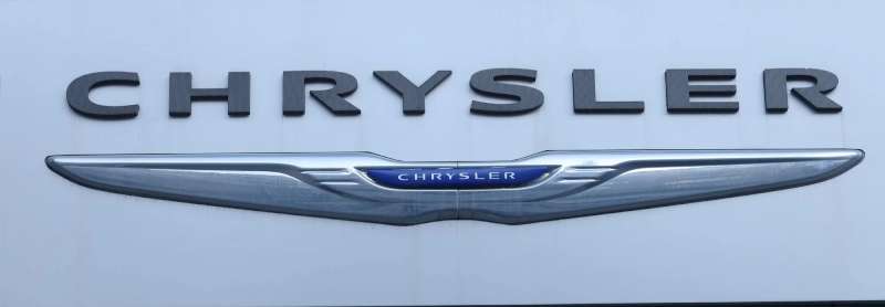
You’re cruising down the highway, and there it is – that iconic silver seal zooming past. It’s not just any badge; it’s the Chrysler logo. Steeped in history, emblematic of innovation, and a symbol of American automaking heritage.
Now, why should you stick around? Think of it this way: That one emblem on the grille tells a tale richer than its chrome finish.
From its conception by Walter P. Chrysler to the current wings spread wide, there’s a legacy and a science behind it that’s as fascinating as the cars themselves.
In this deep dive, you’ll get the lowdown on the logo that’s stamped its identity on the world.
We’re talking a slice of branding genius, the evolution over time, and the psychology of its design that commands respect on the road.
Chrysler’s branding and pentastar prominence didn’t just sprout overnight; there’s a whole strategy and a bag of market branding tactics behind it.
Strap in and get ready. By the end of our gears-shifting journey, you’ll see this not-so-ordinary badge through a whole new lens.
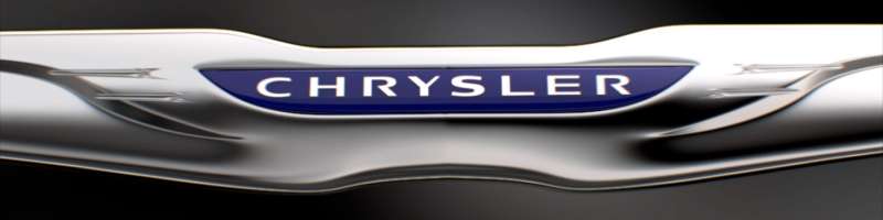
The Meaning Behind the Chrysler Logo
![]()
The Chrysler logo, it’s more than just a symbol.
The Emblem of Quality
You see, the Chrysler logo screams quality. A mark of distinction, it carries an air of elegance and class. It’s a representation of the brand’s commitment to craft vehicles with top-notch performance, safety, and reliability.
Pentastar – A Symbol of Unity
Remember the Pentastar logo? A five-pointed star within a pentagon? This was a symbol of unity, signifying the five divisions of Chrysler Corporation coming together. A powerful representation of strength in unity.
The Wings – Symbolizing Freedom and Elevation
And those wings. Oh, those wings! They symbolize freedom, elevation, and the constant drive for innovation. The wings stand as a testament to Chrysler’s aviation heritage, its lofty ambitions, and the free spirit it embodies.
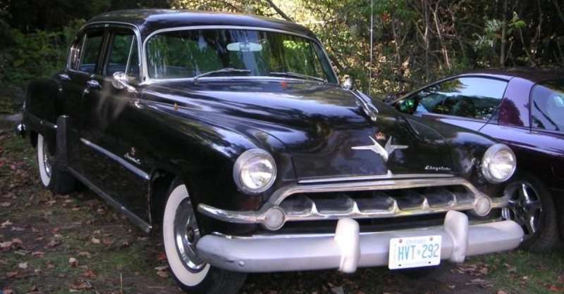
The History of the Chrysler Logo
![]()
A journey through time, the history of the Chrysler logo is quite a ride.
The Roaring Twenties – The Birth of an Icon
In the roaring twenties, when Chrysler was just getting its wheels off the ground, the first logo was born. An art-deco style medallion, it reflected the aesthetic of the time, simple yet elegant.
The Fifties to the Eighties – The Pentastar Era
Then came the fifties, and the iconic Pentastar was introduced. This logo stood for the unity of the brand’s divisions and remained the face of Chrysler for a good three decades.
The Nineties and Beyond – Return of the Wings
In the nineties, the wings made a comeback, bringing with them an air of nostalgia and a renewed commitment to quality and innovation. They’ve evolved since, becoming sleeker, sharper, more modern, but they’ve never lost their spirit.
The Colors of the Chrysler Logo
The colors of the Chrysler logo, they speak a language of their own.
The Bold Blue
That bold blue you see, it represents strength and excellence. It’s also a nod to the brand’s American roots, a subtle reminder of its heritage.
The Pure Silver
And the silver, it’s not just any silver. It’s pure silver, symbolizing sophistication, innovation, and modern design. It’s a color that shines with confidence, just like the brand it represents.
The Font Used in the Chrysler Logo
The font, oh, it’s a piece of art in itself.
Sophistication in Every Letter
Every letter in that Chrysler logo exudes sophistication. It’s clean, it’s modern, it’s bold. Just like the vehicles that bear its name.
Boldness in Simplicity
Despite its simplicity, there’s a boldness to it. It speaks volumes about the brand’s confidence in its products, its unwavering commitment to quality, and its drive for innovation.
The Evolution of the Chrysler Logo
The Chrysler logo, it’s evolved. Like a living entity, it’s adapted, it’s grown.
Adapting with Time
Over the years, the Chrysler logo has evolved, reflecting the brand’s growth and its adaptation to changing times. The logo has moved with the times, becoming sleeker, sharper, and more modern.
Preserving the Essence
But despite its evolution, the logo has preserved its essence. The wings, the colors, the font, they all still speak the same language. They still symbolize the same principles, and the same commitment to quality, innovation, and excellence that the brand has always stood for.
Chrysler Logo in Pop Culture
Chrysler’s logo, it’s not just a car emblem. It’s touched pop culture in surprising ways.
From Silver Screens to Toy Shelves
You’ve seen it on the silver screen, in movies like The Godfather and Gran Torino. It’s graced toy shelves, on miniature cars raced by eager little hands. It’s become an icon, a symbol that’s instantly recognizable, not just in the automotive world, but far beyond.
A Style Statement
And it’s not just movies and toys. The Chrysler logo has become a style statement. From caps to tees, from keychains to collectibles, the logo has found its way into fashion and lifestyle, becoming a symbol of style and class.
Impact of the Chrysler Logo on Brand Identity
The Chrysler logo, it’s had a massive impact on shaping the brand’s identity.
A Symbol of Trust
Through years of consistent quality and innovation, the Chrysler logo has become a symbol of trust. When people see those wings, they think reliability, safety, and performance. The logo has become synonymous with the brand’s commitment to excellence.
Building a Legacy
And it’s not just about the present. The Chrysler logo has played a crucial role in building a legacy, a story that spans nearly a century. It’s a legacy of unity, of quality, of relentless innovation. And it’s a legacy that’s beautifully encapsulated in that one iconic logo.
So there you have it. The Chrysler logo. More than just a car emblem, it’s a symbol of a rich heritage, of unwavering commitment to quality, of relentless innovation.
It’s a legacy, a style statement, a symbol of trust. It’s the Chrysler logo. And it stands for so much more than you might think.
FAQ On The Chrysler Logo
What’s the meaning behind the Chrysler logo?
The Chrysler logo, with its soaring wings, signifies American freedom and the pursuit of excellence.
Reflecting the spirit of the brand’s innovation, it’s evolved from its original 1925 badge – a nod to Chrysler’s roots and a commitment to pushing boundaries in the automotive industry.
How has the Chrysler logo changed over time?
From the classic seal to the current sleek wings, the Chrysler logo has undergone significant transformations. Each change mirrored the era’s design trends and the company’s evolution, reflecting Chrysler’s history and aligning with modern aesthetics of the auto industry.
What does the Chrysler logo represent?
It’s a representation of luxury, quality, and sophistication, folks! Chrysler’s logo, with its wings and Pentastar design, historically radiates strength and innovation within the American car market, projecting a premium feel to customers across the globe.
Who designed the Chrysler logo?
While no single designer gets all the credit, it was Walter P. Chrysler and his team who birthed the early logos. Since then, various iterations have been crafted by different designers, each adding a touch of modern branding strategies to keep pace with changing times.
Why does the Chrysler logo have wings?
Originally, wings in logos symbolize speed, freedom, and aspiration. For Chrysler, the wings embody progressive automotive design and aspirations for luxury vehicles, merging classic iconography with the thrust for future mobility in their brand identity.
Is there a hidden message in the Chrysler logo?
No hidden messages here – it’s all about luxury vehicle craftsmanship and innovation in automotive branding. However, the wings do subtly communicate Chrysler’s mission to soar above the rest in quality and design, a pledge since Walter P. Chrysler’s time.
What color is the Chrysler logo?
Stylish and sophisticated — the logo’s been historically chromed out, symbolizing high-grade American cars. The emblem’s sleek silver against a black background oozes the market branding strategies of elegance and premium quality Chrysler’s known for.
Is the Chrysler logo the same as the Chrysler Group LLC logo?
Close but no cigar. The Chrysler Group LLC logo often incorporates the company name with a simple, clean font. The Chrysler car logo is more elaborate, with the iconic wings and Pentastar design symbolizing the brand’s prowess.
Do all Chrysler cars have the same logo?
Throughout its models, the logo remains a constant symbol of the brand. However, some editions and special series might have slight tweaks to signify their uniqueness, all within the overall auto branding framework. Think continuity with a dash of special sauce.
Can the Chrysler logo be used commercially?
Hold your horses there! The Chrysler logo is a trademarked icon, legally protected and used exclusively for official Chrysler brand products and marketing. Unauthorized commercial use is a big no-no without explicit permission from Stellantis, the parent company.
Conclusion
So, here we are, parked at the end of our journey, right where we started — staring at the Chrysler logo and all that it stands for. Who knew that a badge, a simple piece of automotive jewelry, could carry such a cargo of meaning?
We’ve rolled through the twisting roads of Chrysler’s history, from Walter P.’s leap into the industry to the sleek, winged emblem that’s come to rest on the grilles of modern luxury. It’s more than a marker of brand identity; it’s the signature of a legacy.
Through design evolution, rebranding whirlwinds, and the embrace of branding genius tactics, we now see that logo as a beacon of American automaking. A storyteller in chrome, whispering tales of innovation, the spirit of Detroit, and that timeless quest for perfection in the fast lane.
Next time that winged badge captures your gaze, remember the psychology, strategy, and the story behind. It’s not just an emblem; it’s Chrysler’s promise — rev up the engines and aim skywards.
If you liked this article about the Chrysler logo, you should check out this article about the Lamborghini logo.
There are also similar articles discussing the Bentley logo, the Hyundai logo, the Jeep logo, and the Audi logo.
And let’s not forget about articles on the Cadillac logo, the Jaguar logo, the Maserati logo, and the Dodge logo.
Bogdan Sandu, a seasoned designer with 15 years of diverse experience, has been designing websites since 2008.
Renowned for his expertise in logo design and visual branding, Bogdan has developed a multitude of logos for various clients.
His skills extend to creating posters, vector illustrations, business cards, and brochures. Additionally, Bogdan's UI kits were featured on marketplaces like Visual Hierarchy and UI8.
Latest posts by Bogdan Sandu (see all)
- Seamlessly Blended: Gorgeous Gradient Color Palettes - 30 April 2024
- Examples of Great Gym Websites to Inspire You - 30 April 2024
- The Activision Blizzard Logo History, Colors, Font, And Meaning - 29 April 2024