The Aston Martin Logo stands as one of the most recognized symbols in the automotive world. Those wings. That wordmark. It screams British luxury without saying a word.
Within the broader history of car logos, Aston Martin’s emblem holds a special place. The brand competes with icons like Bentley and Rolls-Royce, yet its visual identity remains distinctly its own.
The current version dates back to 2022, though the winged concept has roots stretching to 1927. Marek Reichman, Aston Martin’s Chief Creative Officer, oversaw the latest refresh.
Founded in 1913 by Lionel Martin and Robert Bamford, the company has cycled through roughly eight major logo versions. Each iteration refined the wings while keeping the core identity intact.
What is the Aston Martin Logo?
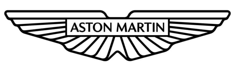
The Aston Martin logo features a pair of stylized wings with the brand name across the center. Officially introduced in its current form in 2022, the design was refined by the in-house team under Marek Reichman. It symbolizes speed, elegance, and British craftsmanship.
Design Type: Combination mark (emblem with wordmark)
Primary Elements:
- Stylized wings extending horizontally
- Brand name “ASTON MARTIN” in custom uppercase lettering
- Clean, streamlined silhouette
Official Introduction Date: 2022 (current version)
Designer/Agency: Aston Martin in-house design team, led by Chief Creative Officer Marek Reichman
Trademark Status: Registered trademark, protected globally
Color Palette:
- Aston Martin Racing Green: #004225
- Silver/Chrome for 3D applications
- Black and white for simplified usage
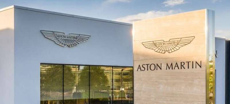
Usage Context: Vehicle badges, marketing materials, dealership signage, merchandise, Formula 1 team branding, digital platforms
How Has the Aston Martin Logo Evolved Over Time?
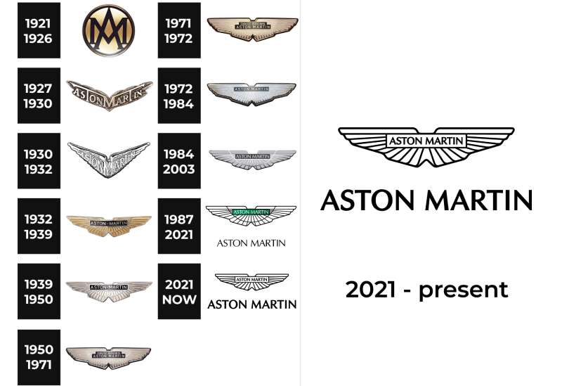
The Aston Martin logo has transformed significantly since 1913. Early versions featured circular badges before the iconic wings appeared in 1927.
Major redesigns occurred in 1932, 1984, and 2022. Each update streamlined the wings while maintaining brand recognition.
Original Aston Martin Logo (1913-1920)
Years Active: 1913-1920
Design Description: The first logo was simple. Just the letters “A” and “M” intertwined in a circular format. No wings yet.
Color Scheme: Gold lettering on dark backgrounds
Designer: Unknown, likely founders Lionel Martin and Robert Bamford
Context: The company was brand new. They needed something quick and functional for their early racing cars.
Key Changes from Previous: This was the original, so no previous version existed.
Cultural Significance: It marked the birth of a British sports car legend, though few would recognize it today.
First Winged Aston Martin Logo (1927-1932)
Years Active: 1927-1932
Design Description: Wings made their debut. The design showed a stylized “V” shape with feathered wings spreading outward. The name sat inside.
Color Scheme: Black and silver
Designer: Attributed to company management under Augustus Bertelli’s ownership era
Context: Aston Martin had just been acquired by Augustus Bertelli. The new ownership wanted a fresh identity that suggested speed and aviation.
Key Changes from Previous: Complete redesign. The circular motif disappeared. Wings became the defining feature.
Cultural Significance: This established the visual language that would define Aston Martin for the next century.
Refined Wings Logo (1932-1984)
Years Active: 1932-1984
Design Description: The wings became more angular and streamlined. Typography moved to the center band. More detailed feather textures appeared in the wings.
Color Scheme: Chrome, black, and white
Designer: S.C.H. Davis (Sammy Davis)
Context: Racing success demanded a more prestigious look. The company wanted something that would look stunning on car grilles.
Key Changes from Previous: Wings stretched wider. The overall shape became more horizontal and aggressive.
Cultural Significance: This version appeared on the DB5 in James Bond films. It became the logo most people associate with classic Aston Martin.
Modernized Logo (1984-2022)
Years Active: 1984-2022
Design Description: Cleaner lines replaced the detailed feathers. The wings became more geometric while keeping their sweep.
Color Scheme: Green, silver, black, and white variations
Designer: Various updates by in-house teams
Context: The 1980s brought new ownership and manufacturing changes. A cleaner logo suited modern production methods better.
Key Changes from Previous: Simplified details. The feather textures gave way to smooth surfaces. Typography became bolder.
Cultural Significance: This version carried the brand through its revival and modern success story.
Current Aston Martin Logo (2022-Present)
Years Active: 2022-present
Design Description: The most minimal version yet. Wings are stripped to their essence. Clean lines dominate.
Color Scheme: Aston Martin Racing Green (#004225), silver, black, white
Designer: In-house team under Marek Reichman
Context: The brand entered Formula 1 as a constructor. A fresh identity signaled a new chapter.
Key Changes from Previous: Sharper angles. More angular wing tips. Updated typography with refined letter spacing.
Cultural Significance: It represents Aston Martin’s push into motorsport and electric vehicles.
What Do the Design Elements of the Aston Martin Logo Mean?
The wings represent speed, freedom, and flight. They draw from early aviation imagery that fascinated the automotive industry in the 1920s.
The horizontal spread suggests forward motion. It creates a sense of something about to take off.
Why Did Aston Martin Choose These Specific Colors?
Aston Martin Racing Green
- Hex: #004225
- Pantone: 3308 C
- Symbolic meaning: British racing heritage, prestige, tradition
- Psychological impact: Conveys wealth, stability, and exclusivity
- Brand connection: British Racing Green has defined UK motorsport since the early 1900s
Silver/Chrome
- Symbolic meaning: Precision engineering, modernity, luxury
- Psychological impact: Suggests high technology and premium quality
- Brand connection: Reflects the metalwork and craftsmanship of the vehicles
Black
- Hex: #000000
- Symbolic meaning: Sophistication, power, elegance
- Psychological impact: Creates authority and timelessness
- Brand connection: Works for formal applications and high-contrast visibility
Understanding color psychology helps explain why these choices resonate with luxury car buyers.
What Typography Style Is Used in the Aston Martin Logo?
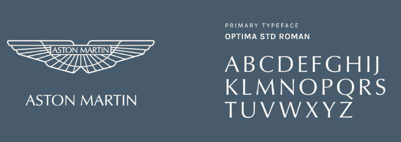
Aston Martin uses a custom sans-serif font designed specifically for the brand. The letters are uppercase with generous spacing between them.
Each character has been drawn to match the angular nature of the wings. The letterforms are tall and narrow with precise geometry.
Readability was a priority. The logo needs to work on everything from car grilles to tiny keyfobs. The clean sans-serif style ensures legibility at any size.
Earlier versions used more ornate lettering. The evolution toward simplicity mirrors broader trends in logo design.
What Are the Hidden Meanings in the Aston Martin Logo?
The wings weren’t random. They connected to the aviation obsession of the 1920s and 30s.
Some see a subtle “A” shape in the overall wing form. Whether intentional or not, it reinforces the brand initial.
The horizontal lines suggest the horizon. The road ahead. Endless possibilities.
Designers have noted the symmetry creates visual stability. It makes the logo feel balanced and trustworthy.
How Does the Aston Martin Logo Compare to Competitor Logos?
Luxury car brands tend toward similar themes. Wings, shields, animals. Aston Martin picked wings, and they’re not alone.
The logo sits between the ornate and the minimal. It’s cleaner than some competitors but more detailed than others.
The Bentley Logo also uses wings, creating obvious visual overlap. Both brands lean into British heritage and aviation symbolism.
Compared to the Ferrari Logo with its prancing horse, Aston Martin feels more understated. Ferrari is loud. Aston Martin is quietly confident.
The Rolls-Royce Logo takes a different path with its Spirit of Ecstasy figure. Aston Martin’s wings are more abstract, less figurative.
The Jaguar Logo chose an animal rather than wings. Both represent speed, but through different visual metaphors.
What Are the Technical Specifications of the Aston Martin Logo?
Official Color Codes:
Primary Color: Aston Martin Racing Green
Secondary Color: Silver
- Hex: #C0C0C0
- RGB: (192, 192, 192)
- CMYK: (0, 0, 0, 25)
Accent Color: Black
- Hex: #000000
- RGB: (0, 0, 0)
- CMYK: (0, 0, 0, 100)
Dimensions and Proportions:
- Aspect ratio: Approximately 3:1 (width to height)
- Minimum size: 25mm width for print applications
- Clear space: Equal to the height of the “A” in ASTON on all sides
- The logo should never be stretched, rotated, or modified
Modern applications require vector graphics formats for scalability across all media.
What Cultural Impact Has the Aston Martin Logo Had?
James Bond made this logo famous worldwide. When the DB5 appeared in Goldfinger, those wings became synonymous with sophisticated cool.
The logo transcends cars. It appears on watches, clothing, and even real estate developments.
In motorsport, the wings returned to Formula 1 in 2021. A new generation now associates them with racing rather than just spy films.
How Does the Aston Martin Logo Fit Into the Overall Brand Identity?
The logo anchors everything Aston Martin does. It sets the tone for dealership design, marketing materials, and the cars themselves.
Every touchpoint reflects the wings. Interior stitching patterns. Website navigation. Even the way showrooms are lit.
The brand guidelines ensure consistency across global markets. Whether you see an Aston Martin in Tokyo or Toronto, the visual experience stays cohesive.
How Should the Aston Martin Logo Be Used?
Official Usage Guidelines:
Do:
- Use official logo files from authorized sources
- Maintain clear space around the logo
- Use approved color variations only
- Scale proportionally
Don’t:
- Alter the colors outside brand specifications
- Add effects like shadows or gradients to the flat logo
- Place the logo on busy backgrounds that reduce visibility
- Stretch or distort the proportions
Where to Access Official Logos: Authorized dealers and partners receive logo files through Aston Martin’s brand portal. Public use requires licensing agreements.
Trademark Protection: The Aston Martin wings are protected intellectual property. Unauthorized commercial use may result in legal action. Fan art and editorial use typically fall under fair use, but commercial applications need permission.
FAQ on The Aston Martin Logo
What Does the Aston Martin Logo Represent?
The Aston Martin wings represent speed, elegance, and freedom. The design draws from early aviation imagery popular in the 1920s.
It connects the British automotive brand to precision engineering and luxury craftsmanship. The winged emblem signals prestige on every vehicle badge.
Who Designed the Original Aston Martin Logo?
The first winged logo appeared in 1927 during Augustus Bertelli’s ownership. S.C.H. Davis (Sammy Davis) later refined the design in 1932.
The current version comes from Marek Reichman and the in-house team at Gaydon. Each designer added their own interpretation.
Why Does Aston Martin Use Wings in Its Logo?
Wings symbolize flight and velocity. In the 1920s, aviation captured public imagination worldwide.
Lionel Martin and later owners wanted their sports car insignia to suggest speed. The winged logo design became their signature.
How Many Times Has the Aston Martin Logo Changed?
The brand has updated its car manufacturer symbol roughly eight times since 1913. Major redesigns happened in 1927, 1932, 1984, and 2022.
Each version kept the wings while refining details. The core identity stayed consistent throughout.
What Colors Are Used in the Aston Martin Logo?
The primary color is Aston Martin Racing Green (hex #004225). Silver and black serve as secondary options.
These colors reflect British racing heritage and luxury positioning. The color palette changes depending on application context.
Is the Aston Martin Logo Trademarked?
Yes. The winged emblem is a registered trademark protected globally. Aston Martin Lagonda holds exclusive rights to the design.
Unauthorized commercial use can result in legal action. The company actively defends its brand identity design.
What Font Does Aston Martin Use in Its Logo?
Aston Martin uses a custom typeface designed specifically for the brand. The uppercase letters feature clean, angular geometry.
Proper kerning ensures readability at all sizes. The typography elements complement the wing shapes perfectly.
How Is the Aston Martin Logo Connected to James Bond?
The DB5 appeared in Goldfinger (1964) and made the logo world famous. James Bond films turned the winged badge into a cultural icon.
That association boosted brand recognition far beyond the automotive industry. It still influences perception today.
What Is the Difference Between Old and New Aston Martin Logos?
Older versions featured detailed feather textures and ornate styling. The 2022 update stripped everything to clean lines.
Modern logo design principles favor simplicity. The current emblem works better across digital platforms and the Aston Martin F1 Team branding.
Can I Use the Aston Martin Logo for Personal Projects?
Editorial and fan art typically fall under fair use. Commercial applications require licensing from Aston Martin Lagonda.
The company provides official assets through their brand portal. Always check trademark guidelines before any public use of this iconic luxury car badge.
Conclusion
The Aston Martin Logo remains one of the most recognizable symbols in the luxury car segment. Those wings have survived ownership changes, economic struggles, and shifting design trends.
From Newport Pagnell to Gaydon, the brand kept its visual identity intact. David Brown’s era gave us the DB series. Lawrence Stroll brought the company into Formula 1.
The emblem evolved but never lost its soul. It still represents British automotive heritage, GT racing pedigree, and handcrafted excellence.
Few premium car emblems carry this much history. Fewer still look this good on a Vantage grille.

Renowned for his expertise in logo design and visual branding, Bogdan has developed a multitude of logos for various clients.
His skills extend to creating posters, vector illustrations, business cards, and brochures. Additionally, Bogdan's UI kits were featured on marketplaces like Visual Hierarchy and UI8.
He also wrote in the past years on sites like Design Your Way, WebDesignerDepot, WPDean, Designmodo, Speckyboy, Slider Revolution, and more.
- How to Install Fonts on Mac (Step-by-Step Guide) - 20 September 2026
- From Mockup to Code: How AI-Augmented Development Speeds Up the Design Handoff - 19 September 2026
- The Beehiiv Logo History, Colors, Font, And Meaning - 18 September 2026

Bogdan Sandu is a seasoned designer who has been designing websites since 2008. Renowned for his expertise in logo design and visual branding, Bogdan has developed a multitude of logos for various clients. His skills extend to creating posters, vector illustrations, business cards, and brochures. Additionally, Bogdan's UI kits were featured on marketplaces like Visual Hierarchy and UI8. He also wrote in the past years on sites like Design Your Way, WebDesignerDepot, WPDean, Designmodo, Speckyboy, Slider Revolution, and more.
You Might Also Like