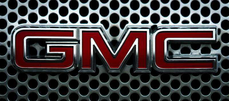
The GMC Logo stands as one of the most recognized automotive emblems in North America. Three bold red letters on a chrome background. That’s it. Simple, direct, and unmistakably American.
Within the broader context of car logos, GMC’s mark occupies a unique space. It represents trucks and SUVs built for serious work, not luxury cruisers or economy vehicles.
The current version dates back to 1987, though variations existed since 1912. General Motors’ truck division has cycled through roughly a dozen logo iterations over 110+ years. Each version refined the same core idea: bold lettering that commands attention on a grille.
What is the GMC Logo?
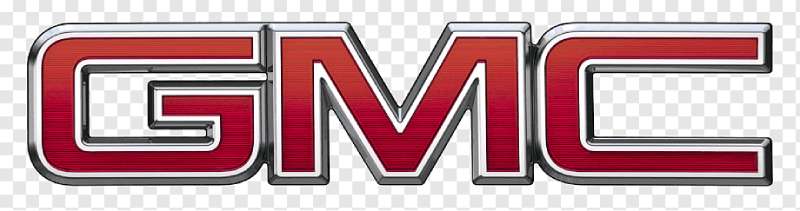
The GMC Logo is a red wordmark featuring three capitalized letters in a bold sans-serif typeface, officially standardized in 1987. The design represents General Motors’ truck and commercial vehicle division. Its core symbolism centers on strength, durability, and professional-grade capability.
Design Type: Wordmark (lettermark)
Primary Elements: Three capital letters “GMC” with distinctive angular styling and a chrome or silver outline
Official Introduction Date: Current version standardized in 1987
Designer/Agency: General Motors in-house design team
Trademark Status: Registered trademark of General Motors LLC
Color Palette:
- GMC Red: #C41230
- Chrome Silver: #C0C0C0
- Black (secondary): #000000
Usage Context: Vehicle grilles, tailgates, steering wheels, dealership signage, marketing materials, digital platforms, and merchandise
How Has the GMC Logo Evolved Over Time?
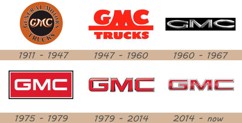
The GMC Logo has gone through significant changes since 1912. Early versions were ornate and detailed.
Mid-century designs simplified the look considerably. The modern red wordmark emerged in the 1960s and got refined in the 1980s.
Recent updates have focused on digital optimization while keeping the core design intact.
Original GMC Logo (1912-1938)
Years Active: 1912-1938
Design Description: Early GMC trucks carried various script and block-letter designs. The lettering varied between vehicles and often included “GMC Truck” in full.
Color Scheme: Primarily black, silver, and gold tones typical of the era
Designer: Rapid Motor Vehicle Company design team (GMC’s predecessor)
Context: These early logos appeared during the brand’s formation years when Max Grabowsky’s truck company merged into General Motors. Consistency wasn’t a priority yet.
Key Changes from Previous: N/A (original design period)
Cultural Significance: Represented the birth of American commercial trucking. These trucks built the infrastructure of a growing nation.
Mid-Century GMC Logo (1938-1965)
Years Active: 1938-1965
Design Description: Streamlined block letters replaced earlier ornate scripts. The design reflected Art Deco influences common in automotive design of that period.
Color Scheme: Chrome and silver dominated, with some red accents appearing later
Designer: General Motors styling department
Context: Post-war industrial boom. GMC trucks were everywhere, from farms to construction sites to military applications.
Key Changes from Previous: Cleaner letterforms, more standardized application across vehicle lines
Cultural Significance: Became associated with American industrial might and post-war prosperity
Red Era GMC Logo (1965-1987)
Years Active: 1965-1987
Design Description: The signature red color emerged during this period. Letters became bolder with stronger geometric shapes.
Color Scheme: Red letters with chrome outlining
Designer: GM Design Center
Context: Consumer trucks gained popularity. GMC needed to differentiate from Chevrolet while sharing platforms.
Key Changes from Previous: Introduction of red as primary color, more aggressive angular styling
Cultural Significance: Marked GMC’s shift toward premium positioning within the GM truck lineup
Modern GMC Logo (1987-Present)
Years Active: 1987-Present
Design Description: Refined version of the red wordmark with precise proportions. Chrome border standardized. The current iteration received subtle digital updates in 2014.
Color Scheme: GMC Red (#C41230) with chrome/silver accents
Designer: General Motors in-house team
Context: Corporate identity standardization across global markets. Digital applications became increasingly important.
Key Changes from Previous: Precise color specifications, updated letter spacing, optimized for digital and print reproduction
Cultural Significance: Represents the “Professional Grade” era. Associated with upscale trucks and SUVs.
What Do the Design Elements of the GMC Logo Mean?
The GMC Logo communicates strength through bold letterforms and aggressive styling. Red signals power and energy.
The chrome outline adds a premium touch that separates GMC from economy brands.
Every design choice reinforces the “Professional Grade” positioning.
Why Did GMC Choose These Specific Colors?
GMC Red (#C41230) wasn’t an accident. Red grabs attention faster than almost any other color on the road.
According to color psychology, red creates feelings of excitement and power. Perfect for trucks marketed to people who need serious capability.
The chrome silver provides contrast while suggesting quality manufacturing and durability.
Together, these colors position GMC as premium but not pretentious. Tough but refined.
What Typography Style Is Used in the GMC Logo?
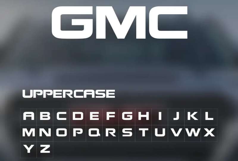
GMC uses a custom sans-serif font designed specifically for the brand. No off-the-shelf typeface here.
The letters feature squared-off edges and consistent stroke widths. This creates a stable, grounded appearance.
Readability works at any size, from a tiny key fob to a massive dealership sign.
The typography has barely changed since 1987. Minor adjustments improved digital rendering, but the essential character stayed the same.
What Are the Hidden Meanings in the GMC Logo?
Honestly? There aren’t many hidden meanings here. GMC keeps it straightforward.
The angular letter shapes suggest forward motion and progress. Some designers point to the slightly tilted crossbar in the “G” as implying movement.
What you see is what you get. Three letters. Red and chrome. Built for recognition, not mystery.
The designers wanted instant identification, and that’s exactly what they achieved.
How Does the GMC Logo Compare to Competitor Logos?
Compared to the RAM Logo, GMC takes a more understated approach. RAM went bold with a literal ram’s head.
The Ford Logo uses a classic script that feels more heritage-focused.
GMC sits in between. Modern but not flashy. Recognizable but not over-designed.
Against the Toyota Logo‘s abstract overlapping ovals, GMC feels more direct. You know exactly what brand you’re looking at without needing to interpret anything.
The Chevrolet Logo is interesting because both brands share a parent company. GMC’s wordmark versus Chevy’s bowtie creates clear differentiation despite similar truck platforms.
What Are the Technical Specifications of the GMC Logo?
Official Color Codes:
Primary Color: GMC Red
Secondary Color: Chrome Silver
- Hex: #C0C0C0
- RGB: (192, 192, 192)
- CMYK: (0, 0, 0, 25)
Accent Color: Black
- Hex: #000000
- RGB: (0, 0, 0)
- CMYK: (0, 0, 0, 100)
Dimensions and Proportions:
- Aspect ratio: Approximately 3:1 (width to height)
- Minimum size: 0.5 inches for print, 72 pixels for digital
- Clear space: Minimum of 25% logo height on all sides
- Official usage guidelines: Available through GM’s brand portal for authorized partners
What Cultural Impact Has the GMC Logo Had?
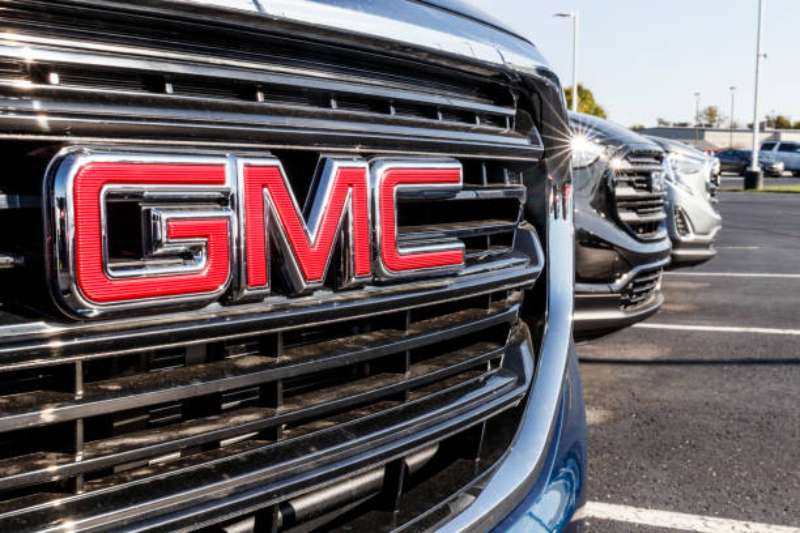
The GMC Logo has become shorthand for “serious truck.” Not a weekend warrior. Not a mall crawler.
In American culture, that red badge signals capability and no-nonsense utility.
Movies and TV shows regularly feature GMC vehicles when they need to portray working professionals. Think contractors, first responders, and business owners.
The logo transcends the vehicles themselves. It represents a certain attitude about getting work done.
How Does the GMC Logo Fit Into the Overall Brand Identity?
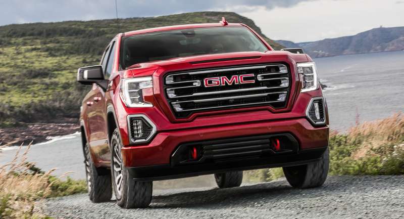
The logo anchors everything else in GMC’s brand guidelines. Colors, fonts, photography styles all flow from that central mark.
“Professional Grade” as a tagline makes perfect sense paired with the logo’s straightforward design.
Marketing materials use the red consistently. Dealership architecture incorporates the chrome aesthetic. Even the vehicle interiors reference the brand colors.
The Cadillac Logo handles GM’s luxury image. GMC handles the capable-but-premium truck segment. Clear lanes, clear identities.
How Should the GMC Logo Be Used?
Official Usage Guidelines:
- Never alter proportions or colors
- Maintain required clear space around the logo
- Use only approved logo files from official sources
- Don’t place the logo on busy backgrounds that reduce visibility
- Chrome version preferred on vehicles; flat red version for print and digital
Where to Access Official Logos: GM’s brand center provides approved files to dealers, marketing partners, and media. Unauthorized use gets shut down quickly.
Licensing Information: Third-party use requires written permission from General Motors. Merchandise licensing goes through GM’s official licensing program.
Trademark Protection: The GMC name and logo are registered trademarks of General Motors LLC. GM actively protects against infringement. Using the logo without authorization can result in legal action.
FAQ on The GMC Logo
What Does GMC Stand For?
GMC stands for General Motors Truck Company. The name traces back to 1912 when the brand formed under General Motors.
Today, the GMC division produces trucks, SUVs, and commercial vehicles. The three-letter emblem represents over a century of American truck manufacturing heritage.
Who Designed the Current GMC Logo?
General Motors’ in-house design team created the current GMC badge. No external agency handled the work.
The modern version was standardized in 1987. Detroit designers refined the logo to work across vehicle grilles, dealership signage, and marketing materials.
What Are the Official GMC Logo Colors?
The official color palette features GMC Red (hex #C41230) as the primary color. Chrome silver provides the outline.
These colors appear on every Sierra, Yukon, Canyon, and Acadia. The red hue remains consistent across all GMC branding.
When Was the First GMC Logo Created?
The first GMC truck logo appeared in 1912. Max Grabowsky’s Rapid Motor Vehicle Company had just merged into General Motors.
Early versions varied significantly. The brand went through roughly twelve logo iterations before settling on the current design.
What Font Does the GMC Logo Use?
GMC uses a custom typeface designed specifically for the brand. You won’t find it in any font library.
The lettering features squared edges and consistent stroke widths. This creates strong visual hierarchy on vehicle grilles.
Why Is the GMC Logo Red?
Red signals power, energy, and action. GMC chose this color to differentiate from Chevrolet’s gold bowtie within the GM truck lineup.
The bold red also grabs attention on the road. It reinforces the “Professional Grade” positioning that defines GMC’s brand identity.
Is the GMC Logo Trademarked?
Yes. The GMC name and symbol are registered trademarks of General Motors LLC. The company actively protects against unauthorized use.
Using the GMC emblem without permission can result in legal action. Licensing requires written approval from General Motors.
How Is the GMC Logo Different From Chevrolet?
GMC uses a red wordmark. Chevrolet uses a gold bowtie emblem. Both brands share vehicle platforms but target different buyers.
GMC positions itself as premium and professional. The logo design principles reflect this upscale truck market positioning.
Can I Download the Official GMC Logo?
Official logo files are available through GM’s brand portal. Access is restricted to authorized dealers, media, and marketing partners.
For personal projects, you’ll need vector graphics versions. These maintain quality at any size, from decals to billboards.
Has the GMC Logo Changed Recently?
The core design hasn’t changed since 1987. Minor refinements in 2014 improved digital rendering and screen display.
GMC kept the same red chrome badge while competitors like Ford and Toyota underwent major redesigns. Consistency builds recognition.
Conclusion
The GMC Logo proves that simplicity works. Three red letters on chrome. No hidden symbols, no complex imagery. Just bold lettering that’s been commanding attention on truck grilles since 1912.
General Motors understood something about automotive branding early on. Recognition beats cleverness every time.
The GMC emblem sits comfortably among red logos that dominate the American truck market. It shares DNA with the Denali and Sierra nameplates that define professional-grade capability.
Whether you’re looking at a Yukon XL or a Canyon pickup, that badge means the same thing. Built for work. Built to last.

Renowned for his expertise in logo design and visual branding, Bogdan has developed a multitude of logos for various clients.
His skills extend to creating posters, vector illustrations, business cards, and brochures. Additionally, Bogdan's UI kits were featured on marketplaces like Visual Hierarchy and UI8.
He also wrote in the past years on sites like Design Your Way, WebDesignerDepot, WPDean, Designmodo, Speckyboy, Slider Revolution, and more.
- How to Install Fonts on Mac (Step-by-Step Guide) - 20 September 2026
- From Mockup to Code: How AI-Augmented Development Speeds Up the Design Handoff - 19 September 2026
- The Beehiiv Logo History, Colors, Font, And Meaning - 18 September 2026

Bogdan Sandu is a seasoned designer who has been designing websites since 2008. Renowned for his expertise in logo design and visual branding, Bogdan has developed a multitude of logos for various clients. His skills extend to creating posters, vector illustrations, business cards, and brochures. Additionally, Bogdan's UI kits were featured on marketplaces like Visual Hierarchy and UI8. He also wrote in the past years on sites like Design Your Way, WebDesignerDepot, WPDean, Designmodo, Speckyboy, Slider Revolution, and more.
You Might Also Like