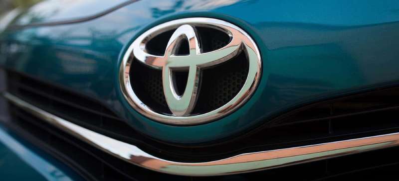
The Toyota Logo is one of the most recognized automotive emblems worldwide. It consists of three overlapping ellipses that form a stylized “T” shape within an outer oval boundary.
Toyota Motor Corporation, founded in 1937 in Japan, introduced this current emblem in 1989 to mark its 50th anniversary. The design took approximately five years to develop.
Within the automotive industry, this logo stands as a prime example of minimalist design thinking. It replaced earlier text-based marks with pure geometric abstraction.
The company has used variations of its branding since 1935. This current version remains unchanged for over three decades, making it one of the most stable corporate identities in automotive history.
What is the Toyota Logo?
![]()
The Toyota Logo features three overlapping ellipses arranged within an outer oval frame. Introduced in October 1989 for the company’s 50th anniversary, this emblem was created by Toyota’s in-house design team. It symbolizes the unification of customer hearts and company values through its interlocking shapes.
Design Type: Abstract symbol mark with geometric elements
Primary Elements:
- Two perpendicular inner ellipses (forming stylized “T”)
- One encompassing outer ellipse
- Negative space creating letter forms
Official Introduction Date: October 1989
Designer/Agency: Toyota Motor Corporation in-house design team
Trademark Status: Registered trademark in over 170 countries worldwide
Color Palette:
- Toyota Red (primary): #EB0A1E
- Silver/Chrome (vehicle applications)
- Black (monochrome usage)
- White (reversed applications)
Usage Context: Vehicle grilles, steering wheels, key fobs, dealership signage, marketing materials, digital platforms, merchandise, and corporate communications
How Has the Toyota Logo Evolved Over Time?
![]()
Toyota’s visual identity has gone through several distinct phases since 1935. The brand started with Japanese characters before moving to Romanized text.
Eventually, they landed on the abstract ellipse design we know today. Each change reflected shifts in the company’s market position and global ambitions.
Original Toyoda Logo (1935-1936)
Years Active: 1935-1936
Design Description: Japanese katakana characters spelling “Toyoda” (the founder’s family name) enclosed in a diamond shape. Red text on white background.
Color Scheme: Red and white
Designer: Internal company design
Context: Created when the company was still the automotive division of Toyoda Automatic Loom Works. The name honored founder Kiichiro Toyoda’s family.
Key Changes from Previous: First official automotive logo for the company
Cultural Significance: Represented the transition from textile machinery to automobile manufacturing
First Toyota Logo (1936-1949)
Years Active: 1936-1949
Design Description: The name changed from “Toyoda” to “Toyota” in katakana script. Still used Japanese characters but with a cleaner, more streamlined appearance.
Color Scheme: Red text, various background applications
Designer: Selected through public competition with over 27,000 entries
Context: The name “Toyota” was chosen because it required eight brush strokes in Japanese, considered a lucky number. It also sounded better and was easier to pronounce.
Key Changes from Previous: Name spelling changed, simplified character structure
Cultural Significance: Marked the official establishment of Toyota Motor Corporation as an independent company in 1937
Romanized Text Logo (1949-1989)
Years Active: 1949-1989
Design Description: Simple wordmark using “TOYOTA” in Latin alphabet letters. Various typographic treatments appeared during this period, including a distinctive red block letter version.
Color Scheme: Primarily red, sometimes black or chrome for vehicle badges
Designer: Internal design team with multiple refinements over the years
Context: Post-war international expansion required a logo readable by global audiences. The Romanized version supported entry into American and European markets.
Key Changes from Previous: Complete shift from Japanese characters to Western alphabet
Cultural Significance: Signaled Toyota’s ambitions to become a truly global automaker
Current Ellipse Logo (1989-Present)
Years Active: 1989-present
Design Description: Three overlapping ellipses. Two inner ellipses positioned perpendicularly create the letter “T” while representing the customer and company. The outer ellipse symbolizes the world embracing Toyota.
Color Scheme: Toyota Red (#EB0A1E), silver/chrome for 3D applications, monochrome versions available
Designer: Toyota Motor Corporation in-house team (five-year development process)
Context: Unveiled to celebrate the company’s 50th anniversary. Designed to work in the emerging digital age while maintaining strong physical presence on vehicles.
Key Changes from Previous: Complete departure from wordmark to abstract symbol. First non-typographic primary logo.
Cultural Significance: Represented Toyota’s confidence as a global leader and its forward-thinking philosophy
What Do the Design Elements of the Toyota Logo Mean?
The three ellipses carry specific meanings according to official Toyota communications.
The two inner ellipses represent the heart of the customer and the heart of the company.
Their overlap shows the mutually beneficial relationship and trust between them. The outer ellipse represents the world embracing Toyota.
Why Did Toyota Choose These Specific Colors?
Toyota Red
- Hex Code: #EB0A1E
- Pantone: 485 C
- Symbolic Meaning: Energy, passion, and excitement
- Psychological Impact: Commands attention and conveys confidence
- Brand Connection: Reflects Japanese cultural appreciation for red as a positive, celebratory color
Silver/Chrome
- Application: 3D vehicle badges and premium contexts
- Symbolic Meaning: Quality, precision, and technological advancement
- Psychological Impact: Suggests premium value and durability
- Brand Connection: Aligns with automotive industry standards for badge materials
Understanding color psychology helps explain why these choices work so well for automotive branding.
What Typography Style Is Used in the Toyota Logo?
The current ellipse logo contains no typography within the symbol itself.
When the Toyota wordmark appears alongside the emblem, it uses a custom sans-serif font called Toyota Type.
This typeface was developed specifically for brand communications.
It features clean lines with slightly rounded terminals, making it readable at small sizes while maintaining a friendly, approachable character.
What Are the Hidden Meanings in the Toyota Logo?
Look closely at the overlapping ellipses. They spell out every letter in “TOYOTA” if you examine the negative space and shapes carefully.
The design team claims this was intentional. Some people dispute whether this works perfectly.
I’ve stared at it for a while and can see most letters, though the “A” takes some imagination.
Beyond the letter trick, the ellipses reference the psychology of shapes, where ovals and circles suggest completeness and unity.
How Does the Toyota Logo Compare to Competitor Logos?
Among major automakers, Toyota took a different path with pure geometric abstraction.
Most competitors use letters, crests, or animal mascots. Toyota went minimal.
This approach shares more DNA with tech companies than traditional car brands.
Versus Japanese Competitors:
The Honda Logo uses a bold “H” letterform. The Nissan Logo combines wordmark and circular framing. Mazda’s emblem features a stylized “M” with wings.
Toyota’s design stands out for having no obvious letter reference at first glance.
Versus Luxury Division:
Toyota’s own luxury brand uses the Lexus Logo, which takes a completely different approach with its angular “L” inside an oval.
The parent and luxury brands share the oval motif but express different personalities.
Versus European and American Brands:
German manufacturers like BMW and Audi lean into heritage and mechanical precision with their circular designs.
American brands like Ford and Chevrolet emphasize wordmarks and iconic shapes with stronger national identity cues.
Toyota’s ellipses feel more universal, less tied to national identity.
What Are the Technical Specifications of the Toyota Logo?
Official Color Codes:
Toyota Red (Primary):
Black (Secondary):
- Hex: #000000
- RGB: (0, 0, 0)
- CMYK: (0, 0, 0, 100)
White (Reverse Applications):
- Hex: #FFFFFF
- RGB: (255, 255, 255)
- CMYK: (0, 0, 0, 0)
Dimensions and Proportions:
- Aspect Ratio: Approximately 1.28:1 (width to height)
- Minimum Size: 12mm width for print, 40 pixels for digital
- Clear Space: Minimum space equal to height of inner ellipse on all sides
- The logo should always appear as vector graphics when possible for scalability
What Cultural Impact Has the Toyota Logo Had?
The Toyota emblem appears on more vehicles worldwide than almost any other car logo.
This sheer visibility made it a cultural touchstone across multiple generations.
In Japan, it represents industrial achievement and global success.
In emerging markets, it signals reliability and practicality. And for design students, it serves as a case study in geometric abstraction for corporate identity.
How Does the Toyota Logo Fit Into the Overall Brand Identity?
Toyota’s emblem works as the anchor for a broader visual system.
The company maintains strict brand guidelines covering everything from logo placement to partner co-branding scenarios.
Sub-brands like TRD (Toyota Racing Development) and GR (Gazoo Racing) use modified versions that maintain the ellipse DNA while adding performance cues.
The brand style guide ensures consistent application across dealerships, advertising, digital platforms, and merchandise globally.
How Should the Toyota Logo Be Used?
Official Usage Guidelines:
Do:
- Maintain minimum clear space around the logo
- Use official color values from the brand guide
- Scale proportionally (never stretch or distort)
- Apply on approved background colors only
Don’t:
- Alter the proportions of the ellipses
- Apply drop shadows or other effects
- Place on busy photographic backgrounds
- Recreate the logo from memory
- Use outdated versions of the emblem
Accessing Official Logos:
Toyota provides official logo files through its media newsroom and authorized dealer portals. Press and partners can request high-resolution files for approved uses.
Trademark Protection:
The Toyota ellipse logo is a registered trademark in over 170 countries. Unauthorized commercial use, counterfeiting on merchandise, and misleading application can result in legal action. The company actively monitors and enforces trademark violations globally.
FAQ on The Toyota Logo
What Does the Toyota Logo Represent?
The Toyota emblem features three overlapping ellipses with specific meanings.
Two inner ovals represent customer and company hearts united. The outer ellipse symbolizes the world embracing Toyota.
This Japanese automaker designed the mark to show trust and global connection through simple geometric shapes.
Why Did Toyota Change Its Name from Toyoda?
The founding family name was actually Toyoda. In 1936, “Toyota” won a public naming contest.
The new spelling required eight brush strokes in Japanese. That number brings good luck.
It also sounds cleaner and separates the corporate identity from the family name.
When Was the Current Toyota Logo Introduced?
October 1989. Toyota unveiled this emblem for its 50th anniversary celebration.
The design team spent five years developing it. Pretty long time for three ovals, right?
But that careful approach to logo design principles paid off with a timeless result.
What Are the Official Toyota Logo Colors?
Toyota Red serves as the primary brand color. The hex code is #EB0A1E.
Silver and chrome appear on vehicle badges. Black works for monochrome applications.
Understanding color theory explains why red conveys energy and passion for this automotive brand.
How Do You Spell Toyota Using the Logo?
Here’s where it gets interesting. The overlapping ellipses supposedly contain every letter in “TOYOTA.”
You need to look at both the shapes and negative space. The company confirms this was intentional.
Some letters are easier to spot than others. The “A” takes real imagination.
What Font Does Toyota Use?
Toyota Type. It’s a custom font created specifically for brand communications.
The typography features clean lines with slightly rounded edges.
This makes it readable at small sizes while maintaining a friendly, approachable character across all marketing materials.
Is the Toyota Logo Trademarked?
Yes. The Toyota trademark is registered in over 170 countries worldwide.
Toyota Motor Corporation actively enforces these protections. Unauthorized commercial use leads to legal action.
Counterfeit merchandise and misleading applications face serious consequences from their legal team.
What Is the Meaning of the Three Ellipses?
Each ellipse carries purpose. The two perpendicular inner ovals form a stylized “T” shape.
They represent the relationship between customers and the company.
The outer ellipse shows global reach. Together, they demonstrate unity and connection in automotive branding.
How Has the Toyota Logo Changed Over Time?
Four major versions exist. Japanese characters came first in 1935.
Then Romanized text for international markets starting in 1949.
The current ellipse design arrived in 1989. Each change in the logo evolution reflected growing global ambitions and market positioning shifts.
Can I Use the Toyota Logo for My Business?
Not without permission. The Toyota symbol is protected intellectual property.
Dealers and authorized partners receive official files through approved channels. Everyone else needs explicit licensing.
Using it without authorization violates trademark law and will attract legal attention from Toyota’s enforcement team.
Conclusion
The Toyota Logo stands as proof that simple geometric forms can carry deep meaning. Three ellipses. Five years of development. Over three decades of consistent use worldwide.
That kind of staying power is rare in automotive branding.
The design demonstrates strong visual hierarchy and balance through its symmetry.
Every curve serves a purpose. The Toyota oval emblem works on a tiny key fob and a massive dealership sign with equal clarity.
For anyone studying graphic design principles, this vehicle badge offers a masterclass in restraint and intentional design elements.
Renowned for his expertise in logo design and visual branding, Bogdan has developed a multitude of logos for various clients.
His skills extend to creating posters, vector illustrations, business cards, and brochures. Additionally, Bogdan's UI kits were featured on marketplaces like Visual Hierarchy and UI8.
He also wrote in the past years on sites like Design Your Way, WebDesignerDepot, WPDean, Designmodo, Speckyboy, Slider Revolution, and more.
- Canva for Teams Review: Is It Worth the Business Plan? - 24 July 2026
- 5 Brand Compliance Checkpoints Every Enterprise Should Automate - 23 July 2026
- Timeless Open Sans Font Pairing for Any Project - 22 July 2026
Bogdan Sandu is a seasoned designer who has been designing websites since 2008. Renowned for his expertise in logo design and visual branding, Bogdan has developed a multitude of logos for various clients. His skills extend to creating posters, vector illustrations, business cards, and brochures. Additionally, Bogdan's UI kits were featured on marketplaces like Visual Hierarchy and UI8. He also wrote in the past years on sites like Design Your Way, WebDesignerDepot, WPDean, Designmodo, Speckyboy, Slider Revolution, and more.
You Might Also Like