The Ford logo is one of the most recognized automotive emblems in the world. That blue oval with the white “Ford” script has been on the company’s radiators since the Model A arrived at the end of 1927, though Ford Motor Company itself dates back to 1903.
Ford, headquartered in Dearborn, Michigan, has adjusted its logo many times, but the script and the oval have barely moved. The current badge keeps the classic shape and lettering, with a flat blue version added for screens.
Henry Ford founded the company, but the script came from Childe Harold Wills, an early engineer and draftsman who had worked in printing before joining Ford. It is often mistaken for Henry Ford’s signature. It isn’t.
What is the Ford Logo?
The Ford logo is a blue oval with the word “Ford” in white script. The script is credited to engineer Childe Harold Wills, who drew it in the company’s first years. The oval appeared around 1907, became a blue radiator badge on the 1928 Model A, and the current Centennial Blue Oval dates from 2003.
| Symbol | Blue oval with the white “Ford” script |
| Designer/agency | Script credited to Childe Harold Wills; designer of the 2003 oval not publicly credited |
| Current version since | 2003 (Centennial Blue Oval); flat blue fill used since 2019 |
| Colors (hex) | Blue #003478 (widely cited reference value), white #FFFFFF |
| Typeface | Custom hand-drawn script, not a commercial font |
| Previous major version | 1976 standardized blue oval with a glossy, dimensional look |
Design Type: Combination mark (emblem with wordmark)
Usage Context: Vehicle grilles and badges, dealership signage, advertising, digital platforms, merchandise, and racing liveries.
How Has the Ford Logo Evolved Over Time?
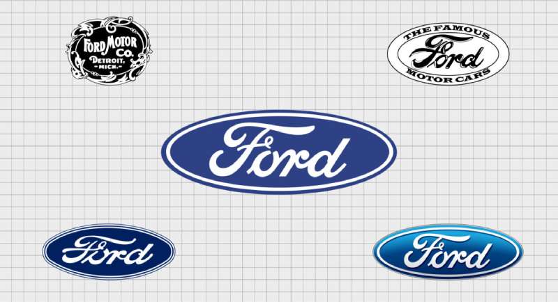
The Ford logo went from a busy, decorative crest to the clean oval we see today. Along the way it picked up wings, a triangle, a coat of arms and block letters, then dropped all of them.
The script is the constant. Ford registered it with the U.S. Patent and Trademark Office in 1909, and it has stayed close to its original form ever since.
Most changes were refinements, not overhauls. Ford even turned down a modernist redesign from Paul Rand in the 1960s, when Henry Ford II decided the old logo was good enough to keep.
Original Ford Logo (1903)
Years Active: From 1903, in the company’s first years
Design Description: The first Ford logo, the “1900s Ford logo” people still search for, was an ornate round crest framed by decorative vines and curls. It read “Ford Motor Co. Detroit, Mich.” in the lettering style of the period. Very busy by today’s standards.
Designer: Ford credits C. Harold Wills with the original design.
Context: Ford Motor Company had just been founded. The decorative style matched how American businesses presented themselves at the turn of the century.
Cultural Significance: It marked the start of a company that would put the world on wheels with the Model T five years later.
The Ford Script and the First Oval (1906–1909)
Years Active: From about 1906
Design Description: Wills’ flowing “Ford” script took over from the crest. According to Jalopnik, he based it on a typesetting set left from his earlier printing work. Ford’s own heritage notes say a winged version of the script appeared on its cars in 1906.
The first oval: In 1907, Ford’s British agents put the name inside an oval and promoted it as a mark of reliability and economy. That is the oldest ancestor of the blue oval.
Key Changes from Previous: The crest gave way to a single word in script. The script was registered as a trademark in 1909.
Winged “Universal Car” Logo (1909–1912)
Years Active: Used in Ford Times and in ads between roughly 1909 and 1912
Design Description: A winged triangle carrying the Ford name and the line “The Universal Car,” the slogan of the Model T era.
Context: Speed and flight were popular themes in early automotive marketing.
Cultural Significance: It didn’t last. Jalopnik reports that Henry Ford disliked it, and the script came back.
Blue Oval on the Model A (1927–1950s)
Years Active: From the Model A onward
Design Description: This is the “1927 Ford logo” collectors look for: the white script inside an oval on a deep blue radiator badge. The Model A was introduced in December 1927 as a 1928 model, and Ford’s heritage team calls it the first Ford vehicle to carry the script in oval form.
Color Scheme: Deep blue background with white or silver script
Key Changes from Previous: The wings were gone. The oval and the blue arrived together.
Cultural Significance: This set the basic template still in use. Even so, the oval did not appear on every Ford for decades.
Coat of Arms and Block Letters (1950s–1970s)
Years Active: 1950s to the 1970s
Design Description: From the 1950s into the late 1960s, a red, white and blue coat of arms sat on many Ford hoods and trunk lids. Through the 1970s, cars often wore “FORD” in block letters, while the Mustang and Thunderbird had their own emblems.
Context: Ford started using the oval to identify the company itself in 1961, even while the cars wore other badges.
Standardized Blue Oval (1976–2003)
Years Active: 1976–2003
Design Description: Ford made the blue oval its standard logo and gave it a glossy, three-dimensional look with a silver border. The oval returned to the outside of Ford vehicles from 1982, and the mid-1980s Taurus introduced the “floating oval” set into the front air intake.
Key Changes from Previous: One logo across the lineup instead of a mix of crests and lettering.
Centennial Blue Oval (2003–Present)
Years Active: 2003–present, with a flat version since 2019
Design Description: The current Ford logo, created for the company’s 100th anniversary, uses a brighter blue with a subtle gradient and a slimmer, cleaner oval. In 2019 Ford adopted a flat blue fill for many uses, which works better on screens, although the dimensional version still appears.
Designer: Not publicly credited
Side Note: Between 2006 and 2008, Ford pledged its assets, including the Blue Oval trademark, as collateral for a loan. It later got the logo back.
What Do the Design Elements of the Ford Logo Mean?
The Ford logo is about continuity more than hidden symbolism. Its core elements are the oval, the script and the blue.
The oval gives the name a simple, complete container, and the psychology of shapes links ovals with stability. The script adds a personal, handwritten quality, which font psychology associates with warmth.
Blue reads as trust and dependability. White provides the contrast and clear visual hierarchy that keep the name readable at a distance.
What Are the Ford Logo Colors?

The Ford logo uses two colors: a dark Ford blue and white. Ford does not publish a public color specification, so the values below come from widely cited reference sites, not from Ford.
- Ford Blue: Hex #003478, RGB (0, 52, 120), CMYK (100, 57, 0, 53)
- White: Hex #FFFFFF, RGB (255, 255, 255)
People often ask for the Ford blue Pantone color. Brand Color Code lists Pantone 288 C as the closest match and says the value is not given in Ford’s guidelines. Other sites suggest different Pantone blues, so treat any PMS number as an approximation.
Blue is a conservative choice. According to color psychology, it suggests reliability, and Ford sells trucks to farmers and SUVs to families. The color palette needs to appeal across that range without looking flashy.
Use vector graphics files rather than low-resolution pixel images, so the script stays sharp in print design and on screens.
What Font Is Used in the Ford Logo?
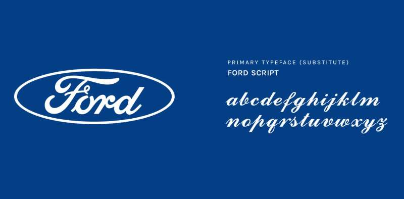
There is no Ford logo font. The script is custom lettering credited to C. Harold Wills, not a typeface you can buy.
It isn’t a font you can download. Fan-made “Ford script” fonts exist online, but none is official, and Ford protects the lettering as a trademark.
The letters flow and join, giving it a signature-like look. Readability still works at small sizes because each letterform is distinct.
What Are the Hidden Meanings in the Ford Logo?
Honestly, the Ford logo is pretty straightforward. It doesn’t hide an arrow like FedEx or contain secret symbols.
Some people read the oval as a racetrack, which fits Ford’s motorsport history. Ford has never said so.
The script feels like a signature, implying a personal guarantee of quality, even though it isn’t Henry Ford’s handwriting.
The oval itself started as a practical sales tool. The British agents who first used it in 1907 wanted a mark that stood for reliability.
How Does the Ford Logo Compare to Competitor Logos?
Ford takes a distinctly American approach compared to its competitors. While German brands like the BMW logo and Audi logo lean on geometry, Ford keeps things warmer with handwritten lettering.
The Chevrolet logo uses a bowtie shape. The Dodge logo went through various ram imagery. Ford stuck with its basic concept longer than almost anyone.
Japanese competitors like Toyota and Honda use more abstract marks. Ford’s script feels almost old-fashioned by comparison. But that’s the point.
Among car logos, Ford’s emblem ranks among the most recognizable globally. The consistency has paid off.
What Cultural Impact Has the Ford Logo Had?
The Ford logo shows up in a century of photographs, films and advertising about American life.
During World War II, Ford factories built military vehicles and B-24 bombers, which tied the company to the war effort.
The “Built Ford Tough” tagline for its trucks pushed the logo’s meaning beyond transportation. It became shorthand for durability and working-class values.
How Does the Ford Logo Fit Into the Overall Brand Identity?
The blue oval is the center of Ford’s identity. Like most large companies, Ford keeps brand guidelines for dealers and partners, but it does not publish them.
The oval appears on vehicles, dealerships, advertisements, and merchandise. It anchors everything from the F-150 to the Mustang, which still wears its own pony badge.
Sub-brands like Ford Performance build on the oval. Lincoln, Ford’s luxury division, has its own distinct identity.
The logo works because it is simple enough to adapt, from key fobs to dealership signs. A brand style guide for a mark like this covers things most people never think about, such as monochrome versions.
How Should the Ford Logo Be Used?
This is general advice, not Ford’s own rules.
The Ford name, script and oval are registered trademarks of Ford Motor Company. Editorial use, such as news articles, reviews and commentary, is generally fine when you show the logo unaltered.
Commercial use, like merchandise, ads or anything that implies a partnership, needs permission. Press files come from Ford’s media site, and licensing goes through Ford directly.
FAQ on The Ford Logo
Who Designed the Ford Logo?
Ford credits Childe Harold Wills, an early engineer and draftsman, with the original logo and the Ford script. No designer has been publicly credited for the 2003 Centennial Blue Oval.
Is the Ford Script Henry Ford’s Signature?
No. The script is often mistaken for Henry Ford’s signature, but it is credited to C. Harold Wills, who reportedly based it on a typesetting set from his printing days.
When Did the Ford Logo Become a Blue Oval?
Ford’s British agents used the name inside an oval in 1907. The blue oval radiator badge arrived with the Model A, introduced in December 1927 as a 1928 model.
What Did the Old Ford Logo Look Like?
The 1903 logo was an ornate round crest reading “Ford Motor Co. Detroit, Mich.” Around 1909 to 1912, Ford also used a winged triangle with the line “The Universal Car.”
What Font Is Used in the Ford Logo?
None. The Ford logo uses custom hand-drawn lettering, not a commercial script font. Fan-made versions exist, but none is official. It belongs among the iconic fonts of major brands.
What Are the Ford Logo Colors?
Ford blue and white. The widely cited hex code for Ford blue is #003478. Ford does not publish official values, so treat it as a reference value.
What Is the Ford Blue Pantone Color?
Ford has not published one. Brand Color Code lists Pantone 288 C as the closest match to Ford blue, and other sources suggest similar dark blues. It also shows up among popular blue logos.
What Is the Current Ford Logo?
The current logo is the Centennial Blue Oval introduced in 2003. Since 2019 Ford has also used a flat blue version, mainly for digital use.
Has the Ford Logo Changed Over the Years?
Yes, but the script has barely changed since it was trademarked in 1909. The crest, wings, coat of arms and block letters came and went, while the oval became standard in 1976. That kind of consistency is a core idea in logo design principles.
Why Is the Ford Logo Blue?
Ford has not explained the choice. Deep blue was used on the Model A radiator badge, and blue is commonly linked with trust and dependability, which suits a mass-market carmaker.
Can I Use the Ford Logo for Personal Projects?
The Ford logo is a registered trademark. Editorial use is usually fine, but selling merchandise with it requires a license. Always check font licensing rules for any lettering you use too.
Where Is the Ford Logo Placed on Vehicles?
The blue oval usually sits on the front grille, the tailgate or trunk, and the steering wheel. It acts as the focal point of the front end, placed for balance and visibility following basic graphic design principles.
Conclusion
The Ford logo shows that lasting brand identity comes from simplicity and consistency. For more than a century, the blue oval and script lettering have stood for American cars.
Lettering credited to an early Ford engineer still defines Ford Motor Company today. That’s remarkable when you think about it.
The design elements work together through strong emphasis and clear symmetry, and the script has carried the typography since the 1900s. No hidden tricks. No complicated symbolism.
Just a name in an oval that billions recognize instantly. Sometimes the best logos are the ones that refuse to overthink things.
Sources
- Ford Motor Company, Throwback Thursday: the evolution of the Ford logo – https://www.at.ford.com/us/en/home/news-media/news/2023/9/tbt-09-28.html
- Jalopnik, How Ford’s Logo Changed Over Time (And Why The Blue Oval Stuck) – https://jalopnik.com/1975202/history-ford-logo-blue-oval/
- Brand Color Code, Ford brand hex, RGB, CMYK and Pantone color codes – https://www.brandcolorcode.com/ford

Renowned for his expertise in logo design and visual branding, Bogdan has developed a multitude of logos for various clients.
His skills extend to creating posters, vector illustrations, business cards, and brochures. Additionally, Bogdan's UI kits were featured on marketplaces like Visual Hierarchy and UI8.
He also wrote in the past years on sites like Design Your Way, WebDesignerDepot, WPDean, Designmodo, Speckyboy, Slider Revolution, and more.
- How to Unlock Canva Page and Locked Elements - 4 November 2026
- How to Design a Google Docs Template That Looks Professionally Designed: Fonts, Grid and Color - 4 November 2026
- Black Metal Font Generator - 2 November 2026

Bogdan Sandu is a seasoned designer who has been designing websites since 2008. Renowned for his expertise in logo design and visual branding, Bogdan has developed a multitude of logos for various clients. His skills extend to creating posters, vector illustrations, business cards, and brochures. Additionally, Bogdan's UI kits were featured on marketplaces like Visual Hierarchy and UI8. He also wrote in the past years on sites like Design Your Way, WebDesignerDepot, WPDean, Designmodo, Speckyboy, Slider Revolution, and more.
You Might Also Like