The Nissan Logo stands as one of the most recognized automotive emblems worldwide. It represents nearly nine decades of Japanese engineering and design philosophy.
The current version, introduced in 2020, marked the brand’s first major redesign in 20 years. This flat, minimalist emblem replaced the three-dimensional chrome badge that defined Nissan vehicles since 2001.
Nissan Motor Corporation was founded in 1933 in Yokohama, Japan. The company has cycled through approximately six distinct logo versions since then. Each iteration reflected the design trends and corporate identity shifts of its time.
The emblem’s evolution mirrors broader graphic design movements in automotive branding, moving from ornate badges to clean digital-ready marks.
What is the Nissan Logo?
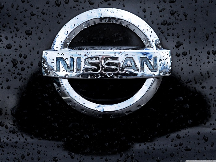
The Nissan Logo is a circular emblem featuring the company name within a thin ring, representing the rising sun of Japan. Introduced in July 2020, it was designed by Nissan’s in-house team and symbolizes horizon, dawn, and new beginnings.
Design Attributes:
- Design Type: Combination mark (wordmark within symbolic frame)
- Primary Elements: Circular ring with horizontal bar, uppercase wordmark
- Official Introduction Date: July 15, 2020
- Designer: Nissan Design Center (in-house team led by Alfonso Albaisa)
- Trademark Status: Registered trademark in all major markets
- Color Palette: Silver/Chrome (#C0C0C0), Black (#000000), White (#FFFFFF)
- Usage Context: Vehicle badges, dealerships, digital platforms, marketing materials, merchandise
How Has the Nissan Logo Evolved Over Time?
The Nissan Logo has transformed through six major versions since 1933.
Each redesign reflected changing design philosophies and corporate strategies.
The brand transitioned from the Datsun name to Nissan globally in the 1980s, requiring significant identity updates.
Original Datsun/Nissan Logo (1933-1959)
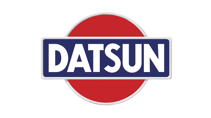
- Years Active: 1933-1959
- Design Description: Rectangular badge with “Datsun” text, featuring a rising sun motif behind the wordmark
- Color Scheme: Red, blue, and white
- Designer: Unknown (internal design)
- Context: Introduced when Nissan acquired Datsun. The rising sun represented Japanese national pride during industrial expansion.
- Cultural Significance: Established the sunrise symbolism that continues today
Classic Circle Badge (1959-1983)
- Years Active: 1959-1983
- Design Description: Simplified circular emblem with “Datsun” across a horizontal bar within a circle
- Color Scheme: Red circle, blue bar, white text
- Key Changes from Previous: Dropped the rectangular frame for a cleaner circular shape
- Context: Coincided with Datsun’s expansion into American markets. The simpler design worked better at smaller scales on vehicle badges.
Nissan Name Transition (1983-1988)
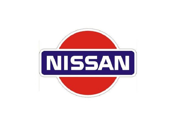
- Years Active: 1983-1988
- Design Description: Dual branding period with both Datsun and Nissan names appearing on vehicles
- Color Scheme: Red and blue maintained
- Key Changes from Previous: Introduction of “Nissan” wordmark alongside existing Datsun badge
- Context: Corporate decision to unify global branding under the Nissan name. This was controversial among loyal Datsun customers.
Chrome 3D Badge (1988-2001)
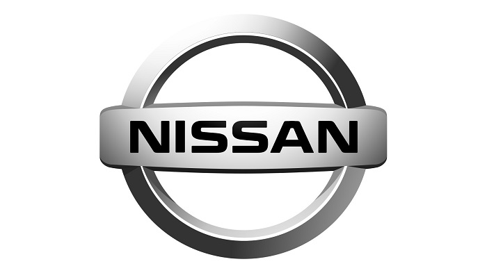
- Years Active: 1988-2001
- Design Description: Three-dimensional chrome emblem with “NISSAN” in bold letters across a horizontal bar
- Color Scheme: Chrome silver with embossed lettering
- Key Changes from Previous: Complete transition to Nissan name, added dimensional depth
- Context: Reflected 1990s automotive design trends favoring chrome and dimensional badges
- Cultural Significance: This version established the modern Nissan identity most consumers recognize
Refined Chrome Badge (2001-2020)
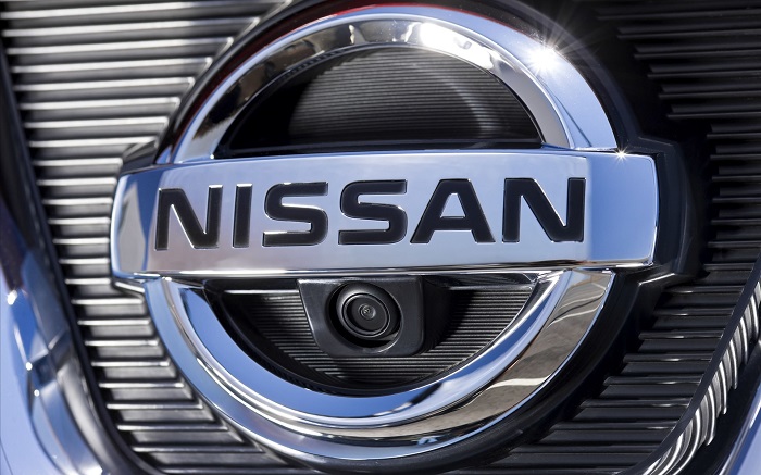
- Years Active: 2001-2020
- Design Description: Polished chrome circle with refined “NISSAN” lettering, more sculptural depth
- Color Scheme: High-polish chrome, sometimes with blue accents
- Designer: Nissan Design Center
- Key Changes from Previous: Smoother curves, more premium appearance, updated letterforms
- Context: Introduced alongside the brand’s push into premium segments with vehicles like the 350Z and later GT-R
Modern Flat Logo (2020-Present)
- Years Active: 2020-Present
- Design Description: Thin-line circular emblem with open center, flat rendering, illumination-ready design
- Color Scheme: Monochromatic silver, black, or white depending on application
- Designer: Alfonso Albaisa and Nissan Design Center team
- Key Changes from Previous: Removed 3D chrome effects, thinned all elements, created negative space in center
- Context: Debuted on the Ariya electric crossover. Designed for LED illumination on EVs and digital-first applications.
- Cultural Significance: Signals Nissan’s transition toward electrification and digital branding
What Do the Design Elements of the Nissan Logo Mean?
The circular form represents the rising sun, a direct connection to Japan’s national identity.
The horizontal bar through the center symbolizes the horizon line at dawn.
Together, these elements suggest new beginnings, innovation, and forward movement.
Why Did Nissan Choose These Specific Colors?
Silver dominates the current palette. It communicates technology, precision, and automotive craftsmanship.
This choice aligns with color psychology principles used throughout the auto industry.
- Silver/Chrome: Hex #C0C0C0. Represents innovation, modernity, and premium quality. Connects to the metallic nature of automobiles.
- Black: Hex #000000. Used for contrast and sophistication. Provides flexibility in various applications.
- White: Hex #FFFFFF. Represents purity and simplicity. Primary choice for illuminated badges on electric vehicles.
The historical red and blue (from the Datsun era) were dropped to create a more universal, less region-specific identity.
What Typography Style Is Used in the Nissan Logo?
The wordmark uses a custom sans-serif font designed specifically for the brand.
Letters are uppercase with consistent stroke widths throughout.
The tracking between letters is generous, allowing each character room to breathe.
This spacing improves readability at small sizes on vehicle badges.
The typeface evolved from bolder weights in earlier versions to the current thin, refined letterforms.
What Are the Hidden Meanings in the Nissan Logo?
The company name “Nissan” derives from “Ni” (sun) and “ssan” (production or birth).
So the logo literally illustrates the brand name through its sunrise imagery.
The thin circle in the 2020 version creates an incomplete ring. Some interpret this as representing continuous improvement or an open horizon of possibilities.
The negative space in the center was designed to accommodate LED lighting, but it also suggests forward motion.
How Does the Nissan Logo Compare to Competitor Logos?
Most Japanese automakers use circular or symmetrical badges.
The Toyota Logo features overlapping ovals, while the Honda Logo uses a bold “H” in a trapezoid shape.
Nissan’s horizontal bar element sets it apart from these competitors.
European rivals like BMW and Audi also use circular forms, but with different internal structures.
The Mazda Logo shares some DNA with Nissan. Both use a circle with stylized internal elements that suggest movement.
Korean competitors like Hyundai and Kia have moved toward wordmark-focused designs, contrasting with Nissan’s symbolic approach.
Among mainstream brands, Nissan’s 2020 redesign was one of the first to fully commit to flat, digital-ready aesthetics.
What Are the Technical Specifications of the Nissan Logo?
Official Color Codes:
- Primary Silver: Hex #C0C0C0, RGB (192, 192, 192), CMYK (0, 0, 0, 25)
- Black: Hex #000000, RGB (0, 0, 0), CMYK (0, 0, 0, 100)
- White: Hex #FFFFFF, RGB (255, 255, 255), CMYK (0, 0, 0, 0)
Dimensions and Proportions:
- Aspect Ratio: Approximately 3:1 (horizontal orientation with wordmark)
- Minimum Size: 20mm width for print applications
- Clear Space: Minimum padding equal to the height of the “N” character on all sides
- Circle Proportions: The outer ring thickness is approximately 1/20th of the total diameter
The logo exists in both horizontal (with wordmark) and standalone symbol versions. The symbol-only version is used on vehicle badges where space is limited.
What Cultural Impact Has the Nissan Logo Had?
The Nissan emblem became globally recognized through motorsport success, particularly in rally and endurance racing.
The GT-R and Z-car lineage cemented the badge as a performance symbol.
In Japan, the sunrise motif carries deep cultural meaning beyond corporate branding.
The 2020 redesign sparked conversations about automotive minimalist design and the shift toward flat aesthetics across the industry.
How Does the Nissan Logo Fit Into the Overall Brand Identity?
The logo anchors a broader visual system that includes the Infiniti luxury division and Nismo performance brand.
Each sub-brand maintains its own identity while connecting to Nissan’s corporate mark.
The brand guidelines specify how the logo interacts with vehicle design language, dealership architecture, and marketing materials.
Nissan’s “Innovation that excites” tagline pairs with the forward-looking symbolism of the sunrise emblem.
The 2020 refresh aligned the logo with the brand’s electric vehicle strategy, creating visual consistency between the badge and new EV models like the Ariya.
How Should the Nissan Logo Be Used?
Official Usage Guidelines:
- Do: Maintain clear space around the logo, use approved color versions, scale proportionally
- Don’t: Stretch or distort the logo, place on busy backgrounds, alter colors or proportions, add effects like shadows or gradients
Where to Access Official Logos:
Nissan provides official assets through its media portal and dealer networks. Press kits include vector graphics in various formats.
Licensing Information:
The Nissan logo is a registered trademark. Commercial use requires explicit permission from Nissan Motor Corporation. Unauthorized reproduction for merchandise or advertising is prohibited.
Trademark Protection:
Nissan actively enforces trademark rights globally. The company has pursued legal action against counterfeit products and unauthorized use of its emblems.
FAQ on The Nissan Logo
What Does the Nissan Logo Represent?
The Nissan emblem represents the rising sun of Japan. The circular shape with a horizontal bar symbolizes dawn and new beginnings.
This connects directly to the company name. “Nissan” translates to “sun origin” or “sun production” in Japanese.
The design reflects the brand’s national heritage and forward-thinking philosophy.
When Was the Current Nissan Logo Introduced?
Nissan unveiled its current logo on July 15, 2020. The redesign debuted alongside the Ariya electric crossover.
This marked the first major brand identity update in nearly two decades.
The flat, thin-line design replaced the chrome 3D badge used since 2001.
Why Did Nissan Change Its Logo in 2020?
Nissan needed a logo that works in digital spaces. The old chrome badge looked dated on screens and apps.
The new design supports LED illumination on electric vehicles. It also signals the company’s shift toward electrification.
Following core logo design principles, the refresh prioritized simplicity and scalability.
What Is the Meaning Behind the Circle in the Nissan Logo?
The circle represents the sun. Specifically, it depicts sunrise over a horizon line.
This shape psychology communicates completeness and unity. Circles suggest continuity and protection in automotive branding.
The thin ring in the current version adds a sense of openness and innovation.
Who Designed the New Nissan Logo?
Alfonso Albaisa led the redesign as Nissan’s Senior Vice President of Global Design. The Nissan Design Center team in Japan executed the project.
No external agency was involved. The entire process stayed in-house at Nissan Motor Corporation headquarters in Yokohama.
What Colors Are Used in the Nissan Logo?
The current color palette is intentionally simple. Silver, black, and white are the official colors.
Earlier Datsun-era logos used red and blue. These were dropped during the global brand unification in the 1980s.
The monochrome approach allows flexibility across different applications and backgrounds.
How Has the Nissan Logo Changed Over Time?
Nissan has used approximately six distinct logo versions since 1933. The brand started as Datsun before transitioning to the Nissan name globally.
Early designs featured bold red and blue colors. Later versions embraced chrome and three-dimensional styling.
The 2020 update represents the biggest departure, moving toward flat digital-ready aesthetics.
What Font Is Used in the Nissan Logo?
Nissan uses a custom font designed specifically for the brand. The letterforms are uppercase with consistent stroke weights.
The typography evolved from heavier weights in older versions. Current letters are thinner, matching the refined circle design.
Is the Nissan Logo Trademarked?
Yes. The Nissan trademark is registered in all major global markets. The company actively protects its intellectual property.
Unauthorized use for merchandise or commercial purposes is prohibited. Nissan pursues legal action against counterfeit products bearing its emblem.
Where Can I Download the Official Nissan Logo?
Official logos are available through Nissan’s media portal. Press kits include files in multiple formats for print and digital use.
Authorized dealers also receive brand assets. Commercial use requires explicit permission from Nissan Motor Corporation.
The brand style guide specifies correct usage for all approved applications.
Conclusion
The Nissan Logo has come a long way since its Datsun origins in 1933. Six distinct versions tell the story of a Japanese automaker adapting to changing times.
The 2020 brand refresh stripped away chrome excess. What remains is a thin, purposeful emblem built for the electric vehicle era.
That sunrise motif still anchors the design. Some things stick around for a reason.
The current vehicle badge works everywhere, from illuminated grilles to smartphone apps. Clean design elements and strong visual hierarchy make it instantly recognizable worldwide.

Renowned for his expertise in logo design and visual branding, Bogdan has developed a multitude of logos for various clients.
His skills extend to creating posters, vector illustrations, business cards, and brochures. Additionally, Bogdan's UI kits were featured on marketplaces like Visual Hierarchy and UI8.
He also wrote in the past years on sites like Design Your Way, WebDesignerDepot, WPDean, Designmodo, Speckyboy, Slider Revolution, and more.
- How to Install Fonts on Mac (Step-by-Step Guide) - 20 September 2026
- From Mockup to Code: How AI-Augmented Development Speeds Up the Design Handoff - 19 September 2026
- The Beehiiv Logo History, Colors, Font, And Meaning - 18 September 2026

Bogdan Sandu is a seasoned designer who has been designing websites since 2008. Renowned for his expertise in logo design and visual branding, Bogdan has developed a multitude of logos for various clients. His skills extend to creating posters, vector illustrations, business cards, and brochures. Additionally, Bogdan's UI kits were featured on marketplaces like Visual Hierarchy and UI8. He also wrote in the past years on sites like Design Your Way, WebDesignerDepot, WPDean, Designmodo, Speckyboy, Slider Revolution, and more.
You Might Also Like