The Mazda logo stands as one of the most recognizable symbols in the automotive world. A stylized “M” shaped like wings sits at the center of the current emblem, which Mazda says expresses its drive for continuous improvement and growth.
Within the broader landscape of car logos, Mazda’s mark holds a distinct position. It pairs a name taken from ancient Persian religion with a clean Japanese design approach.
The winged emblem became Mazda’s brand symbol in June 1997. Mazda’s own history pages don’t name its designer.
The company was founded in Hiroshima in 1920 as Toyo Cork Kogyo, became Toyo Kogyo in 1927 and took the name Mazda Motor Corporation in 1984. Along the way it has used more than a dozen marks, from a cork-crusher badge to the flat winged M unveiled in 2025.
What is the Mazda Logo?
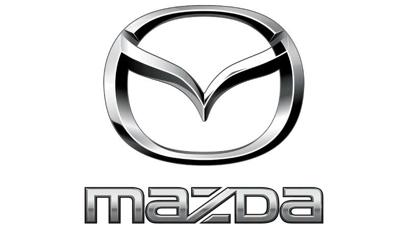
The Mazda logo is a stylized “M” whose two strokes spread like wings inside an oval, usually shown in chrome above the MAZDA wordmark. Mazda adopted it as its brand symbol in June 1997 and has not publicly credited a designer. It was refined in 2015 and 2018, and a flatter version followed in 2025.
| Symbol | Winged “M” (a V-shaped pair of wings) inside an oval |
| Designer/agency | Not publicly credited by Mazda (often attributed to Rei Yoshimura, who designed the 1975 MAZDA wordmark) |
| Current version since | June 1997 as the brand symbol; metallic update 2015, wordmark pairing 2018, flat redesign shown in October 2025 |
| Colors (hex) | No official codes published; chrome silver approx. #BEBFC0 with dark gray approx. #616262, sampled from the 2018 logo |
| Typeface | Custom MAZDA lettering created by Rei Yoshimura with the design firm PAOS in 1975; not a commercial font |
| Previous major version | Rounded diamond in a circle evoking wings and the sun (1991–1997) |
How Has the Mazda Logo Evolved Over Time?
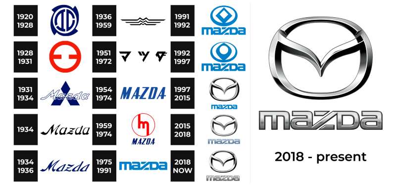
Mazda’s visual identity has gone through dramatic shifts since 1920. The company started with industrial corporate marks, moved to script wordmarks, and then to the abstract symbols of the 1990s.
Each redesign reflected changes in company direction, market position and the design trends of the era. The dates below follow Mazda’s own logo history page.
Toyo Cork Kogyo Mark (around 1920)
This is the first logo connected to the company. The letters “T” (Toyo) and “C” (Cork) sit inside an outline shaped like the blade of a cork crusher.
It belonged to a cork maker, not a car brand. The name Mazda did not exist yet.
Toyo Kogyo “Maru-Kō” Mark (1928)
After the company became Toyo Kogyo, it adopted a stylized Japanese character 工 (“kō”, manufacturing) in a circle. Employees called it the “Maru-Kō mark”, and it was shown in red.
First Mazda Product Mark (1931)
The Mazda name first appeared on the Mazda-Go Type-DA three-wheeled truck in 1931. Its mark combined the word “Mazda” with the three diamonds of Mitsubishi, which distributed the trucks at the time.
A flowing “Mazda” script wordmark also appears in this period. It is the answer to “what was Mazda’s first logo” if you mean the first one carrying the Mazda name.
The “Emblem of Wings” (1936–1959)
In 1936 Mazda introduced a corporate mark of three stacked “M” lines, for “Mazda Motor Manufacture.” The design was based on the flowing-river emblem of Hiroshima City and shaped like wings to suggest agility and speed.
It is a long, thin, horizontal mark, very different from anything Mazda uses today.
Stylized “m” (1959 to the mid-1970s)
Mazda adopted a stylized lowercase “m” for all products in 1959, one year before its first passenger car, the R360 coupe. On the cars it appeared as a chrome “m” inside a circle, often with a MAZDA script or block wordmark.
During the 1950s and 1960s, the company also used an italic block MAZDA wordmark on its trucks and cars.
Corporate Wordmark and Mazda Blue (1975–1991)
In 1975 Mazda launched a full corporate identity created with the Japanese design firm PAOS. The new MAZDA logotype was designed by New York-based Japanese designer Rei Yoshimura, chosen through a closed competition.
Its most distinctive detail is the “Z,” with a diagonal stroke cut through its horizontal bars. The system also introduced a corporate blue, meant to suggest a clear sky. With no separate symbol, pure typography carried the brand on its own.
Diamond Emblem (1991–1992)
In 1991 Mazda introduced a product mark inside a circle meant to evoke wings, the sun and a halo of light, a nod to Ahura Mazda, the source of the name.
The pointed diamond shape looked too similar to the Renault logo, so in 1992 Mazda smoothed its edges.
Rounded Diamond Emblem (1992–1997)
The softened version kept the wings-and-sun idea in a blue circle above the blue MAZDA wordmark. It stayed in use until the current symbol arrived.
Winged “M” Logo (1997–Present)
In June 1997 Mazda established its brand symbol: a stylized “M” with soaring wings inside an oval. It reunified the brand under the Mazda name, and the old corporate symbol became the corporate mark.
In 2015 the symbol and marks were given a polished metallic look. In 2018 the MAZDA wordmark took on the same metallic texture, and Mazda began pairing the wordmark with the symbol as standard. In October 2025, at the Japan Mobility Show, Mazda showed a flatter, bolder version of the winged M with a rounder outer ring and a simplified wordmark, built for digital use. Mazda says the new and current versions will be used side by side depending on location and media.
What Do the Design Elements of the Mazda Logo Mean?
The current Mazda logo carries a simple message. The winged “M” stands for Mazda and for flight toward the future.
Mazda describes the wings as its drive to pursue improvement and continuous growth with flexible thinking, creativity and resilience.
What Does the Wing Shape Symbolize?
The V-shaped wings represent growth and improvement. The oval around them frames the wings and gives the badge a strong focal point on a grille.
The link to Ahura Mazda, the Zoroastrian god of wisdom and light, is clearest in the 1991 emblem, which Mazda says used wings, a sun and a halo. The 1997 symbol keeps the wings and drops the sun.
What Are the Mazda Logo Colors?
Mazda does not publish official color codes for its logo. The values below are approximations sampled from logo images, not brand specifications.
- Chrome silver: approx. #BEBFC0, sampled from the 2018 logo. The main color of the badge and wordmark.
- Dark gray: approx. #616262, sampled from the shading of the same logo. It creates the metallic gradient.
- Black: used for flat one-color versions and as a background that makes the chrome stand out.
- Mazda blue: the corporate color introduced in 1975 and used on the 1990s logos. Mazda says it refined this blue in 2015 but publishes no code.
Soul Red Crystal is Mazda’s signature paint color, not a logo color. Because no official values exist, this article lists no Pantone, CMYK or RGB numbers. Color psychology explains why silver reads as precise and modern, which suits a car badge.
What Font Is Used in the Mazda Logo?
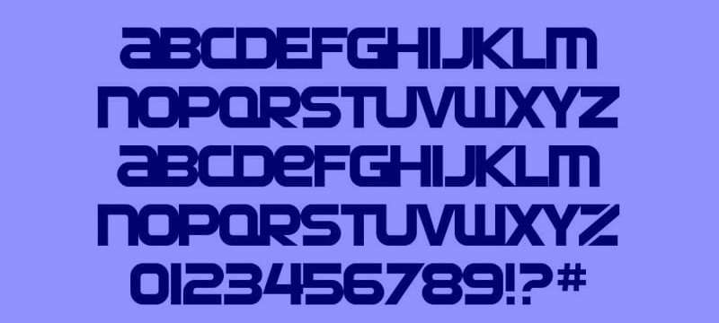
The MAZDA wordmark is custom lettering, not a commercial typeface. Rei Yoshimura designed it in 1975 for Mazda’s corporate identity with PAOS, and it has been refined since.
It is a wide, squared sans-serif font style with rounded corners. The key detail is the “Z,” cut by a diagonal stroke through its horizontal bars.
The alphabet shown above is a fan-made font that imitates the logo style. It is useful for mockups, but it is not Mazda’s own typeface. The 2025 redesign simplified the wordmark again.
Is There a Hidden Meaning in the Mazda Logo?
Some people see a tulip, an owl or a flame in the winged M. These are fan interpretations. Mazda’s own explanation is wings that stand for growth and continuous improvement.
How differently people read the same shape shows the psychology of shapes at work.
How Does the Mazda Logo Compare to Competitor Logos?
Among Japanese automakers, Mazda’s winged emblem stands apart from the corporate simplicity of competitors. Toyota’s overlapping ovals feel more conservative.
Honda’s bold “H” is straightforward and industrial.
Nissan’s recent redesign went flat and minimal. Mazda kept the dimensional chrome look for years, and only moved to a flat version in 2025.
German competitors like BMW and Audi use geometric precision. Mazda’s organic wing shape offers a warmer, more emotional alternative.
Compared to luxury brands like Lexus or Acura, Mazda’s logo has similar polish without feeling cold.
The wing motif puts Mazda in conversation with Bentley and Aston Martin, brands that also use wings. Mazda’s interpretation is more abstract.
What Cultural Impact Has the Mazda Logo Had?
The Mazda logo has become linked with affordable driving enjoyment. Car enthusiasts recognize the winged emblem as a mark of fun-to-drive engineering.
The MX-5 Miata, which has worn this badge since its second generation, holds the record as the best-selling two-seat sports car in history.
That kind of success turns a logo into a cultural symbol. It stands for accessible sports car ownership for millions worldwide.
How Does the Mazda Logo Fit Into the Overall Brand Identity?
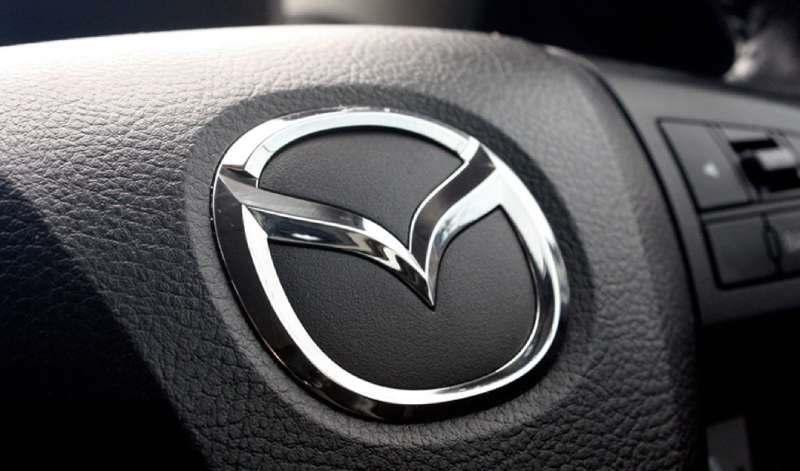
Mazda’s “Kodo: Soul of Motion” design philosophy shapes its cars, and the flowing winged M fits the same idea of motion.
Since 2018, Mazda’s basic rule has been to use the wordmark and the brand symbol together, both in the same metallic finish. That keeps the badge on a steering wheel, a grille and a showroom sign consistent.
The company’s internal brand guidelines are not public, but the 2025 update shows the direction: flatter marks that work on screens as well as on cars.
How Should the Mazda Logo Be Used?
The following is general advice for editorial and design work, not Mazda’s own rules.
- Use the logo as published, without stretching, rotating or recoloring it.
- Use clean vector graphics where possible, since copied raster files often have poor DPI and wrong colors.
- Place the chrome version on plain, contrasting backgrounds.
- Don’t redraw the wordmark with a lookalike font for anything that could be mistaken for official Mazda material.
Trademark Protection: The Mazda name and symbol are registered trademarks of Mazda Motor Corporation. Editorial use is generally fine, but commercial use, including merchandise, needs permission.
FAQ on the Mazda Logo
What Does the Mazda Logo Represent?
The Mazda emblem is a stylized “M” shaped like wings. Mazda says the wings express its drive to pursue improvement and continuous growth with flexible thinking, creativity and resilience. The M stands for Mazda.
Who Designed the Current Mazda Logo?
Mazda has not publicly credited a designer for the 1997 winged M. It is often attributed to Rei Yoshimura, who designed the 1975 MAZDA wordmark with the firm PAOS, but Mazda’s own history does not confirm this.
When Was the Current Mazda Logo Introduced?
The winged M became Mazda’s brand symbol in June 1997. It got a metallic update in 2015, was paired with a matching wordmark in 2018, and a flatter version was shown in October 2025.
What Was Mazda’s First Logo?
The first company mark, from around 1920, combined a T and a C for Toyo Cork Kogyo inside a cork-crusher-blade outline. The first mark with the Mazda name appeared in 1931 on the Mazda-Go three-wheeled truck, combining “Mazda” with Mitsubishi’s three diamonds.
What Did the Old Mazda Logos Look Like?
The 1936 “emblem of wings” was three stacked M lines based on Hiroshima’s city emblem. From 1959 Mazda used a stylized “m,” often in a circle. In 1991–1997 it used a diamond in a circle, softened in 1992, above a blue MAZDA wordmark.
How Many Times Has the Mazda Logo Changed?
Mazda’s own history lists marks from around 1920, 1928, 1931, 1936, 1959, 1975, 1991 and 1997, plus updates in 2015, 2018 and 2025. Each version reflects the company’s direction and the design movements of its era.
Why Does the Mazda Logo Have a Wing Shape?
Wings represent growth and forward progress. The shape follows key logo design principles: it is simple, works at small sizes, and suggests motion without being literal.
What Colors Are Used in the Mazda Logo?
The current logo is chrome silver with darker gray shading, shown on black or on the car body. Mazda blue was the corporate hue in the 1975–1997 logos. Mazda publishes no official hex codes, and the brand color palette values online are estimates.
What Font Does Mazda Use in Its Logo?
The MAZDA wordmark is custom lettering by Rei Yoshimura from 1975, not a commercial font. Its signature detail is the “Z” with a diagonal cut. Fan-made fonts imitate it, and its open kerning keeps the wide letters readable.
What Is the Meaning Behind the Name Mazda?
Mazda says the name comes from Ahura Mazda, the god of wisdom, intelligence and harmony in West Asian civilization. It also echoes the name of founder Jujiro Matsuda. That double meaning is good storytelling for a car company.
Conclusion
The Mazda Logo tells a story of transformation. From a cork maker’s badge in 1920 to the winged emblem we see today, the brand identity has always reflected the company’s ambitions.
That stylized “M” captures movement and aspiration in a single shape. Few automotive emblems achieve this level of unity between form and meaning.
The connection to Ahura Mazda adds depth. The 1975 wordmark adds a typographic signature, and the 2025 flat redesign shows the symbol can keep adapting.
Whether on a Mazda3 grille or a CX-5 steering wheel, this symbol works. It has earned its place among respected automotive logos worldwide.
Sources
- Mazda Motor Corporation, Mazda marks and symbols history – https://www.mazda.com/en/about/history/mark/
- Inside Mazda UK, Mazda at 100: the history of the Mazda badge – https://www.insidemazda.co.uk/?p=12898
- BP&O, Mazda by Rei Yoshimura & PAOS, 1975 – https://bpando.org/2024/03/21/mazda-by-rei-yoshimura-paos-1975/
- Jalopnik, The Meaning Behind Mazda’s Wing Shaped Logo – https://www.jalopnik.com/1962275/mazda-logo-wing-shape-meaning/
- Autobuzz, Mazda has a new minimalist logo for the digital era – https://autobuzz.my/2025/10/31/just-like-all-other-brands-mazda-has-a-new-minimalist-logo-for-the-digital-era/

Renowned for his expertise in logo design and visual branding, Bogdan has developed a multitude of logos for various clients.
His skills extend to creating posters, vector illustrations, business cards, and brochures. Additionally, Bogdan's UI kits were featured on marketplaces like Visual Hierarchy and UI8.
He also wrote in the past years on sites like Design Your Way, WebDesignerDepot, WPDean, Designmodo, Speckyboy, Slider Revolution, and more.
- How to Unlock Canva Page and Locked Elements - 4 November 2026
- How to Design a Google Docs Template That Looks Professionally Designed: Fonts, Grid and Color - 4 November 2026
- Black Metal Font Generator - 2 November 2026

Bogdan Sandu is a seasoned designer who has been designing websites since 2008. Renowned for his expertise in logo design and visual branding, Bogdan has developed a multitude of logos for various clients. His skills extend to creating posters, vector illustrations, business cards, and brochures. Additionally, Bogdan's UI kits were featured on marketplaces like Visual Hierarchy and UI8. He also wrote in the past years on sites like Design Your Way, WebDesignerDepot, WPDean, Designmodo, Speckyboy, Slider Revolution, and more.
You Might Also Like