The Kia Logo stands as one of the most talked-about automotive rebrandings in recent memory. Introduced in 2021, this stylized wordmark replaced Kia’s oval emblem that had been around since 1994.
The current design features interconnected letters that spell “KIA” in a sharp, angular style. Some people read it as “KN” at first glance. That confusion sparked countless memes and search queries.
Kia Corporation, founded in 1944 in Seoul, South Korea, has gone through roughly seven logo iterations. The company started as a bicycle parts manufacturer before becoming part of Hyundai Motor Group in 1998.
This latest emblem reflects Kia’s pivot toward electric vehicles and premium positioning. It’s bold. It’s polarizing. And it absolutely got people talking.
What is the Kia Logo?
The Kia logo is a stylized wordmark featuring interconnected letters “K,” “I,” and “A” in a continuous, angular design. Introduced on January 6, 2021, the emblem was created as part of Kia’s “Plan S” strategy to signal its transformation into an electric vehicle brand.
Design Type: Wordmark (logotype)
Primary Elements:
- Three connected letters forming a signature-style mark
- Sharp, upward-rising angles
- No enclosed oval or badge shape
- Continuous stroke connecting all characters
Official Introduction Date: January 6, 2021
Designer/Agency: Kia’s in-house design team, led by Karim Habib (Head of Kia Design Center)
Trademark Status: Registered trademark worldwide. The stylized wordmark is protected intellectual property of Kia Corporation.
Color Palette:
- Primary: Midnight Black (#05141F)
- Secondary: Polar White (#FFFFFF)
- Accent: Kia Red (#BB162B)
Usage Context: Vehicle badges, dealership signage, marketing campaigns, digital platforms, merchandise, and corporate communications
How Has the Kia Logo Evolved Over Time?
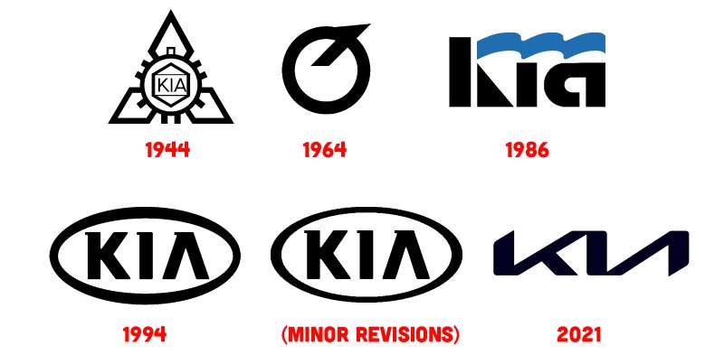
Kia’s visual identity has shifted dramatically across eight decades. The brand moved from simple text marks to ornate emblems and back to a stripped-down wordmark.
Each redesign reflected where the company stood at that moment. Budget brand. Family cars. Electric future.
The evolution mirrors Kia’s journey from Korean manufacturer to global competitor.
Original Kia Logo (1944-1964)
Years Active: 1944-1964
Design Description: Simple Korean text mark reading “Kyungsung Precision Industry,” the company’s original name. No Latin characters appeared since the brand served domestic markets only.
Color Scheme: Black text on white background
Designer: Unknown internal design
Context: The company manufactured bicycle parts and steel tubing during post-war Korea. Branding wasn’t a priority.
Cultural Significance: Represented Korea’s early industrialization efforts and self-sufficiency goals.
First “KIA” Wordmark (1964-1986)
Years Active: 1964-1986
Design Description: The company adopted “Kia” as its official name and introduced Latin lettering. Block letters in a straightforward arrangement. Nothing fancy.
Color Scheme: Red and black variations
Key Changes from Previous: First use of Roman alphabet. Shift toward international market ambitions.
Context: Kia had begun producing motorcycles and was preparing to enter automobile manufacturing.
Oval Emblem Era (1994-2012)
Years Active: 1994-2012
Design Description: The “KIA” letters sat inside a red oval badge. Chrome variations appeared on vehicles. This was the logo most people recognized globally.
Color Scheme: Red oval with white or silver lettering
Key Changes from Previous: Added the oval container. Standardized the badge for global markets.
Context: Kia was expanding into North America and Europe. The oval conveyed reliability and accessibility.
Cultural Significance: Became synonymous with affordable, practical vehicles. Some called it boring, but it worked.
Refreshed Oval (2012-2021)
Years Active: 2012-2021
Design Description: Slimmer oval with refined typography. Slightly more premium feel while keeping the familiar shape.
Color Scheme: Silver/chrome with red accents
Key Changes from Previous: Modernized proportions. Cleaner letter spacing.
Context: Peter Schreyer had joined as design chief. Quality was improving. The logo needed a subtle update.
Current Stylized Wordmark (2021-Present)
Years Active: 2021-present
Design Description: Angular, connected letters without an enclosing shape. The letters rise upward at an angle, suggesting forward momentum.
Color Scheme: Black, white, and red variations
Designer: Kia Design Center team
Key Changes from Previous: Complete departure from the oval. No badge container. Premium, tech-forward aesthetic.
Context: Kia was launching the EV6 and repositioning as a lifestyle brand. The old logo felt dated.
Cultural Significance: Generated massive online discussion. Many people couldn’t read it correctly at first. That confusion, weirdly, created brand awareness.
What Do the Design Elements of the Kia Logo Mean?
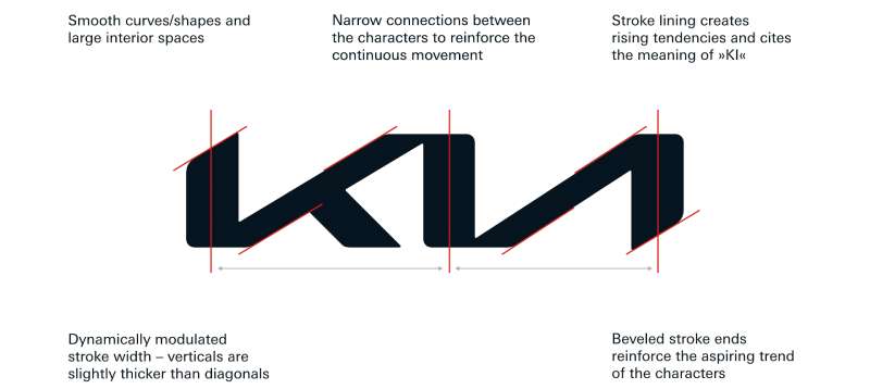
The current Kia emblem communicates ambition through every design choice. The upward angle suggests growth and momentum.
Connected letters represent unity and continuous innovation. There’s no break in the stroke.
The minimalist design approach reflects modern automotive trends. Less clutter, more confidence.
Why Did Kia Choose These Specific Colors?
Midnight Black (#05141F)
Black communicates sophistication and premium positioning. Color psychology tells us black suggests power and elegance.
Kia wanted to shed its budget image. Black helps accomplish that.
Polar White (#FFFFFF)
White provides clean contrast and works on any background. It’s practical for vehicle badges and digital screens.
Kia Red (#BB162B)
Red maintains brand continuity from previous logos. It signals energy and passion.
The specific shade leans toward a deeper, more mature red than before. Less sporty, more refined.
What Typography Style Is Used in the Kia Logo?
The current logo uses custom lettering rather than an existing font. The characters were drawn specifically for this mark.
Angular strokes and sharp terminals define the style. It’s a sans-serif approach with no decorative elements.
The connected letters required careful kerning adjustments. Too tight and it’s unreadable. Too loose and the signature effect disappears.
Readability became a problem. Many people see “KN” instead of “KIA” because the letters merge so aggressively.
What Are the Hidden Meanings in the Kia Logo?
The upward angle represents Kia’s brand slogan: “Movement that Inspires.” Rising lines suggest progress and aspiration.
Connected strokes symbolize the bond between humans and machines. That’s the official interpretation from Kia.
Some see a handwritten signature, adding a personal touch to a corporate mark.
The “KN” misreading wasn’t intentional, but Kia leaned into the viral confusion. Free publicity, after all.
How Does the Kia Logo Compare to Competitor Logos?
Korean automakers have all modernized their badges recently. The Hyundai logo underwent its own refresh with a sleeker, flatter design.
Japanese competitors like Toyota and Honda have kept their classic emblems largely unchanged.
Mazda’s logo maintains its winged “M” from the 1990s.
Kia’s redesign is more dramatic than most competitors. The company took a genuine risk by abandoning recognizable elements.
Among electric vehicle brands, the stylized wordmark approach is becoming common. Kia fits right in with that crowd now.
What Are the Technical Specifications of the Kia Logo?
Official Color Codes:
Primary Color: Midnight Black
Secondary Color: Polar White
- Hex: #FFFFFF
- RGB: (255, 255, 255)
- CMYK: (0, 0, 0, 0)
Accent Color: Kia Red
- Hex: #BB162B
- RGB: (187, 22, 43)
- CMYK: (0, 88, 77, 27)
- Pantone: 187 C
Dimensions and Proportions:
- Aspect ratio: Approximately 2.8:1 (width to height)
- Minimum digital size: 50 pixels wide
- Minimum print size: 15mm wide
- Clear space: Equal to the height of the “I” character on all sides
The logo must always be reproduced from official vector graphics files. No recreations or approximations.
What Cultural Impact Has the Kia Logo Had?

The 2021 redesign generated unprecedented attention for an automotive logo change. Search queries for “KN car” and “KIA new logo” spiked immediately.
Social media exploded with memes about the readability problem. People genuinely couldn’t identify the brand on vehicles.
Some marketing experts called it a failure. Others praised the viral exposure. Both perspectives have merit.
The logo succeeded at one thing: people stopped ignoring Kia. That matters for a brand trying to move upmarket.
How Does the Kia Logo Fit Into the Overall Brand Identity?
The logo anchors Kia’s complete visual system. Every touchpoint connects back to this mark.
Dealership architecture features the angular aesthetic. Marketing materials echo the sharp, rising lines.
Vehicle design language incorporates similar geometric shapes. The “tiger nose” grille complements the logo’s angles.
Following proper brand guidelines ensures consistency across all applications. The brand style guide specifies exact usage for every scenario.
Digital platforms, print materials, and physical signage all work together. One visual language. No confusion (except for that readability thing).
How Should the Kia Logo Be Used?
Official Usage Guidelines:
Do:
- Use official vector files only
- Maintain minimum clear space requirements
- Apply approved color combinations
- Scale proportionally without distortion
Don’t:
- Alter the logo geometry in any way
- Apply unapproved colors or gradients
- Place the logo on busy backgrounds
- Rotate or skew the mark
- Add shadows, outlines, or effects
Where to Access Official Logos:
Kia provides official assets through its media portal and to authorized dealers. Third-party use requires written permission.
Licensing Information:
The Kia logo is a registered trademark. Commercial use without authorization constitutes infringement. Fan content and editorial use follow standard fair use provisions.
Trademark Protection:
Kia actively protects its intellectual property worldwide. Counterfeit badges and unauthorized merchandise face legal action.
FAQ on The Kia Logo
What Does the New Kia Logo Mean?
The stylized Kia emblem represents “Movement that Inspires.” Connected letters symbolize unity between people and vehicles.
The upward angle suggests forward momentum and ambition. Kia Corporation designed this mark to reflect its shift toward electric vehicles and premium positioning in the Korean automotive industry.
Why Does the Kia Logo Look Like KN?
The connected letterforms create visual confusion. Many people misread “KIA” as “KN” because the stylized design merges the letters tightly.
This wasn’t intentional. But the viral confusion generated massive brand awareness. Thousands searched “KN car brand” after spotting vehicles on the road.
When Did Kia Change Its Logo?
Kia unveiled its current brand identity on January 6, 2021. The reveal included a pyrotechnic display that set a Guinness World Record.
This logo change accompanied the company’s “Plan S” strategy. The Korean automaker was signaling a complete transformation.
Who Designed the New Kia Logo?
Kia’s in-house design team created the emblem. Karim Habib, Head of Kia Design Center, led the project.
The team studied shape psychology and modern automotive branding trends. They wanted something that felt handwritten yet bold. A signature for the brand.
What Font Is Used in the Kia Logo?
No existing typeface was used. The Kia wordmark features custom lettering designed specifically for this application.
Angular strokes and sharp terminals define the style. The typography elements were crafted to feel modern and tech-forward rather than traditional.
What Are the Official Kia Logo Colors?
The primary color palette includes Midnight Black (#05141F), Polar White, and Kia Red (#BB162B).
These colors work across digital platforms and vehicle badges. The red maintains continuity with previous Kia branding while the black adds premium appeal.
Why Did Kia Rebrand Its Logo?
Kia needed to shed its budget car image. The old oval emblem felt dated compared to competitors.
The Kia rebranding supported their electric vehicle push. Models like the Kia EV6 required a modern visual identity to compete in the premium segment.
What Was the Old Kia Logo?
The previous Kia badge featured “KIA” text inside a red oval. It debuted in 1994 and received minor updates in 2012.
That emblem served Kia well during global expansion. But it screamed “affordable” rather than “desirable.” Time for a change.
How Many Times Has Kia Changed Its Logo?
Kia has used approximately seven different logos since 1944. The company started as Kyungsung Precision Industry, making bicycle parts.
Major logo evolution moments occurred in 1964, 1994, 2012, and 2021. Each redesign reflected where the South Korea manufacturer stood at that moment.
Is the Kia Logo Copyrighted?
Yes. The Kia symbol is a registered trademark protected worldwide. Unauthorized commercial use constitutes infringement.
Kia Corporation actively pursues counterfeit Kia badges and unauthorized merchandise. Editorial and fan use follows standard fair use guidelines. Always use official assets for business purposes.
Conclusion
The Kia Logo redesign stands as one of the boldest moves in automotive branding history. Love it or hate it, the stylized wordmark got people talking.
That KN confusion? Genius marketing, even if accidental.
The angular Kia emblem reflects where the Korean automaker is headed. Electric vehicles. Premium positioning. Global ambition.
Strong logo design principles guided the transformation. The mark creates instant visual hierarchy on any vehicle badge or dealership sign.
Whether the Kia symbol ages well remains to be seen. For now, it’s doing exactly what modern car logos should do: demand attention.

Renowned for his expertise in logo design and visual branding, Bogdan has developed a multitude of logos for various clients.
His skills extend to creating posters, vector illustrations, business cards, and brochures. Additionally, Bogdan's UI kits were featured on marketplaces like Visual Hierarchy and UI8.
He also wrote in the past years on sites like Design Your Way, WebDesignerDepot, WPDean, Designmodo, Speckyboy, Slider Revolution, and more.
- Canva AI Features Reviewed: Are They Actually Useful? - 4 October 2026
- The Substack Logo History, Colors, Font, And Meaning - 2 October 2026
- How UX Design Impacts SaaS User Retention and Churn - 1 October 2026

Bogdan Sandu is a seasoned designer who has been designing websites since 2008. Renowned for his expertise in logo design and visual branding, Bogdan has developed a multitude of logos for various clients. His skills extend to creating posters, vector illustrations, business cards, and brochures. Additionally, Bogdan's UI kits were featured on marketplaces like Visual Hierarchy and UI8. He also wrote in the past years on sites like Design Your Way, WebDesignerDepot, WPDean, Designmodo, Speckyboy, Slider Revolution, and more.
You Might Also Like