The Acura Logo stands as one of the most recognized symbols in the luxury automotive segment. It represents Honda’s premium division, launched in 1986 as the first Japanese luxury car brand in North America.
The current emblem features a stylized “A” shaped like a caliper, a precision measuring tool. This design debuted in 1990 and has remained largely unchanged since then.
Acura has used two primary logo versions throughout its history. The brand itself emerged during Japan’s economic boom, positioning itself against established European luxury marques like BMW and Mercedes-Benz.
What Is the Acura Logo?
The Acura logo is a stylized letter “A” designed to resemble a caliper, introduced in 1990 by Honda’s in-house design team. It symbolizes precision engineering and replaced the original 1986 emblem that spelled out “ACURA” in a distinctive serif font.
Design Attributes:
- Design Type: Abstract lettermark (combination of letter “A” and caliper shape)
- Primary Elements: Angular “A” with extended peak, forming a caliper silhouette
- Official Introduction Date: 1990 (current version)
- Designer/Agency: Honda’s internal design team
- Trademark Status: Registered trademark of Honda Motor Co., Ltd.
- Color Palette: Silver/Chrome (#C0C0C0), Black (#000000), Red (#E40521 for Type S variants)
- Usage Context: Vehicle badges, dealership signage, marketing materials, digital platforms, merchandise
How Has the Acura Logo Evolved Over Time?
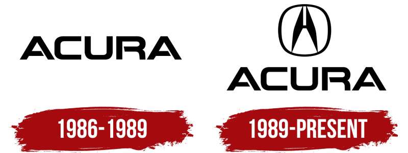
The Acura emblem has gone through two major versions since 1986. The original wordmark served the brand for four years before the caliper symbol took over.
That second design proved so effective that Acura kept it for over three decades. Minor refinements happened along the way, but the core shape stayed intact.
Original Acura Logo (1986-1990)
- Years Active: 1986-1990
- Design Description: “ACURA” spelled out in custom serif lettering with distinctive angular styling
- Color Scheme: Silver, black, and occasionally red
- Designer: Honda Motor Company design division
- Context: Created for Acura’s launch as Honda’s luxury division in North America
- Key Changes from Previous: First logo, no predecessor
- Cultural Significance: Marked Japan’s entry into the American luxury car market
Caliper Acura Logo (1990-Present)
- Years Active: 1990-present
- Design Description: Stylized “A” shaped like a mechanical caliper with pointed apex
- Color Scheme: Chrome/silver primary, with black backgrounds on vehicles
- Designer: Honda’s internal creative team
- Context: Introduced to give Acura a more distinctive visual identity separate from Honda
- Key Changes from Previous: Shifted from wordmark to abstract symbol
- Cultural Significance: Became synonymous with Japanese precision and engineering excellence
What Do the Design Elements of the Acura Logo Mean?
The caliper shape carries real meaning here. It references the precision measuring tools used in engineering and manufacturing.
Honda wanted buyers to associate Acura with accuracy and meticulous craftsmanship. The pointed apex suggests forward motion and ambition.
Why Did Acura Choose These Specific Colors?
Silver dominates the Acura palette. It connects to the precision instruments the logo mimics.
Chrome finishes also signal luxury in the automotive world. Most premium brands lean on metallic tones for exactly this reason.
- Silver/Chrome: Hex #C0C0C0 – Represents technology, sophistication, and modern engineering
- Black: Hex #000000 – Provides contrast and adds premium feel
- Red (Type S): Hex #E40521 – Reserved for performance variants, signals sportiness
What Typography Style Is Used in the Acura Logo?
The current emblem doesn’t rely on traditional typography at all. It’s purely symbolic.
When Acura does use text, they pair the symbol with a clean sans-serif font. The lettering stays understated so it doesn’t compete with the caliper mark.
Earlier versions used angular serif type that matched the logo’s geometric feel.
What Are the Hidden Meanings in the Acura Logo?
Look closer at the shape. The two sides meeting at a point form both an “A” and a measuring tool simultaneously.
Some see it as a stylized “H” for Honda, though Acura has never confirmed this interpretation. The upward point definitely suggests aspiration and progress.
The symmetry reinforces ideas of balance and precision that Acura wants you to feel.
How Does the Acura Logo Compare to Competitor Logos?
Among luxury car logos, Acura takes a more abstract approach than most. The Lexus emblem also uses a stylized letter, but Acura’s caliper concept adds another layer.
German brands like BMW and Mercedes stick with circular badges rooted in their heritage. Acura’s angular design feels distinctly modern by comparison.
The Honda emblem (a simple “H”) shares the same minimalist approach, showing family resemblance between the two brands.
What Are the Technical Specifications of the Acura Logo?
Official Color Codes:
- Primary Silver: Hex #C0C0C0, RGB (192, 192, 192), CMYK (0, 0, 0, 25)
- Black: Hex #000000, RGB (0, 0, 0), CMYK (0, 0, 0, 100)
- Type S Red: Hex #E40521, RGB (228, 5, 33), CMYK (0, 98, 86, 11), Pantone 185 C
Dimensions and Proportions:
- Aspect Ratio: Approximately 1:1 (square boundary)
- Minimum Size: 0.5 inches for print applications
- Clear Space: Equal to the height of the logo’s apex on all sides
- File Formats: Available in vector formats (AI, EPS, SVG) and raster (PNG, JPG)
What Cultural Impact Has the Acura Logo Had?
The caliper mark helped establish Japanese luxury cars as legitimate competitors to European brands. It showed up in countless films, TV shows, and video games throughout the 1990s and 2000s.
For a generation of car enthusiasts, especially fans of the Integra and NSX, the logo became a symbol of attainable performance.
How Does the Acura Logo Fit Into the Overall Brand Identity?
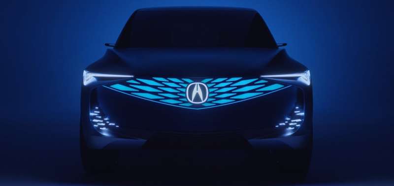
The emblem anchors everything Acura does visually. Dealerships, advertisements, and vehicles all center on that caliper mark.
Their tagline “Precision Crafted Performance” directly ties back to what the logo represents. The brand guidelines keep things consistent across all touchpoints.
Red accents for Type S models create a performance sub-brand that still fits within the larger visual system.
How Should the Acura Logo Be Used?
Official Usage Guidelines:
- Do: Maintain clear space around the logo, use approved color variations, keep proportions intact
- Don’t: Stretch or distort the mark, place on busy backgrounds, alter the colors outside approved palettes
- Access: Official assets available through Acura’s dealer portal and media resources
- Licensing: Trademark owned by Honda Motor Co., Ltd. – unauthorized commercial use prohibited
- Protection: Registered in major markets worldwide, actively enforced against counterfeits
FAQ on The Acura Logo
What Does the Acura Logo Represent?
The Acura emblem represents precision engineering and Japanese craftsmanship. The stylized “A” mimics a caliper design, a tool used for exact measurements.
Honda created this symbol to position Acura as a luxury vehicle brand focused on accuracy and performance excellence.
Why Does the Acura Logo Look Like a Caliper?
Honda’s design team chose the caliper shape deliberately. It connects to the brand’s “Precision Crafted Performance” tagline.
Calipers measure with extreme accuracy. That association transfers directly to how Acura wants customers to perceive their vehicles and brand identity overall.
When Was the Current Acura Logo Introduced?
The current chrome badge debuted in 1990. It replaced the original wordmark that launched with the brand in 1986.
This caliper symbol has remained virtually unchanged for over three decades, proving its effectiveness as a lasting automotive emblem.
Who Designed the Acura Logo?
Honda’s internal design division created both Acura logos. No external agency was involved.
The team developed the caliper concept to give Acura a distinct visual identity separate from Honda’s simpler “H” mark. Following solid logo design principles paid off.
What Colors Are Used in the Acura Logo?
Silver and chrome dominate the official color palette. Black provides background contrast on most vehicle applications.
Type S performance models add red accents. Understanding color psychology explains why metallic tones signal luxury and technology.
Is the Acura Logo Related to the Honda Logo?
Yes and no. Acura operates as Honda’s luxury division, but their emblems differ intentionally.
The Honda emblem uses a simple “H” while Acura’s caliper mark signals premium positioning. Both share Japanese design sensibilities and clean execution.
What Was the Original Acura Logo?
The 1986 original spelled “ACURA” in angular serif lettering. It looked sharp but lacked the iconic quality Honda wanted.
After four years, they switched to the abstract caliper symbol. That decision gave the brand stronger brand recognition worldwide.
Can I Use the Acura Logo for My Business?
No. The Acura trademark belongs exclusively to Honda Motor Co., Ltd.
Unauthorized commercial use violates trademark law. Dealers and licensed partners access official assets through Honda’s corporate portal with proper agreements in place.
Where Can I Find Official Acura Logo Files?
Authorized dealers access files through Acura’s media resources portal. Journalists can request assets from Honda’s press department.
Public use requires written permission. The brand style guide specifies proper usage for all approved applications.
Why Did Acura Change Their Logo in 1990?
The original wordmark didn’t differentiate Acura enough from competitors. Honda needed something more memorable.
The caliper symbol created instant visual focus and tied directly to precision messaging. It worked. The NSX, Integra, and Legend all benefited from this stronger identity.
Conclusion
The Acura Logo proves that thoughtful automotive branding can last for decades. That caliper-shaped emblem has represented the MDX, TLX, and every Type S model since 1990.
Honda’s luxury division understood something important early on. A strong vehicle insignia needs meaning behind it, not just aesthetic appeal.
The psychology of shapes works here. Angular lines suggest precision. The chrome finish signals premium quality.
Whether you spot it on an Integra at a car show or a new RDX at the dealership, the Acura trademark remains instantly recognizable. That’s effective graphic design at work.

Renowned for his expertise in logo design and visual branding, Bogdan has developed a multitude of logos for various clients.
His skills extend to creating posters, vector illustrations, business cards, and brochures. Additionally, Bogdan's UI kits were featured on marketplaces like Visual Hierarchy and UI8.
He also wrote in the past years on sites like Design Your Way, WebDesignerDepot, WPDean, Designmodo, Speckyboy, Slider Revolution, and more.
- Canva AI Features Reviewed: Are They Actually Useful? - 4 October 2026
- The Substack Logo History, Colors, Font, And Meaning - 2 October 2026
- How UX Design Impacts SaaS User Retention and Churn - 1 October 2026

Bogdan Sandu is a seasoned designer who has been designing websites since 2008. Renowned for his expertise in logo design and visual branding, Bogdan has developed a multitude of logos for various clients. His skills extend to creating posters, vector illustrations, business cards, and brochures. Additionally, Bogdan's UI kits were featured on marketplaces like Visual Hierarchy and UI8. He also wrote in the past years on sites like Design Your Way, WebDesignerDepot, WPDean, Designmodo, Speckyboy, Slider Revolution, and more.
You Might Also Like