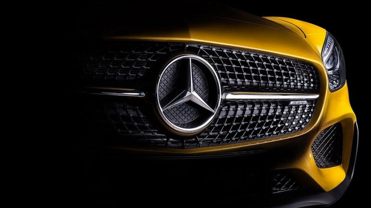
The Mercedes logo stands among the most recognizable automotive emblems worldwide. The three-pointed star has represented the German luxury manufacturer since 1909, symbolizing the brand’s dominance across land, sea, and air transportation.
Over more than a century, this iconic symbol has evolved from a simple radiator badge into a global status indicator. The current iteration maintains the original star design while adapting to modern vehicle aesthetics and digital applications.
Mercedes-Benz has refined its visual identity through multiple iterations, yet the core symbolism remains unchanged. The emblem appears on everything from luxury sedans to performance vehicles, maintaining consistent brand recognition across markets.
What is the Mercedes-Benz Logo?
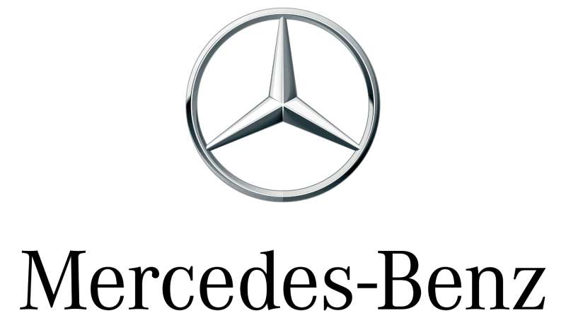
The Mercedes-Benz logo features a three-pointed star enclosed within a circular ring, introduced in 1909. Designed to represent the company’s engineering prowess across land, sea, and air, the emblem combines geometric simplicity with powerful symbolism that reinforces the brand’s premium positioning.
Design Type: Combination mark featuring both icon and wordmark elements
Primary Elements:
- Three-pointed star symbol
- Circular enclosure ring
- Mercedes-Benz wordmark (in specific applications)
- Chrome or silver finish in most applications
Official Introduction Date: 1909 (star symbol), 1926 (current form with ring)
Designer/Agency: The original star symbol came from Gottlieb Daimler’s family, who trademarked it after his death
Trademark Status: Registered trademark protected globally across multiple classes
Color Palette:
- Primary: Silver/Chrome (Hex: #C0C0C0)
- Secondary: Black (Hex: #000000)
- Background: White (Hex: #FFFFFF) or transparent
Usage Context: Vehicle grilles, wheels, marketing materials, dealership signage, merchandise, digital platforms, and corporate communications
The star itself represents a complete design philosophy. Each point symbolizes a different domain of transportation mastery.
The circular ring was added in 1926 after the merger of Daimler-Motoren-Gesellschaft and Benz & Cie. This created the unified brand identity we recognize today.
How Has the Mercedes-Benz Logo Evolved Over Time?

The Mercedes emblem has undergone seven major redesigns since 1902, each reflecting changing automotive trends and manufacturing capabilities. The three-pointed star emerged in 1909 and has remained the central element through every iteration, though its presentation and surrounding elements have been refined repeatedly.
Original Mercedes Logo (1902-1909)
Years Active: 1902-1909
Design Description: The word “Mercedes” in an oval frame with decorative flourishes
Color Scheme: Black text on white or gold background
Designer: Unknown (commissioned by Emil Jellinek who named the brand after his daughter)
Context: Created during the transition from Daimler to Mercedes branding, this wordmark established the luxury positioning
Key Changes from Previous: First official Mercedes trademark, replacing generic Daimler badges
Cultural Significance: Marked the birth of the Mercedes name in automotive history
Three-Pointed Star Introduction (1909-1916)
Years Active: 1909-1916
Design Description: Simple three-pointed star without circular enclosure
Color Scheme: Typically silver or chrome finish
Designer: Adapted from Gottlieb Daimler’s personal symbol by his sons
Context: Daimler’s widow and sons trademarked the symbol to honor his vision of motorization across all transport domains
Key Changes from Previous: Introduction of the iconic star replacing text-only branding
Cultural Significance: Established the visual symbol that would become synonymous with German engineering excellence
Laurel Wreath Period (1916-1926)
Years Active: 1916-1926
Design Description: Three-pointed star surrounded by laurel wreath with four small stars
Color Scheme: Gold and silver elements
Designer: Daimler-Motoren-Gesellschaft design team
Context: Laurel wreaths symbolized victory and achievement in early 20th-century design
Key Changes from Previous: Added decorative wreath element for enhanced visual impact
Cultural Significance: Reflected the company’s racing success and premium market position
Merger Logo (1926-1989)
Years Active: 1926-1989
Design Description: Three-pointed star enclosed in circular ring with “Mercedes-Benz” text
Color Scheme: Silver star and ring on black or white backgrounds
Designer: Created following Daimler and Benz merger
Context: The 1926 merger required a unified identity combining both heritage brands
Key Changes from Previous: Addition of the circular ring that became permanent
Cultural Significance: Symbolized the union of two pioneering automotive companies
Modern Simplification (1989-2008)
Years Active: 1989-2008
Design Description: Refined three-pointed star in circle with cleaner lines
Color Scheme: Chrome silver finish standardized
Designer: Mercedes-Benz in-house design team
Context: Automotive design shifted toward minimalism and clarity
Key Changes from Previous: Simplified geometry, removed some decorative elements
Cultural Significance: Adapted the classic symbol for modern manufacturing and reproduction across media
Contemporary Version (2008-2024)
Years Active: 2008-2024
Design Description: Three-dimensional rendering with enhanced depth and reflective surfaces
Color Scheme: Polished chrome with gradient effects
Designer: Mercedes-Benz Brand Experience team
Context: Digital media required more versatile logo treatments
Key Changes from Previous: Added dimensionality for richer visual presence
Cultural Significance: Maintained heritage while embracing contemporary design principles
Latest Iteration (2024-Present)
Years Active: 2024-Present
Design Description: Flattened design with optional two-dimensional treatment for digital applications
Color Scheme: Flexible color system including silver, black, and white variants
Designer: Mercedes-Benz Global Design team
Context: Transition to electric vehicles required a refreshed identity
Key Changes from Previous: Simplified for better scalability across digital platforms
Cultural Significance: Represents the brand’s evolution into electrification while honoring 115+ years of heritage
What Do the Design Elements of the Mercedes-Benz Logo Mean?

The three-pointed star represents Mercedes-Benz’s original ambition to produce engines for land, sea, and air vehicles. Each point symbolizes one domain of transportation, reflecting Gottlieb Daimler’s comprehensive vision for motorization across all transport methods, while the enclosing circle represents global reach and unity.
Why Did Daimler Choose the Three-Pointed Star?
Gottlieb Daimler originally used the three-pointed star as a personal symbol in correspondence with his wife, marking it on a postcard of their home to represent future success.
His sons Paul and Adolf Daimler later trademarked the symbol in 1909, three years after their father’s death. The three points specifically referenced the company’s production of engines for automobiles, boats, and aircraft.
This wasn’t just abstract symbolism. Daimler-Motoren-Gesellschaft actually manufactured engines for all three applications during this period, making the star a literal representation of their product range.
Why Did Mercedes-Benz Choose These Specific Colors?
Silver/Chrome:
- Hex: #C0C0C0
- Pantone: Cool Gray 7 C
- Symbolic meaning: Precision, quality, technological advancement
- Psychological impact: Conveys luxury, sophistication, and modernity
- Brand connection: References both German Silver Arrows racing cars and premium metal finishes
Black:
- Hex: #000000
- Pantone: Process Black C
- Symbolic meaning: Power, elegance, timelessness
- Psychological impact: Creates contrast and sophistication
- Brand connection: Traditional luxury automotive color
Silver became particularly significant after Mercedes racing cars were stripped to bare metal in the 1930s, creating the legendary “Silver Arrows” that dominated racing.
The chrome finish on physical badges reflects light, making the emblem visible and striking from various angles. This practical consideration reinforces the premium aesthetic.
What Typography Style Is Used in the Mercedes-Benz Logo?
The Mercedes-Benz wordmark uses Corporate A, a custom sans-serif font developed specifically for the brand.
Corporate A features clean lines, even spacing, and geometric letterforms that complement the star symbol’s precise geometry. The font maintains excellent readability at both large and small scales.
Earlier versions used variations of Futura and Helvetica before the custom typeface was commissioned. The shift to proprietary typography gave Mercedes-Benz greater control over brand consistency.
What Are the Hidden Meanings in the Mercedes-Benz Logo?
The circular ring added in 1926 represents more than decorative framing. It symbolizes the merger of Daimler and Benz, two pioneering companies joining forces.
Some interpretations suggest the three points also represent the three founders: Gottlieb Daimler, Wilhelm Maybach, and Karl Benz. However, this wasn’t the original intention.
The star’s geometric perfection creates balance and symmetry, subconsciously communicating precision engineering. Each point measures exactly 120 degrees from the others.
How Does the Mercedes-Benz Logo Compare to Competitor Logos?

Mercedes-Benz employs an emblematic approach with strong symbolic content, contrasting with text-focused competitors like Ford or typographic badges from Lincoln. The three-pointed star’s geometric simplicity and consistent application across 115 years gives it recognition advantages over frequently redesigned competitor marks.
BMW: Uses a circular quartered design representing Bavarian flag colors and aviation heritage. Both German luxury brands favor circular emblems with historical symbolism, though BMW’s design is more complex.
Audi: Features four interlocking rings representing the 1932 merger of four companies. Simpler than Mercedes in execution but similar in representing corporate unity through geometry.
Lexus: Employs a stylized “L” within an oval, focusing on letterform rather than abstract symbolism. More modern and less historically rooted than Mercedes.
Cadillac: Uses a heraldic crest with intricate details and multiple colors. Far more ornate than Mercedes’s minimalist design approach.
Porsche: Displays a detailed crest featuring the Stuttgart coat of arms. Much busier visually compared to Mercedes’s clean star.
Jaguar: Previously used a leaping cat sculpture, now simplified to a flatter mark. Both brands evolved from three-dimensional hood ornaments to flatter applications.
The Mercedes star’s strength lies in its immediate recognizability even at small sizes or from a distance. This scalability makes it effective across applications from wheel centers to mobile app icons.
Unlike car logos that rely on national flags or animals, the abstract star transcends cultural boundaries. The symbol carries meaning without requiring translation or cultural context.
What Are the Technical Specifications of the Mercedes-Benz Logo?
Official Color Codes:
Primary Color: Silver Chrome
- Hex: #C0C0C0
- RGB: (192, 192, 192)
- CMYK: (0, 0, 0, 25)
- Pantone: Cool Gray 7 C
Secondary Color: Black
- Hex: #000000
- RGB: (0, 0, 0)
- CMYK: (0, 0, 0, 100)
- Pantone: Process Black C
Accent Color: White
- Hex: #FFFFFF
- RGB: (255, 255, 255)
- CMYK: (0, 0, 0, 0)
- Pantone: White
Dimensions and Proportions:
- Aspect ratio: 1:1 (perfect circle)
- Minimum size requirements: 10mm diameter for print, 16px for digital
- Clear space specifications: Minimum clear space equal to one-quarter of the logo diameter on all sides
- Star points: Each extends to 80% of the circle radius
- Ring thickness: Approximately 8% of total diameter
Official Usage Guidelines:
The logo must maintain its circular proportions and cannot be stretched, rotated, or distorted. Background colors should provide sufficient contrast for visibility.
Three-dimensional renderings are acceptable for physical applications but should follow official depth and lighting specifications. The star should always appear centered within the ring.
Color palette variations are limited to approved combinations. Single-color versions should use either black on light backgrounds or white on dark backgrounds.
What Cultural Impact Has the Mercedes-Benz Logo Had?

The three-pointed star transcends automotive branding to function as a universal luxury symbol. Hip-hop culture adopted the emblem in the 1980s and 1990s as jewelry and fashion statements, removing it from its automotive context entirely and transforming it into standalone status iconography.
The logo appears in music videos, fashion accessories, and street art worldwide. This cultural appropriation actually strengthened rather than diluted the brand, expanding its recognition beyond car buyers.
In Germany, the rotating Mercedes star atop the company’s Stuttgart and Berlin buildings has become an architectural landmark. The Berlin installation at Europa-Center is particularly iconic, visible across the city.
The emblem’s appearance in films signals wealth and success. Directors use Mercedes badges as visual shorthand for character status without needing dialogue.
How Does the Mercedes-Benz Logo Fit Into Overall Brand Identity?

The star serves as the central anchor for all Mercedes-Benz brand communications, appearing consistently across vehicle design, marketing materials, dealership environments, and digital platforms. Every brand touchpoint reinforces the star’s symbolic connection to engineering excellence and luxury positioning.
The logo design principles extend into vehicle design language. The prominent grille-mounted star influences front-end styling across the entire lineup, from compact sedans to large SUVs.
Interior design elements echo the star’s geometry. Air vents, steering wheel centers, and ambient lighting patterns frequently incorporate the three-point motif.
Brand guidelines specify how the logo integrates with model names, trim levels, and sub-brands like AMG and Maybach. Each has specific rules for logo placement and sizing relative to model badges.
How Should the Mercedes-Benz Logo Be Used?

Official Usage Do’s:
- Maintain specified clear space around all sides
- Use approved color variations only
- Ensure minimum size requirements for legibility
- Apply to flat surfaces or approved three-dimensional applications
- Download official files from Mercedes-Benz brand portal
Official Usage Don’ts:
- Never stretch, skew, or distort proportions
- Never rotate the star to non-standard angles
- Never place on busy backgrounds that reduce visibility
- Never recreate or redraw the logo manually
- Never combine with unauthorized text or graphics
Where to Access Official Logos:
Authorized dealers and partners access official logo files through the Mercedes-Benz Brand Portal. Media professionals can request assets through the company’s press website.
Public use of the trademark requires written permission from Mercedes-Benz AG. Unauthorized commercial use violates trademark protection.
Licensing Information:
Mercedes-Benz maintains strict control over logo usage through licensing agreements. Approved merchandise partners must follow detailed brand style guide specifications.
Trademark Protection Details:
The three-pointed star is registered across multiple international trademark classes. Mercedes-Benz actively enforces protection against unauthorized use and counterfeiting.
Registration extends beyond automotive applications to cover apparel, accessories, and various consumer goods where brand confusion might occur.
FAQ About the Mercedes-Benz Logo
When was the Mercedes-Benz logo created?
The three-pointed star was first trademarked in 1909 by Gottlieb Daimler’s sons, Paul and Adolf Daimler. The current form with the circular ring was established in 1926 following the merger of Daimler-Motoren-Gesellschaft and Benz & Cie, creating the Mercedes-Benz brand identity that has remained largely consistent for nearly 100 years.
Who designed the Mercedes-Benz logo?
Gottlieb Daimler originally used the three-pointed star as a personal symbol, marking it on a postcard to his wife. After his death in 1900, his sons Paul and Adolf Daimler recognized its potential as a trademark and officially registered it in 1909, transforming the family symbol into corporate identity.
What do the colors in the Mercedes-Benz logo mean?
Silver or chrome represents precision engineering, technological advancement, and luxury quality, referencing the legendary Silver Arrows racing cars. Black adds sophistication and timelessness, creating strong visual contrast. Together, these colors communicate premium positioning and German engineering heritage through color psychology principles that have remained effective across generations.
How many times has the Mercedes-Benz logo been redesigned?
The logo has undergone seven major redesigns since 1902. The original text-only Mercedes mark (1902-1909) gave way to the three-pointed star (1909), which gained a laurel wreath (1916-1926), then the circular ring (1926-present). Subsequent refinements in 1989, 2008, and 2024 simplified and modernized the presentation while maintaining core elements.
Where can I download the official Mercedes-Benz logo?
Official Mercedes-Benz logos are available through the company’s Brand Portal for authorized dealers, partners, and media professionals. The press website provides approved assets for editorial use. Public or commercial use requires written permission and licensing agreements. Unauthorized downloads from third-party websites may provide incorrect or outdated versions that violate brand standards.
Is the Mercedes-Benz logo trademarked?
Yes, the three-pointed star is extensively protected through international trademark registrations across multiple classes. Mercedes-Benz AG actively enforces these protections against unauthorized commercial use, counterfeiting, and brand confusion. The trademark covers automotive applications, apparel, accessories, and various consumer goods where the Mercedes-Benz name or emblem might appear.
What font is used in the Mercedes-Benz logo?
The Mercedes-Benz wordmark uses Corporate A, a custom sans-serif typeface developed exclusively for the brand. This proprietary font features geometric letterforms with clean lines and even spacing that complement the star symbol’s precise geometry. Earlier iterations used Futura and Helvetica variations before commissioning the custom typography for greater brand consistency.
Why did Mercedes-Benz choose a three-pointed star for their logo?
The three points represent Daimler’s ambition to produce engines for land, sea, and air vehicles. This wasn’t purely symbolic – Daimler-Motoren-Gesellschaft actually manufactured engines for automobiles, marine vessels, and aircraft, making the star a literal representation of their product range and Gottlieb Daimler’s comprehensive vision for motorization across all transportation domains.
Conclusion
The Mercedes-Benz logo remains one of the most enduring and recognizable symbols in automotive history. The three-pointed star, introduced in 1909, successfully balances historical significance with contemporary relevance through careful evolution rather than radical redesign.
Key attributes – geometric simplicity, powerful symbolism, premium color application, and consistent brand integration – have maintained the logo’s effectiveness across 115+ years. The emblem transcends its automotive origins to function as a universal luxury indicator.
As Mercedes-Benz transitions into electric mobility, the three-pointed star continues adapting to new contexts while preserving its core meaning. This flexibility ensures the logo will likely maintain its iconic status for generations to come, proving that strong logo design principles create identities that outlast technological and cultural shifts.

Renowned for his expertise in logo design and visual branding, Bogdan has developed a multitude of logos for various clients.
His skills extend to creating posters, vector illustrations, business cards, and brochures. Additionally, Bogdan's UI kits were featured on marketplaces like Visual Hierarchy and UI8.
He also wrote in the past years on sites like Design Your Way, WebDesignerDepot, WPDean, Designmodo, Speckyboy, Slider Revolution, and more.
- The Windsurf Logo History, Colors, Font, And Meaning - 10 October 2026
- How to Remove Background From Product Photos (No Photoshop) - 10 October 2026
- How Designers can Build a Stronger Online Creative Identity - 9 October 2026

Bogdan Sandu is a seasoned designer who has been designing websites since 2008. Renowned for his expertise in logo design and visual branding, Bogdan has developed a multitude of logos for various clients. His skills extend to creating posters, vector illustrations, business cards, and brochures. Additionally, Bogdan's UI kits were featured on marketplaces like Visual Hierarchy and UI8. He also wrote in the past years on sites like Design Your Way, WebDesignerDepot, WPDean, Designmodo, Speckyboy, Slider Revolution, and more.
You Might Also Like