The Shell logo ranks among the most recognized corporate symbols worldwide. That yellow and red scallop shell has been greeting drivers at gas stations for over a century now.
Few petroleum brands have achieved this level of visual recognition. The pecten design (that’s the scientific name for the shell type) connects directly to the company’s origins in seashell trading. Royal Dutch Shell introduced its current logo version in 1971, created by industrial designer Raymond Loewy.
The company itself dates back to 1897. Since then, the logo has gone through roughly nine major redesigns. Each version refined the shell symbol while keeping its core identity intact.
What is the Shell Logo?
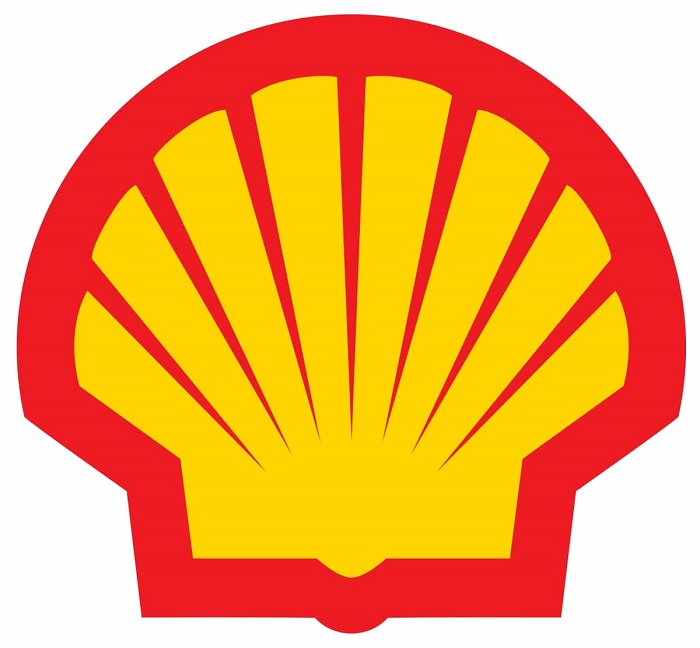
The Shell logo is a stylized pecten shell rendered in bright yellow with red outlines. Raymond Loewy designed the current version in 1971. It represents the company’s heritage in seashell importing and symbolizes quality, trust, and energy.
Design Type: Pictorial mark (standalone symbol without wordmark in primary usage)
Primary Elements:
- Stylized scallop shell (pecten maximus)
- Radiating grooves creating visual depth
- Bold outline defining the shape
Official Introduction Date: 1971 (current version)
Designer: Raymond Loewy, one of the most famous graphic designers of the 20th century
Trademark Status: Registered trademark of Shell plc globally
Color Palette:
- Shell Yellow: #FBCE07
- Shell Red: #DD1D21
Usage Context: Service stations, lubricant packaging, corporate communications, digital platforms, fleet vehicles, and retail merchandise
How Has the Shell Logo Evolved Over Time?
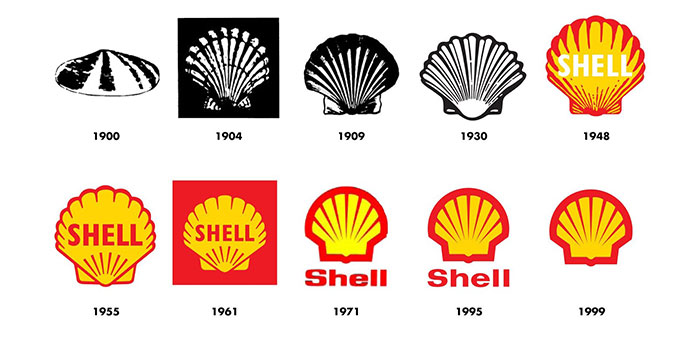
The Shell logo has transformed dramatically since 1900. It started as a realistic mussel shell illustration. Over nine versions, it became the simplified, bold symbol we see today.
Each redesign stripped away detail while strengthening recognition.
Original Shell Logo (1900-1904)
Years Active: 1900-1904
Design Description: A realistic black and white mussel shell drawing. Not the scallop we know today. It looked more like something from a biology textbook.
Color Scheme: Black outline on white background
Designer: Unknown (likely commissioned illustration)
Context: Marcus Samuel founded the company importing decorative seashells from the Far East. The logo literally represented his merchandise.
Cultural Significance: Connected the brand directly to its trading origins in London.
First Pecten Shell Logo (1904-1909)
Years Active: 1904-1909
Design Description: The company switched to a scallop shell (pecten). Still highly detailed with realistic shading and natural proportions.
Color Scheme: Black and white
Key Changes from Previous: Different shell species entirely. The pecten offered better symmetry and a more distinctive silhouette.
Context: Shell was expanding its petroleum operations. Needed a more memorable symbol.
Introduction of Color (1948)
Years Active: 1948-1955
Design Description: Yellow and red colors appeared for the first time. The shell shape remained detailed but gained warmth.
Color Scheme: Yellow fill, red outline
Context: Post-war expansion into California. The colors were chosen to stand out against the Spanish-influenced architecture and compete with local brands.
Cultural Significance: This color combination would become permanently associated with the brand.
Raymond Loewy Redesign (1971-Present)
Years Active: 1971-present
Design Description: Dramatically simplified. Bold geometric lines replaced realistic grooves. The shape became iconic through reduction.
Color Scheme: Shell Yellow (#FBCE07), Shell Red (#DD1D21)
Designer: Raymond Loewy
Key Changes from Previous: Removed all unnecessary detail. Created perfect scalability for modern applications.
Context: Television advertising demanded simpler graphics. Loewy understood that less detail meant more impact at any size.
Cultural Significance: Became a textbook example of corporate identity refinement.
What Do the Design Elements of the Shell Logo Mean?
The pecten shell carries meaning on multiple levels. It references the company’s founding in seashell trading.
But it also suggests nature, quality, and timelessness.
The radiating lines create a sense of energy moving outward. Pretty fitting for an energy company, actually.
Why Did Shell Choose These Specific Colors?
The yellow and red combination wasn’t arbitrary. Understanding color psychology explains why these work so well together.
Shell Yellow
- Hex: #FBCE07
- Pantone: 116 C
- Symbolic meaning: Energy, optimism, warmth
- Psychological impact: Grabs attention, suggests friendliness
- Brand connection: Represents the sunlight and petroleum’s energy potential
Shell Red
- Hex: #DD1D21
- Pantone: 485 C
- Symbolic meaning: Power, passion, action
- Psychological impact: Creates urgency, increases heart rate
- Brand connection: Suggests the power of combustion engines
Together, these colors create strong contrast that works from highway distances. Companies with yellow logos often aim for visibility and approachability.
What Typography Style Is Used in the Shell Logo?
Shell uses a custom sans-serif font called Shell Gothic for its wordmark. It’s clean and modern without being cold.
The letterforms have subtle humanist touches. You’ll notice slightly rounded terminals.
They designed it for readability at small sizes on product labels. Works equally well on massive highway signs.
The typography evolved alongside the symbol, becoming bolder and simpler over decades.
What Are the Hidden Meanings in the Shell Logo?

The radiating grooves do more than look nice. They create implied motion, suggesting fuel flowing outward.
Some see a sunrise in the design. Others notice the shell points toward the sky, like growth or aspiration.
Loewy never confirmed hidden symbolism. He focused on functional simplicity over clever tricks.
The psychology of shapes tells us curved forms feel organic and trustworthy. The rounded shell shape softens what could feel industrial.
How Does the Shell Logo Compare to Competitor Logos?
Most oil company logos rely on abstract shapes or text. Shell stands alone with its pictorial approach.
BP uses a green and yellow sunflower pattern. ExxonMobil goes with bold typography. Chevron has geometric stripes.
Shell’s naturalistic symbol creates emotional warmth that abstract marks struggle to achieve. It feels approachable in an industry often seen as impersonal.
Comparative Analysis:
| Brand | Logo Type | Primary Colors | Symbol |
| Shell | Pictorial mark | Yellow, Red | Scallop shell |
| BP | Abstract mark | Green, Yellow | Helios sunflower |
| ExxonMobil | Wordmark | Red, Blue | None |
| Chevron | Abstract mark | Red, Blue | Chevron stripes |
| Total | Abstract mark | Red, Orange, Blue | Multicolored sphere |
What Are the Technical Specifications of the Shell Logo?
Official Color Codes:
Primary Color: Shell Yellow
Secondary Color: Shell Red
- Hex: #DD1D21
- RGB: (221, 29, 33)
- CMYK: (0, 87, 85, 13)
- Pantone: 485 C
Dimensions and Proportions:
- Aspect ratio: Approximately 1:1 (square bounding box)
- Minimum size: 10mm height for print applications
- Clear space: Minimum of 25% of logo height on all sides
- The logo works as vector graphics for infinite scalability
What Cultural Impact Has the Shell Logo Had?
The Shell pecten became a case study in design schools worldwide. It demonstrates how reduction strengthens recognition.
Raymond Loewy’s 1971 redesign influenced a generation of corporate identity work. The logo appears in design textbooks alongside Coca-Cola and Apple.
For many people, that yellow shell is their first visual memory of a gas station. It shaped how we expect energy brands to present themselves.
How Does the Shell Logo Fit Into the Overall Brand Identity?
The logo anchors everything Shell does visually. Station architecture uses the same yellow and red. Uniforms, packaging, and digital interfaces all reference these colors.
Shell’s brand guidelines specify exactly how the logo interacts with other elements.
The pecten appears on lubricant bottles, credit cards, and racing team liveries. Each application reinforces the others.
This consistency took decades to build. It’s why you can spot a Shell station from a mile away.
How Should the Shell Logo Be Used?
Official Usage Guidelines:
Do:
- Use official color values exactly
- Maintain clear space requirements
- Scale proportionally
- Use approved file formats from Shell’s brand portal
Don’t:
- Alter colors or proportions
- Add effects like shadows or gradients
- Place on busy backgrounds
- Recreate from memory (always use official files)
Accessing Official Logos: Licensed partners can download approved files through Shell’s brand management system.
Trademark Protection: The Shell pecten is registered globally. Unauthorized use triggers legal action. Even parody requires careful legal consideration.
FAQ on The Shell Logo
What Does the Shell Logo Represent?
The Shell logo represents the company’s origins in seashell trading. Marcus Samuel started by importing decorative shells from Asia.
The pecten symbol now stands for energy, reliability, and global reach. It connects heritage to modern petroleum operations.
Who Designed the Current Shell Logo?
Raymond Loewy designed the current version in 1971. He was a legendary industrial designer known for simplifying complex forms.
Loewy applied minimalist design thinking to the existing shell shape. His version removed unnecessary detail while keeping instant recognition.
When Was the First Shell Logo Created?
The first Shell logo appeared in 1900. It showed a realistic mussel shell in black and white.
The company switched to a scallop shell design in 1904. That basic shape has remained ever since, though heavily refined.
Why Is the Shell Logo a Shell?
Simple answer: the company literally sold seashells first. Marcus Samuel’s father ran a London shop selling oriental shells.
When they moved into oil, keeping the shell made sense. It provided instant focal point recognition and honored their roots.
What Are the Official Shell Logo Colors?
Shell uses yellow (#FBCE07) and red (#DD1D21) exclusively. These colors create a complementary color scheme with maximum visibility.
The combination first appeared in 1948 for California stations. It was chosen to stand out against Spanish architecture.
How Many Times Has the Shell Logo Changed?
The logo has gone through approximately nine major versions since 1900. Each redesign simplified the shell further.
Most changes were gradual refinements. The 1971 Loewy redesign was the most dramatic shift in the brand’s visual identity history.
What Type of Shell Is in the Logo?
It’s a pecten maximus, commonly called a scallop shell. The original 1900 logo actually showed a mussel.
They switched to the pecten in 1904. Its radiating grooves and symmetrical shape offered better recognition from a distance.
Is the Shell Logo Trademarked?
Yes. Royal Dutch Shell holds global trademark protection for the pecten design. The company aggressively defends it.
Unauthorized use triggers legal action. Even similar shell shapes in competing industries have faced challenges from Shell’s legal team.
What Font Does Shell Use With Its Logo?
Shell uses a custom typeface called Shell Gothic. It’s a clean sans-serif with humanist characteristics.
The font was designed for legibility at all sizes. Works on tiny product labels and massive highway signs equally well.
Why Did Shell Choose Yellow and Red Colors?
Visibility drove the decision. Understanding color theory explains why this pairing works brilliantly at highway speeds.
Yellow grabs attention. Red adds urgency and energy. Together they create the strong visual hierarchy needed for roadside recognition.
Conclusion
The Shell logo proves that great brand marks get better with age. Raymond Loewy’s 1971 redesign turned a century-old symbol into a masterclass in corporate identity.
That yellow and red pecten shell works everywhere. Gas station canopies. Tiny lubricant labels. Racing cars at 200 mph.
Few petroleum companies achieve this level of visual recognition. The logo follows solid logo design principles while honoring the company’s seashell trading origins.
It demonstrates how simplification strengthens recall. Every groove removal made the symbol more powerful.
Royal Dutch Shell built something lasting here. The pecten will likely outlive us all.

Renowned for his expertise in logo design and visual branding, Bogdan has developed a multitude of logos for various clients.
His skills extend to creating posters, vector illustrations, business cards, and brochures. Additionally, Bogdan's UI kits were featured on marketplaces like Visual Hierarchy and UI8.
He also wrote in the past years on sites like Design Your Way, WebDesignerDepot, WPDean, Designmodo, Speckyboy, Slider Revolution, and more.
- Canva vs Photoshop: When Does Each Make Sense? - 12 September 2026
- Briefing 3D Game Animation: Rigs, Clip Lists and Engine Handoffs - 11 September 2026
- The Webflow Logo History, Colors, Font, And Meaning - 10 September 2026

Bogdan Sandu is a seasoned designer who has been designing websites since 2008. Renowned for his expertise in logo design and visual branding, Bogdan has developed a multitude of logos for various clients. His skills extend to creating posters, vector illustrations, business cards, and brochures. Additionally, Bogdan's UI kits were featured on marketplaces like Visual Hierarchy and UI8. He also wrote in the past years on sites like Design Your Way, WebDesignerDepot, WPDean, Designmodo, Speckyboy, Slider Revolution, and more.
You Might Also Like