The Photoshop logo stands as one of the most recognized symbols in creative software. It represents Adobe’s flagship image editing program, a tool that changed how designers, photographers, and artists work with digital images.
Within the broader landscape of technology company branding, this logo holds a special place. It marks the visual identity of software that basically invented the concept of “photoshopping” as a verb.
The current version features the letters “Ps” against a blue gradient background. Adobe introduced this rounded rectangle format in 2020. The company has gone through roughly six major logo iterations since Photoshop launched in 1990.
Thomas Knoll and John Knoll created the original software. Adobe acquired it shortly after and has maintained the brand ever since.
What is the Photoshop Logo?
The Photoshop logo is a combination mark featuring “Ps” letterforms inside a rounded square with a blue gradient. Adobe officially introduced the current design in 2020. The internal creative team developed it as part of Adobe’s unified Creative Cloud branding system. It symbolizes professional image editing and digital creativity.
Design Type: Combination mark (letterform plus container shape)
Primary Elements: “Ps” letters, rounded rectangle container, blue gradient background
Official Introduction Date: November 2020 (current version)
Designer/Agency: Adobe’s in-house design team
Trademark Status: Registered trademark of Adobe Inc.
Color Palette: Deep blue (#31A8FF primary, #001E36 dark accent)
Usage Context: Software application icons, Creative Cloud interface, marketing materials, splash screens, product packaging
How Has the Photoshop Logo Evolved Over Time?
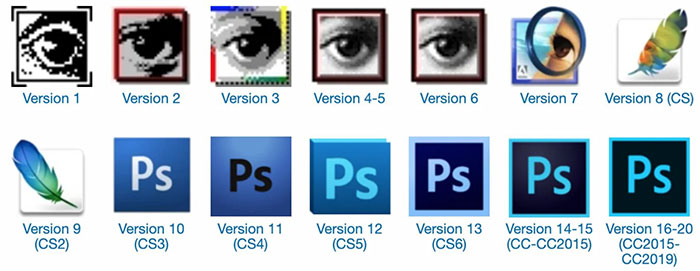
The Photoshop logo has gone through dramatic changes since 1990. Early versions focused on eye imagery and paintbrush motifs.
The 2000s brought the feather era. Then came the simplified “Ps” approach we know today.
Each redesign reflected shifts in design trends and Adobe’s broader identity strategy.
Original Photoshop Logo (1990-2002)
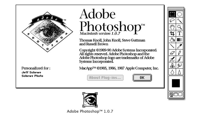
Years Active: 1990-2002
Design Description: The original logo featured an eye with a paintbrush passing through it. Very literal in its symbolism. It screamed “image editing” without any subtlety.
Color Scheme: Multi-colored with blues, greens, and warm tones
Designer: Thomas Knoll (original concept)
Context: Photoshop was new. Users needed to understand what the software did at a glance. Software packaging sat on physical retail shelves back then.
Key Changes from Previous: This was the first. No previous version existed.
Cultural Significance: It established Photoshop’s identity during the desktop publishing revolution.
Feather Era Logo (2002-2012)
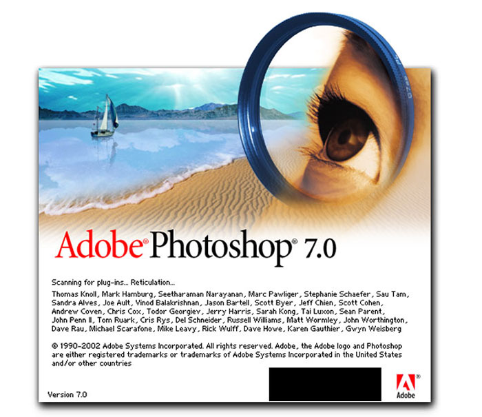
Years Active: 2002-2012
Design Description: A blue feather became the central icon. It represented lightness and precision. The look was more sophisticated than the original eye motif.
Color Scheme: Predominantly blue with subtle gradients
Designer: Adobe Creative Team
Context: Adobe unified its Creative Suite branding. Each application got a unique icon with consistent styling.
Key Changes from Previous: Moved away from literal imagery toward abstract symbolism
Cultural Significance: The feather became iconic among designers. Many still feel nostalgic about this version.
Modern Ps Logo (2012-Present)
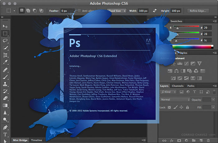
Years Active: 2012-present (with updates in 2020)
Design Description: Simple “Ps” letterforms inside a rounded square. Clean and immediately recognizable. The 2020 update added rounded corners and refined the blue tones.
Color Scheme: Cyan blue with darker blue accents
Designer: Adobe Design Team
Context: The shift to Creative Cloud required a new visual language. Subscription models meant the logo appeared constantly in interfaces.
Key Changes from Previous: Abandoned pictorial elements entirely for pure typography
Cultural Significance: Represents minimalist design thinking in software branding
What Do the Design Elements of the Photoshop Logo Mean?
The “Ps” abbreviation serves a practical purpose. It identifies the application instantly among dozens of Creative Cloud apps.
But there’s more going on here. The rounded rectangle mimics an app icon shape. The blue connects to themes of trust and creativity.
Why Did Adobe Choose These Specific Colors?
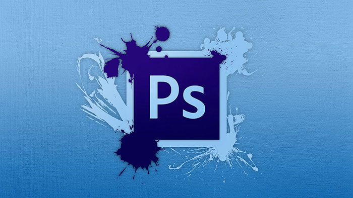
Blue dominates the Photoshop logo for good reasons.
Primary Blue (#31A8FF): This cyan-leaning blue suggests creativity and digital innovation. It stands out on dark interfaces. The psychology behind this color choice points to trust, reliability, and professionalism.
Dark Blue (#001E36): This near-black blue adds depth. It creates strong contrast with the lighter primary color.
Together, these colors position Photoshop as a serious professional tool. Not playful. Not intimidating. Just capable and trustworthy.
What Typography Style Is Used in the Photoshop Logo?
The “Ps” uses a custom sans-serif typeface designed specifically for Adobe.
It features slightly rounded terminals. The letterforms feel modern but not trendy.
Readability was critical since the logo appears at tiny sizes in dock icons and toolbars. The stroke weights balance well even at 16 pixels.
What Are the Hidden Meanings in the Photoshop Logo?
Honestly? Not much hidden symbolism here. Adobe went for clarity over cleverness.
The rounded corners signal approachability. They soften what could feel like a corporate tech brand.
Some designers note that the “P” and “s” create a visual hierarchy. The uppercase P dominates while the lowercase s supports it. Whether intentional or not, it’s there.
How Does the Photoshop Logo Compare to Competitor Logos?
Photoshop’s logo plays it safe compared to competitors. That’s probably smart.
Affinity Photo uses a more dynamic, angular approach. GIMP sticks with a mascot (the dog-like creature). Pixelmator goes for a playful paint splatter vibe.
Adobe chose professionalism over personality. The Autodesk brand takes a similar approach with its creative software logos.
When you’re the industry standard, you don’t need to try hard to stand out. Your market position does that for you.
What Are the Technical Specifications of the Photoshop Logo?
Official Color Codes:
Primary Blue:
- Hex: #31A8FF
- RGB values: (49, 168, 255)
- CMYK breakdown: (73, 26, 0, 0)
Dark Background Blue:
- Hex: #001E36
- RGB: (0, 30, 54)
- CMYK: (100, 80, 43, 55)
Dimensions and Proportions:
- Aspect ratio: 1:1 (square)
- Corner radius: Approximately 20% of width
- Minimum size: 16×16 pixels for digital use
- Clear space: Equal to the height of the “s” on all sides
What Cultural Impact Has the Photoshop Logo Had?
This logo appears everywhere. Design tutorials. YouTube thumbnails. Marketing materials worldwide.
It signals “professionally edited” before you even see the work. The blue square has become shorthand for digital image manipulation.
Among designers, seeing that icon triggers muscle memory. They know exactly what workspace and tools await them.
How Does the Photoshop Logo Fit Into the Overall Brand Identity?
Adobe built a whole system around these letter-based icons. Illustrator gets “Ai” in orange. InDesign gets “Id” in pink.
Photoshop’s blue “Ps” anchors this family as the most recognized member. The official brand guidelines ensure consistency across all applications.
Everything connects. Same container shape. Same typography style. Different colors create instant differentiation.
How Should the Photoshop Logo Be Used?
Do:
- Use official logo files from Adobe’s brand portal
- Maintain minimum clear space around the logo
- Use approved color variations (full color, white, black)
Don’t:
- Stretch or distort the proportions
- Change the official colors
- Add effects like drop shadows or gradients
- Place on busy backgrounds that reduce legibility
Access: Official logos available through Adobe’s brand resource center for partners and licensees.
Trademark: “Photoshop” and the Ps logo are registered trademarks of Adobe Inc. Unauthorized use in commercial contexts is prohibited.
FAQ on The Photoshop Logo
What Does the Photoshop Logo Look Like?
The Photoshop logo features “Ps” letters inside a rounded square. The background shows a blue gradient effect.
It’s part of Adobe Creative Cloud’s unified branding system. Simple, clean, instantly recognizable among other graphic design tools.
What Do the Colors in the Photoshop Logo Mean?
The cyan blue represents creativity, trust, and digital innovation. Adobe chose this specific hue to differentiate Photoshop from other Creative Suite applications.
Each Adobe app gets a unique color. Photoshop claimed blue early on.
Why Is the Photoshop Logo Blue?
Blue connects to professionalism and reliability. It also photographs well and maintains strong color saturation across different screens.
The choice works for both print ready materials and web logo optimization. Practical and symbolic.
Who Designed the Current Photoshop Logo?
Adobe’s in-house design team created the modern Ps logo. The 2020 update refined corner radius and color values.
Original Photoshop software came from Thomas and John Knoll. But Adobe handled all brand identity design afterward.
When Was the Photoshop Logo First Created?
The original logo appeared in 1990 when Photoshop launched. It featured an eye with a paintbrush.
The current “Ps” format started in 2012. Adobe updated it again in 2020 with softer corners.
How Has the Photoshop Logo Changed Over Time?
Photoshop went from literal imagery to abstract typography. The eye icon became a feather. The feather became letters.
Each redesign followed broader logo design trends. The evolution mirrors how the entire software industry approached branding.
What Font Is Used in the Photoshop Logo?
Adobe uses a custom typeface for the Ps letters. It’s not publicly available.
The letterforms have slightly rounded terminals. They’re optimized for small sizes since the logo appears in app icons and toolbars.
Can I Use the Photoshop Logo for My Project?
Not without permission. The Ps logo is a registered trademark of Adobe Inc.
Commercial use requires licensing. Editorial use has more flexibility. Check Adobe’s official brand guidelines before using it anywhere.
What File Format Should I Use When Saving a Logo in Photoshop?
For logos with a transparent background, use PNG file format. For print, export as PDF or EPS.
PSD files preserve layer styles and smart objects. But vector graphics from Illustrator scale better for professional logo design.
How Do I Create a Logo Similar to Photoshop’s Style?
Start with a square artboard. Use the shape tool to create a rounded rectangle. Add your letters with the type tool.
Apply a gradient overlay through layer styles. Keep it simple. The logo design process here rewards restraint.
Conclusion
The Photoshop logo proves that great brand marks don’t need complexity. Two letters. One rounded square. A blue gradient. That’s it.
Adobe built an entire visual system around this approach. Every Creative Cloud application follows the same template with different colors.
Whether you’re working in the logo design workspace or just opening the app to edit photos, that Ps icon signals professional image editing software.
It went from an eye with a paintbrush to pure typographic simplicity. The evolution reflects how the industry itself matured.
Sometimes the best logo design principles come down to restraint.

Renowned for his expertise in logo design and visual branding, Bogdan has developed a multitude of logos for various clients.
His skills extend to creating posters, vector illustrations, business cards, and brochures. Additionally, Bogdan's UI kits were featured on marketplaces like Visual Hierarchy and UI8.
He also wrote in the past years on sites like Design Your Way, WebDesignerDepot, WPDean, Designmodo, Speckyboy, Slider Revolution, and more.
- The Cursor Logo History, Colors, Font, And Meaning - 24 September 2026
- Top 7 Web Design Subscription Services That Replace Full-Time Hires - 24 September 2026
- Canva vs PowerPoint: Which Is Better for Presentations? - 22 September 2026

Bogdan Sandu is a seasoned designer who has been designing websites since 2008. Renowned for his expertise in logo design and visual branding, Bogdan has developed a multitude of logos for various clients. His skills extend to creating posters, vector illustrations, business cards, and brochures. Additionally, Bogdan's UI kits were featured on marketplaces like Visual Hierarchy and UI8. He also wrote in the past years on sites like Design Your Way, WebDesignerDepot, WPDean, Designmodo, Speckyboy, Slider Revolution, and more.
You Might Also Like