Square fonts demand attention. There’s something about those rigid, geometric letterforms that instantly signals modernity, strength, and precision.
Finding the best square fonts for your project can be tricky, though. Some look fantastic in headlines but fall apart at smaller sizes. Others nail the tech aesthetic but feel cold for brand work.
This guide breaks down the top geometric typefaces worth your time. You’ll learn which square fonts work best for logos, web headers, and poster design. We’ll cover free options from Google Fonts alongside premium choices.
Whether you’re building a futuristic brand identity or just need blocky lettering that pops, you’ll find something here.
The Best Square Fonts
| Font Name | Design Characteristics | Best Use Cases | Availability |
|---|---|---|---|
| Bebas Neue | Tall condensed letterforms with squared terminals. Uppercase-only design featuring consistent stroke weight and geometric structure. | Headlines, posters, branding materials requiring bold impact and vertical emphasis. | Free (Google Fonts) |
| Futura | Geometric sans-serif with circular forms and squared elements. Clean modernist aesthetic with precise mathematical proportions. | Corporate identity, editorial design, minimalist branding requiring timeless sophistication. | Commercial license |
| ITC Avant Garde Gothic | Geometric construction with perfect circles and squares. Tight spacing with distinctive ligatures and alternate characters. | Display typography, luxury branding, fashion industry applications needing geometric precision. | Commercial license |
| Gotham | Squared geometric forms inspired by architectural signage. Wide letter spacing with strong horizontal emphasis and squared curves. | Political campaigns, corporate communications, institutional branding requiring authority and accessibility. | Commercial license |
| Montserrat | Urban geometric typeface with squared terminals. Multiple weight variations offering versatility for digital and print environments. | Web design, mobile interfaces, startup branding needing modern geometric characteristics. | Free (Google Fonts) |
| Rigid Square | Strictly geometric typeface with hard right angles. Uniform stroke width creating mechanical precision and industrial character. | Technology branding, robotics industry, gaming interfaces emphasizing technical precision. | Varies by foundry |
| TAMPOOL | Display typeface with squared letterforms and decorative elements. Bold weight with distinctive geometric ornamentation. | Event posters, music industry branding, artistic projects requiring decorative square geometry. | Varies by foundry |
| Quabork | Angular squared forms with sharp terminals. Condensed proportions creating dense texture and compact visual impact. | Magazine headlines, packaging design, retail signage needing condensed square aesthetics. | Varies by foundry |
| Black Square | Ultra-bold square typeface with minimal counter space. Heavy stroke weight producing maximum visual density and strength. | Large format displays, architectural signage, sports branding demanding maximum weight and presence. | Varies by foundry |
| Delimo | Squared geometric sans with refined details. Balanced proportions combining clarity with squared terminal treatment. | Digital interfaces, app design, modern branding requiring legibility with geometric square character. | Varies by foundry |
| Higrah | Contemporary square typeface with Arabic-inspired geometric patterns. Angular construction with cultural design elements. | Multicultural branding, Islamic design projects, cultural institutions needing geometric square forms. | Varies by foundry |
| Neurotic | Experimental square display face with irregular spacing. Unconventional letter construction creating dynamic tension and movement. | Alternative music covers, underground culture branding, artistic installations emphasizing disruption. | Varies by foundry |
| Chinese Rocks | Rugged square typeface with textured edges. Distressed aesthetic combining squared forms with rough surface treatment. | Vintage branding, rock music graphics, distressed design applications requiring weathered square letterforms. | Varies by foundry |
| Speeday | Squared racing-inspired typeface with speed-line details. Italicized angle with squared terminals suggesting velocity and motion. | Motorsports branding, athletic equipment, action sports requiring dynamic squared letterforms. | Varies by foundry |
| DAGGERSQUARE | Sharp angular typeface with dagger-like terminals. Aggressive squared geometry with pointed accents and dramatic contrast. | Heavy metal typography, horror genre graphics, aggressive branding requiring sharp square elements. | Varies by foundry |
| Motion Control | Technical squared typeface with engineering precision. Monospaced characteristics with squared terminals reflecting mechanical systems. | Engineering documentation, industrial design, technical manuals requiring squared mechanical aesthetics. | Varies by foundry |
| Propaganda | Bold squared constructivist typeface with Soviet aesthetic. Strong vertical stress with squared serifs and authoritative presence. | Political design, historical projects, retro branding referencing constructivist square typography. | Varies by foundry |
| RE Ecap | Reversed cap-height typeface with squared forms. Unconventional baseline treatment with squared geometric structure. | Experimental design, conceptual art projects, editorial work requiring unconventional squared typography. | Varies by foundry |
| LOGX-20 | Futuristic squared typeface with sci-fi elements. Modular construction with squared terminals and technological character. | Science fiction branding, tech startups, futuristic interfaces requiring squared digital aesthetics. | Varies by foundry |
| HWT Konop | Wood type revival with squared serifs. Historical design featuring thick squared strokes and Victorian-era proportions. | Vintage posters, heritage branding, letterpress projects requiring historical squared wood type aesthetics. | Hamilton Wood Type |
Bebas Neue
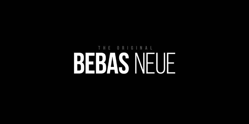
A tall, condensed all-caps display typeface with extreme vertical proportions and tight spacing. Originally released as a free project font in 2005, then refined in 2010 as Bebas Neue.
Geometric Properties
Built on strict geometric principles with near-perfect circular forms in curved letters like O, C, and G. Corners meet at precise 90-degree angles without any optical softening.
The stroke weight remains absolutely uniform throughout each character (no thick-thin variation). Squared terminals on letters like E and F create that blocky, architectural feeling.
Readability Characteristics
Works best at display sizes (36pt and above) where the condensed proportions don’t compromise legibility.
The tall letterforms and tight spacing can feel cramped in smaller applications. Large x-height relative to cap height wasn’t an issue initially since early versions were caps-only.
Use Cases
Perfect for headlines, poster titles, and branding that needs immediate visual impact.
Sports teams, tech startups, and fashion brands gravitate toward its bold presence. Widely used in packaging design and social media graphics where space is tight but impact matters. The 2016 La La Land movie credits used Bebas Neue extensively.
Technical Specifications
Available in 5 weights: Thin, Light, Book, Regular, and Bold.
Extended Latin character support covers 80+ languages. OpenType features include fractions, localization, and ordinals. Licensed under SIL Open Font License (free for commercial use). TTF, OTF, WOFF, and WOFF2 formats available.
Pairing Compatibility
Pairs beautifully with humanist sans-serif fonts like Museo Sans or geometric options like Montserrat for body text.
Works surprisingly well with slab serif fonts that share its industrial aesthetic. Avoid pairing with other condensed display faces (creates visual tension).
Designer & Background
Created by Ryoichi Tsunekawa of Dharma Type foundry in 2005, refined in 2010.
Fontfabric expanded it into a full family in 2014. The design philosophy centered on creating a “Helvetica of free fonts” with clean lines and simple warmth that works across web, print, and commercial applications.
Futura
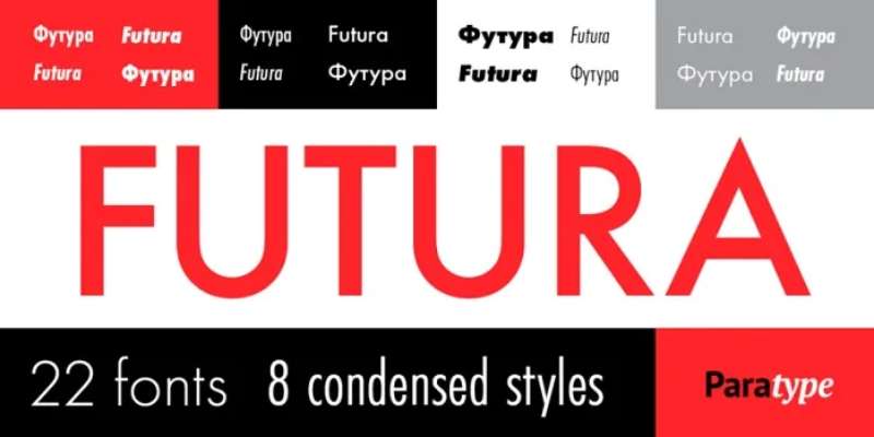
The quintessential geometric sans-serif based on pure circles, triangles, and squares. Despite its mathematical appearance, subtle optical adjustments make it surprisingly warm and readable.
Geometric Properties
Near-perfect circles form the basis of O, Q, C, and curved strokes. Straight lines intersect at exact geometric angles with no humanist softening.
The famous pointy apex on uppercase A and the perfectly round O define its character. Stroke contrast is completely absent (monolinear construction). Sharp, unadorned terminals give it that machine-precise feel.
Readability Characteristics
Performs exceptionally well at all sizes due to careful optical corrections Renner made to the geometric base.
The moderate x-height and generous apertures prevent it from feeling closed off. Actually reads better than many geometric competitors in body text applications (10-14pt range).
Use Cases
Corporate identities, fashion branding, and architectural signage love Futura’s timeless modernism.
NASA used it on the moon landing plaque in 1969. Brands like Volkswagen, FedEx, Louis Vuitton, and Domino’s Pizza built their identities around it. Wes Anderson uses it extensively in film credits and poster design.
Technical Specifications
Available in 8 weights from Light to Extra Bold, plus obliques.
Futura Now (2020 Monotype revival) expanded to 102 styles with size-specific spacing. Full Latin, Greek, and Cyrillic support. Multiple foundries offer it (licensing varies). Commercial license required for most versions.
Pairing Compatibility
Classic pairing with Baskerville or Bodoni creates sophisticated editorial layouts.
Works with geometric siblings like ITC Avant Garde for multi-level hierarchies. Avoid pairing with other stark geometric faces. Pairs well with script fonts for invitation design.
Designer & Background
Paul Renner designed it between 1924-1927 for Bauer Type Foundry in Frankfurt, Germany.
Influenced by Bauhaus design principles but Renner wasn’t formally part of the movement. He believed modern type should express modern models, not revive historical forms. The Nazis dismissed him in 1933 for opposing their ideology.
ITC Avant Garde Gothic
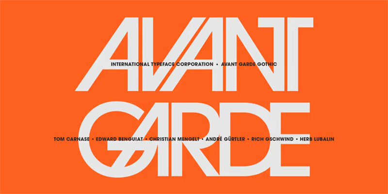
Born from Herb Lubalin’s magazine logo design, this geometric sans-serif features perfectly circular O’s and tight ligatures. Known for its distinctive sloped A and V alternates.
Geometric Properties
Perfect circles and squares form the structural foundation with no optical compensations in earlier versions.
Uppercase characters sit on a strict geometric grid. Lowercase features an unusually tall x-height (almost 3/4 of cap height).
The original included 33 alternate characters and wild ligatures that break normal spacing rules. Wide letter proportions create an open, airy feeling.
Readability Characteristics
Best at display sizes (24pt+) where the geometric purity shines without compromising legibility.
The tall x-height and wide apertures help maintain readability in smaller applications. Large open counters prevent the letters from feeling heavy. Those alternate ligatures? Use them sparingly or risk illegibility.
Use Cases
Magazine headlines, logo design, and brand identities that need 1970s modernist credibility.
The Adidas logo uses a modified version. Perfect for album covers, fashion branding, and editorial design. Works well in architectural poster design and corporate communications.
Technical Specifications
Five weights available (four for condensed): Extra Light, Book, Medium, Demi, and Bold.
Obliques designed by André Gürtler, Erich Gschwind, and Christian Mengelt in 1977. OpenType version includes all 33 original alternates and ligatures. Extended Latin support with multilingual characters. Commercial licensing required through ITC/Monotype.
Pairing Compatibility
Pairs exceptionally with Lubalin Graph (its slab serif sibling) for editorial layouts.
Works with Old Style serifs like ITC Legacy Serif for sophisticated documents. Avoid pairing with other geometric sans-serifs. Combine with humanist sans like ITC Goudy Sans for contrast.
Designer & Background
Herb Lubalin and Tom Carnase developed it in 1970 based on Lubalin’s Avant Garde magazine logo.
Ed Benguiat drew the condensed weights in 1974. Inspired by 1920s German Bauhaus geometric aesthetics. Released as ITC’s first typeface offering (alongside ITC Souvenir).
Gotham
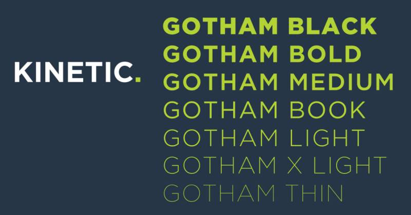
Inspired by mid-century NYC architectural signage, Gotham balances geometric precision with engineered practicality. Built from actual Port Authority Bus Terminal lettering.
Geometric Properties
Based on simple geometric forms but with crucial optical corrections that separate it from pure geometry.
Circular forms slightly flattened at connection points to prevent visual distortion. Terminals cut at slight angles (not perfectly horizontal).
The lowercase features a large x-height with shortened ascenders and descenders. Stroke weight stays consistent without humanist modulation.
Readability Characteristics
Exceptional legibility at all sizes thanks to meticulous optical adjustments invisible to casual observers.
Slightly condensed proportions pack more words per line without sacrificing clarity. Open apertures and generous counters prevent letters from closing up at small sizes. Works surprisingly well for body text despite being designed as a display face.
Use Cases
Political campaigns (Barack Obama 2008), corporate branding, and architectural wayfinding systems.
Used by brands like Netflix (until 2018), Spotify, and countless tech startups. Perfect for web design headers and mobile interfaces. Obama’s “Hope” poster used Gotham exclusively.
The cornerstone of One World Trade Center features Gotham lettering.
Technical Specifications
Massive family with 66+ styles across four widths (Regular, Narrow, Extra Narrow, Condensed).
Eight weights from Thin to Ultra with matching italics. Screen-optimized version included for digital applications. Gotham Rounded variant added in 2007. Full Latin, Greek, and Cyrillic support added 2015. Licensed through Hoefler & Co.
Pairing Compatibility
Pairs with Mercury Text for editorial applications (Jonathan Hoefler designed both with pairing in mind).
Works beautifully with slab serifs like Sentinel or Archer. Chronicle Display provides elegant contrast for luxury applications. Avoid pairing with Futura or other pure geometric sans.
Designer & Background
Tobias Frere-Jones with Jesse Ragan designed it in 2000, commissioned by GQ magazine.
Released publicly by Hoefler & Frere-Jones foundry in 2002. The design philosophy centered on “engineered letters” that looked practical rather than designed. Frere-Jones photographed NYC building signage extensively for research.
Montserrat

A free geometric sans-serif inspired by 1920s-1950s signage from Buenos Aires’ Montserrat neighborhood. Became Google Fonts’ third most popular typeface.
Geometric Properties
Geometric construction based on urban architectural lettering rather than pure mathematical forms.
Circular bowls with slight flattening at stress points. The uppercase stays closer to pure geometry while lowercase shows more humanist influence.
Tall x-height with short descenders maximizes space efficiency. Wide letter proportions with open apertures. Multiple stylistic alternates included in the family.
Readability Characteristics
Large x-height and wide apertures provide excellent legibility even at small web sizes (12-14px).
Short descenders allow tighter line spacing without letters colliding. Open counters prevent characters from feeling cramped. Actually outperforms many premium fonts in sustained reading tests.
Use Cases
Web design and UI applications where licensing costs matter.
Tech startups, app interfaces, and editorial websites. Used on over 19 million websites (2023 data). Perfect for multilingual projects requiring extensive language support. Works well in both headlines and body text.
Technical Specifications
Nine weights from Thin to Black with matching italics (18 styles total).
Montserrat Alternates family provides stylistic variations. Extended Latin with 250+ glyphs covering massive language range. Full Cyrillic support added 2017. Licensed under SIL Open Font License (completely free). Available through Google Fonts in WOFF2 format.
Pairing Compatibility
Pairs naturally with serif fonts like Lora or Crimson Text for web applications.
Works with Roboto for multi-level sans-serif hierarchies. Open Sans provides good body text contrast. Avoid pairing with Gotham or Proxima Nova (too similar).
Designer & Background
Julieta Ulanovsky designed it starting in 2010 during her master’s studies at University of Buenos Aires.
Jacques Le Bailly redrew the entire family in 2017 for improved text performance. Crowdfunded through Kickstarter in 2011. The design philosophy centered on rescuing disappearing urban typography before modernization erased it forever.
Rigid Square

An octagonal geometric face with 45-degree corner cuts. Designed specifically for technical documentation and mechanical instructions despite its decorative appearance.
Geometric Properties
Every letter follows strict octagonal construction with 45-degree chamfered corners throughout.
No curved strokes exist anywhere in the design (all angles or straight lines). Uniform stroke weight with zero modulation.
Capital I and lowercase l have distinguishable shapes (critical for technical contexts). Neo-humanist touches on lowercase b, d, g, p, q improve readability without breaking geometric consistency.
Readability Characteristics
Surprisingly readable in body text applications due to careful kerning and spacing adjustments.
The octagonal shapes create consistent visual rhythm that guides the eye. Distinguishable character shapes prevent common reading errors (1 vs l vs I). Works well for technical manuals, product instructions, and data sheets.
Use Cases
Technical documentation, mechanical manuals, and industrial branding.
Perfect for tech product interfaces, gaming UI elements, and futuristic design themes. Works well in packaging design for electronics or automotive products. Space and sci-fi themed projects embrace its engineered aesthetic.
Technical Specifications
14 styles available across 7 weights with matching italics.
Weights range from Thin to ExtraBold. Full Latin character set with numerals and punctuation. Available through Adobe Fonts (subscription) or commercial purchase from Dharma Type. OTF and TTF formats provided.
Pairing Compatibility
Pairs with clean geometric sans like Roboto for body text in technical documentation.
Works surprisingly well with monospaced fonts for coding contexts. DIN provides similar industrial feeling for multi-level hierarchies. Avoid ornate or humanist typefaces.
Designer & Background
Ryoichi Tsunekawa of Dharma Type designed it in 2014.
Same designer behind Bebas Neue. The design philosophy centered on creating a geometric face that maintains readability in technical contexts where precision matters. Inspired by industrial signage and CNC-machined lettering.
TAMPOOL

A bold display font with identical robust character shapes across all letters. Designed for maximum impact in sports and motivational contexts.
Geometric Properties
Every character shares identical width and geometric construction (extreme uniformity).
Perfect squares form the basis of all letterforms with minimal curved elements. Stroke weight stays heavy and consistent throughout.
Sharp corners with no rounding or optical corrections. Tight spacing creates solid word blocks.
Readability Characteristics
Best used at large display sizes (48pt+) where the extreme geometric boldness reads clearly.
Not suitable for body text or small applications. The uniform character width creates unusual spacing in natural language. Works perfectly for single words or short phrases.
Use Cases
Sports team branding, t-shirt designs, and motivational posters.
Athletic apparel companies use it for bold product graphics. Perfect for gym signage, sports equipment branding, and competitive gaming logos. Social media quote graphics leverage its powerful presence.
Technical Specifications
Single weight (Bold) with uppercase only.
Basic Latin character set plus numerals. Multiple format support (OTF, TTF, WOFF). Limited language support (English-focused). Commercial license available through independent foundries.
Pairing Compatibility
Pair with clean, neutral sans-serifs like Helvetica or Arial for supporting text.
Works with condensed gothic faces for sports design hierarchy. Avoid pairing with other display or decorative faces. Best with minimal white space around it.
Designer & Background
Designer information limited (released through independent type designers).
Created specifically for the athletic and sports design market. Inspired by jersey lettering and stadium signage. Philosophy: maximum impact through geometric simplicity.
Quabork
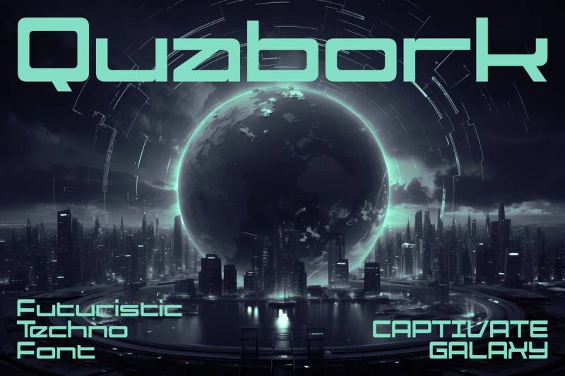
A futuristic square font channeling retro arcade and neon aesthetics. Pixel-inspired but smoothed for modern applications.
Geometric Properties
Grid-based construction with strict horizontal and vertical alignments (no diagonals except in specific letters like X and V).
Sharp squared corners throughout without any rounding. Blocky letterforms with consistent stroke width.
Negative space carved out in geometric patterns creates the retro gaming feel. Characters designed on visible grid system.
Readability Characteristics
Functions best at medium to large sizes (18pt+) where the geometric detail remains visible.
Small sizes cause the squared forms to blur together. The retro aesthetic trades some legibility for stylistic impact. Short text applications work better than sustained reading.
Use Cases
Gaming interfaces, retro-themed branding, and tech startup identities.
Perfect for arcade game titles, 1980s-inspired designs, and cyberpunk aesthetics. Streaming overlays and esports branding embrace its digital origins. Works well for poster design celebrating retro gaming culture.
Technical Specifications
Multiple format support (OTF, TTF, WOFF) for cross-platform compatibility.
Single weight with uppercase and lowercase. Basic punctuation and numerals included. Limited extended character support. Free for personal use, commercial license available.
Pairing Compatibility
Pairs with clean modern sans-serifs like Inter or Roboto for UI applications.
Works with other geometric faces for layered gaming interfaces. Avoid pairing with traditional or classical typefaces. Combines well with monospaced coding fonts.
Designer & Background
Created for the gaming and digital entertainment market.
Inspired by 1980s arcade cabinet lettering and early computer displays. Design philosophy embraces the lo-fi pixel aesthetic while maintaining modern usability. Released through indie type distributors.
Black Square

A modern futuristic sans-serif font with clean, professional geometric forms. Available in 12 distinct styles ranging from thin to outline treatments.
Geometric Properties
Perfect square construction with consistent stroke weight across all letterforms.
Sharp 90-degree corners throughout with zero rounding or softening. Uniform character widths create strong visual hierarchy in layouts. The geometry stays strict (no humanist touches or optical corrections).
Readability Characteristics
Works best at display sizes (24pt+) where the bold geometric shapes read clearly.
Large apertures and open counters maintain legibility even in bolder weights. The outline style creates interesting visual effects but trades readability for impact. Small sizes cause the squared corners to create visual noise.
Use Cases
UI design for tech applications, esports branding, and gaming interfaces.
Perfect for web design headers, digital displays, and futuristic branding concepts. Sports merchandise and athletic logos benefit from its bold presence. Marketing graphics for tech startups and cryptocurrency projects.
Technical Specifications
12 styles available:
- 6 upright weights (Light, Thin, Regular, Bold, Black, Outline)
- Matching italics for all weights
Full Latin character set with extended glyphs. OTF, TTF, and WOFF formats provided. Commercial licensing through Agny Hasya Studio.
Pairing Compatibility
Pairs with neutral sans-serifs like Roboto or Inter for body text.
Works well with other geometric faces for layered tech interfaces. Avoid pairing with organic or humanist typefaces. Combines effectively with monospaced coding fonts for developer-focused designs.
Designer & Background
Designed by Firman Maulana of Agny Hasya Studio in Bandung, Indonesia.
Released in 2022 as part of the studio’s evolution into dedicated type design. Philosophy centered on merging aesthetic appeal with practical usability for digital-first applications. Inspired by contemporary tech aesthetics and gaming culture.
Delimo

A playful contemporary square display font with bold strokes and distinctive ligatures. Supports 100+ languages with extensive character coverage.
Geometric Properties
Rounded square construction with friendly curved corners instead of sharp angles.
Thick stroke weight stays uniform throughout each character. The playful geometry includes unexpected ligature combinations that break traditional spacing rules. Open counter spaces prevent the bold weight from feeling too heavy.
Readability Characteristics
Best at large display sizes (36pt+) where the playful ligatures remain visible.
The bold strokes require generous spacing to avoid crowding. Short text applications work better than sustained reading. Ligatures add visual interest but can reduce scanning speed.
Use Cases
Children’s branding, playful product packaging, and casual restaurant identities.
Perfect for poster design targeting younger audiences. Social media graphics and app interfaces with friendly aesthetics. Educational materials and youth-oriented marketing campaigns.
Technical Specifications
Single bold weight with extensive ligature set.
Extended Latin support covering 100+ languages. Multiple format availability (OTF, TTF, WOFF). OpenType features include contextual alternates and stylistic sets. Commercial license available through independent distributors.
Pairing Compatibility
Pairs with simple geometric sans like Poppins or Nunito for supporting text.
Works with other rounded typefaces for cohesive playful hierarchies. Avoid pairing with sharp or angular fonts (creates visual dissonance). Combines well with script fonts for casual applications.
Designer & Background
Created for contemporary branding that requires approachable, friendly aesthetics.
Designer information limited (released through indie type foundries). Philosophy emphasizes accessibility and warmth in geometric square design. Influenced by children’s book typography and casual branding trends.
Higrah

An industrial monospace font with distinctive square letter construction. Features unique capitalization styles creating a strong masculine aesthetic.
Geometric Properties
Pure square construction with rigid grid-based alignment.
Every character occupies identical width (true monospace). Sharp corners with zero rounding create that mechanical precision. Stroke weight stays perfectly uniform. The squared letterforms can be arranged in custom grid patterns for unique layouts.
Readability Characteristics
Functions well at medium to large sizes (18-48pt) in technical contexts.
The monospace nature creates unusual spacing in natural language text. Works better for titles, logos, and display applications than body copy. The industrial aesthetic prioritizes impact over comfortable reading.
Use Cases
Titles, logo design, book covers, and industrial branding.
Perfect for tech product packaging and mechanical documentation. Architecture firms and engineering companies embrace its precision. Gaming interfaces and sci-fi themed projects leverage its technical appearance.
Technical Specifications
Single weight available with all-caps character set.
Monospace spacing with identical character widths. Basic Latin characters plus numerals and punctuation. Multiple format support (OTF, TTF). Free for personal use, commercial license available.
Pairing Compatibility
Pairs with clean sans-serifs like DIN or Eurostile for technical hierarchies.
Works with other monospaced fonts for coding contexts. Avoid ornate or classical typefaces. Combines well with Rigid Square for multi-level industrial designs.
Designer & Background
Created by Gelasmantra for industrial and technical design applications.
Released through indie distributors focusing on display fonts. Design philosophy centers on precision and masculine strength. Inspired by CNC machining, blueprint lettering, and industrial signage.
Neurotic
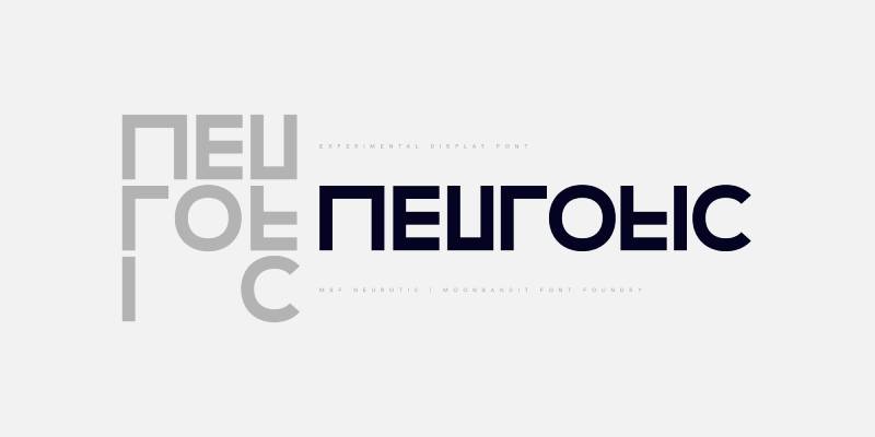
A geometric modern minimalist square sans-serif combining angled and straight lines. Creates unique typeface design through experimental construction.
Geometric Properties
Experimental mix of 45-degree angles and straight lines within square framework.
Some letters feature diagonal stress while others stay purely vertical/horizontal. Stroke weight remains consistent despite the angular variations. The contrasting construction creates dynamic visual rhythm. Sharp corners throughout with no rounded treatments.
Readability Characteristics
Works at display sizes (24pt+) where the angular details remain visible and impactful.
The experimental geometry requires careful spacing to maintain legibility. Best for headlines and short phrases rather than extended text. Uppercase and lowercase both included for layout flexibility.
Use Cases
Logo design, poster headlines, display applications, and t-shirt graphics.
Perfect for modern brands seeking distinctive geometric identity. Tech startups and creative agencies appreciate its experimental nature. Music festival branding and contemporary art exhibitions.
Technical Specifications
Available in uppercase and lowercase character sets.
Basic Latin alphabet with numerals and punctuation. Single weight focusing on display applications. OTF and TTF formats provided. Commercial license available through Moonbandit foundry.
Pairing Compatibility
Pairs with neutral geometric sans like Gotham or Proxima Nova for body text.
Works with other experimental typefaces for bold editorial layouts. Avoid pairing with traditional or conservative fonts. Combines well with minimalist design approaches.
Designer & Background
Created by Moonbandit Font Shop Foundry focusing on modern display typography.
Release date aligns with contemporary minimalist design trends. Philosophy explores experimental geometry within practical constraints. Designed to offer alternatives to conventional geometric sans-serifs.
Chinese Rocks
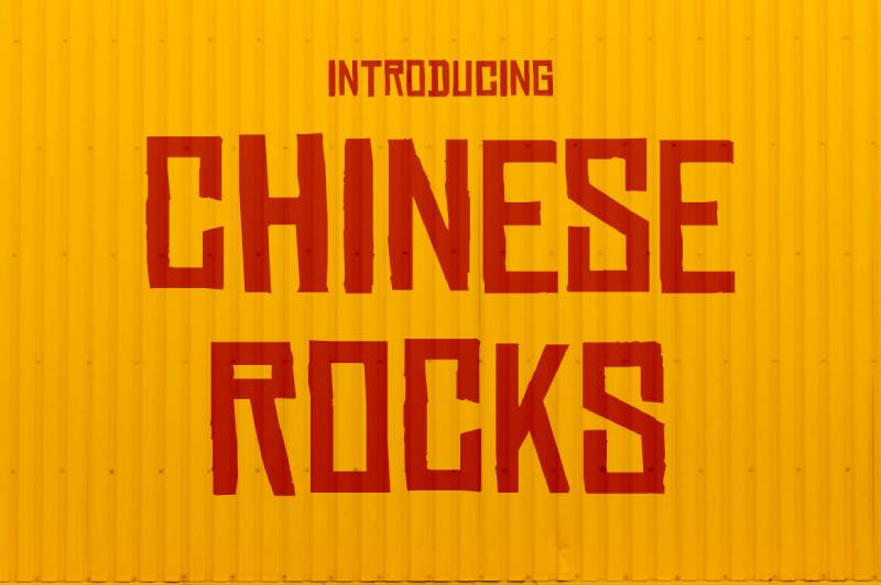
A rugged stencil-style font inspired by hand-cut rubber stamp lettering on mid-century Chinese export crates. Features authentic irregularities and condensed proportions.
Geometric Properties
Condensed square construction with intentional irregularities mimicking hand-carved stencils.
Straight lines dominate with minimal curved elements. Stroke weight varies slightly to simulate cutting imperfections. Sharp corners with rough edges create authentic vintage texture. Tight spacing reflects utilitarian origins.
Readability Characteristics
Reads clearly at display sizes (18pt+) where the stencil details add character without compromising legibility.
The condensed proportions pack significant text into tight spaces. Irregular shapes require slightly larger point sizes than clean geometric fonts. Works well for headlines and short text blocks.
Use Cases
Vintage branding, packaging design referencing mid-century aesthetics, and gritty urban themes.
Perfect for brewery branding, distressed t-shirt designs, and retro poster work. Gaming graphics and historical design projects. Music merchandise and underground culture branding.
Technical Specifications
16 styles including:
- Fat, Condensed, and Shaded variations
- Multiple weights for layout flexibility
Extended Latin support for international applications. Commercial license through Typodermic Fonts. OTF and TTF formats available.
Pairing Compatibility
Pairs with clean sans-serifs like Helvetica for contrast between rough and refined.
Works with other vintage or distressed typefaces for period-appropriate designs. Avoid pairing with polished modern fonts (defeats the gritty aesthetic). Combines with slab serifs for Western or industrial themes.
Designer & Background
Designed by Ray Larabie of Typodermic Fonts.
Released as homage to twentieth-century shipping crate lettering. Philosophy captures authentic artisanal quality of hand-cut stamps. Inspired by researching actual Chinese export packaging and cargo stencils.
Speeday

A dynamic display sans-serif inclined at 23 degrees with rounded finish. Thick contemporary appearance delivering kinetic energy.
Geometric Properties
Slanted geometric construction at precise 23-degree angle creates forward motion.
Rounded terminals soften the angular slant. Uniform stroke weight maintains clarity despite the dynamic angle. Character widths vary naturally (not monospaced). The incline remains consistent across all letterforms.
Readability Characteristics
Excellent legibility at display sizes (24-72pt) where the dynamic slant creates energy without confusion.
Carefully configured kerning prevents spacing issues from the angle. Works better for headlines than extended text. Small caps version provides additional hierarchy options.
Use Cases
Sports branding, automotive advertising, and high-energy marketing materials.
Perfect for tech product launches and action-oriented campaigns. Racing graphics, fitness branding, and entertainment posters. Editorial headlines requiring dynamic visual impact.
Technical Specifications
3 styles available:
- Regular
- Bold
- Small Caps
9 sets of numerals plus 3 uppercase character sets. Advanced OpenType features include alternates. Extended Latin support for European languages. Commercial license through deFharo foundry.
Pairing Compatibility
Pairs with upright geometric sans like Montserrat for body text balance.
Works with other slanted faces for extreme energy (use sparingly). Avoid pairing with traditional or conservative typefaces. Combines with condensed gothics for sports design hierarchies.
Designer & Background
Created by Fernando Haro (deFharo) in 2021.
Released after difficult personal year as return to type design. Philosophy emphasizes dynamism and originality in advertising applications. Designed specifically for graphic, editorial, and advertising contexts requiring maximum impact.
DAGGERSQUARE
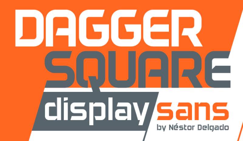
A sharp-edged geometric display font with aggressive angular construction. Creates bold statements through extreme square geometry.
Geometric Properties
Extreme square construction with dagger-sharp pointed elements at strategic locations.
Perfectly straight sides meet at aggressive angles. Stroke weight stays heavy and uniform throughout. The pointed details create weapon-like aesthetic while maintaining geometric discipline. Tight spacing amplifies the aggressive presence.
Readability Characteristics
Functions at display sizes (36pt+) where the sharp details create intended dramatic impact.
Not suitable for small sizes or body text applications. The aggressive geometry demands attention but limits sustained reading. Short words and phrases work best.
Use Cases
Gaming logos, aggressive branding, and heavy metal band graphics.
Perfect for action game titles and combat sports branding. Horror-themed designs and dark aesthetic projects. Extreme sports merchandise and rebellious brand identities.
Technical Specifications
Limited style availability (typically 1-2 weights).
Basic Latin character set. Multiple format support (OTF, TTF). Designer attribution varies by distributor. Licensing terms require verification before commercial use.
Pairing Compatibility
Pairs with neutral sans like Arial for readable supporting text.
Works with other aggressive display faces for extreme designs. Avoid pairing with refined or elegant typefaces. Best used as solo headline font with minimal accompaniment.
Designer & Background
Created by Nestor Delgado in 2015.
Released through independent type distributors. Philosophy centers on creating maximum visual aggression while maintaining functional letterforms. Designed for niche markets requiring extreme aesthetic impact.
Motion Control

A technical geometric font with precision engineering aesthetic. Designed for control panel interfaces and technical documentation.
Geometric Properties
Grid-based square construction with mechanical precision throughout.
Every angle measures exactly 90 degrees or 45 degrees (no arbitrary angles). Consistent stroke weight mimics precision-machined lettering. Character proportions favor clarity over stylistic flourishes. Open counters maximize legibility in technical contexts.
Readability Characteristics
Optimized for small to medium sizes (10-24pt) in technical documentation and interface design.
Clear character differentiation prevents common reading errors (l vs 1, O vs 0). The mechanical precision aids scanning in dense technical information. Functions well in both digital displays and printed manuals.
Use Cases
Control panel interfaces, technical manuals, and industrial equipment displays.
Perfect for aviation cockpits, machinery operation screens, and scientific instruments. Engineering documentation and technical print design. Medical equipment interfaces and automotive dashboard displays.
Technical Specifications
Available in multiple weights for hierarchical flexibility.
Extended character set covers technical symbols and special characters. Optimized for both screen and print rendering. Commercial licensing for industrial applications. OTF and TTF formats provided.
Pairing Compatibility
Pairs with other technical faces like Eurostile or Bank Gothic for industrial systems.
Works with monospaced fonts for technical documentation. Avoid decorative or expressive typefaces. Combines with DIN for German engineering aesthetic.
Designer & Background
Created for industrial and technical applications requiring maximum clarity.
Designer information varies by version. Philosophy prioritizes functionality and precision over aesthetic experimentation. Influenced by control panel lettering, technical diagrams, and aerospace typography.
Propaganda
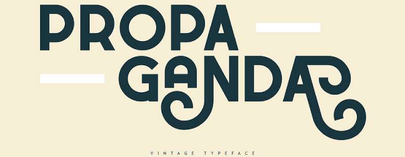
A bold geometric font inspired by Soviet-era poster lettering. Features blocky construction with eye-catching visual impact designed to command attention.
Geometric Properties
Square-based construction with heavy stroke weight throughout.
Sharp 90-degree corners create authoritarian aesthetic. Uniform thickness across all letterforms (zero stroke contrast). The geometric forms prioritize visual strength over refinement. Tight letter spacing amplifies the commanding presence.
Readability Characteristics
Functions best at display sizes (36pt+) where the bold forms create maximum visual impact.
The heavy weight and tight spacing limit readability at smaller sizes. Best for short headlines or single words rather than extended text. All-caps construction reinforces the propaganda aesthetic but reduces scanning efficiency.
Use Cases
Vintage poster designs, political campaign materials, and retro branding projects.
Perfect for historically-inspired poster design and period-accurate graphics. Music festival branding and underground culture events. Historical documentaries and museum exhibitions requiring authentic period typography.
Technical Specifications
Typically available in single bold weight.
All-caps character set with limited punctuation. Basic Latin alphabet without extensive language support. Multiple format availability (OTF, TTF). Free versions available through DaFont and similar distributors (personal use).
Pairing Compatibility
Pairs with neutral sans-serif fonts like Helvetica for readable body text.
Works with other period-appropriate fonts from 1930s-1950s era. Avoid pairing with modern or refined typefaces (breaks historical authenticity). Combines with distressed textures and vintage color palettes.
Designer & Background
Created by Apostrophic Labs (some versions) and various independent designers.
Multiple versions exist inspired by Soviet propaganda posters from 1920s-1950s. Philosophy centers on capturing authoritarian visual language and commanding presence. Design references actual propaganda displays from historical Communist materials.
RE Ecap

A bold authentic display font designed for modern branding and esports applications. Features clean geometric forms with contemporary edge.
Geometric Properties
Modern square construction with consistent geometric discipline throughout.
Stroke weight stays uniform and heavy for maximum presence. Sharp corners balanced with subtle optical corrections for improved readability. Character proportions favor display applications over text setting. Open counters prevent the bold weight from feeling too closed.
Readability Characteristics
Works at display sizes (24-72pt) where the bold forms maintain clarity without overwhelming.
The heavy weight requires careful spacing to prevent crowding. Best for logo design, headlines, and short phrases. Not suitable for body text or small applications. Uppercase and lowercase both available for layout flexibility.
Use Cases
Esports branding, gaming team logos, and athletic merchandise.
Perfect for t-shirt printing and apparel graphics. Tech startup identities and digital brand applications. Sports team branding and competitive gaming interfaces. Modern poster work requiring bold contemporary presence.
Technical Specifications
Available in bold display weight.
Full Latin character set with uppercase and lowercase. Basic punctuation and numerals included. OTF and TTF formats provided. Commercial license available through Envato and similar marketplaces.
Pairing Compatibility
Pairs with clean geometric sans like Roboto or Inter for supporting text.
Works with other bold display faces for extreme design approaches. Avoid pairing with traditional or elegant typefaces. Combines well with sans-serif fonts in condensed weights for hierarchical contrast.
Designer & Background
Designer information limited (released through independent marketplaces).
Created specifically for modern branding and esports market. Philosophy emphasizes bold authenticity and contemporary edge. Released through Envato Elements and similar commercial platforms.
LOGX-20
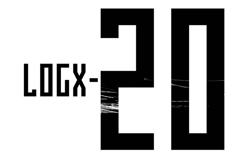
A geometric all-caps display typeface with tall, narrow proportions. Designed for visual identification elements and technical aesthetics.
Geometric Properties
Tall, narrow geometric construction with angular precision throughout.
Uniform stroke width creates clean technical appearance. Sharp corners and straight edges dominate (minimal curved elements). The tall proportions create distinctive vertical emphasis. Grid-based design ensures mathematical consistency.
Readability Characteristics
Excels at display sizes (24-72pt) where the angular details remain visible and sharp.
The narrow proportions pack text efficiently without sacrificing legibility. Works well in varied arrangements (headers, sentences, longer text blocks). Functions effectively on screens, print, and applications. All-caps only limits usage to display contexts.
Use Cases
Technology branding, sci-fi themed projects, and logo design.
Perfect for futuristic visual identities and tech product branding. Game interfaces, app headers, and digital product design. Modern poster design and editorial headlines. Creative projects requiring geometric precision.
Technical Specifications
Available in 2 styles (Regular and Italic).
All-caps character set with numerals and punctuation. Extended Latin support for international applications. OTF and TTF formats available. Commercial license through Fontsphere foundry and MyFonts.
Pairing Compatibility
Pairs with wider geometric sans for readable body text balance.
Works with other technical faces like Eurostile for layered tech aesthetics. Avoid pairing with organic or humanist typefaces. Combines with monospaced fonts for coding and technical applications. Part of LOGX series (LOGX-10, LOGX-30 available for varied widths).
Designer & Background
Designed by Bartosz Panek of Fontsphere foundry in 2021.
Part of broader LOGX family exploring geometric condensed forms. Philosophy centers on minimalism, geometry, and playful modern design. Created for graphic designers needing distinctive technical aesthetics. Fontsphere specializes in pixel art, logos, and visual identities.
HWT Konop
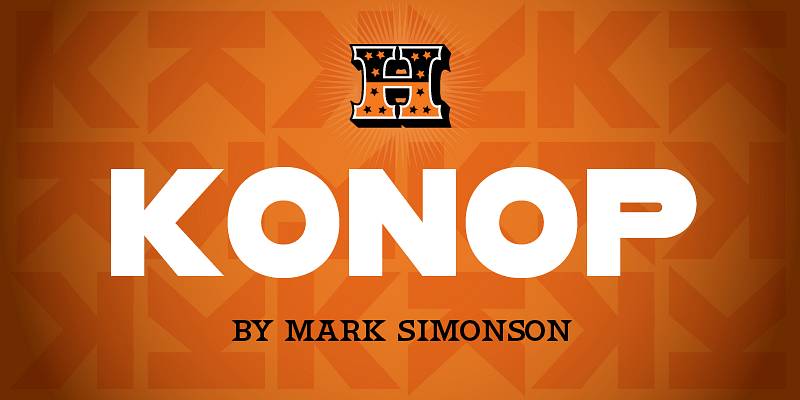
A monospaced square font where each character occupies identical width and height. Designed for multi-directional arrangement and letterpress creativity.
Geometric Properties
Perfect square monospace construction (characters fit identical square grids).
Bold gothic style with geometric precision throughout. Every character designed on square body for any-direction setting (horizontal, vertical, rotated). Sharp corners with uniform stroke weight. No optical corrections (designed for 360-degree rotation).
Readability Characteristics
Functions at display sizes (24-48pt) where the square grid system remains clear.
The monospace nature creates unusual spacing in natural language. Best for artistic arrangements rather than conventional reading. Works beautifully when characters are rotated or stacked creatively. Limited character set focuses on caps, numerals, and basic punctuation.
Use Cases
Artistic poster design, experimental typography, and letterpress printing.
Perfect for modern letterpress projects requiring visual expression over traditional text. Creative branding and logo explorations with rotational elements. Museum graphics and art installations. Design education demonstrating modular type systems.
Technical Specifications
3 size designs available:
- 12 Line (largest)
- 8 Line (medium)
- 6 Line (smallest)
OpenType stylistic sets enable character rotation (90° left, right, 180°). Limited character set (caps, numbers, punctuation, symbols). No accented characters (designed for tight line spacing). Commercial license through P22/Hamilton Wood Type.
Pairing Compatibility
Works independently as solo display element (pairing often unnecessary).
Combines with clean neutrals like Helvetica if supporting text needed. Avoid traditional pairing approaches (this font defies conventions). Best appreciated as modular design toolkit rather than text font.
Designer & Background
Designed by Mark Simonson (creator of Proxima Nova) in 2018.
Created for Hamilton Wood Type & Printing Museum as part of Legacy Project. Named after Don Konop (Hamilton Manufacturing employee 1959-2004). Philosophy centers on creative expression for modern letterpress printers. 100% of royalties support Hamilton Wood Type & Printing Museum. Wood type version currently in production alongside digital release.
FAQ on The Best Square Fonts
What defines a square font?
A square font features letterforms built on rigid, geometric shapes. The characters have uniform stroke widths and angular corners instead of curves.
These blocky typefaces create a structured, modern appearance. Think Eurostile or Microgramma.
Are square fonts good for logos?
Absolutely. Square fonts project stability and technological sophistication, which makes them ideal for logo design.
Tech companies, gaming brands, and automotive industries love them. Just ensure proper kerning for clean spacing.
What’s the best free square font?
Bebas Neue remains the most popular free option. It’s available on Google Fonts and works beautifully for headlines.
Orbitron and Rajdhani are solid alternatives. Both offer multiple font weights for flexibility.
Can I use square fonts for body text?
Generally, no. Most square fonts sacrifice readability for style at smaller sizes.
Stick to using them as display fonts for headings. Pair them with a clean sans-serif font for paragraphs.
Which square fonts work best for web design?
Exo 2, Share Tech, and Quantico perform well on screens. They’re optimized for digital display and load quickly.
All three are available through Google Fonts with proper font licensing for commercial use.
How do I pair square fonts with other typefaces?
Contrast is key. Match bold geometric fonts with simple, neutral body text.
A square headline font like Audiowide pairs nicely with Open Sans or Roboto. Check guides on pairing fonts for more combinations.
Are square fonts trendy or timeless?
Both, honestly. Bank Gothic dates back to 1930 and still looks fresh.
The geometric aesthetic has staying power. Futuristic typefaces cycle through trends, but clean square designs remain consistently useful.
What industries commonly use square fonts?
Technology, gaming, automotive, aerospace, and fitness brands gravitate toward them.
Any industry wanting to convey innovation or precision tends to reach for angular typography. Science fiction media uses them constantly.
Do square fonts support multiple languages?
Depends on the specific typeface. Premium options like Eurostile typically include extended character sets.
Free fonts vary widely. Always verify glyph coverage before committing to a multilingual project.
Where can I download quality square fonts?
Google Fonts offers excellent free geometric typefaces. Adobe Fonts provides premium options with Creative Cloud subscriptions.
MyFonts and Font Squirrel are reliable sources too. Always check licensing terms before commercial use.
Conclusion
Choosing the best square fonts comes down to your specific project needs. A tech startup building brand identity requires different typefaces than someone designing gaming graphics or sci-fi movie posters.
The fonts covered here range from classics like Bank Gothic and Microgramma to modern favorites like Bebas Neue and Exo 2. Each brings something unique to the table.
Start with free options from Google Fonts to test what works. Consider factors like font spacing, available weights, and variable fonts support before committing.
Don’t overlook typographic hierarchy either. Even the boldest geometric font fails without proper structure.
Test your choices at multiple sizes. What looks sharp as a headline might not hold up in subheadings. Trust your eye, but verify with real-world application.

Renowned for his expertise in logo design and visual branding, Bogdan has developed a multitude of logos for various clients.
His skills extend to creating posters, vector illustrations, business cards, and brochures. Additionally, Bogdan's UI kits were featured on marketplaces like Visual Hierarchy and UI8.
He also wrote in the past years on sites like Design Your Way, WebDesignerDepot, WPDean, Designmodo, Speckyboy, Slider Revolution, and more.
- How to Install Fonts on Mac (Step-by-Step Guide) - 20 September 2026
- From Mockup to Code: How AI-Augmented Development Speeds Up the Design Handoff - 19 September 2026
- The Beehiiv Logo History, Colors, Font, And Meaning - 18 September 2026

Bogdan Sandu is a seasoned designer who has been designing websites since 2008. Renowned for his expertise in logo design and visual branding, Bogdan has developed a multitude of logos for various clients. His skills extend to creating posters, vector illustrations, business cards, and brochures. Additionally, Bogdan's UI kits were featured on marketplaces like Visual Hierarchy and UI8. He also wrote in the past years on sites like Design Your Way, WebDesignerDepot, WPDean, Designmodo, Speckyboy, Slider Revolution, and more.
You Might Also Like