The Ford Logo History, Colors, Font, and Meaning

Ever pondered how a simple design can rev up such powerhouse recognition? Dive headfirst into the head-turning journey of the Ford logo—that iconic emblem gracing gleaming grills worldwide, whispering tales of revolution and identity.
Flashback to a garage in Detroit: Birthplace of an entity far surpassing mere automotive prowess.
This isn’t just about four wheels and an engine; it’s a chronicle of emblems, identity, and the blue oval that became the pulse of the automotive industry.
Fasten your seatbelt—we’re delving deep into the sinews of brand muscle, unravelling the fabric of America’s heartbeat on four wheels.
From the sketchy outlines of Henry Ford’s vision to the logo redesigns echoing through times of war and peace, crave the thrill as I rev the engine on unwrapping visual cues that shaped consumer minds.
By the end, you’ll navigate the lanes of logomaniac legends with the intimate knowledge of how the Ford badge steered beyond a car’s hood to etch into cultural lore.
Unpack the evolution, trademark tales, and marketing mastery behind the emblem that’s forever etched in our driveways and hearts.
The Meaning Behind the Ford Logo
Bold, Blue, and Beautiful
Step right into any city, any town, any garage—you’ll spot it. That familiar blue oval, the sleek script. It’s the Ford logo, as American as apple pie.
You ever wonder why? What’s the story behind this blue badge of honor?
Well, it’s a tale of strength and persistence, just like the man who started it all—Henry Ford. The logo is a symbol, a beacon. It communicates the unwavering reliability and quality of Ford vehicles.
Significance of the Oval
Now, let’s take a closer look at the shape of the logo. It’s an oval, right? Why an oval?
There’s no big secret here. The oval creates a sense of enclosure, a boundary that holds in all the promise and quality that Ford represents. It’s a visual hug, wrapping customers in the assurance of excellence and durability that Ford delivers.
The oval’s a promise, friend. It says, “You’re in good hands with Ford.”
Signature of Success
And that script, that signature? It’s more than just a name. It’s a mark of integrity, the signature of the man who revolutionized the auto industry. It’s Henry Ford’s personal seal of approval. When you see that script, you know you’re getting the real deal. No compromises.
The History of the Ford Logo
An Emblem is Born
So how did this emblem, this symbol of American industry, come to life? It’s a journey, let me tell ya.
The first Ford logo didn’t have the famous blue oval. Nope, it was a simple, elegant affair, an artful combination of the words “Ford Motor Co. Detroit, Mich.” But change was on the horizon.
The Evolution of Excellence
In 1907, the signature we know today was introduced. Did you know it wasn’t even designed by Henry Ford? A man named Childe Harold Wills, Ford’s first chief engineer and designer, is the creative genius behind it.
But the logo’s evolution didn’t stop there. The blue oval was introduced in 1927, creating the image we know and love today. Since then, there’ve been slight tweaks, slight nudges, but the core—blue oval, Ford script—has remained the same.
The Colors of the Ford Logo

The Power of Blue
There’s something about that shade of blue, isn’t there? It’s warm, it’s inviting, it’s trustworthy.
Ford’s blue isn’t just any blue. It’s called “Ford Blue,” a distinctive shade that’s become synonymous with the brand. It symbolizes strength, excellence, and class—all traits associated with Ford.
The Accent of White
And let’s not forget the script, the name, written in white. The white pops against the blue, creating a visual dance of contrast and clarity. It’s clean, it’s crisp—it’s Ford.
The Font Used in the Ford Logo
Signature Style
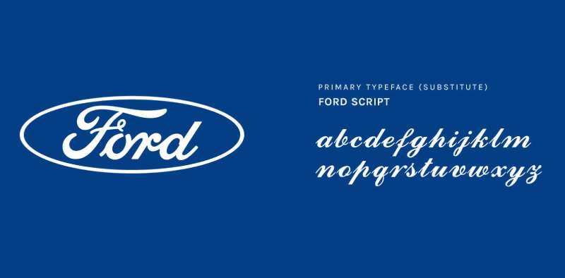
The script used in the Ford logo isn’t your everyday font. It’s a custom design, inspired by Henry Ford’s own handwriting. This script, often referred to as “Ford script,” carries a sense of history, personality, and authenticity.
The Power of Handwriting
Using handwriting in a logo? It’s a bold move. It personalizes the brand, makes it feel more human. When you see that script, it’s like getting a letter from an old friend. A friend who happens to make some of the best cars on the planet.
The Impact of the Ford Logo on Pop Culture
Iconic Imagery
There’s no denying it—the Ford logo has made quite a splash in pop culture. It’s graced the silver screen, been parodied in cartoons, and even made appearances in video games.
Screen Star
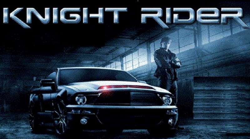
Remember those high-speed chases in Steve McQueen’s “Bullitt”? That was a Ford Mustang. Or how about the classic television show “Knight Rider”? The car, KITT, was a modified Ford model.
Logo with a Laugh
And who could forget the playful parodies in cartoons and comics? It’s a testament to the logo’s recognition and respect that it’s been gently teased over the years. It’s all in good fun, of course, a wink and a nod to a beloved icon.
The Ford Logo’s Influence on Design
Setting the Standard
Not only has the Ford logo left a mark on pop culture, but it’s also influenced the world of design. It’s a prime example of branding done right.
A Lesson in Logo Design
Designers take note—Ford’s logo is a masterclass in simplicity and significance. It’s stood the test of time, remaining relevant and recognizable over the decades. And that’s no easy feat.
The Power of Color
Ford’s strategic use of color also serves as a lesson to designers. The distinct “Ford Blue” and the contrast of the white script create a visually striking logo that’s hard to forget.
Script that Speaks
And let’s not forget the unique script. The use of a handwriting-inspired font adds a personal touch, humanizing the brand. It’s a reminder that behind the machines, there are people—visionaries like Henry Ford.
From pop culture to design, the Ford logo isn’t just an emblem—it’s an icon. It’s a symbol of American ingenuity, a testament to the power of design, and a beacon of brand identity done right. It’s more than just a logo—it’s Ford.
FAQ On The Ford Logo
What’s the history behind the Ford logo?
The Ford logo started its journey over a century ago. Henry Ford wanted something simple yet memorable, etching his last name into an elliptical badge.
This emblem’s been tweaked over time, yet, the famous blue oval has stood the test of time, a tribute to heritage and evolution in the automotive industry.
Why is the Ford logo blue?
Color carries weight, it’s branding 101, right? The blue oval wasn’t just a random pick; it signifies strength, reliability, and excellence.
Blue connects with folks on the street, giving that sense of trust we all want when key turns engine. Plus, it sticks in your memory like gum on a hot sidewalk.
Has the Ford logo always looked the same?
Oh, if logos could talk! The Ford emblem has shifted gears a few times but subtly. The core vibe stayed intact—that recognizable script.
But yes, from a fancier look in its early years to today’s crisp, modern finish, the iconic logos journey mirrors Ford’s heritage and innovation.
What does the Ford logo represent?
Beyond rubber and metal, the Ford logo champions an ethos—affordable quality for all, Henry Ford’s prime goal.
It’s a branding powerhouse, embodying dependability, innovation, and American industrious spirit—qualities tied closer to the heart than car manufacturer logos usually go.
Who designed the original Ford logo?
Say cheers to Childe Harold Wills; Ford’s first chief engineer and a sharp mind to boot. His calligraphic flair with a stencil set chalked the path for the script we know and nod at. Yeah, Harold stamped a mark as iconic in design as Model T in automotive history.
Is there a hidden meaning in the Ford logo?
Some love to dive for hidden treasure. So let me spill—there’s no secret code here, no buried secret in its curves. The logo’s elegance lies in its straightforward ode to the creator’s name. It’s marketing genius without the branding smoke and mirrors—pure and simple.
When was the last update to the Ford logo?
The conjuring of the logo is slow-moving magic. The last significant brushstroke graced us in the year 2003. Subtle tweaks, sharp lines, a touch of silver, and that 3D pop gave it a layer of contemporary cool while bowing respectfully to that timeless Ford Motor Company legacy.
Can the Ford logo be used freely?
Now, hold your horses before you go slapping that blue oval on anything. The Ford insignia is guarded by intellectual property laws—it’s legal dynamite. You wanna play with it, you gotta get permission. Ford’s got their trademark design locked down tight.
Why did Ford choose an oval shape for its logo?
Ovals invite a second glance—there’s something about those curves. Ford latched onto this back in 1907, shaping the logo to mirror the Model A’s radiator grille.
Nowadays, it’s known worldwide. Branding at its finest—Ford’s badge screams simplicity, recognition, and it just looks darn good.
What font is used in the Ford logo?
Ever caught sight of a font and thought, “Now that’s slick?” Meet the Ford script—with its elegant, flowing lines, it’s got charm.
Not snagged from a catalog but custom-created, probably by Wills himself. It’s stood its ground, engraving Ford’s visual identity into public consciousness without missing a beat.
Conclusion
And there you have it. The road trip through the evolution of the Ford logo? Yeah, it’s been quite the ride. From Detroit’s humming factories to streets that span the globe, this insignia is stitched into culture’s fabric. A mix of blue oval, admired script, and heritage—it’s more than just a symbol.
To wrap this up, let’s lock in a few solid takeaways:
- The emblem? A beacon of automotive history, branding smarts, and quality.
- That classic blue—yeah, it’s earned its keep on the color wheel.
- Henry Ford—a name that kicked off a lineage of emblems.
- And let’s not forget intellectual property; respect the badge.
This isn’t just about the cars that zip and zoom. It’s deeper. An icon that drove past being just a car manufacturer logo. It speaks of legacy, trademark tales, and the binding thread of an automotive brand symbol. Thanks for cruising through the story of Ford’s visual identity—worthy of just as much respect as the machines it represents.
If you liked this article about the Ford logo, you should check out this article about the RAM logo.
There are also similar articles discussing the Kia logo, the Porsche logo, the Toyota logo, and the Cadillac logo.
And let’s not forget about articles on the Jaguar logo, the Chrysler logo, the Maserati logo, and the Dodge logo.
Bogdan Sandu, a seasoned designer with 15 years of diverse experience, has been designing websites since 2008.
Renowned for his expertise in logo design and visual branding, Bogdan has developed a multitude of logos for various clients.
His skills extend to creating posters, vector illustrations, business cards, and brochures. Additionally, Bogdan's UI kits were featured on marketplaces like Visual Hierarchy and UI8.
Latest posts by Bogdan Sandu (see all)
- After Dark: Night Color Palettes for Mysterious Designs - 27 April 2024
- The Capcom Logo History, Colors, Font, And Meaning - 26 April 2024
- Earth Color Palettes Grounded in Nature: 40 Examples - 26 April 2024