

The types of icons in UI design
User Interface (UI) Design is the unsung hero of the digital product world. It’s the visual, interactive part of a product that guides users through their digital journey. Among the various elements that make up UI design, one of the most crucial is icons.
These compact visuals are tasked with a critical role — conveying a multitude of messages without using a single word. This might seem like a simple task, but designing effective icons is an art in itself. Let’s delve deeper into the world of icons in UI design.
The Importance of Icons in UI Design
Enhancing Usability
An icon can speak a thousand words. In the bustling digital space where every second matters, icons are a lifeline. They make user interfaces more user-friendly, offering instant recognition and faster interaction. From depicting simple actions like “save” or “delete” to indicating various features, icons pave the way for seamless interaction between the user and the product.
Saving Space
Given that real estate in digital interfaces, especially mobile screens, is limited, icons are indispensable. They are space-efficient solutions that encapsulate complex ideas in a simple graphic. Icons deliver the message without taking up much room, thus helping to maintain a clean and uncluttered interface.
Visual Appeal
Apart from functionality, icons also add an aesthetic element to the interface. A well-designed icon not only guides users but also enhances the overall visual appeal, making the interface pleasing to the eye.
Universal Icons
Recognized Across Cultures
Icons like the magnifying glass for search or the shopping cart for checkout have become universal symbols, recognized and understood across cultures and languages. They help make products globally usable, fostering a sense of familiarity even in new users.
Confusing Icons and Their Impact
The Danger of Misinterpretation
On the flip side, if an icon is too abstract or unfamiliar, it can become a stumbling block in the user journey. Misinterpreted icons can lead to confusion, frustration, and might even result in user drop-off. That’s why it’s important to test icons with users to ensure they are intuitive and easily comprehended.
Types of Icons in UI Design
Glyph Icons
These are minimalistic, simple icons that are small but pack a punch! They are often used in mobile applications due to their clean look and space efficiency.
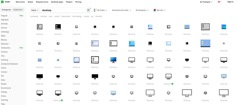
Flat Icons
Flat icons are two-dimensional, featuring no gradients or shadows. Their simplicity and clarity make them extremely popular in modern designs. An example of flat icons is the desktop icons set. They use simple, flat designs to represent common actions or features on a computer interface, like the trash bin for deleted items or the folder icon for storing files.
Outline Icons
These are essentially icon designs that consist of only the outline of a symbol. They are often used in minimalistic designs due to their sleek and modern appearance.
Filled Outline Icons
These icons are a hybrid, blending the clarity of outline icons with the visibility of filled icons.
Isometric Icons
These icons provide a 3D view in a 2D space, bringing depth and dimension to the interface.
Photorealistic Icons
Photorealistic icons mimic real-world objects with high precision and are often used in game design or applications that aim to provide a hyper-realistic experience.
Skeuomorphic Icons
Skeuomorphic icons try to recreate their real-world counterparts in as much detail as possible, including texture and shadow.
Material Icons
Material icons, influenced by Google’s Material Design, use grid-based layouts, responsive animations, and transitions, providing a modern and sleek aesthetic.
Factors to Consider When Choosing Icons
Audience Understanding
Who will be using your product? What’s their digital literacy level? These are crucial questions to consider. Icons that work for tech-savvy users might confuse novices.
Platform Specifications
Every platform has its unique design guidelines. Make sure your icons comply with these rules.
Cultural Sensitivity
An icon that is appreciated in one culture might be offensive in another. It’s important to understand cultural implications while designing icons.
Conclusion
Icons are the silent communicators of the UI design world. When used effectively, they can significantly enhance the user experience, making your product more intuitive and user-friendly. By understanding the different types of icons in UI design and following best practices, you can create an interface that communicates clearly and efficiently with your users.
Bogdan Sandu, a seasoned designer with 15 years of diverse experience, has been designing websites since 2008.
Renowned for his expertise in logo design and visual branding, Bogdan has developed a multitude of logos for various clients.
His skills extend to creating posters, vector illustrations, business cards, and brochures. Additionally, Bogdan's UI kits were featured on marketplaces like Visual Hierarchy and UI8.
Latest posts by Bogdan Sandu (see all)
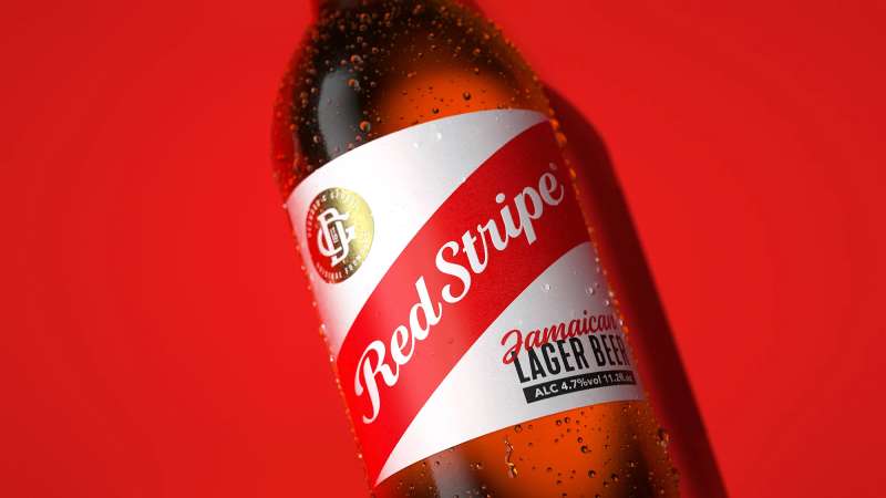
- The Red Stripe Logo History, Colors, Font, And Meaning - 9 May 2024
- Tie the Knot: Romantic Wedding Color Palettes - 9 May 2024
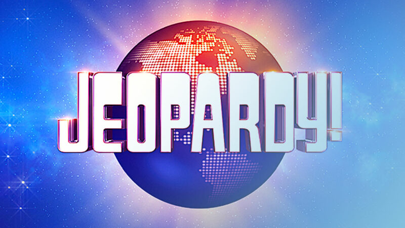
- Game Show Typography: What Font Does Jeopardy Use? - 9 May 2024