

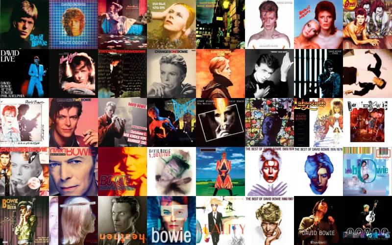
No artist treated album artwork like David Bowie did. Every record sleeve was a full identity shift, a new character, a new visual language built from scratch.
David Bowie album covers didn’t just package music. They defined entire cultural moments, from the Ziggy Stardust lightning bolt to the stark black star that closed out his career.
Bowie worked with some of the best photographers and designers of the 20th century. Brian Duffy, Guy Peellaert, Masayoshi Sukita, Jonathan Barnbrook. Each collaboration produced iconic artwork that still shapes how we think about music packaging today.
This guide breaks down his most memorable covers. You’ll find the stories behind each design, the artists who made them, the color choices that defined them, and the cultural impact they left behind.
Best David Bowie Album Covers
Aladdin Sane (1973)
The Cover
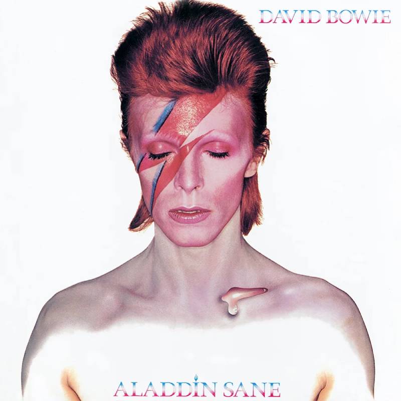
A bare-chested Bowie with eyes closed, a red and blue lightning bolt slashed across his face, and a single airbrushed teardrop resting on his collarbone. The background is stark white. Nothing else.
It’s the most recognized image in rock music history. People call it the “Mona Lisa of Pop,” and honestly, that tracks.
Artist and Photographer
Brian Duffy shot the photograph in his London studio in January 1973. Makeup artist Pierre La Roche painted the lightning bolt directly onto Bowie’s face. Philip Castle handled the airbrushing, adding the teardrop on the collarbone and extending the eyelashes.
The lightning bolt? Duffy got the idea from looking at a rice cooker in the studio kitchen. Sometimes the best ideas come from the dumbest places.
Design Concept
Bowie’s manager Tony Defries commissioned the shoot specifically to convince RCA Records that Bowie deserved megastar-level treatment and funding. The goal was a high-impact image that would function as branding, not just album art.
At the time, it was the most expensive album cover ever produced. The original went through a dye transfer process with plates made in Switzerland.
Color Palette and Visual Style
The color palette is deceptively simple. Vivid red and blue against white skin. The lightning bolt uses a complementary color scheme that creates maximum visual tension.
The high saturation of the bolt against Bowie’s deliberately pale skin produces a striking contrast that makes the image almost impossible to forget.
Cultural Impact
In November 2025, the original dye transfer print sold at Bonhams London for 380,000 pounds (roughly $496,000). That made it the most expensive album artwork ever sold at auction.
The “David Bowie Is” exhibition at the V&A Museum used an unseen open-eyed version of the shot and toured 12 museums worldwide, drawing over 2 million visitors. The image has been reproduced, parodied, and referenced across advertising, fashion, and media for over five decades.
Notable Details
Duffy only shot about two rolls of film during the session. The whole thing was remarkably quick. Also, this was the only time Bowie ever wore the lightning bolt makeup. Just once. That’s all it took.
Where to Find It
Original vinyl pressings on RCA Records. Remastered CD and vinyl reissues are widely available. Limited edition fine art prints are sold through the Duffy Archive.
The Rise and Fall of Ziggy Stardust and the Spiders from Mars (1972)
The Cover
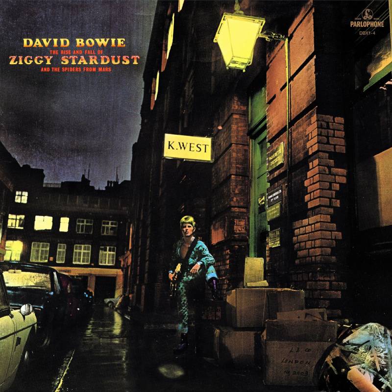
Bowie stands alone on a wet London street at night. Guitar slung over his shoulder, one foot propped on a step, bathed in the glow of a single street lamp. Above him, a sign reads “K.WEST.”
It doesn’t scream alien rock star. It whispers it.
Artist and Photographer
Photographer Brian Ward shot the image in black and white outside his studio at 23 Heddon Street, London. Artist Terry Pastor then hand-colorized the photograph at Main Artery, his design studio in Covent Garden. George Underwood, Bowie’s childhood friend, suggested Pastor for the job.
Design Concept
Bowie wanted a location that looked like a Brooklyn alley scene, something that would sell the idea of this alien being arriving on Earth. Ward suggested they step outside before the natural light faded completely.
The Spiders from Mars stayed inside. Only Bowie braved the cold and rain, despite suffering from a bad flu. Took me a while to realize this: sometimes the best storytelling happens by accident.
Pastor wasn’t given a detailed brief. He picked bright colors for Ziggy’s jumpsuit and hair, making the figure pop against the dark alley. The typography was initially applied with Letraset transfers, then airbrushed in red and yellow with white stars inset.
Color Palette and Visual Style
The hand-colorization gives the image a slightly unreal quality. Somewhere between a photograph and a comic book panel. Bowie’s jumpsuit and hair glow with artificial color against the muted, rainy street tones.
That tension between realism and fantasy is exactly what Ziggy Stardust was about. The hue choices lean warm and saturated, pulling Bowie forward from the cold, wet background.
Cultural Impact
In 2010, the UK’s Royal Mail featured the Ziggy Stardust cover on a 1st-class stamp in their Classic Album Covers set. In 2012, a plaque was installed at 23 Heddon Street to mark the spot where the photo was taken.
The album was selected for preservation by the Library of Congress in 2017. The “K.WEST” sign became a source of endless speculation. Fans thought it was code for “quest.” It was actually just a furrier’s name. Bowie himself seemed amused by the theories.
Notable Details
Ward shot 54 photos total that night. Pastor was paid roughly 200 pounds for the colorization work. Bowie was virtually unknown when the cover was created. Six months later, he was a global star.
Where to Find It
Original pressings on RCA Records. The 40th anniversary remaster from 2012 is the go-to edition. Terry Pastor’s signed fine art prints are available through specialized galleries.
Diamond Dogs (1974)
The Cover
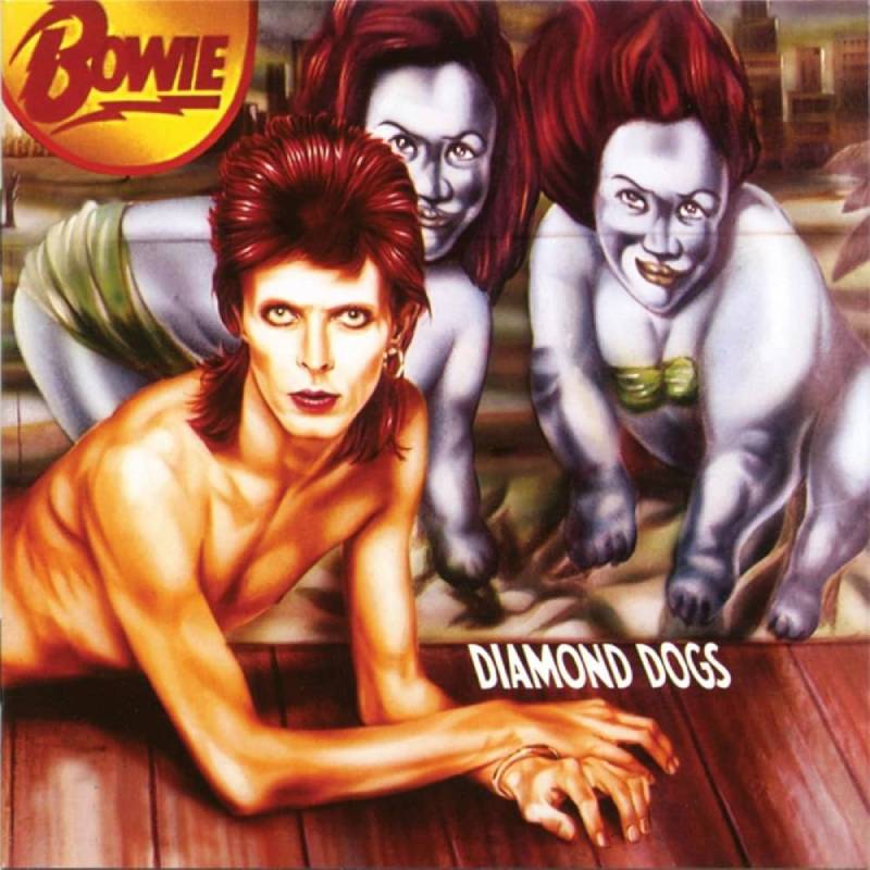
A painted half-man, half-dog creature with Bowie’s face and torso, flanked by two freak-show dog figures, set against a backdrop of a post-apocalyptic cityscape. It’s grotesque, glamorous, and completely unforgettable.
Artist and Photographer
Belgian artist Guy Peellaert painted the cover, working from photographs taken by Terry O’Neill during a dedicated photo session. Peellaert had just published his book Rock Dreams, a collection of surreal painted portraits of rock stars.
Here’s the fun part. Bowie saw Rock Dreams at Mick Jagger’s house and immediately hired Peellaert before Jagger could. Jagger had already commissioned Peellaert for the Rolling Stones‘ It’s Only Rock and Roll. Diamond Dogs came out five months earlier. “You wouldn’t wear a new pair of shoes around David,” Jagger reportedly said.
Design Concept
Bowie wanted to be depicted in the style of Josephine Baker, based on a 1926 photograph of the dancer posing like a wild animal. Peellaert merged Bowie’s body with the legs of a whippet and added freak-show details inspired by Coney Island’s Pleasure Park performers.
The album was originally conceived as a stage adaptation of George Orwell’s Nineteen Eighty-Four, but Bowie couldn’t get the rights. So he fused those themes with William S. Burroughs’ cut-up style and his own glam-rock sensibilities.
Color Palette and Visual Style
Peellaert’s painting uses a mix of photomontage and traditional painting techniques. The palette runs warm and burnt, with deep yellows and dirty oranges giving the image an Orwellian gloom. It’s pop surrealism at its most disturbing.
The inner gatefold featured a dreamlike cityscape montage in deep burnt yellow, seen through a haze. It felt like looking at a world that had already ended.
Cultural Impact
The original gatefold sleeve showed the hybrid creature’s full genitalia. RCA executives ordered the artwork airbrushed just before release. Very few uncensored copies made it into circulation.
Those original uncensored sleeves are now among the most expensive vinyl collectibles in the world. Goldmine price guides have listed them at thousands of dollars per copy. Later CD reissues restored the original artwork.
Notable Details
The two dog figures flanking Bowie were based on real Coney Island sideshow performers, Alzoria Lewis and Johanna Dickens. The freak show badge originally read “Alive” but was changed to “Bowie” for the final version.
Where to Find It
Censored versions on original RCA pressings. Uncensored artwork restored on Rykodisc and EMI reissues. Original uncensored sleeves (without records) sell for thousands at auction.
Heroes (1977)
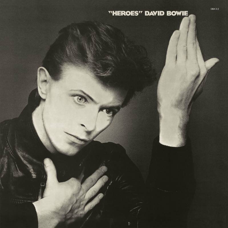
The Cover
Bowie in a leather jacket, hands raised in a contorted, expressive pose against a dark background. His face catches dramatic light. It’s theatrical and raw at the same time.
Artist and Photographer
Japanese photographer Masayoshi Sukita captured the image. Sukita had a long working relationship with Bowie spanning several decades and multiple photo sessions. This particular shot became one of Bowie’s most reproduced portraits.
Design Concept
The pose was directly inspired by Roquairol, a 1917 painting by German Expressionist artist Erich Heckel. Bowie was living in Berlin at the time, deep in his collaboration with Brian Eno and producer Tony Visconti. The same Heckel painting also inspired the cover of Iggy Pop’s The Idiot, released the same year.
Both albums share a visual DNA rooted in German Expressionism. Makes sense when you know Bowie was soaking in Berlin’s art history while recording at Hansa Studios near the Berlin Wall.
Color Palette and Visual Style
The image is high-contrast with rich black shadows and sharp highlights on Bowie’s face and hands. Monochrome colors dominate, with the lighting doing most of the work. There’s almost no color to speak of. Just light and dark, shape and gesture.
The visual hierarchy is all about that hand gesture. Your eye goes straight to it.
Cultural Impact
The “Heroes” cover became shorthand for Bowie’s Berlin era. It’s the second album in his Berlin Trilogy (alongside Low and Lodger), and this image is the one people associate most closely with that period.
Jonathan Barnbrook would later reference this cover directly when designing The Next Day (2013), placing a white square over the “Heroes” image to signal Bowie’s return.
Notable Details
The album title has always been written with quotation marks, “Heroes”, suggesting the heroism is ironic or performed. The cover’s theatrical pose reinforces that reading.
Where to Find It
Original pressings on RCA Records. Remastered editions widely available on CD and vinyl. The 2017 box set A New Career in a New Town (1977-1982) includes the remastered album.
Low (1977)
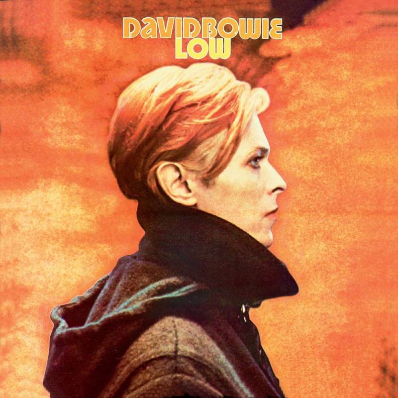
The Cover
Bowie’s profile, cropped tight, his orange hair fading into an orange background. The word “LOW” appears small in the corner. That’s it. The image is a still from the film The Man Who Fell to Earth.
Artist and Photographer
The photograph is a still from Nicolas Roeg’s 1976 film, taken by photographer Steve Schapiro. George Underwood, Bowie’s school friend, designed the cover artwork and handled the color treatment.
Design Concept
The cropped profile was a deliberate visual pun. “Low profile.” Many fans didn’t get the joke until Bowie pointed it out in an interview years later. The connection to The Man Who Fell to Earth wasn’t meant to promote the film. It was about linking the album’s themes to the character of Thomas Jerome Newton, the alien who couldn’t go home.
Bowie’s hair blends into the background, and the figure feels like it’s dissolving. Which is basically what the music does too.
Color Palette and Visual Style
The dominant analogous colors are orange and burnt amber. Bowie’s hair is the same shade as the background, creating what one critic called “a solipsistic notion of place reflecting person.” It’s minimalist design before minimalism became a design trend.
The album title treatment is understated, almost invisible. The whole cover resists the idea of selling you something. It just exists.
Cultural Impact
Low kicked off the Berlin Trilogy and became one of the most influential albums in rock history. Composer Philip Glass created his first symphony based on the album in 1992.
RCA initially refused to release the album for three months, fearing commercial failure. It reached number 2 in the UK. The cover’s understated approach influenced a generation of cover design thinking.
Notable Details
The same Man Who Fell to Earth still-frame trick was used for Station to Station (1976), though with a different image. Also, Bowie insisted on the cropped, profile-only version. He wanted the image tight and ambiguous.
Where to Find It
Original pressings on RCA Records. Remastered on multiple formats. Included in the A New Career in a New Town box set.
Hunky Dory (1971)
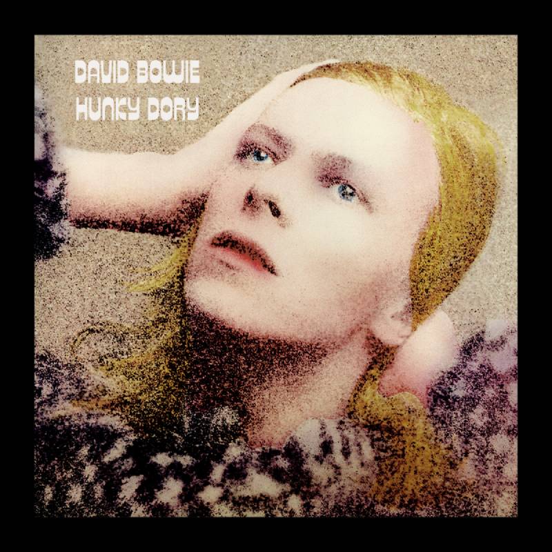
The Cover
Bowie as a golden-haired vision, head tilted back, caught in soft light. The pose channels classic Hollywood glamour. He looks like a 1940s film star, not a 24-year-old British musician.
Artist and Photographer
Photographer Brian Ward took the shot. George Underwood and Terry Pastor handled the artwork and design. Pastor colorized the black-and-white photograph, just as he would later do for Ziggy Stardust.
Design Concept
Bowie brought a Marlene Dietrich photo book to the session and used it as direct reference. The pose, the lighting, the angle. All Dietrich.
It’s one of Bowie’s prettiest covers. But there’s something unsettling about it too. The tilt of the head, the slightly blank expression. You’re not sure if he’s inviting you in or shutting you out.
Color Palette and Visual Style
Warm golden tones throughout, with Bowie’s blonde hair and skin tones blending into a soft amber palette. The colorization adds a dreamlike quality that lifts the image out of its time period.
The emphasis is entirely on Bowie’s face. No distractions. No text crowding the image.
Cultural Impact
Hunky Dory didn’t sell well at first. The album and its cover gained appreciation retroactively after Ziggy Stardust made Bowie a star. Now it’s considered one of the finest album covers of the early 1970s.
Notable Details
George Underwood, who designed the cover, is the same person who gave Bowie his famous mismatched pupils by punching him in the eye during a school fight over a girl. Bowie later thanked him for the distinctive look.
Where to Find It
Original RCA pressings. Widely reissued on CD and vinyl. Alternative colorized versions by Pastor are available as fine art prints.
Blackstar (2016)
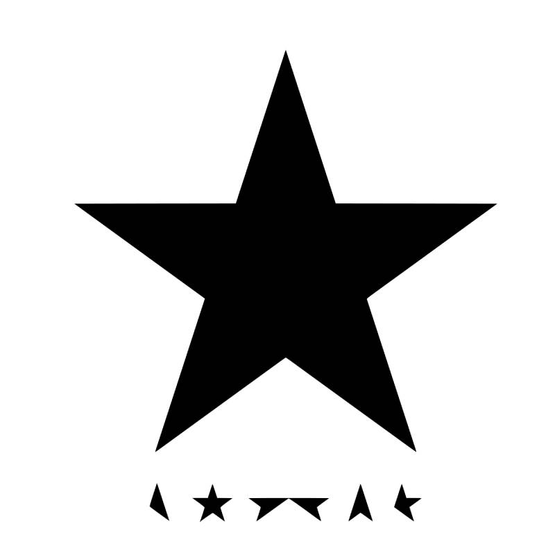
The Cover
A large black star on a white background with fragmented star shapes spelling out “BOWIE” beneath it. No photograph of Bowie anywhere. It’s the only studio album cover in his entire discography that doesn’t feature his image.
Artist and Photographer
Jonathan Barnbrook designed the artwork. He had been Bowie’s graphic design collaborator since Heathen (2002), making him one of Bowie’s longest-serving visual partners. The design won the Grammy Award for Best Recording Package and the Design Museum’s Beazley Graphic Design of the Year, both in 2016.
Design Concept
The album dropped on Bowie’s 69th birthday. He died two days later. Barnbrook later explained that the design was about “a man who was facing his own mortality.”
Using the star symbol instead of writing “Blackstar” was deliberate. It carried a sense of finality. The vinyl edition takes it further, with the sleeve cut so you can see the black record inside. “The fact that you can see the record as a physical thing that degrades, it gets scratched as soon as it comes into being, that is a comment on mortality too,” Barnbrook said.
Some critics initially dismissed the cover as lazy. Barnbrook pushed back: “There is a misunderstanding about the simplicity.”
Color Palette and Visual Style
Pure black on white. The vinyl packaging is entirely black on black. It’s about as stripped down as album artwork gets.
The black star references black holes, the Big Bang, mortality, and the idea of light being consumed by darkness. The geometric precision of the star shapes gives the whole thing a Constructivist quality that Barnbrook discussed openly. He and Bowie talked about Malevich’s Black Square during the design process.
Cultural Impact
After Bowie’s death, Barnbrook released the artwork under a Creative Commons license so fans could use and remix it freely. He and Bowie had discussed this before his passing.
The cover became a global symbol of mourning. Fans used the black star imagery for tattoos, murals, and tributes worldwide. Producer Tony Visconti described the entire album as “a parting gift.”
Notable Details
The typeface used is Virus Deja Vu, one of Barnbrook’s own open-source fonts. The star symbol was chosen partly because it would display consistently across all digital platforms, from web to iTunes to email.
Where to Find It
Available on CD and vinyl through Columbia/ISO Records. The vinyl version offers the fullest design experience with its die-cut packaging. Digital artwork is free to download under Creative Commons.
The Man Who Sold the World (1970)
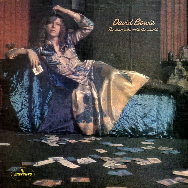
The Cover
Bowie reclines on a chaise longue wearing a long, flowing dress designed by fashion designer Michael Fish. He has curly, shoulder-length hair and looks entirely unbothered. For 1970, this was a provocation.
Artist and Photographer
Photographer Keith MacMillan captured the image. The “man dress” was designed by Michael Fish, a London fashion designer known for pushing gender boundaries in men’s clothing.
Design Concept
The US and UK releases had different covers. The UK version featured the now-famous dress photo. The US version used a cartoon illustration by Michael J. Weller showing a cowboy in front of the Cane Hill psychiatric hospital, where Bowie’s half-brother Terry Burns had been a patient.
Bowie’s gender-bending image on the UK cover was years ahead of the androgynous glam rock looks that would define his career. He was testing boundaries before he had an audience that understood them.
Color Palette and Visual Style
The image has a pre-Raphaelite feel. Soft, natural tones with Bowie’s flowing hair and dress creating an almost painterly composition. It’s more fine art portrait than rock album cover.
Cultural Impact
When Nirvana’s Kurt Cobain wore a dress on stage, he directly cited this cover as an influence. The image has been referenced in countless discussions about gender fluidity in rock music.
Notable Details
Bowie took the dress from Fish’s shop after trying it on during a visit. The Mercury Records US label apparently found the image too controversial and opted for the cartoon alternative instead.
Where to Find It
The original UK pressing on Mercury Records features the dress cover. Most modern reissues use the UK artwork. The US cartoon cover has become a collector’s item in its own right.
Scary Monsters (and Super Creeps) (1980)
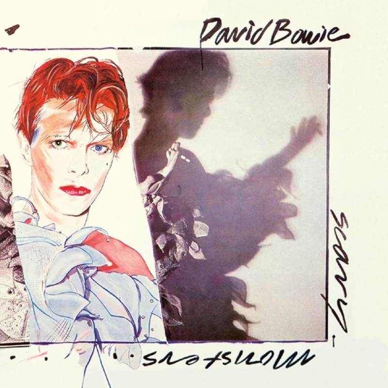
The Cover
Bowie in a full Pierrot clown costume, the same outfit from the “Ashes to Ashes” music video. But the image is partially painted over, blurring the line between photography and painting.
Artist and Photographer
Brian Duffy took the photographs. This was the third and final Bowie album cover Duffy would shoot, after Aladdin Sane and Lodger. Artist Edward Bell then painted over Duffy’s photograph to create the finished artwork.
Design Concept
The Pierrot costume represented a callback to Italian commedia dell’arte, connecting Bowie’s rock persona to centuries of performance tradition. The combination of photography and painting created something that felt unstable. You can’t fully trust what you’re looking at.
It was a fitting visual for the album’s content, which bridged Bowie’s experimental Berlin period with a more accessible, new wave-influenced sound.
Color Palette and Visual Style
Bold primary colors in the Pierrot costume clash with the painterly brushstrokes. The balance between photographic realism and gestural painting gives the cover an art-school sensibility that still feels fresh.
Cultural Impact
Scary Monsters marked the end of Bowie’s extraordinary 1970s run. The cover’s hybrid approach, half photo and half painting, anticipated mixed-media techniques that would become common in album art decades later.
Notable Details
Duffy used a Hasselblad 500C camera, the same one he’d used for the Aladdin Sane session years earlier. That camera later sold at auction through Bonhams.
Where to Find It
Original RCA Records pressings. Remastered on CD and vinyl. The cover is often included in retrospective exhibitions of Bowie’s visual identity.
Young Americans (1975)
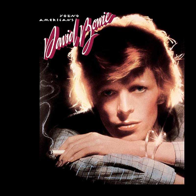
The Cover
Bowie with perfectly coiffed hair, smoking a cigarette, looking like a polished soul singer rather than a glam rocker. It’s sleek, cool, and deliberately adult.
Artist and Photographer
Eric Stephen Jacobs shot the album cover photo. Craig DeCamps completed the cover design. The approach was completely different from anything Bowie had done before.
Design Concept
The cover was built to distance Bowie from his glam rock past. He had become obsessed with Philadelphia soul and R&B during his time in the US, and the artwork needed to reflect that shift.
No costumes. No face paint. No alien personas. Just Bowie, looking sharp. The simplicity was the point. After years of visual excess, this was Bowie saying: I’m something else now.
Color Palette and Visual Style
Warm, natural skin tones with soft lighting. The palette reflects Bowie’s move toward what he called “plastic soul.” Everything about the image prioritizes elegance over shock value.
Cultural Impact
Young Americans was Bowie’s first top-ten album in the US and featured his first American number-one single, “Fame” (co-written with John Lennon). The cover’s understated approach signaled a complete identity reset that proved Bowie could reinvent himself without relying on elaborate visual personas.
Notable Details
The album was recorded at Sigma Sound Studios in Philadelphia with local session musicians, the same studio where much of classic Philly soul was tracked. The cover’s polished look matches that production context.
Where to Find It
Original RCA Records pressings. Remastered editions widely available. The album is included in the Who Can I Be Now? (1974-1976) box set.
FAQ on David Bowie Album Covers
What is David Bowie’s most iconic album cover?
Aladdin Sane (1973) is widely considered his most iconic cover. Photographer Brian Duffy shot the lightning bolt portrait, with makeup by Pierre La Roche. The original print sold for nearly $500,000 at auction in 2025, making it the most expensive album artwork ever sold.
Who designed the Ziggy Stardust album cover?
Photographer Brian Ward shot the black-and-white image on Heddon Street in London. Artist Terry Pastor then hand-colorized the photograph at Main Artery studio. George Underwood, Bowie’s childhood friend, suggested Pastor for the job after they collaborated on Hunky Dory.
Why was the Diamond Dogs cover censored?
Belgian artist Guy Peellaert‘s painting showed the half-man, half-dog hybrid’s genitalia on the gatefold sleeve. RCA Records ordered them airbrushed out just before release. Uncensored copies are now among the most expensive vinyl collectibles, worth thousands of dollars.
What inspired the Heroes album cover pose?
Japanese photographer Masayoshi Sukita captured Bowie’s expressive hand gesture. The pose was inspired by Roquairol, a 1917 painting by German Expressionist Erich Heckel. The same painting also influenced the cover of Iggy Pop’s The Idiot that year.
Who designed the Blackstar album artwork?
Jonathan Barnbrook designed the cover using a black star symbol instead of text. It was Bowie’s first album without his image on the front. Barnbrook later released the artwork under a Creative Commons license as a tribute after Bowie’s death.
What is the Low album cover image from?
The cover uses a still from Nicolas Roeg’s 1976 film The Man Who Fell to Earth. George Underwood designed the artwork. The cropped profile against an orange background was a visual pun meaning “low profile,” a joke Bowie later confirmed in interviews.
How many album covers did Brian Duffy shoot for Bowie?
Duffy photographed three Bowie album covers: Aladdin Sane (1973), Lodger (1979), and Scary Monsters and Super Creeps (1980). They worked together across five photo sessions over eight years. Duffy’s Hasselblad 500C camera later sold at Bonhams auction.
Why did Bowie wear a dress on The Man Who Sold the World cover?
Bowie wore a flowing gown designed by fashion designer Michael Fish for the UK pressing. The gender-bending image was years ahead of his glam rock era. The US label found it too controversial and replaced it with a cartoon illustration instead.
Are original David Bowie album covers valuable?
Yes. Uncensored Diamond Dogs sleeves sell for thousands. The original Aladdin Sane dye transfer print fetched $496,000 in 2025. First pressings of Ziggy Stardust on RCA Records with intact gatefold artwork are highly sought after by vinyl collectors worldwide.
What makes Bowie’s album artwork different from other artists?
Bowie treated each cover as a complete identity reset. He worked with top photographers and designers like Duffy, Sukita, Peellaert, and Barnbrook. Every sleeve introduced a new persona, from Ziggy Stardust to the Thin White Duke to Halloween Jack.
Conclusion
David Bowie album covers did something most record sleeves never attempted. They built entire visual worlds around each release, turning vinyl packaging into a form of artistic expression that stood on its own.
From Brian Duffy’s Aladdin Sane portrait to Jonathan Barnbrook’s stripped-down Blackstar artwork, every cover reflected a deliberate creative vision. Bowie understood that album art wasn’t decoration. It was identity.
The photographers, painters, and graphic design minds behind these covers helped shape how music and visual culture intersect. Guy Peellaert’s Diamond Dogs painting, Masayoshi Sukita’s “Heroes” session, Terry Pastor’s Ziggy Stardust colorization. Each one pushed the boundaries of what a record sleeve could communicate.
These covers remain collector’s items, cultural touchstones, and reference points for anyone working in album artwork today. Bowie set the standard. It still holds.

Renowned for his expertise in logo design and visual branding, Bogdan has developed a multitude of logos for various clients.
His skills extend to creating posters, vector illustrations, business cards, and brochures. Additionally, Bogdan's UI kits were featured on marketplaces like Visual Hierarchy and UI8.
He also wrote in the past years on sites like Design Your Way, WebDesignerDepot, WPDean, Designmodo, Speckyboy, Slider Revolution, and more.
- The Cursor Logo History, Colors, Font, And Meaning - 24 September 2026
- Canva vs PowerPoint: Which Is Better for Presentations? - 22 September 2026
- How to Install Fonts on Mac (Step-by-Step Guide) - 20 September 2026

Bogdan Sandu is a seasoned designer who has been designing websites since 2008. Renowned for his expertise in logo design and visual branding, Bogdan has developed a multitude of logos for various clients. His skills extend to creating posters, vector illustrations, business cards, and brochures. Additionally, Bogdan's UI kits were featured on marketplaces like Visual Hierarchy and UI8. He also wrote in the past years on sites like Design Your Way, WebDesignerDepot, WPDean, Designmodo, Speckyboy, Slider Revolution, and more.
You Might Also Like


