The McLaren Logo History, Colors, Font, and Meaning

Fasten your seatbelts, creative minds and design aficionados!
There’s power in imagery—a truth no one grasps quite like the aficionados of speed and style behind the wheel.
Dig into the essence of what makes an icon tick; think McLaren logo, a masterpiece of design that merges legacy with high-speed modernity.
Here, aesthetics and heritage collide, steering us through a visceral journey of what it means to visualize velocity.
Picture this: we’re delving deep, exploring every curve and contour of the logo tied to a name synonymous with breakneck speed and luxurious innovation.
By the roadmap’s end, you’ll have an enlightened perspective on design principles that drive global brands into pole position.
Prepare to unravel the tapestry of the iconic symbol, where history is woven with contemporary fibers, establishing an indelible mark in both automotive grandeur and graphic eloquence. Buckle up, as we chase the horizon where branding meets adrenaline.
The Meaning Behind the McLaren Logo

Alright, let’s dive headfirst into the deep pool that is the McLaren logo. You know, logos are like the faces of the brands. They aren’t just a random collection of shapes and colors, they often hold a powerful meaning. And McLaren’s logo isn’t any different.
A Symbol of Speed
The McLaren logo, or as we designers like to call it, the ‘Speedmark’, resembles the swoosh of air left in the wake of a high-speed object. It’s like the car zoomed by so fast, it left its mark in the air! It’s a nod to the brand’s dedication to speed, and their commitment to pushing the boundaries of automotive technology.
Inspired by Nature
Here’s something you might not know – the McLaren logo is actually inspired by a Kiwi bird. Yeah, you heard me right, a Kiwi. The first logo of McLaren was an illustration of a Kiwi bird, showing the roots of the company’s founder, Bruce McLaren, who was from New Zealand.
The current logo retains that inspiration, but it’s been stylized to a point where the bird isn’t immediately recognizable. But once you see it, you can’t unsee it!
The History of the McLaren Logo
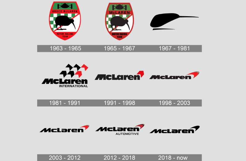
A logo’s evolution is a fascinating journey. It’s like watching a character in a movie grow and change over time. And the story of the McLaren logo is no different.
From Humble Beginnings
The first logo of McLaren, as I mentioned before, was a simple drawing of a Kiwi bird. It was a heartfelt tribute to Bruce McLaren’s homeland. But as the company grew, so did the need for a logo that reflected its ambitions and achievements.
The Evolution
In the early 1960s, the Kiwi bird got its wings clipped. The logo became a stylized ‘M’, representing the initial of McLaren.
As the company started conquering the racing world, the logo evolved to keep pace. The swoosh, or the ‘Speedmark’, was introduced, symbolizing speed, agility, and technological advancement.
The Colors of the McLaren Logo
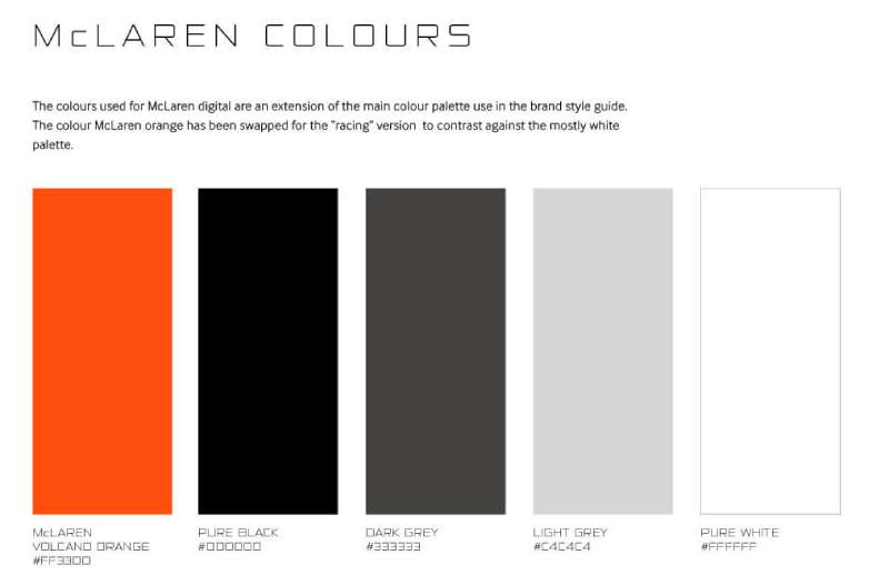
Colors in a logo aren’t just for aesthetics, they speak volumes about a brand’s personality. In the case of McLaren, the colors play a huge role in telling their story.
Vibrant Orange
McLaren’s logo is predominantly finished in a vibrant shade of orange, a color that’s synonymous with the brand. This orange color is a tribute to their racing heritage. The first car that Bruce McLaren himself designed and raced in was finished in this distinctive shade.
The Minimalist Approach
Beyond the vibrant orange, the logo is often seen in a minimalist black or white. These shades lend an air of sophistication, showcasing the brand’s commitment to precision and its premium positioning.
The Font Used in the McLaren Logo
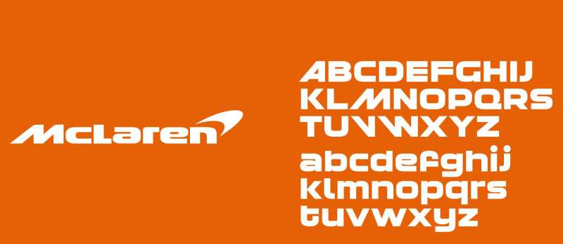
Typography, my friend, is an art in itself. The font used in a logo can set the tone for the entire brand image. McLaren’s logo uses a custom sans-serif typeface, which mirrors the brand’s ethos.
Bold and Futuristic
The font is bold, with clean lines and a modern, futuristic look. It’s a perfect reflection of the innovative spirit of the brand.
A Nod to Simplicity
Despite its bold appearance, the font maintains a simple and clean aesthetic, much like the vehicles that McLaren produces. It’s a beautiful balance, don’t you think?
The Impact of the McLaren Logo
Let’s turn our lens on the impact that the McLaren logo has had. Because a logo isn’t just a pretty face, it has a job to do.
A Strong Identity
The McLaren logo has become a symbol of high-speed, high-quality, and state-of-the-art design in the automotive world. When people see that swoosh, they immediately think of the brand and everything it represents. That’s the mark of a successful logo.
Global Recognition
The logo has also played a crucial role in McLaren’s global recognition. Whether it’s on the racetrack or on the streets, the sight of the swoosh has become a sign of excellence in automotive engineering.
The Influence of the McLaren Logo
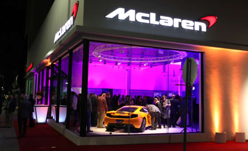
There’s no doubt that the McLaren logo has made waves in the design world, and its influence can be felt far and wide.
Setting Trends
The McLaren logo, with its aerodynamic swoosh, has set trends in the automotive industry. It has influenced other brands to adopt similar dynamic elements in their logos, pushing the envelope of logo design in the industry.
An Inspiration to Designers
For us designers, the McLaren logo serves as an inspiration. It’s a testament to how a brand can stay true to its roots while evolving with time. It encourages us to think outside the box, to create designs that are both meaningful and aesthetically pleasing.
The Future of the McLaren Logo
While the McLaren logo has a rich history and a strong presence, it’s also interesting to speculate about its future.
Continual Evolution
Just as the logo has evolved over the years, it will likely continue to do so in the future. As McLaren pushes the boundaries of automotive technology, its logo might morph to reflect those advancements.
Maintaining Its Core
No matter how the logo changes, it’s safe to say that it will always maintain its core identity. It will continue to symbolize speed, innovation, and excellence, staying true to the essence of McLaren.
In the end, the McLaren logo is more than just a logo. It’s a symbol of a brand that’s committed to pushing the boundaries, a brand that’s not afraid to evolve and change. And that’s something we can all take inspiration from.
FAQ On The Mclaren Logo
What’s the story behind the McLaren logo?
Ah, you’re diving right into the heart of the emblem. The logo draws inspiration from the vortices created by our beloved McLaren cars on the track. Think of it as a stylized speedmarque that nods to the company’s roots in aerodynamics and racing.
Has the McLaren logo always been the same?
Far from it. It’s evolved, you see. Started off as a simple kiwi bird, paying homage to founder Bruce McLaren’s home country, New Zealand. It’s been streamlined over time into the sleek, arrow-like symbol we recognize today.
What do the colors in the McLaren logo represent?
Dynamic and bold. The iconic papaya orange—that’s a nod to the early days of McLaren racing. It’s all about heritage and visually popping out from the grid. The black and silver shades? Think sophistication and modernity, mate.
Why did they choose a speedmark for the McLaren logo?
All about capturing the essence of movement, my friend. High-speed vehicles, they’re the lifeblood of McLaren. That speedmark? It’s a snapshot of motion, power, and forward-thinking—much like the supercars that bear it.
Is there an official name for the McLaren logo?
Folks often call it the “Speedmark”. Pretty fitting, eh? Represents the brand’s commitment to speed, innovation, and design seamlessly fused into one graphic.
Can you tell me about the font used in the McLaren logo?
Absolutely. It’s bespoke, tailored for the brand. Think modern, sleek, with a touch of futuristic—mirroring the cars’ aesthetics. You won’t find it on any old font list; it’s exclusive, like the machinery it adorns.
What influence does the McLaren logo have on brand identity?
Enormous! It’s the beacon that signals luxury, performance, and technical prowess. It’s more than just a logo; it’s a promise of the thrill that’s built into every McLaren model, stamped onto the public consciousness.
How often has the McLaren logo been redesigned?
A handful of times since inception. Each redesign subtly timed with the brand’s evolution, shifting gears as the company entered new eras of automotive design and technological achievements.
Do all McLaren cars use the same logo?
Unmistakably, yes. It’s a universal badge of honor, whether gracing a Formula 1 car or a high-performance road vehicle like the McLaren P1 or 720S. It’s about unity in excellence.
Where can I find official merchandise with the McLaren logo?
Straight from the horse’s mouth—McLaren’s own store. Authentic merch, from apparel to model cars, all decked out in that legendary logo. Just steer clear of knock-offs; accept only the genuine article.
Conclusion
And there we have it—the checkered flag on our lap around the McLaren logo. It’s a marque that roars with the legacy of Bruce McLaren, whispers the tales of F1 glory, and boldly announces innovation with every pixel it adorns. A token that’s evolved, yet steadfastly echoes the past with its papaya orange hue.
To cap it off, this emblem—no mere squiggle on a page or a hood—is the heart of a narrative steeped in triumph, tragedy, and technology. It’s a beacon for speed aficionados and a badge of honor for the engineers who crafted aerodynamic wonders.
As we pull away from the starting line of this exploration, keep this in mind: every time you catch a glimpse of that logo, it’s not just seeing—it’s experiencing a legacy. Ready to shift gears and accelerate into the future, the essence of McLaren races on.
If you liked this article about the McLaren logo, you should check out this article about the Alfa Romeo logo.
There are also similar articles discussing the Lexus logo, the Mazda logo, the Aston Martin logo, and the Acura logo.
And let’s not forget about articles on the Chevrolet logo, the GMC logo, the Genesis logo, and the Maybach logo.
- Deep Dive: Sea Color Palettes for Tranquil Designs - 3 May 2024
- The Stella Artois Logo History, Colors, Font, And Meaning - 2 May 2024
- Sky Color Palettes for Fresh Designs: 40 Examples - 2 May 2024


