The Alfa Romeo Logo stands as one of the most complex and historically rich emblems in automotive history. It combines two powerful symbols from Milan, Italy: the red cross of the city’s coat of arms and the Biscione serpent from the Visconti family crest.
This logo has remained remarkably consistent since 1910, though it has undergone several refinements. The circular badge format positions Alfa Romeo alongside other prestigious European manufacturers who favor heraldic-style branding.
Currently, the brand uses a streamlined version introduced in 2015. The emblem has seen roughly ten design iterations since the company’s founding in Milan on June 24, 1910. That’s over a century of visual identity built on the same core elements.
What is the Alfa Romeo Logo?
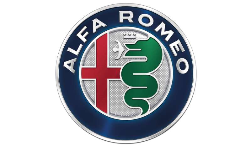
The Alfa Romeo logo is a circular emblem featuring the red cross of Milan on the left and the Biscione (a serpent consuming a human figure) on the right. Introduced in 1910 and designed by Romano Cattaneo, it represents Milan’s civic pride and the Visconti dynasty’s power.
Design Type: Combination mark (emblem with integrated wordmark)
Primary Elements:
- Red cross of Milan (left half)
- Biscione serpent with human figure (right half)
- Blue background field
- Circular border with “ALFA ROMEO” text
- Decorative Savoy knots (in historical versions)
Official Introduction Date: 1910
Original Designer: Romano Cattaneo (draftsman at the company)
Trademark Status: Registered globally, now owned by Stellantis N.V.
Official Color Palette:
- Alfa Red: #B5152B
- Alfa Blue: #00205B
- Metallic Silver: #8A8D8F
- White: #FFFFFF
Usage Context: Vehicle badges, dealership signage, marketing materials, motorsport liveries, merchandise, digital platforms
How Has the Alfa Romeo Logo Evolved Over Time?
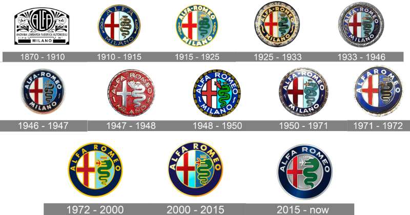
The Alfa Romeo logo has maintained its core dual-symbol structure for over 110 years.
Major updates occurred in 1915, 1925, 1946, 1950, 1972, and 2015.
Each revision simplified details while preserving the essential Milan cross and Biscione serpent.
Original A.L.F.A. Logo (1910-1915)
Years Active: 1910-1915
Design Description: Circular badge with “A.L.F.A.” text at top, “MILANO” at bottom. The left side showed Milan’s red cross on white. The right side featured the blue Biscione serpent eating a red human figure (sometimes described as a Moor or Saracen).
Color Scheme: Red, blue, white, with gold border accents
Designer: Romano Cattaneo
Context: Created when the company was called Anonima Lombarda Fabbrica Automobili (A.L.F.A.). The design drew from Milanese heraldry visible on the Filarete Tower of Castello Sforzesco, where Cattaneo reportedly found inspiration while waiting for a tram.
Cultural Significance: Established the brand’s permanent connection to Milan’s medieval heritage and aristocratic symbolism.
Alfa Romeo Logo (1915-1925)
Years Active: 1915-1925
Design Description: Similar circular format but with “ALFA – ROMEO” replacing “A.L.F.A.” following Nicola Romeo’s takeover of the company. Added metallic border treatment.
Color Scheme: Red, blue, white, gold metallic border
Key Changes from Previous: Company name updated to reflect new ownership. Hyphen added between “ALFA” and “ROMEO.”
Context: Nicola Romeo acquired A.L.F.A. in 1915 and shifted production to military equipment during World War I. Car production resumed in 1919 under the new name.
Alfa Romeo Logo with Laurel Wreath (1925-1946)
Years Active: 1925-1946
Design Description: Added a laurel wreath surrounding the circular emblem. This celebrated Alfa Romeo’s 1925 World Championship victory in motorsport.
Color Scheme: Traditional red, blue, white core with gold laurel wreath
Key Changes from Previous: Laurel wreath addition as victory symbol. Refined border detailing.
Cultural Significance: Marked Alfa Romeo’s rise as a dominant racing force. The laurel has appeared in various forms ever since.
Post-War Alfa Romeo Logo (1946-1950)
Years Active: 1946-1950
Design Description: Removed the Savoy knots that had appeared in some versions. Italy had abolished the monarchy, making royal symbols inappropriate.
Color Scheme: Red, blue, white, metallic silver border
Key Changes from Previous: Political symbols stripped from design. Cleaner overall appearance.
Context: Post-World War II Italy became a republic. The company adapted its branding to reflect the new political reality.
Modernized Alfa Romeo Logo (1950-1972)
Years Active: 1950-1972
Design Description: Refined proportions and cleaner lines. The serpent and cross received more standardized rendering. Border text became more uniform.
Color Scheme: Deeper blue tones, consistent red, chrome-style border
Key Changes from Previous: More industrial, reproducible design suited to growing production volumes.
Cultural Significance: Reflected Alfa Romeo’s transition from boutique manufacturer to larger-scale producer during Italy’s economic boom.
Simplified Alfa Romeo Logo (1972-2015)
Years Active: 1972-2015
Design Description: Further streamlined details. The serpent design became more stylized. Border received a more modern treatment with cleaner typography.
Color Scheme: Standardized Alfa Red and Alfa Blue, silver metallic border
Key Changes from Previous: Reduced ornamental details. Better suited for modern reproduction methods.
Context: The 1970s brought ownership changes and financial difficulties. The simplified logo worked better across diverse applications.
Current Alfa Romeo Logo (2015-Present)
Years Active: 2015-present
Design Description: Flat design approach removing most three-dimensional effects. Monochromatic silver/grey palette for the main badge, with color versions for specific applications.
Color Scheme: Predominantly metallic silver with subtle color retention in some versions
Designer: Robilant Associati (brand consultancy)
Key Changes from Previous: Dramatic shift to flat, modern aesthetic. Removal of glossy effects. Single-tone treatment for premium appearance.
Cultural Significance: Aligned with contemporary automotive design trends favoring minimalist design approaches. Signaled brand revival under new management.
What Do the Design Elements of the Alfa Romeo Logo Mean?
The Alfa Romeo emblem combines two distinct Milanese symbols with centuries of history.
The red cross represents Milan’s civic identity, dating to the Crusades.
The Biscione serpent carries Visconti family heritage, symbolizing power and regeneration.
Together, they ground the brand in deep Italian roots.
What Does the Red Cross Symbolize?
The red cross on white comes directly from Milan’s coat of arms.
Legend connects it to the First Crusade, when Milanese soldiers carried this banner.
Some historians link it to the city’s patron saint, Ambrose.
For Alfa Romeo, it represents birthplace pride and Italian identity.
The cross creates immediate geographic and cultural association.
What Does the Serpent (Biscione) Represent?
The Biscione shows a large serpent consuming (or birthing, depending on interpretation) a human figure.
This symbol belonged to the Visconti family, who ruled Milan from 1277 to 1447.
The imagery suggests power, wisdom, and the cycle of rebirth.
It connects Alfa Romeo to Milan’s aristocratic past.
The human figure’s meaning remains debated. Some say it represents enemies being destroyed. Others interpret it as new life emerging.
Why Did Alfa Romeo Choose These Specific Colors?
Understanding color theory helps explain why these choices work so well together.
Alfa Red (#B5152B)
- Direct reference to Milan’s heraldic red
- Conveys passion, speed, and Italian racing heritage
- Creates strong contrast against blue and white
- Connects to the tradition of red logos in automotive branding
Alfa Blue (#00205B)
- Background for the Biscione section
- Represents trust, depth, and nobility
- Balances the aggressive red with sophistication
- Follows the approach seen in many blue logos that convey premium positioning
Metallic Silver (#8A8D8F)
- Modern border treatment
- Suggests engineering precision and technology
- Provides neutral frame for the colorful center
White (#FFFFFF)
- Background for the red cross section
- Creates clean separation between elements
- Traditional heraldic field color
What Typography Style Is Used in the Alfa Romeo Logo?
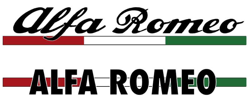
The wordmark uses a custom serif font with classical proportions.
Letters appear in all capitals around the badge perimeter.
The serifs add a traditional, established feel that matches the heraldic imagery.
Spacing between letters has tightened over the years for better readability at small sizes.
Recent versions show slightly modernized letterforms while keeping the classic character.
What Are the Hidden Meanings in the Alfa Romeo Logo?
The human figure in the serpent’s mouth sparks endless debate.
Some see a Saracen being devoured, linking to Crusade-era symbolism. Others interpret the figure as being protected or reborn rather than consumed.
The circular format suggests completeness and continuity.
The left-right split creates balance between civic and noble identities.
Romano Cattaneo never left detailed notes about his intentions, leaving room for interpretation.
How Does the Alfa Romeo Logo Compare to Competitor Logos?
Among luxury and sports car brands, Alfa Romeo’s logo stands out for its complexity.
Most competitors favor simpler abstract marks or stylized initials.
The heraldic approach puts Alfa Romeo in a small group alongside Porsche and Ferrari.
Compared to German Brands:
The BMW logo uses a simple quartered circle. Audi relies on four interlocking rings. Alfa Romeo’s detail-rich emblem contrasts sharply with this Germanic minimalism.
Compared to Italian Rivals:
The Maserati logo features the Bologna trident, a simpler single symbol. Lamborghini shows a charging bull. Alfa Romeo’s divided shield format is unique among Italian marques.
Compared to British Luxury:
The Bentley logo and Aston Martin logo use winged designs suggesting speed and flight. Alfa Romeo grounds itself in place and history instead.
Few car logos carry this much historical narrative within a single badge.
What Are the Technical Specifications of the Alfa Romeo Logo?
Official Color Codes:
Primary Red (Alfa Red)
Primary Blue (Alfa Blue)
- Hex: #00205B
- RGB: (0, 32, 91)
- CMYK: (100, 85, 5, 36)
- Pantone: 281 C
Metallic Silver
- Hex: #8A8D8F
- RGB: (138, 141, 143)
- CMYK: (0, 0, 0, 50)
- Pantone: Cool Gray 7 C
Dimensions and Proportions:
- Aspect ratio: 1:1 (circular)
- Minimum reproduction size: 15mm diameter for print, 50px for digital
- Clear space: Minimum of 10% of logo diameter on all sides
- The emblem divides vertically with cross on left, serpent on right
Modern applications use vector graphics formats to maintain crispness at any size.
What Cultural Impact Has the Alfa Romeo Logo Had?
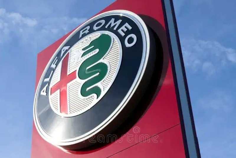
The Alfa Romeo badge has become shorthand for Italian automotive passion.
It appears in films, fashion collaborations, and design exhibitions worldwide.
The serpent imagery has inspired countless discussions about symbolism and meaning.
For car enthusiasts, the logo represents a specific philosophy: style and driving pleasure over pure practicality.
Milan proudly claims the brand as part of its industrial and cultural heritage.
How Does the Alfa Romeo Logo Fit Into the Overall Brand Identity?
The logo anchors everything Alfa Romeo communicates visually.
Vehicle grilles feature the badge prominently, creating a distinct face.
Marketing materials use the red and blue palette consistently.
The Quadrifoglio (four-leaf clover) appears on high-performance variants, adding another layer to the visual system.
Dealership architecture and brand guidelines extend these elements into physical spaces. The logo’s historical depth supports storytelling across all brand touchpoints.
How Should the Alfa Romeo Logo Be Used?
Official Usage Guidelines:
- Never stretch, distort, or rotate the logo
- Maintain minimum clear space around the emblem
- Use only approved color versions (full color, monochrome silver, or white)
- Never place on busy backgrounds that reduce legibility
- Do not recreate or modify the serpent or cross elements
Where to Access Official Logos:
Authorized dealers and partners receive logo files through Stellantis corporate channels. Press materials are available through Alfa Romeo’s media site.
Licensing Information:
Commercial use requires written permission from Stellantis. Fan sites and editorial use typically fall under fair use but cannot imply official endorsement.
Trademark Protection:
The Alfa Romeo name, logo, and Biscione symbol are registered trademarks in most countries. Stellantis actively protects against unauthorized commercial use.
FAQ on The Alfa Romeo Logo
What Does the Alfa Romeo Logo Mean?
The Alfa Romeo emblem combines two symbols from Milan, Italy. The left side shows the city’s red cross coat of arms.
The right side features the Biscione serpent from the Visconti family crest. Together, they represent civic pride and noble heritage.
Why Is There a Snake in the Alfa Romeo Logo?
The serpent comes from the Visconti family, who ruled Milan for nearly 200 years. This heraldic symbol appeared throughout the city.
Romano Cattaneo spotted it on the Filarete Tower and incorporated it into the 1910 design. The snake represents power and rebirth.
What Is the Red Cross in the Alfa Romeo Logo?
The red cross on white is Milan’s official coat of arms. It dates back to the Crusades era.
Local legend connects it to Milanese soldiers who fought in the First Crusade. The psychology of shapes here conveys strength and tradition.
When Was the Alfa Romeo Logo Created?
The original logo appeared in 1910 when the company was called A.L.F.A. (Anonima Lombarda Fabbrica Automobili).
Nicola Romeo acquired the company in 1915. The name changed, but the core visual identity remained intact through every ownership transition.
Who Designed the Original Alfa Romeo Logo?
Romano Cattaneo, a young draftsman working at the company, created the first design. He wasn’t a famous graphic designer at the time.
The story goes that he found inspiration while waiting for a tram near Castello Sforzesco. Sometimes the best ideas come from everyday moments.
Has the Alfa Romeo Logo Changed Over Time?
Yes. The badge has been refined roughly ten times since 1910. Each update simplified details while keeping the serpent and cross.
The 2015 redesign brought a flat, monochromatic look. Understanding logo design principles shows why this evolution made sense for modern applications.
What Do the Colors in the Alfa Romeo Logo Represent?
Red symbolizes Milan’s heraldic tradition and Italian racing passion. Blue provides a noble backdrop for the Biscione serpent.
The color palette creates strong color psychology associations. White and metallic silver complete the scheme with clean neutrality.
What Is the Biscione Symbol?
The Biscione is a heraldic charge showing a large serpent consuming or birthing a human figure. It belonged to the Visconti dynasty.
After the Viscontis, the House of Sforza adopted it. The symbol remains visible throughout Milan today, not just on Alfa Romeo vehicles.
Why Does the Alfa Romeo Logo Show a Man Being Eaten?
Interpretations vary. Some see an enemy being destroyed. Others view it as a figure being reborn or protected.
The ambiguity adds mystery. Medieval design elements often carried multiple meanings, and this one certainly delivers on that tradition.
Is the Alfa Romeo Logo Trademarked?
Absolutely. Stellantis N.V. owns all trademark rights globally. The company actively protects the emblem against unauthorized commercial use.
Fan sites typically operate under fair use. But selling merchandise with the badge requires written permission from the parent company.
Conclusion
The Alfa Romeo Logo stands apart in automotive branding. Few car emblems carry this much historical weight.
From Romano Cattaneo’s 1910 sketch to the current flat design, every version honors Milan’s heraldic roots. The Biscione serpent and red cross create instant brand recognition worldwide.
This Italian automotive symbol proves that strong visual hierarchy and unity in design can last over a century.
The badge connects motorsport legacy with Lombardy craftsmanship. It tells a story without saying a word.

Renowned for his expertise in logo design and visual branding, Bogdan has developed a multitude of logos for various clients.
His skills extend to creating posters, vector illustrations, business cards, and brochures. Additionally, Bogdan's UI kits were featured on marketplaces like Visual Hierarchy and UI8.
He also wrote in the past years on sites like Design Your Way, WebDesignerDepot, WPDean, Designmodo, Speckyboy, Slider Revolution, and more.
- The Cursor Logo History, Colors, Font, And Meaning - 24 September 2026
- Top 7 Web Design Subscription Services That Replace Full-Time Hires - 24 September 2026
- Canva vs PowerPoint: Which Is Better for Presentations? - 22 September 2026

Bogdan Sandu is a seasoned designer who has been designing websites since 2008. Renowned for his expertise in logo design and visual branding, Bogdan has developed a multitude of logos for various clients. His skills extend to creating posters, vector illustrations, business cards, and brochures. Additionally, Bogdan's UI kits were featured on marketplaces like Visual Hierarchy and UI8. He also wrote in the past years on sites like Design Your Way, WebDesignerDepot, WPDean, Designmodo, Speckyboy, Slider Revolution, and more.
You Might Also Like