The Bugatti logo stands as one of the most recognizable emblems in automotive history. This oval badge, known as the macaron, carries the initials “EB” for founder Ettore Bugatti above the BUGATTI name in white on red.
Within the world of car logos, few symbols communicate exclusivity quite like the Bugatti macaron. It first appeared in 1909 on the Type 13, the first official Bugatti, built in Molsheim, Alsace.
Ettore Bugatti designed the badge himself. More than a century later, the macaron on a new Bugatti looks almost exactly like the original, even though the company behind it has changed hands several times.
What is the Bugatti Logo?
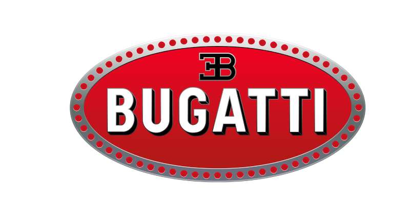
The Bugatti logo is the macaron: a red oval with the black “EB” initials of Ettore Bugatti and the BUGATTI name in white, framed by 60 red dots on a white border. Ettore designed it himself, and it debuted in late 1909 on the Type 13. It has barely changed since.
| Symbol | Red oval “macaron” with a mirrored E and a B, the BUGATTI name, and 60 dots around the edge |
| Designer/agency | Ettore Bugatti (1909); 2022 corporate identity by Interbrand |
| Current version since | 1909, with only minor refinements; current silver badge made by Poellath since 2003 |
| Colors (hex) | Red, approx. #DD071F, sampled from the current logo; white; black. No official codes published |
| Typeface | Custom bold condensed capitals with a black shadow; Uniform Condensed Bold is a close commercial lookalike |
| Previous major version | None; the 1909 macaron has never been replaced on the cars |
The EB monogram shows a mirrored “E” placed back to back with a “B”. In the 2022 rebrand, Bugatti kept and highlighted the EB logo as the core of its corporate identity. The badge predates the Art Deco era, though Bugatti’s 1920s and 1930s cars are often linked with that style.
How Has the Bugatti Logo Evolved Over Time?
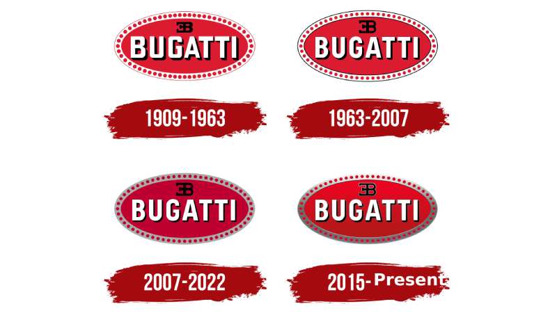
The Bugatti emblem has remained surprisingly stable since its creation.
Most changes involved the way the badge is made and shaded, not its design. The bigger shifts happened around the badge, in the company that owned it.
Original Bugatti Logo (1909-1950s)
Years Active: 1909 through the end of Ettore-era production
Design Description: The red oval with white BUGATTI lettering, black EB initials and 60 dots around a white border. According to Bugatti, Ettore had already developed a similar logo for his previous employer, Deutz in Cologne.
Color Scheme: Red, white and black
Designer: Ettore Bugatti
Context: Bugatti set up his company in Molsheim, Alsace, in 1909. The region was then part of the German Empire and became French after the First World War.
Cultural Significance: The badge appeared on legendary models like the Type 35 and the Royale, making Bugatti a symbol of racing success and automotive artistry.
Dormant Years
Design Description: Ettore Bugatti died in 1947, and car production faded out in the 1950s. The logo lived on mainly on surviving cars and in collector circles.
Context: The brand changed hands, passing to Hispano-Suiza in the 1960s, while the macaron itself stayed the same.
Revival Era Logo (1987-1995)
Design Description: Italian entrepreneur Romano Artioli revived the brand as Bugatti Automobili SpA and built a factory in Campogalliano, Italy. The EB110, unveiled in 1991 on what would have been Ettore’s 110th birthday, wore the traditional macaron.
Color Scheme: Same red, white and black palette
Cultural Significance: Marked Bugatti’s return as a supercar maker, though the company went bankrupt in 1995.
Modern Bugatti Logo (1998-Present)
Years Active: 1998-present
Design Description: Volkswagen Group bought the brand in 1998 and brought production back to Molsheim. Since 2003, starting with the Veyron, the macaron has been made by Poellath, a family firm in Bavaria, from about 150 grams of 970 sterling silver with hand-finished enamel. The Chiron’s badge is larger than the Veyron’s.
Color Scheme: Classic red, with a black macaron on a few special models such as the Chiron Noire
Key Changes from Previous: Materials and production quality, not design
Cultural Significance: Adorns the Veyron, Chiron, and limited editions like La Voiture Noire. Bugatti is now part of Bugatti Rimac, formed in 2021.
2022 Corporate Identity
In July 2022, Bugatti unveiled a new corporate identity by the agency Interbrand under the line “Create the Incomparable.” It added a custom typeface and a “Bugatti Blue” color that refers to the brand’s French origins. The EB logo was kept and given more prominence. The cars still wear the red macaron.
What Do the Design Elements of the Bugatti Logo Mean?
The EB initials honor the founder directly.
Bugatti gives the colors specific meanings: red for power and passion, white for elegance and nobility, black for excellence and courage.
The 60 dots are the subject of legend rather than a confirmed story.
What Are the Bugatti Logo Colors?
Red: The main field. Bugatti has not published an official hex code. Sampled from the current logo, it is approximately #DD071F. Bugatti says red stands for power and passion.
The psychology behind color choices matters here. Red triggers excitement, which suits a performance brand, and puts the macaron among the best-known red logos in motoring.
White: Used for the BUGATTI lettering and the border. It provides contrast against the red field, and Bugatti links it to elegance and nobility.
Black: Used for the EB initials and the shadows behind the lettering. Bugatti links it to excellence and courage.
There are no official RGB, CMYK or Pantone values for the macaron. On the car, the colors are enamel on silver, so they vary with light.
What Font Does the Bugatti Logo Use?
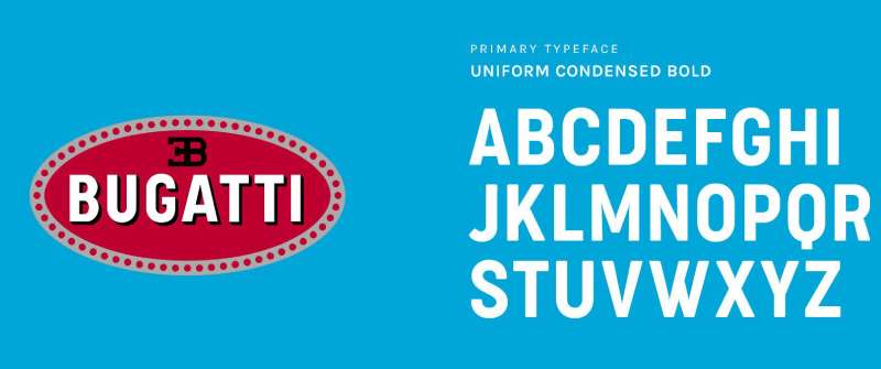
The BUGATTI lettering in the macaron is custom: bold, condensed capitals with a black drop shadow. It is not a serif font, despite what some sites claim.
Uniform Condensed Bold is a close lookalike for the letter shapes, but it is not the official source.
The typography of the wider brand changed in 2022, when Interbrand created custom Bugatti typefaces inspired by vintage French street signs and the company’s photo archive. The tall x-height question doesn’t really apply to the macaron, since it uses only capitals.
The EB monogram is drawn separately, with the E mirrored so it sits back to back with the B.
What Are the Hidden Meanings in the Bugatti Logo?
The 60 dots are the most debated detail. Bugatti says that, according to legend, they represent pearls or Art Nouveau-style threads. The company also notes that similar elements were used on mechanical parts as splints to make permanent connections, a nod to Ettore’s focus on reliability.
There is no confirmed reason for the exact number 60.
Some readers see the mirrored E and B as a reflection. That is an interpretation, not something Bugatti has stated.
How Does the Bugatti Logo Compare to Competitor Logos?
Bugatti’s emblem sits in a category of its own among hypercar manufacturers.
Where competitors like Ferrari use a prancing horse, Bugatti relies on initials and a name.
The Rivian logo takes a completely different approach with modern minimalism.
Compared to brands like Lamborghini with its charging bull, Bugatti’s monogram approach feels more refined. Less aggressive, more assured.
The oval shape distinguishes it from the shields used by Porsche and Lamborghini. It’s softer, yet the red background adds presence.
Among tech company logos, you see similar restraint in premium brands. Apple comes to mind. Sometimes less really does communicate more.
What Cultural Impact Has the Bugatti Logo Had?
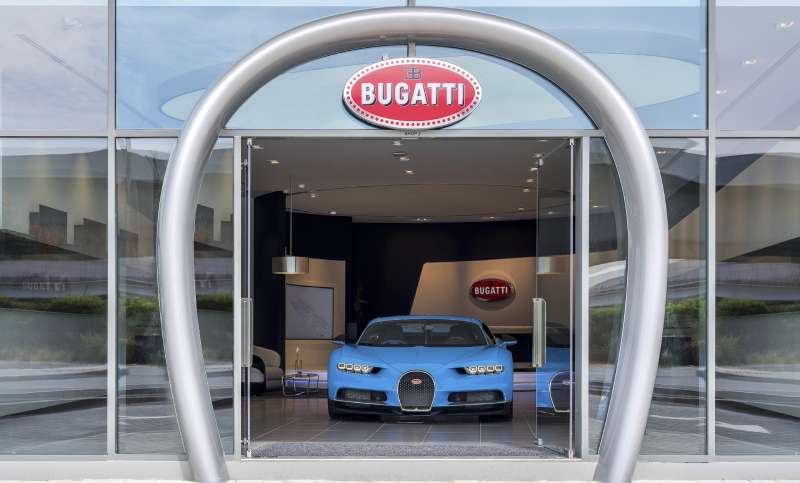
The Bugatti badge transcends automotive branding.
It represents a specific type of European luxury, the kind you see in haute couture and fine watchmaking.
Bugatti cars and their badges sit in major collections such as the Cité de l’Automobile in Mulhouse.
Pop culture references abound. Rappers name-drop Bugatti constantly. The badge became shorthand for ultimate success.
How Does the Bugatti Logo Fit Into the Overall Brand Identity?
The macaron is the anchor on the cars, while the EB logo leads the corporate identity introduced in 2022.
That identity, by Interbrand, added custom typography and a Bugatti Blue palette, and it has rolled out to social channels, stationery, events and showrooms. Like any luxury brand, Bugatti keeps internal brand guidelines for how these pieces fit together.
The horseshoe shape of the Bugatti grille is the other signature element, and it often appears next to the macaron in showrooms and design.
How Should the Bugatti Logo Be Used?
This is general advice, not Bugatti’s own rules.
The Bugatti name, the EB monogram and the macaron are registered trademarks. Using them on products or to suggest a partnership needs permission. Editorial use in news and reviews is generally treated differently.
Use the brand’s own artwork rather than recreating the badge, and don’t recolor the red field unless you are showing one of the black special-edition macarons.
FAQ on the Bugatti Logo
What Does the Bugatti Logo Represent?
The Bugatti logo represents the founder and the brand’s values. The EB initials stand for Ettore Bugatti, and Bugatti links the colors to power and passion (red), elegance (white) and excellence (black).
Who Designed the Bugatti Logo?
Ettore Bugatti designed the macaron himself, according to Bugatti. He had already created a similar badge for his former employer, Deutz. The badge debuted in 1909 on the Type 13.
What Do the 60 Dots on the Bugatti Logo Mean?
Nobody knows for sure. Bugatti says that, according to legend, they represent pearls or Art Nouveau threads, and it also compares them to splints used to make permanent connections on mechanical parts.
What Does EB Stand for in the Bugatti Logo?
EB stands for Ettore Bugatti, the company founder. The E is mirrored so that it sits back to back with the B.
What Is the Bugatti Symbol Called?
The oval badge is called the macaron. The EB monogram on its own is usually called the EB logo.
Why Is the Bugatti Logo Red?
Bugatti says red stands for power and passion. A few special models, such as the Chiron Noire, use a black macaron instead.
When Was the Bugatti Logo Created?
The macaron appeared in late 1909 on the Type 13, the first official Bugatti, built in Molsheim.
Has the Bugatti Logo Changed Over Time?
Very little. The macaron design has stayed essentially the same since 1909, with changes in materials and finish. In 2022 Bugatti introduced a new corporate identity by Interbrand, but the cars kept the red macaron and the EB logo. The principles behind effective logos favor this consistency.
What Font Is Used in the Bugatti Logo?
The BUGATTI lettering is custom: bold condensed capitals with a black shadow. Uniform Condensed Bold is a close lookalike. Since 2022 the brand also uses custom typefaces made by Interbrand. The red, white and black color palette and strong visual hierarchy do as much work as the letters.
What Is the Bugatti Badge Made Of?
Since 2003 the badge has been made by Poellath in Bavaria from 970 sterling silver with enamel. Each one takes about ten hours of handwork.
Is the Bugatti Logo Trademarked?
Yes. The Bugatti name, the EB monogram and the macaron are protected trademarks. Approved third-party uses follow Bugatti’s own brand style guide.
What Shape Is the Bugatti Logo?
The Bugatti badge is an oval, which sets it apart from shield-based logos like Porsche and Lamborghini. The psychology of shapes links curved forms with elegance.
Conclusion
The Bugatti logo stands as a masterclass in automotive brand identity. Few emblems carry this much history while remaining visually relevant after a century.
From Ettore Bugatti’s 1909 Type 13 to the Veyron and Chiron, the core elements persist.
The EB initials, 60 dots, and red oval communicate luxury without saying a word.
This is what separates lasting logo design from forgettable marks. The Bugatti macaron doesn’t follow trends.
French engineering, Italian-born founder, and racing legacy, all compressed into one silver badge.
Sources
- Bugatti Newsroom, The Bugatti Macaron badge: a unique component made of silver – https://newsroom.bugatti.com/press-releases/the-bugatti-macaron-badge-a-unique-component-made-of-silver
- Bugatti Newsroom, Create the Incomparable: Bugatti unveils new corporate identity – https://newsroom.bugatti.com/press-releases/create-the-incomparable-bugatti-unveils-new-corporate-identity
- It’s Nice That, Bugatti’s new look is bolder, sleeker, and slightly sci-fi, thanks to Interbrand – https://itsnicethat.com/news/interbrand-bugatti-rebrand-graphic-design-270722

Renowned for his expertise in logo design and visual branding, Bogdan has developed a multitude of logos for various clients.
His skills extend to creating posters, vector illustrations, business cards, and brochures. Additionally, Bogdan's UI kits were featured on marketplaces like Visual Hierarchy and UI8.
He also wrote in the past years on sites like Design Your Way, WebDesignerDepot, WPDean, Designmodo, Speckyboy, Slider Revolution, and more.
- The YouTube Logo History, Colors, Font, and Meaning - 10 November 2026
- Monthly Retainer Billing for Freelance Designers: How to Get Paid on Time, Every Month - 10 November 2026
- How Design Studios Lose New Clients Between the First Email and the Signed Proposal - 10 November 2026

Bogdan Sandu is a seasoned designer who has been designing websites since 2008. Renowned for his expertise in logo design and visual branding, Bogdan has developed a multitude of logos for various clients. His skills extend to creating posters, vector illustrations, business cards, and brochures. Additionally, Bogdan's UI kits were featured on marketplaces like Visual Hierarchy and UI8. He also wrote in the past years on sites like Design Your Way, WebDesignerDepot, WPDean, Designmodo, Speckyboy, Slider Revolution, and more.
You Might Also Like