The Starbucks logo and its evolution since it was first created

Imagine holding a warm cup in your hands, where a familiar mermaid greets you without saying a word. You’re picturing the Starbucks logo, aren’t you? This iconic emblem isn’t just a random design; it’s the face of a global coffee empire and a symbol of morning rituals worldwide.
Dive in, and you’ll discover how this green and white siren became a visual whisper of coffee culture that promises more than just a caffeine fix. From its mythical origins to its evolution into a branding powerhouse, every curve and color of the logo tells a story.
By the end of this read, you’ll not only sip your next latte with a little more insight but also grasp why powerful imagery like this can turn a mere logo into a corporate mascot, echoing customer loyalty and brand identity beyond the confines of a coffee cup.
So, let’s unravel the branding strategy that transformed a simple sketch into an entity synonymous with comfort, community, and yes, coffee.
Telling the story of Starbucks

In design and advertising, the concept of storytelling has become popular as a way for people to relate to brands by knowing their origin. The best way to do this is for advertising to tell this story. When working with packaging, you have to make the logo visible everywhere in the package, and in this way, you can appreciate its change over time.
But like every story, it has an origin. Starbucks‘s origin was quite humble. Only three partners, who in their lives had had commercial experiences of this important level, founded it.
Its founders were dedicated to literature, being these Jerry Baldwin (English teacher), Zev Siegel (History teacher) and Gordon Bowker (Writer).
The origin of the name
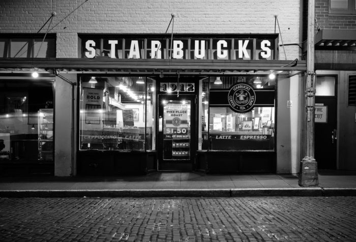
Originally, Starbucks was not going to be the popular coffee shop we know today. The intention was to sell roasted coffee and little else, all thanks to Alfred Peet who taught the 3 men the secret to roasting it.
However, to start the company, a name was necessary. The inspiration, although somewhat curious, comes from a mining map. It turns out that one of them saw the name of a city, “Starbo”, and with a little ingenuity, ended up deriving in the name Starbucks.
The sale of coffee did not begin until 15 years after the foundation of the company. Starbucks until then only sold coffee beans and gave some free samples for people to taste the coffee resulting from the product they sold.
Starbucks in the coffee business
Beyond its humble origins, the company has managed to reap enormous success, and this is combined with its wonderful logo that has reflected the state of the business during the years.
No company does not have its logo. This visual identification is essential if you want everyone to recognize your brand everywhere. And this concept is quite old, in fact, the first signs of logo date from ancient Greece, when the name of the manufacturer was carved on ceramic decorations.
Starbucks logo meaning is quite mythological. The person in the picture is a two-tailed mermaid. The intention of using a siren is that they attracted sailors to the depths, so they were irresistible.
This was not the only cause to select a siren within the original Starbucks logo. Coincidentally, to the south of the Pacific Ocean, there is an island called Starbucks, where many sailors are said to have perished before the claws of the sirens. Yes, it sounds a bit macabre, but it means that people are attracted to Starbucks coffee, or so it is said.
The popularity behind the logo
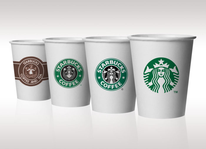
The amount of Starbucks logos that have been seen is not for less and is that every time the brand made a change, it adapted to reflect that evolution. In fact, and following the trend that was being handled at that time, the original logo was vintage and classic, with an appearance that made it related directly to spices and relaxing drinks.
This was changing over time since its popularity in the years grew towards all types of public, which forced them to adapt to a fresher image.
In all this time, the truth is that the siren has not been eliminated. Many say that this is an ingenious advertising movement since by keeping it in the Starbucks logo, the macabre theory that gives it meaning serves to attract the attention of the curious. No matter if it is to criticize, the logo has fulfilled its purpose by making them known it.
The Starbucks logo has changed over the years
Throughout all the changes that the Starbucks logo has had, it has always held firm to certain concepts that make it recognizable. Relaxing colors in a two-tone palette with simple shapes make keeping it updated easy.
The siren is the main thing; she is enclosed in a circle, all with green and white colors. At least, that’s the way it is today, but let’s look firsthand at the Starbucks logo history.
The origin in 1971
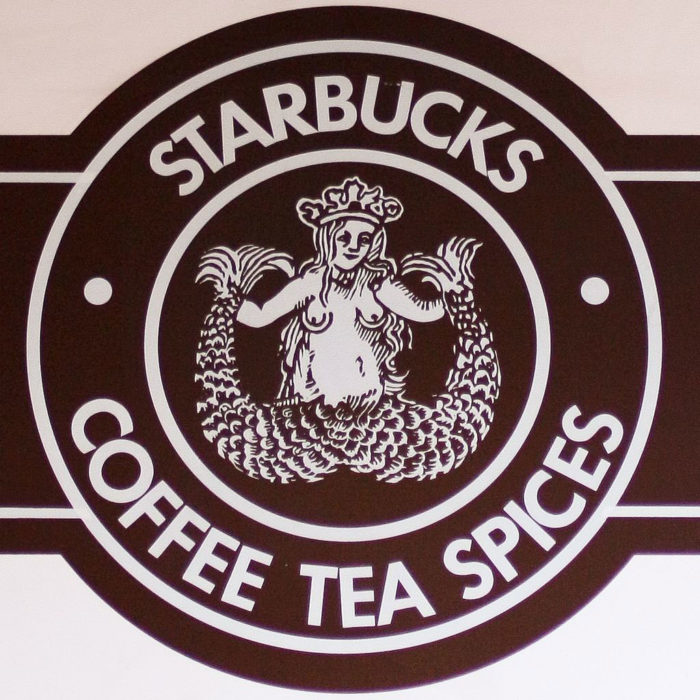
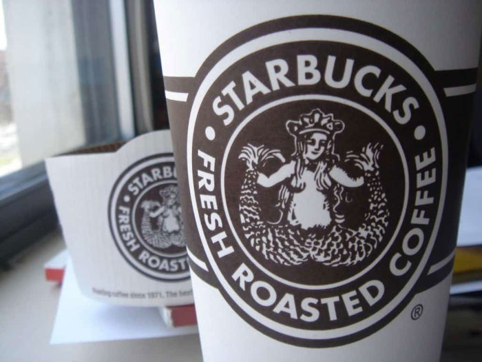
The first logo honored the sale of coffee with a brown color in its entirety. It already presented the two-tailed siren, only in this case she was topless. The circle has been maintained since its conception.
Yes, being uncovered is not the best idea in business, but this wood engraving stayed that way for quite some time. In fact, since the mermaid on its own was quite ambiguous in meaning, the original circle included the words “Starbucks-Coffee-Tea-Spices.”
Like any mermaid, she was refined, so that her dress, at least where it was, was luxurious, like the crown.
Polishing the 1987 logo
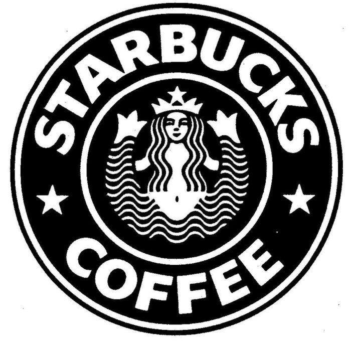
Howard Schultz acquired the brand, and with it, the logo was redesigned to make it more universal and appropriate for the masses. The circle and the mermaid were kept, but the breasts were covered by a long hair, the color of the logo was changed from brown to green (and black in the background of the mermaid), and the words that were in the circle were simplified to only “Starbucks Coffee” between 2 stars.
The green color and the stars represented the fresh change the brand was undergoing after the change of ownership, although it was still fully recognizable by the old users.
Retouching in 1992

The third logo was cleaning of elements. The Starbucks mermaid stood with a camera in the foreground of its face, which made the navel disappear. However, this was not enough to eliminate the two tails, which were still visible on the sides of the circle.
The colors and words remained, and this logo would remain intact for many years before being changed again.
From 2011 to the present

Changing to a more current movement that maintains that less is more, the design presented in 2011 (on the 40th anniversary of the brand) served to eliminate the circle that contained the brand name.
Many people disagreed with this change that contributed little to the essence of Starbucks and was strongly criticized by experts.
However, the company, who defended their position, explained all these changes. Before, it was necessary to use the letters to make a name as a brand, so that others could not copy the design of the mermaid. However, this is no longer necessary as it is worldwide recognized.
Another cause that motivated the removal of the writing is that it took up a lot of space, and usually diverted the attention of the siren.
Unraveling the new Starbucks logo

Design students in all parts of the world should know the origin and meaning of this emblematic logo. The analysis that can be done is extensive and is that the work done by Terry Heckler has a reason for being.
The idea occurred to him when he saw an Old Norse engraving from the 16th century, where a two-tailed mermaid was seen. He was responsible for modernizing it, so this old engraving managed to be part of the advertising news.
Shape: The logo has always maintained a circular shape. Before, this circle contained the name of the brand, but today that is history, although its form for the portrait of the mermaid was maintained.
Color: To make it simple, only two colors were used. All the details, as well as the mermaid’s drawing, are in white, which contrasts very well with the green color of the background. Previously, brown had been used to create a relationship with spices, but then it was changed to green to make it fresh.
The mermaid never left
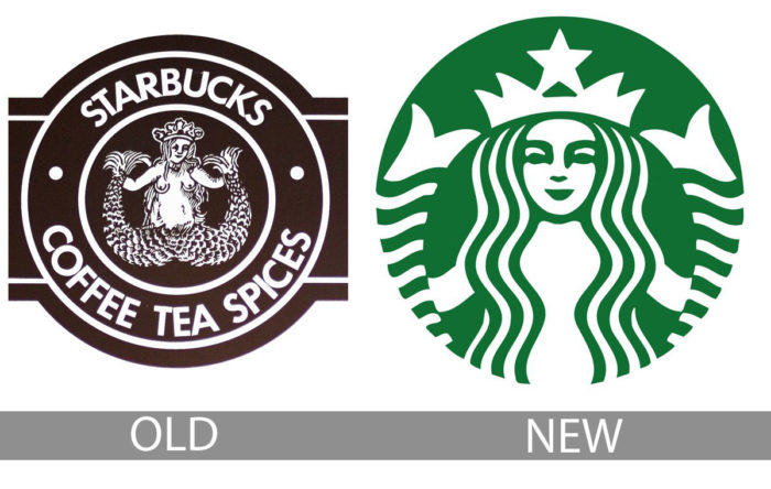 During all the changes over the years, the brand always kept the siren. Even the name disappeared, but the woman with two tails stayed. Although it is not known exactly why they left it, many believe it was to keep people’s curiosity about the story behind the logo.
Others have a simpler theory that the brand had already settled with it, and it is much more recognizable than what the letters were, so, at the time of changing it, the mermaid stayed, but the letters did not.
No matter the causes of this decision, the important thing is that a logo as eccentric as this managed to make the brand recognized worldwide, which should encourage other companies to use figures with strong meanings.
FAQ on the Starbucks logo
Why does the Starbucks logo feature a mermaid?
The mermaid, or rather, a siren from maritime folklore, was chosen for its alluring and mysterious nature. She embodies the seafaring history of Seattle, where Starbucks was founded, serving as a nod to the brand’s deep connection with coffee-charged voyages.
Has the Starbucks logo always been the same?
Not at all. This emblem of coffee culture has undergone several redesigns since 1971. Each refinement retained the siren while streamlining her image to achieve the sleek, green and white symbol we recognize today.
What does the green color in the logo signify?
Green was selected for its representation of freshness, growth, and prosperity. Starbucks aims to evoke a sense of comfort and sustainability while promoting their commitment to ethical sourcing and environmental stewardship within the coffee industry.
Is there a reason behind the Starbucks logo’s circular shape?
Sure is. The circular form encapsulates the siren in a global embrace, highlighting Starbucks’ worldwide presence. It’s a promise that wherever you are, their coffee—and thus, a piece of home—is within arm’s reach.
What was the controversy about the Starbucks logo?
Its controversy stems mostly from the logo’s evolution. Early designs were more explicit, with the siren’s bare chest visible, sparking debates. Over time, the logo has been toned down to focus on her face, ensuring broader acceptability.
How has the Starbucks logo impacted the brand’s equity?
The logo helped in creating a visual identity that’s both recognizable and reassuring, increasing brand equity. It conveys a consistent, high-quality experience, promoting brand loyalty and intellectual property value in the competitive coffee marketplace.
What was the purpose of modernizing the Starbucks logo?
Modernization aimed to simplify the logo, stripping back to essentials — the green color, circular shape, and siren — to make the branding strategy adaptable and scalable across various mediums and products without losing its heritage.
Why doesn’t the Starbucks logo include the company name?
They dropped the company name to signify maturity and ubiquity; Starbucks no longer needed text to be recognized. This aligns with the branding strategy of iconic brands that rely on visual identity over text.
How often has the Starbucks logo been redesigned?
In its 50-year history, the Starbucks logo has been redesigned four major times, each time further focusing on the siren while maintaining continuity and brand recognition.
What do the changes in the Starbucks logo represent?
Each change was more than a stylistic upgrade. It represented the company’s growth, from a single store selling coffee beans to a global chain serving millions daily, adapting to the evolving landscape of coffee culture and customer perception.
Conclusion
And there you have it, the journey of the Starbucks logo, from its humble beginnings to the emblem that ignites a craving for that perfect cup. We’ve seen how the siren’s face calls out to coffee lovers, embodying the brand identity through her mystique.
- We’ve unpacked the stories behind the green hue.
- Pondered over the controversies that stirred up as much as a Grande latte.
- Even traced the logo’s evolution through redesigns, watching it grow up, shedding its name like a proud parent lets go of a child’s hand on the first day of school.
So, next time you lift a cup sporting that mermaid, remember she’s not just serving coffee, but serving a legacy of brand loyalty and a visual promise of quality – a testament to the endearing and enduring power of great design. Raise your cup to that ingenuity. Cheers to the siren, cheers to the craft!
If you enjoyed reading this article about the Starbucks logo, you should read these as well:
- The Nike logo (symbol) and the history behind its simple design
- Round logos showcase: 23 Circular logos to inspire you
- Designing financial logos: banking, accounting, and finance designs
- The Pepsi Logo: The old, the new, its meaning and history


