The Pepsi Logo, the old, the new, its meaning and history
The Pepsi logo, often referred to as the Pepsi-Cola emblem or soda brand insignia, has not gone through much change over the years — or has it?
Many brands, especially those with iconic beverage logos, have to change their logo design.
As iconic as the Pepsi logo is, and while it might appear as a consistent blue, red, and white logo to many, it actually has undergone several changes, representing a logo evolution throughout the company’s history.
Pepsi is an instantly recognizable brand, akin to its ever-evolving Pepsi circle and stripes, and has been for decades. But changing times, logo trends, and new design sensibilities have caused shifts in the Pepsi symbol, making it a better fit for the company’s culture, attitude, and goals. In fact, Pepsi, a leading name in the carbonated drink symbol industry, has not just changed their emblem but also their name and ingredients.
This ‘Pepsi evolution’, which can also be viewed as a part of brand identity trends in the fizzing beverage branding realm, has had a profound impact on the company’s logo.
We’re going to go over the history of the Pepsi logos, which is a history of the Pepsi brand as well, akin to diving deep into the world of iconic beverage logos. It’s a good lesson for anyone looking at logo design or studying logo trends.
The Pepsi logo, in its various forms, has lasted years, at least in part because it could adapt and remain recognizable over time. Let’s see what we can learn from the story of the ever-recognizable Pepsi logo, which is an integral part of the soft drink logo trends.
The Pepsi Logo History
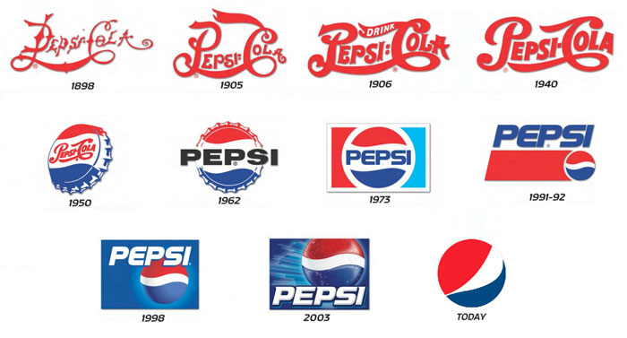
“Brad’s Drink”
Originally, Pepsi, the beverage company known for its blue, red, and white branding, was called “Brad’s Drink”. It took the name of its inventor, Caleb Bradham, after he invented it in 1893.
The name was swapped out for Pepsi, a soft drink label design that gained prominence, only a few years later in 1898, a name that was not trademarked for another five years.
Meanwhile, Coca-Cola, Pepsi’s great rival and another brand with an iconic soda brand insignia, was evolving as well.
Pepsi attempted to mimic Coca-Cola’s swirly script logo originally, and a look back at the original Pepsi logo is strikingly similar to the Coke script. The old Pepsi Cola logo resembled the Coca-Cola one quite a bit. With Pepsi, a long swirly line connected the P of ‘Pepsi’ with the ‘C’ of Cola.
Now, they were not directly trying to mimic Coca-Cola, though it was a more successful brand at the time. Instead, this elegant script logo, similar to many logos seen among the soft drink label designs was the trend among many brands at the time.
The old Pepsi logo was a white script on red and they stuck with that color scheme, similar to many beverage company logos of that era, from 1898 to 1940. This changed over time to the familiar Pepsi colors we all know now, but white and red have remained a major element of the design for 40 years.
A Major Pepsi Logo Change
In 1940, Pepsi, known for its iconic beverage logos, decided to start using a cleaner and more fundamental soda brand insignia. This marked the origin of the now-familiar circular Pepsi logo or the “Pepsi globe” as many term it, as well as the beginning of the Pepsi logo’s inclusion of the color blue, shifting its iconic blue, red, and white branding.
The choice of the circular design was because the company wanted to align with the broader soft drink label design trends and be able to incorporate the slogan of Caleb Bradham’s original group, the Original Pure Food Drink. As for the carbonated drink symbol colors, they maintained the red and white color scheme, but ushered in the blue, reminiscent of the Pepsi circle and stripes.
This had less to do with Pepsi’s history and more to do with World War II. Pepsi, looking to emphasize its brand identity in the soda industry, wanted to show its support for the troops. Red, blue, and white, iconic for both the Pepsi-Cola emblem and patriotic sentiments, were their way to do it. These colors, which became a major element of their design and fizzing beverage branding, would never leave the logo, although variations on the shades of red, white, and blue have been explored by the company.
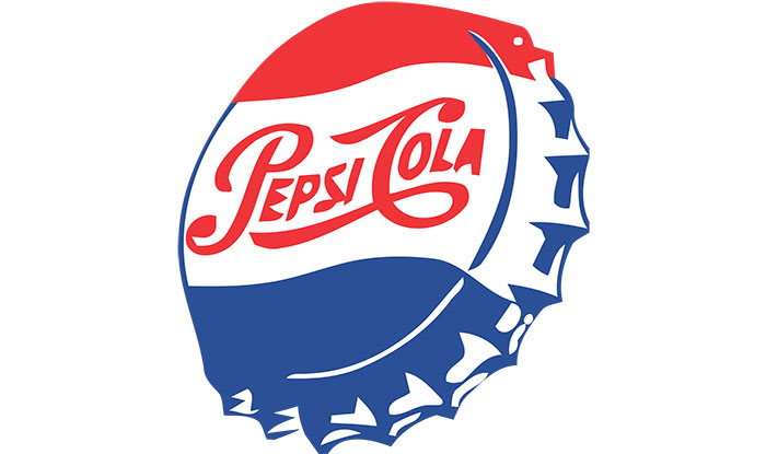
In 1943, Pepsi added flair to the bottle cap design, including “Bigger Drink, Better Taste”. Red was the top part of the circle, emblematic of many beverage company logos of the era, with blue on the bottom and white detailing. The bottle cap element, a nod to the soft drink logo trends of the time, was incorporated through the 1960s. It was during this period that the Pepsi logo, a fundamental part of the carbonated drink symbol world, began its evolution into the form we recognize today.
1960s Pepsi Logo and Bottle Design
The Pepsi logo, always evolving in line with logo trends, underwent another significant change in the 1960s. The new bottle design began to feature a serrated bottle cap, reminiscent of the ever-changing world of soda brand insignias. The colors remained iconic – red and blue, against an entirely white background, continuing the blue, red, and white branding narrative.
This was the commencement of the company’s “Pepsi Generation” ad campaign. As a part of this branding overhaul, in 1960, Pepsi, wanting to streamline its soft drink label design, dropped the word ‘Cola’ from the logo. This element was never reintroduced as a part of the Pepsi logo. In 1962, two bull’s eyes, symbols of the company’s aspiration for domination in the global soft drink market, were added adjacent to the word Pepsi.
Pepsi Logo Changes in the 1970s
![]()
In the 1970s, the Pepsi logo, aligning with the broader trends of logo evolution in the beverage industry, became more minimalistic and began its journey towards the Pepsi logo we know of today, a defining feature in the soda brand insignia landscape.
The company got rid of the swirling script and all curlicues. The word Cola remained absent from the emblem (and is rarely alluded to today in any media). Instead, there was the red and blue circular design, akin to many iconic beverage logos of the era, familiar to many even now.
The refreshed Pepsi logo placed the word Pepsi at the center of the circle, with red and blue flares, reminiscent of the Pepsi circle and stripes, above and below the word respectively.
Outside this minimalistic, smartly designed soda brand insignia circle were two trapezoids, emblematic of the blue, red, and white branding, that could be either red or blue. These iconic features could be placed either on the left or on the right. The white, which had been one of Pepsi’s original colors in their carbonated drink symbol history, was now kept as a tertiary color relegated to the border area, including the circle around the name Pepsi. In many ways, this was Pepsi’s nod to its own history and its legacy as a significant soft drink label design.
What prompted this dramatic break from the more traditional soft drink logo design? The company felt that popular culture was experiencing a shift. Technology and minimalistic beverage logos were becoming the trend.
The old swirly logo, reminiscent of many soda brand insignias of the past, and the frills of the bottle cap logo began to look outdated. They simply did not resonate with the changing times. Simple shapes and clean lines were in vogue in the world of fizzing beverage branding, while frills and curls lost their appeal. Additional details, like the bull’s eyes, were becoming redundant and were hard to discern.
A cleaner design, aligning with broader soft drink logo trends, had other advantages as well. This refined and straightforward emblem, with its basic shapes and forms, was versatile and could be adapted across a range of platforms. It also stood out more distinctly in the ever-evolving and crowded market, making Pepsi’s blue, red, and white branding more recognizable. These attributes became paramount as Pepsi ventured further into the global market.
Modernizing the Pepsi Logo
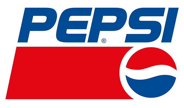
The next pivotal alteration to the Pepsi logo, a testament to its ever-evolving nature in the soda brand insignia landscape, came in 1991. The company decided that the integration of the Pepsi text with the “Pepsi globe” or circle was no longer effective. They opted instead to partition them into distinct sections of their branding graphics.
They didn’t entirely discard these elements, of course. Instead, they positioned the Pepsi name at the pinnacle of the label within the familiar trapezoid shape. The iconic red and blue circle, a central part of Pepsi’s blue, red, and white branding, was strategically placed to the right side of this trapezoid, signifying a departure from traditional design, with a renewed emphasis on text rather than the simplified circle.
With the word Pepsi no longer integral to the circular element of the carbonated drink symbol, they required another captivating element to centralize within the circle, harmonizing the contrasting red and blue halves. Their choice was a wavy white line, reminiscent of the Pepsi circle and stripes, which echoed their historical identity while offsetting the contrast with a neutral hue. It was invigorating to observe white being revived as more than a peripheral border color.
Because of this transformative design, a plethora of new branding opportunities emerged for the Pepsi logo. In recent years, Pepsi has continued its innovative streak, ushering in modifications based on this separated logo design layout.
Changes to the Pepsi Logo Circle in the Modern Era
![]()
In 1998, Pepsi celebrated its 100<sup>th</sup> anniversary, marking a century of its carbonated drink legacy. To commemorate this achievement, they altered their soda brand insignia.
The background, a critical component of their soft drink logo design, was transformed to blue, in sync with the blue, red, and white branding. White was reinstated prominently to highlight the name Pepsi. This revamped Pepsi logo was envisioned to exude a more refreshing and contemporary look, with a three-dimensional appearance that resonated better with the changing soda brand insignia trends of the time.
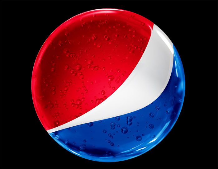
For a decade, this emblematic design remained consistent until a significant revision in 2008. The Pepsi circle, a central element in their fizzing beverage branding, regained its dominance, hovering above the company’s name.
The swirling white line, a distinguishing characteristic of the Pepsi circle and stripes, which separated the red and blue halves, adopted an upward tilt and took on a more wave-like pattern. This design evolution evoked the imagery of a smiley face, infusing the logo with a cheerful aura.
Subtle shifts in the shading at the circle’s zenith added a nuanced touch. This made the iconic Pepsi logo appear more spherical, with a pronounced 3D allure that screamed modernity and aligned with the carbonated drink symbol aesthetics of the time. The design felt dynamic, captivating the gaze of onlookers.
Contemporary audiences, well-versed with evolving soda brand insignias, anticipate designs that adeptly utilize perspective and proportionality.
Arnell group undertook this logo refresh, with a price tag of one million dollars. Its debut faced initial skepticism from the public.
Nevertheless, budding logo designers should assimilate a crucial lesson – logo revisions, despite their alignment with current soft drink logo trends, often face initial resistance. Patience is paramount, allowing adequate time to truly gauge the new logo’s resonance with the target demographic.
From its inception in 1898, the Pepsi logo has weathered numerous transformations. While it evolved in tandem with prevailing trends, technological advancements, and audience expectations, it remained tethered to its roots. This beverage logo design safeguarded its quintessential iconic markers, ensuring it never metamorphosed entirely.
Pepsi grasped the significance of brand loyalty in the world of fizzing beverage branding. An abrupt, full-scale change would risk alienating its dedicated audience base.
What is the Pepsi Logo Meaning?
The Simple Nature of Pepsi’s Insignia
The logo is simple and always has been, even when it incorporated elaborate swirling text, reminiscent of traditional soft drink branding. It was never heavy on the details. The most intricate element, reminiscent of soda brand insignias of its era, was its two bull’s eyes. They were emblematic of Pepsi’s dominant position in the carbonated drink market. Or so you think.
Delving Deeper: The Hidden Meanings
There’s profound symbolism nested within this ostensibly straightforward beverage logo design.
Let’s journey back to the company’s roots. Caleb Bradham, the genius behind Pepsi, concocted the drink within the confines of his pharmacy. Interestingly, the term ‘pharmacy’ traces its origins to the Greek pharmakia, signifying sorcerer.
Such connections might appear far-fetched initially, but the narrative unfolds. Bradham aspired to pioneer the modern era’s first energy drink, a precursor to today’s fizzing beverage craze. In a way, he channeled his inner sorcerer. The era marked the dawn of modern chemistry weaving its transformative magic across diverse life facets.
The Transition to the Circular Logo: A Mysterious Undertone
When Pepsi metamorphosed its branding to adopt the circular logo, they expended millions, aiming for an insignia imbued with clandestine occult symbolism. The task fell upon the maverick designer, Peter Arnell of the Arnell Group. Beneath the surface of this simple Pepsi emblem, lies a tapestry of intricate symbolism.
The tri-segmented logo, sporting a red zenith, a blue nadir, and demarcated by a sinuous white stripe, conjures images of the American flag. Yet, deeper interpretations emerge. The hues symbolize concepts as diverse as earth’s magnetic field, feng shui dynamics, Pythagoras geodynamics, Einstein’s theory of relativity, and the enigmatic golden ratio.
Though it might reek of hyperbole, these interpretations trace their origins to Arnell’s vision. A 27-page dossier Arnell crafted for PepsiCo, which inadvertently found its way to Newsweek, reveals this.
The logo, it’s suggested, alludes to architectural marvels like the Parthenon, artistic masterpieces like the Mona Lisa, scientific wonders like the relativity of space-time, and nature’s phenomena like magnetic fields. It hints at the “gravitational allure” a Pepsi can exerts on the supermarket aisle and metaphorically ties to cosmic expansion rates.
Public Reception and Legacy
Such esoteric explanations, at face value, bordered on the absurd. Many speculated the memo’s authenticity. Arnell’s avant-garde design approach attracted its fair share of detractors, with peers often ridiculing his “expensive lunatic” approach.
However, the design narrative took an unforeseen twist. The revamped logo proved a boon for Pepsi, garnering accolades from consumers and bottlers alike. It seemed to reinvigorate the company’s trajectory. Regardless of the contentious underpinnings of the Pepsi logo, its design genius remains indisputable.
Its omnipresence is undeniable – from cans, bottles, ads, to race cars, apparel, and vehicles. Its impact was so profound that the South Korean flag was mistakenly associated with the Pepsi logo during the 2018 Winter Olympics.
The 2023 Pepsi Logo

Pepsi is launching a bold new logo and visual identity and judging by the comments in this YouTube video, people are actually liking the new version.
FAQ about the Pepsi logo
What’s the history behind the Pepsi logo?
The Pepsi logo, often considered an iconic beverage brand insignia, has a rather fascinating history. Born in 1898 when pharmacist Caleb Bradham concocted Pepsi-Cola, this emblem epitomized the carbonated drink market of its time.
Over subsequent decades, the design underwent numerous transformations, mirroring prevailing trends and styles. The 2008 logo iteration, drawing inspiration from the “smiley face,” encapsulates a contemporary, dynamic, and youthful brand ethos. It’s akin to traversing through a visual timeline.
What does the Pepsi logo symbolize?
The Pepsi logo, more than just a mere soft drink branding element, encapsulates a deeper narrative. The “Pepsi Globe,” marked by a circle bisected by a wavy line, exemplifies Earth and Pepsi’s global footprint.
Its red, white, and blue palette echoes the American spirit, and those curved motifs echo the effervescent and refreshing taste of the soda. Intriguing, isn’t it?
Has the Pepsi logo always maintained a consistent design?
Far from it! The Pepsi emblem, much like other soda brand insignias, has witnessed considerable evolution. From its inception in 1898, it has navigated through roughly 11 pivotal design metamorphoses.
The 2008 transformation heralded the present-day “Pepsi Globe.” Every design iteration mirrored its era’s zeitgeist, ensuring Pepsi remained vibrant and pertinent. It offers a visual chronicle of the brand’s illustrious journey.
Who is the brain behind the current Pepsi logo?
The contemporary Pepsi emblem owes its existence to the Arnell Group. Stationed in New York, this branding powerhouse was tasked with imparting a renewed, avant-garde flair to Pepsi’s image.
Following exhaustive research, they birthed the now-familiar “Pepsi Globe” in 2008. It’s analogous to bestowing Pepsi with a revamped aesthetic wardrobe.
What was the financial outlay for the current Pepsi logo?
Prepare for a jolt – the current Pepsi logo’s creation purportedly drained close to $1 million from the company’s coffers. And yes, that’s accurate.
This astronomical figure encompasses the holistic process, from preliminary research, design conceptualization to the intricate facets of marketing during its grand unveil. Quite the investment for a beverage logo, wouldn’t you agree?
Why did Pepsi undergo a logo transformation in 2008?
Pepsi, always eager to adapt to the fizzing beverage industry, yearned for relevance and a magnetic appeal to the millennial cohort. The 2008 logo revision aimed at capturing a fresh, progressive, and kinetic image, ensuring resonance with the contemporary consumer base.
Coupled with its goal to channel the exhilarating aura and kinetic energy synonymous with the brand, it was about ensuring Pepsi remained in vogue.
Are cryptic elements embedded within the logo?
While the Pepsi logo, much like other beverage insignias, has been rife with speculative hidden connotations, most are conjectural. Some discern a jubilant face within its contours, while a few draw parallels with the yin-yang symbol.
In essence, the primary objective was crafting an emblem echoing exhilaration, dynamism, and worldwide allure.
The focus veered towards epitomizing the brand’s quintessence rather than embedding clandestine messages.
How has the logo influenced the branding strategies of other brands?
The Pepsi logo, often perceived as a stellar beverage brand insignia, has indubitably left its mark on various brands over the years.
Its success in navigating the changing landscape of consumer preferences and branding trends has galvanized other enterprises to adapt similarly.
This knack for evolutionary rebranding – melding the old with the new while preserving its intrinsic identity – is a branding playbook other entities have sought to emulate.
In the realm of brand identity and soft drink marketing, Pepsi has cemented its stature as a trendsetter.
What distinguishes the Pepsi emblem from the Coca-Cola insignia?
The age-old juxtaposition between Pepsi and Coca-Cola isn’t solely confined to taste – their logos too have been the subject of many a debate.
These soda brand insignias, while both iconic, differ markedly in design ethos.
Coca-Cola’s insignia is emblematic of its heritage, employing a distinctive script font that exudes timelessness and classic elegance.
Contrarily, the Pepsi emblem epitomizes modernity and kinetic energy, with the “Pepsi Globe” encapsulating movement, vivacity, and global resonance. Thus, each carves out its unique brand narrative and identity.
What inspired the tricolor scheme of the Pepsi logo?
Diving into the chromatic choices of the Pepsi logo unveils profound symbolism. The triad of red, white, and blue isn’t a mere aesthetic choice but resonates with deeper connotations. These hues are a nod to the American spirit, underscoring Pepsi’s roots in the United States and its ascent in the carbonated drink market.
Furthermore, this palette is meticulously chosen to induce sentiments of nationalism and pride. Coupled with the colors’ representation of Pepsi’s effervescence and invigorating taste, the logo becomes a visual ode to the brand’s essence.
Ending thoughts on the Pepsi logo design
The Pepsi logo has been through several iterations. You can see how market and cultural trends made their mark on it, yet there were core visual and design principals the brand stuck despite those changes.
If you enjoyed reading this article about the Pepsi logo, you should read these as well:
- Best free fonts for logos: 72 modern and creative logo fonts
- Animal logo design ideas and guidelines to create one
- Coca Cola And Pepsi Print Ads (37 Advertisements)
- Personal Logo Design Ideas: How to Create Your Own
Bogdan Sandu, a seasoned designer with 15 years of diverse experience, has been designing websites since 2008.
Renowned for his expertise in logo design and visual branding, Bogdan has developed a multitude of logos for various clients.
His skills extend to creating posters, vector illustrations, business cards, and brochures. Additionally, Bogdan's UI kits were featured on marketplaces like Visual Hierarchy and UI8.
Latest posts by Bogdan Sandu (see all)
- The Bethesda Logo History, Colors, Font, And Meaning - 28 April 2024
- Out of This World: Space Color Palettes for Cosmic Designs - 28 April 2024
- The Bungie Logo History, Colors, Font, And Meaning - 27 April 2024