The Washington Nationals logo is one of the most recognized marks in Major League Baseball. Built around a stylized cursive “W” in red and navy blue, the emblem ties together the franchise’s identity with Washington, D.C.’s deep baseball roots. The current primary version was introduced in 2011 and has since become a fixture on caps, jerseys, and merchandise across the league.
This logo sits within a broader tradition of American sports branding where single-letter marks carry enormous weight. Think about how much a letter can do when it’s the right letter, in the right city, for the right team. The Nationals’ curly W does exactly that. It connects a relocated franchise to decades of D.C. baseball history while still feeling fresh.
The current version is a combination mark featuring the curly W inside a circular badge. It was first introduced in 2011. The franchise itself was founded in 1969 as the Montreal Expos, then relocated to Washington in 2005. Over the years, the team has gone through roughly five to six distinct logo versions spanning both cities.
What Is the Washington Nationals Logo?
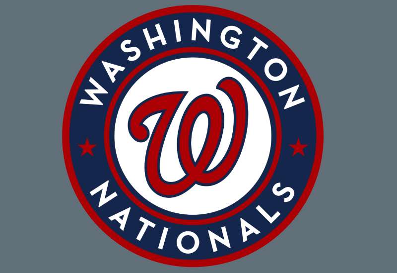
The Washington Nationals logo is a red stylized cursive “W” placed on a white background inside a navy blue circular badge with red outlines, two red five-pointed stars, and the full team name “WASHINGTON NATIONALS” written in white around the border. Introduced in 2011, it was designed by Todd Radom, who adapted the original curly W from the Washington Senators era.
Here’s what you need to know about this mark:
- Design Type: Combination mark (letterform inside an emblem/roundel)
- Primary Elements: Cursive red “W” letterform, circular navy blue frame, two red stars, team wordmark in white, thin red outline rings
- Official Introduction Date: 2011 season (unveiled November 2010)
- Designer: Todd Radom, a sports branding specialist who recast the Senators’ vintage W for MLB
- Trademark Status: Registered under Washington Nationals Baseball Club, LLC and protected through MLB’s intellectual property portfolio
- Color Palette: Scarlet Red (#AB0003), Navy Blue (#14225A), White (#FFFFFF)
- Usage Context: Jerseys, caps, stadium signage at Nationals Park, digital platforms, licensed merchandise, broadcast graphics, and promotional materials
How Has the Washington Nationals Logo Evolved Over Time?
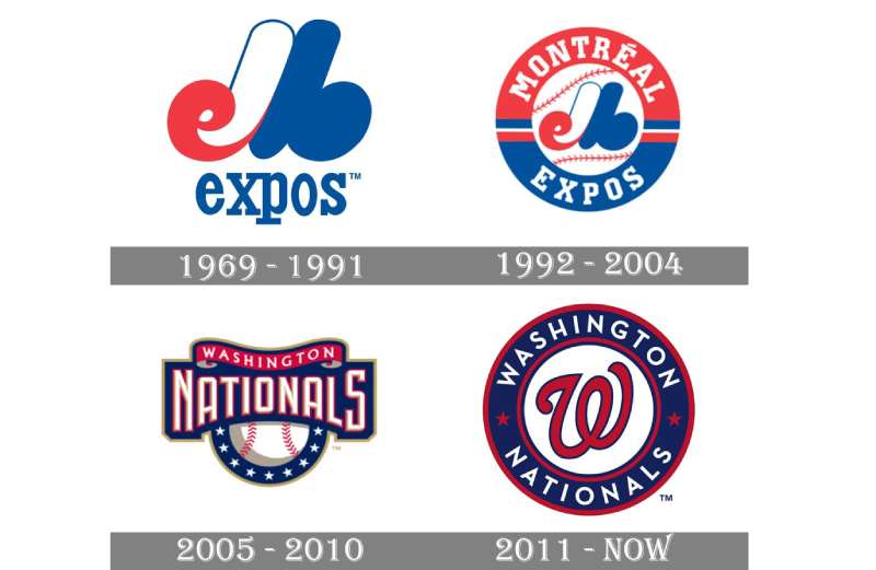
The franchise’s logo history spans two countries and over five decades. It began in 1969 with the Montreal Expos’ clever “EMB” monogram, passed through a circular badge redesign in 1992, and then completely shifted to the curly W after the team moved to Washington in 2005.
The 2011 update cleaned everything up. Gold accents were dropped, and the curly W became the undisputed centerpiece.
Original Montreal Expos Logo (1969-1991)
- Years Active: 1969-1991
- Design Description: A stylized monogram combining the letters “e,” “M,” and “b” (standing for Expos de Montreal Baseball). The lowercase “e” formed from the left curve of a capital “M,” with a lowercase “b” created by the right leg. Below sat the word “expos” in a lowercase serif font.
- Color Scheme: Red, white, and blue (a combination that would stick around for the entire franchise history)
- Designer: Created as part of the original franchise branding when Montreal was granted an expansion team
- Context: The Expos were part of a four-team MLB expansion. The “EMB” monogram was clever, almost puzzle-like, and it became one of the more interesting letter combinations in baseball team logos.
- Cultural Significance: It represented Canada’s first MLB franchise and became a beloved symbol in Montreal for over two decades
Montreal Expos Circular Badge (1992-2004)
- Years Active: 1992-2004
- Design Description: The “EMB” letterform was placed on a white baseball with red stitching, all enclosed inside a circular red and blue ring bearing the “Montreal Expos” name in uppercase serif lettering
- Color Scheme: Red, white, and blue
- Key Changes from Previous: Added a roundel format, introduced the baseball graphic, and switched to all-caps serif text. The standalone monogram was now framed inside a badge structure.
- Context: The redesign came as the team changed ownership. Claude Brochu purchased the franchise in 1991, and a visual refresh followed.
- Cultural Significance: This version saw the team through its most turbulent years, including failed contraction plans and MLB eventually buying the franchise to keep it alive
First Washington Nationals Logo (2005-2010)
- Years Active: 2005-2010
- Design Description: A white baseball with red stitching, overlaid by a blue banner containing the word “Nationals” in white with gold beveling, plus a red ribbon above it reading “Washington.” Nine white stars appeared below the wordmark. The team also introduced the curly W as an alternate cap logo.
- Color Scheme: Red, navy blue, white, and gold accents
- Designer: Todd Radom handled the rebranding for the relocated franchise
- Key Changes from Previous: A complete identity overhaul. Gone was the Expos monogram. Everything shifted to reflect the new Washington, D.C. home. The curly W was borrowed from the old Washington Senators (the team that eventually became the Minnesota Twins).
- Context: Washington, D.C. was chosen as the relocation city in 2004. The new name was announced on November 21, 2004. This was the first MLB franchise in D.C. since the Senators left in 1971.
- Cultural Significance: It brought professional baseball back to the nation’s capital after a 33-year gap. The gold accents gave it a government-document-like feel, which some fans loved and others found a bit much.
Current Washington Nationals Logo (2011-Present)
- Years Active: 2011-present
- Design Description: Red cursive “W” with navy blue outline centered on a white circle. The circle sits inside a wide navy blue ring with “WASHINGTON NATIONALS” in white uppercase letters. Two red five-pointed stars separate the two words. Thin red rings outline the entire badge on both sides.
- Color Scheme: Scarlet red, navy blue, white (no more gold)
- Key Changes from Previous: Gold was eliminated completely. The curly W moved from being an alternate mark to the primary visual. The overall design became cleaner, tighter, more confident.
- Context: Unveiled at a “fashion show” event at Nationals Park in November 2010. Players including Ryan Zimmerman and Drew Storen modeled the new uniforms. This logo was on the team’s chest for the entire golden era of the 2010s, including the 2019 World Series championship.
- Cultural Significance: The curly W roundel is now the definitive symbol of D.C. baseball. It’s the mark fans wore when the Nationals beat the Houston Astros in seven games in 2019. That association alone makes it one of the more meaningful red logos in professional sports.
What Do the Design Elements of the Washington Nationals Logo Mean?
Every piece of this logo points back to place and tradition. The cursive W is about Washington. The circular badge format recalls official seals. And the red, white, and blue palette mirrors the national flag, which makes sense when your home stadium sits about two miles from the U.S. Capitol.
The two stars separating “Washington” and “Nationals” on the badge ring add some structure. They also give the roundel a more official, almost governmental appearance.
Why Did the Washington Nationals Choose These Specific Colors?
The color choices are straightforward. Red, white, and blue are the colors of the American flag, and there’s really no better palette for a team representing the nation’s capital.
Scarlet Red (#AB0003) – Pantone PMS 193 C. This is the dominant color. It carries energy and aggression, which works well for a competitive sports brand. It also directly ties to the U.S. flag’s red stripes.
Navy Blue (#14225A) – Pantone PMS 2766 C. A deep, serious blue that grounds the design. It adds weight to the badge and keeps the logo from feeling too loud. From a color psychology standpoint, navy blue signals trust and authority.
White (#FFFFFF) – Used for the text and as the background of the central circle. White gives the red W room to breathe and keeps the overall mark readable at small sizes.
The color palette is shared with MLB itself (red, white, and blue), though the specific shades differ. It’s a safe choice, sure. But safety isn’t always a bad thing when you’re building a brand that needs to represent an entire city.
What Typography Style Is Used in the Washington Nationals Logo?
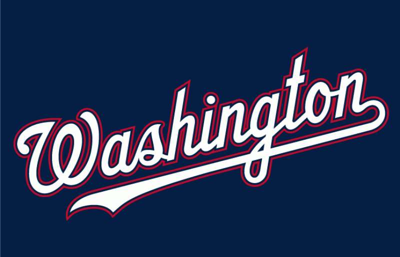
The curly W itself uses a custom cursive typeface that looks hand-drawn. It’s fluid, with rounded strokes and an almost calligraphic quality.
The surrounding text, “WASHINGTON NATIONALS,” uses a clean sans-serif font that closely resembles Neutraface Text Bold. All capitals. No serifs. Straight, geometric characters that contrast with the flowing W at the center.
That mix of a loose, organic letterform with rigid, structured text is smart. It creates tension. The W feels alive while the wordmark stays grounded and readable. Took me a while to appreciate how well those two styles play off each other.
What Are the Hidden Meanings in the Washington Nationals Logo?
There aren’t really hidden meanings in the traditional sense. But a few things are worth noting.
The curly W was originally used by the Washington Senators back in the 1960s. Using it for the Nationals was a deliberate choice to bridge past and present D.C. baseball. It’s a borrowed legacy, which some fans love and purists debate.
The circular badge format looks a lot like an official government seal. For a team based in the political capital of the country, that’s not accidental. It gives the logo a sense of authority and permanence.
And then there’s the Walgreens thing. The curly W is remarkably similar to the drugstore chain’s logo. Designer Todd Radom has acknowledged the resemblance. Walgreens never sued, likely because a pharmacy and a baseball team aren’t competing for the same customers. But if you’ve ever been confused by someone’s hat at a distance, you’re not alone.
How Does the Washington Nationals Logo Compare to Competitor Logos?
Among NL East rivals, the Nationals logo holds its own. The Atlanta Braves logo uses a tomahawk mark with a script wordmark. The New York Mets logo features a skyline inside a circle. The Philadelphia Phillies logo goes with a scripted “P” and a liberty bell.
The Nationals stand out because of how simple the curly W reads at small sizes. On a cap, it’s instantly identifiable. That’s something not every baseball mark achieves.
If you compare it across the full MLB landscape, the Nationals’ roundel format has some visual cousins. The Milwaukee Brewers logo also uses a circular badge with a monogram. The Minnesota Twins logo (the Nationals’ franchise ancestor, remember) uses a wordmark inside a circular shape too.
Where the Nats logo does well is in its consistency. Red, white, blue. Curly W. Roundel. It doesn’t try to do too much. Compared to the Miami Marlins logo, which went through a colorful redesign, or the Arizona Diamondbacks logo, which uses a more complex snake-letter hybrid, the Nationals keep it clean.
What Are the Technical Specifications of the Washington Nationals Logo?
Official Color Codes
Primary Color: Scarlet Red
Secondary Color: Navy Blue
- Hex: #14225A
- RGB: (20, 34, 90)
- CMYK: (100, 95, 34, 29)
- Pantone: PMS 2766 C
Accent Color: White
- Hex: #FFFFFF
- RGB: (255, 255, 255)
- CMYK: (0, 0, 0, 0)
Dimensions and Proportions
The logo uses a circular format, so the aspect ratio is effectively 1:1. The curly W occupies approximately the center 60% of the inner white circle. The navy ring with the team name takes up the remaining border space.
Clear space requirements follow standard MLB brand guidelines, meaning the logo should maintain a buffer zone equal to roughly 10% of the logo width on all sides. Minimum display size for print applications is typically around 0.5 inches in diameter to keep the text legible.
The logo works as a vector graphic for scalability. For web applications, it’s distributed in PNG and SVG formats. Print work requires high-DPI files, usually 300 DPI or higher for merchandise and signage.
What Cultural Impact Has the Washington Nationals Logo Had?
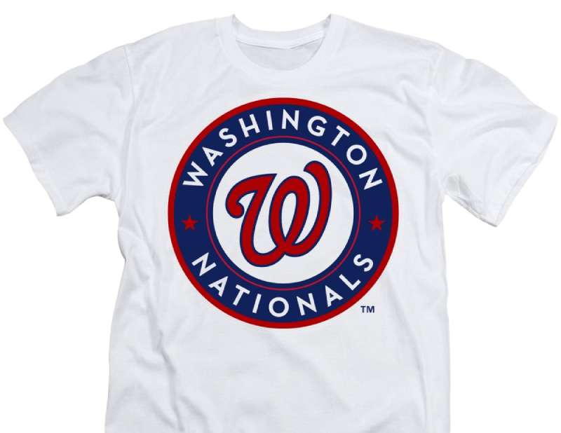
The curly W became a citywide symbol during the Nationals’ 2019 World Series run. You saw it everywhere in D.C., on cars, storefronts, office buildings, even projected onto landmarks. It stopped being just a sports logo and became shorthand for civic pride.
For a team that only arrived in 2005, that’s pretty fast. Most franchises take decades to build that kind of local attachment.
The Walgreens comparison turned into a running joke that actually helped the logo’s visibility. People talked about it, shared memes, debated it on social media. Free publicity, basically.
And the cherry blossom City Connect uniforms from 2022 to 2024 showed that the franchise could stretch its visual identity beyond the curly W without losing itself. The gray and pink design was a departure, but the core logo remained the anchor.
How Does the Washington Nationals Logo Fit Into the Overall Brand Identity?
The curly W sits at the center of a layered identity system. There’s the primary roundel logo, the standalone curly W cap logo, an interlocking “DC” mark, and various wordmark treatments used across uniforms and merchandise.
The team’s visual identity connects to Nationals Park, the D.C. flag’s stars and bars, and the broader heritage of Washington baseball going back to the original Senators. Even the mascot Screech (a bald eagle) plays into the patriotic branding.
In recent years, the organization has been experimenting. The 2024 uniform changes downplayed the curly W on jersey fronts, bringing back a block W inspired by the Senators era and reintroducing the interlocking DC. Some fans weren’t thrilled about that shift.
But the curly W remains on caps, on the primary logo, and across most merchandise. It’s still the thing that says “Nationals” to most people. The brand style guide keeps it consistent across all platforms, from broadcast to social media to packaging for licensed products.
How Should the Washington Nationals Logo Be Used?
Official usage guidelines include:
- Do not alter the colors, proportions, or orientation of the logo
- Maintain required clear space around the mark at all times
- Do not place the logo on busy backgrounds that reduce readability
- Use only approved color variations (full color, single color white, single color black)
- Never stretch, distort, or add effects like shadows or gradients to the official mark
Where to access official logos: Licensed versions are available through MLB’s official brand portal. Media outlets receive approved assets through MLB Communications. Fan and editorial use falls under MLB’s media guidelines.
Licensing information: All Washington Nationals logos are licensed through Major League Baseball Properties. Any commercial use requires an official licensing agreement. Merchandise sold through Fanatics, New Era, Nike, and other partners operates under these agreements.
Trademark protection: The Washington Nationals name, curly W, and related marks are registered trademarks of Washington Nationals Baseball Club, LLC. MLB actively monitors and enforces trademark use. Unauthorized reproduction on merchandise, apparel, or digital products can result in legal action. Even fan-made items sold commercially fall under these protections.
FAQ on The Washington Nationals Logo
What does the Washington Nationals logo look like?
The current Washington Nationals logo features a red curly W with a navy blue outline centered on a white circle. A navy blue ring surrounds it, displaying “WASHINGTON NATIONALS” in white uppercase letters. Two red stars separate the words.
When was the current Nationals logo introduced?
The current primary logo was introduced for the 2011 season. It was unveiled in November 2010 at Nationals Park during a uniform reveal event.
Gold accents from the previous version were removed entirely. The curly W became the main focus of the team’s visual identity.
Who designed the Washington Nationals curly W?
Sports branding specialist Todd Radom designed the Nationals’ identity. He adapted the original curly W from the Washington Senators, the D.C. baseball team that relocated to Texas in 1971. The mark was recast specifically for MLB’s new franchise.
What are the official Washington Nationals logo colors?
The official team colors are scarlet red (#AB0003), navy blue (#14225A), and white (#FFFFFF). These match the complementary color scheme of the American flag.
Red carries Pantone PMS 193 C. Navy blue uses PMS 2766 C.
What did the Nationals logo look like before the curly W?
The 2005-2010 logo showed a white baseball with red stitching, a blue banner reading “Nationals” with gold beveling, and a red ribbon above it with “Washington.” Nine white stars sat below the wordmark. It was busier than what came after.
Why does the Nationals logo look like the Walgreens logo?
Both use a cursive W with similar styling. The Nationals borrowed their W from the 1960s Washington Senators. Walgreens has used a similar mark since the 1950s. The resemblance is coincidental, and Walgreens never pursued legal action against MLB.
What is the connection between the Nationals logo and the Washington Senators?
The curly W was originally worn by the Washington Senators before they became the Minnesota Twins in 1961. When the Nationals arrived in D.C. in 2005, they adopted this letterform to connect with the city’s baseball heritage and NL East traditions.
Can I use the Washington Nationals logo for personal projects?
The logo is a registered trademark of Washington Nationals Baseball Club, LLC. Any commercial use requires licensing through Major League Baseball Properties. Personal, non-commercial fan use is generally tolerated, but selling merchandise with the mark is not allowed without permission.
Has the Nationals logo changed since the 2019 World Series?
The primary roundel logo hasn’t changed since 2011. But the team has introduced alternate marks. A cherry blossom City Connect uniform ran from 2022 to 2024. In 2024, uniform changes reduced the curly W’s presence on jersey fronts.
Where can I download the official Washington Nationals logo?
Official logo files are available through MLB’s brand portal for licensed partners and media. Fans can find approved PNG images on the team’s official website. For vector or high-resolution files, you’ll need to go through MLB’s licensing channels.
Conclusion
The Washington Nationals logo has done something that most relocated franchises struggle with. It built real loyalty in a new city, fast. The curly W went from a borrowed Senators mark to a symbol that an entire fanbase rallied behind during a World Series run.
That’s not easy to pull off with a single letterform inside a roundel.
Whether it shows up on a New Era cap, a jersey at Nationals Park, or a bumper sticker in Northern Virginia, the mark reads the same every time. Clean red, navy blue, and white. No clutter.
For a franchise that started as the Montreal Expos and spent years fighting for survival, having a logo this recognizable across MLB merchandise and D.C. culture is a solid win.

Renowned for his expertise in logo design and visual branding, Bogdan has developed a multitude of logos for various clients.
His skills extend to creating posters, vector illustrations, business cards, and brochures. Additionally, Bogdan's UI kits were featured on marketplaces like Visual Hierarchy and UI8.
He also wrote in the past years on sites like Design Your Way, WebDesignerDepot, WPDean, Designmodo, Speckyboy, Slider Revolution, and more.
- The Windsurf Logo History, Colors, Font, And Meaning - 10 October 2026
- How to Remove Background From Product Photos (No Photoshop) - 10 October 2026
- How Designers can Build a Stronger Online Creative Identity - 9 October 2026

Bogdan Sandu is a seasoned designer who has been designing websites since 2008. Renowned for his expertise in logo design and visual branding, Bogdan has developed a multitude of logos for various clients. His skills extend to creating posters, vector illustrations, business cards, and brochures. Additionally, Bogdan's UI kits were featured on marketplaces like Visual Hierarchy and UI8. He also wrote in the past years on sites like Design Your Way, WebDesignerDepot, WPDean, Designmodo, Speckyboy, Slider Revolution, and more.
You Might Also Like