


The New York Mets Logo History, Colors, Font, and Meaning
Imagine the pulse of thousands cheering, the crack of the bat, the roar of the crowd as fabric emblazoned with a symbol unites them all. That symbol, the New York Mets logo, stands as a beacon of pride and passion, a visual anthem for a city and its baseball saga.
It is more than just a design; it’s a storied emblem woven into the fabric of Major League Baseball and the vibrant culture of Queens, New York.
Within this article, a tapestry unfolds—the blue and orange hues of triumph, the insignia design that has seen miraculous victories and heart-wrenching defeats.
You will delve into the very stitches that bind Mets franchise history, from the iconic skyline dominating the crest to the endearing eccentricities of Mr. Met.
Explore how this powerful sports team branding goes beyond the diamond, influencing fan apparel and encapsulating a sports identity that resonates throughout Citi Field and beyond.
Uncover the elements that make this badge a timeless token of New York sports—this is your gateway to understanding the legacy that is the New York Mets logo.
The Meaning Behind the New York Mets Logo
![]()
Oh, the world of logos. Dive deep, and there’s always a story waiting to be told. The New York Mets logo? It’s no different. It’s not just about baseball – it’s a visual narrative about the city, the team, and the spirit of the game.
Symbolism Unveiled
When you first glance at that logo, it’s more than a mere piece of graphic design.
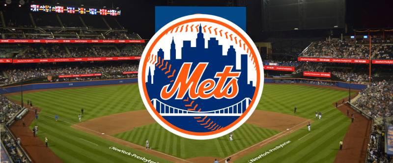
The skyline in the logo? That’s the New York skyline, with iconic structures woven in. It’s a nod to the city they represent. The bridge? It represents the joining of New York’s five boroughs, symbolizing unity and strength.
Baseball’s Essence
The baseball element in the logo? Oh, it’s not just there because they play the sport. It’s the heart of the game, the passion, the spirit. It embodies every pitch, every hit, and every moment that makes your heart race.
The History of the New York Mets Logo
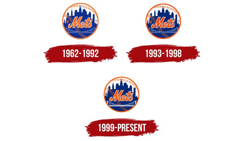
Ah, history, the intriguing tales of yesteryears. The New York Mets logo, too, carries within it a dash of the past.
Humble Beginnings
Way back, when rock ‘n’ roll was young and everything was in black and white (figuratively speaking), the Mets logo was birthed. It drew inspiration from two former New York teams: the Giants and the Dodgers. Paying homage, while creating something entirely new.
The Evolution
Over the years, it’s evolved. Small tweaks here and there, but the essence? Unchanged. Timeless.
The Colors of the New York Mets Logo
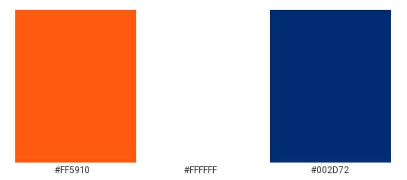
Colors aren’t just colors, especially in logos. They shout emotions, set moods, and tell tales.
Orange and Blue
Bright, vibrant orange juxtaposed with a deep, rich blue. The blue pays tribute to the Brooklyn Dodgers, while the orange hails from the New York Giants. It’s more than color – it’s history and homage.
The Font Used in the New York Mets Logo
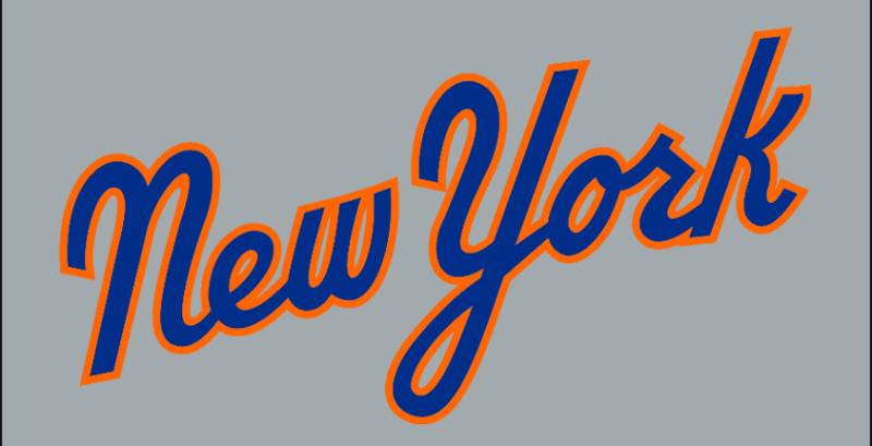
Typography Tells
Fonts, they’re not just letters. They have personality. The font in the Mets logo? It’s bold, it’s strong, but it’s also classic. It speaks of tradition, but with a contemporary twist. Just like New York itself.
The Influence on Popular Culture
The Mets logo isn’t confined to baseball. Its reach goes beyond the pitch.
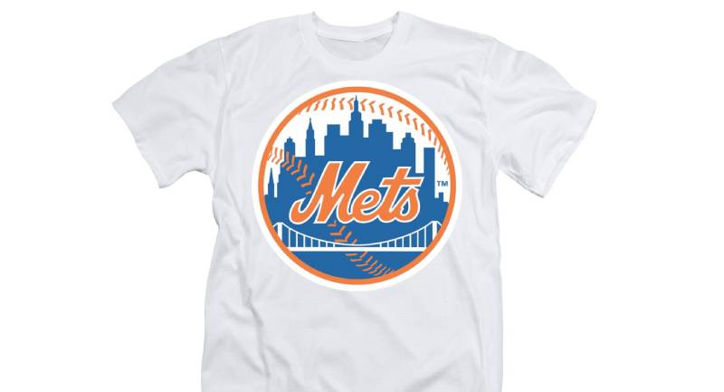
Fashion Statements
Caps, T-shirts, jackets. The Mets logo is a fashion icon in its own right. Worn not just by the sports enthusiast but by anyone with a taste for style and a love for New York.
In Music and Arts
Ever noticed how many times this logo pops up in music videos, films, or artwork? It’s because it’s more than a logo. It’s a symbol of a city, a vibe, a culture.
Global Recognition of the Logo
It’s not just a New York thing.
A Universal Symbol
Across the seas, in tiny cafes in Paris, bustling streets of Tokyo, or colorful markets of Marrakech, sport that Mets cap, and someone’s bound to nod in recognition. It’s universal, a symbol known and respected.
Merchandise Glory
From baseballs to posters, the New York Mets logo graces countless products. It’s a testament to the timeless appeal of this insignia.
FAQ On The New York Mets Logo
What’s the history behind the New York Mets logo?
The emblem, a harmonious blend of orange and blue, ties back to New York’s baseball heritage—orange from the Giants, blue from the Dodgers. Its skyline, featuring iconic buildings, underscores the city’s robust character.
A brainchild of sports cartoonist Ray Gotto, the logo debuted with the franchise, symbolizing the dawn of a fresh Major League chapter.
Has the Mets logo changed over time?
Subtle tweaks, yes; seismic shifts, no. Since its inception, the Mets logo has mostly clung to its roots. Minor updates refine but don’t redefine; think alterations to the skyline elements or color adjustments.
The essential form remains a steadfast banner for the Amazins and their fiercely loyal cohorts.
What do the colors in the Mets logo represent?
An ode to history, blue bridges back to Brooklyn Dodgers; orange, a tip of the hat to New York Giants. Together, they craft a visual chant that resonates not just in Citi Field, but in the heart of every Mets enthusiast.
It’s a color palette rich with MLB’s past, uniting fans across generations.
Why is the New York City skyline featured in the logo?
The skyline, an architect’s dream etched into the emblem, reflects the team’s heartbeat, New York itself. Interwoven are landmarks signaling the city’s resilience and vigor.
This pictorial homage seals the Mets’ identity, rooting the team firmly in the dynamism of the city they call home.
What does the bridge represent in the Mets logo?
The bridge, gracefully arching over the insignia’s lower expanse, is more than a structure. It’s a symbol, speaking of connection, of bringing together the five boroughs into one united front.
Echoes of New York’s connectivity paint the bridge as a metaphorical and literal link within the grand sports team branding tapestry.
Is the New York Mets logo one of the most iconic in MLB?
Among aficionados of sports logos, the Mets emblem holds significant status. Instantly recognizable, a flag bearer for MLB team emblems, it stands alongside baseball’s visual elite.
Iconic? Unquestionably—embodying tradition, continuity, and the passionate essence of New York baseball.
How has the Mets logo influenced fan gear?
This insignia’s reach spans beyond the ball field. It adorns hats, graces shirts, and much more, becoming synonymous with Mets fandom. Its familiar contours spark immediate recognition, solidifying Mets merchandise as more than memorabilia—a badge of dedication.
What’s the reaction to the Mets logo among baseball fans?
Reactions weave a diverse tapestry. Mets diehards wear it as armor, critics may dissect its details, but many in the Major League sphere admire its homage to a city’s heart and baseball’s essence. The logo garners respect, symbolizing the roar of Queens and the whispers of legends walked.
Can you buy official New York Mets logo merchandise?
Absolutely. Official team merchandise, bearing the cherished logo, is available a-click-away or at Citi Field itself. Whether seeking caps, jerseys, or items of memorabilia, the authentic Mets brand—that skyline, those colors—awaits your patronage.
What is the role of the Mets logo in brand identity?
In the cosmos of brand identities, the Mets logo orbits as a sun. It is the face of the franchise, first contact for many.
In those threads, in that crest, lies the team’s narrative, its community’s pulse, and its march through MLB history—an identity interlaced with its city’s very fabric.
Conclusion
In the sprawling tapestry of Major League Baseball, the New York Mets logo is a stitch that binds generations, a beacon in the MLB team emblems that boasts a unique identity—steeped in tradition, yet forever coursing with the kinetic energy of Queens, New York.
- The bridge spanning the logo—a testament to connectivity, portrays the unity sports branding aims for.
- Orange and blue—a salute to the city’s historic baseball heritage.
- The skyline—a declaration of unwavering resilience.
Through triumph, tension, and the theatrics of the sport, one thing remains indelible: this emblem captures more than the essence of a baseball team. It evokes the spirit, the identity, the shared dreams of a community rallying behind the Amazins’. From the stitch on a cap to the fluttering flag at Citi Field, the logo stands as an enduring symbol—a custodian of memories and merriments alike. Such is the power vested in the artistry of that time-honored emblem—the New York Mets logo.
If you liked this article about the New York Mets logo, you should check out this article about the Cleveland Indians logo.
There are also similar articles discussing the Atlanta Braves logo, the Milwaukee Brewers logo, the Chicago Cubs logo, and the Minnesota Twins logo.
And let’s not forget about articles on the Washington Nationals logo, the Texas Rangers logo, the Baltimore Orioles logo, and the San Francisco Giants logo.
Bogdan Sandu, a seasoned designer with 15 years of diverse experience, has been designing websites since 2008.
Renowned for his expertise in logo design and visual branding, Bogdan has developed a multitude of logos for various clients.
His skills extend to creating posters, vector illustrations, business cards, and brochures. Additionally, Bogdan's UI kits were featured on marketplaces like Visual Hierarchy and UI8.
Latest posts by Bogdan Sandu (see all)
- The Activision Blizzard Logo History, Colors, Font, And Meaning - 29 April 2024
- Rainbow Color Palettes for Joyful Designs - 29 April 2024
- The Bethesda Logo History, Colors, Font, And Meaning - 28 April 2024