The Atlanta Braves Logo History, Colors, Font, and Meaning
Imagine the roar of the crowd, the crack of the bat, the rush of the game—a dance of colors and emblems where each symbol tells a story. In this symphony of sports, one icon stands out with a rich tapestry of history woven into its fabric: the Atlanta Braves logo.
This storied insignia isn’t merely an emblem; it’s a beacon of identity for fans and players alike. Sports logo design transcends aesthetics, it embodies tradition, and the Braves mascot is no different.
From the Tomahawk logo to the team insignia, each iteration resonates with tales of triumphs and tribulations.
Dive into a world where design meets legacy as I guide you through the evolution of this legendary MLB logo.
Uncover the nuances of brand identity in the professional baseball realm, delve into the controversies, and celebrate the cultural impact that has etched the Braves emblem into the hearts of many.
By article’s end, expect an enriched appreciation of what lies behind a sports logo—more than meets the eye, a symbol of unwavering spirit, a legacy encapsulated. Welcome to the journey of discovering the Atlanta Braves logo.
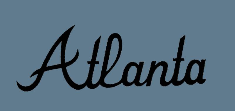
The Meaning Behind the Atlanta Braves Logo
![]()
Alright, let’s dive right in! When you look at a logo, there’s often a story and a meaning waiting to be discovered, lurking right behind those cool graphics. The Atlanta Braves logo is no exception.
A Connection to Native American Heritage
The Braves, in many of their logos, have sought to capture the spirit and pride of Native American cultures. However, this has led to controversy over the years.
Some view it as a tribute, while others see it as cultural appropriation. The debate rages on, but what’s certain is that the logo’s intention was to symbolize bravery and fierceness.
Modern Interpretations
Today’s Braves logo, while simpler, still maintains a connection to its past. There’s an emphasis on pride, resilience, and an unyielding team spirit that’s symbolized in the sharp lines and bold designs. It’s all about representing the city and its fans.
The History of the Atlanta Braves Logo
![]()
Dude, logos have stories too! The Atlanta Braves logo has gone through quite a few transformations. It’s like the team was playing dress-up, trying on different outfits until they found the one that screamed “This is us!”
The Retro Years
Starting in Boston, moving to Milwaukee, and finally settling in Atlanta, the team logo has reflected its journey. Earlier versions showcased a Native American with a mohawk and even an illustration of a Native American inside a circle, capturing the essence of the era.
The Move to Modernity
The tomahawk – a distinctive feature now associated with the Braves – made its debut and it was a game-changer. This logo was more modern, minimalistic, yet packed with meaning.
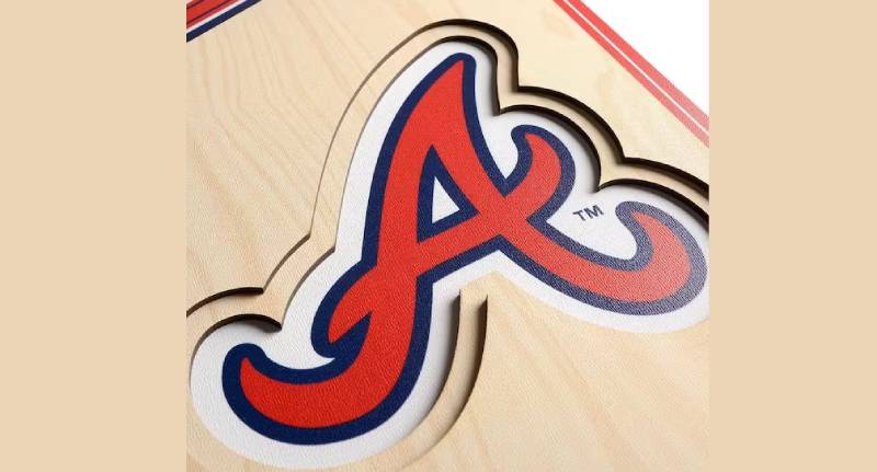
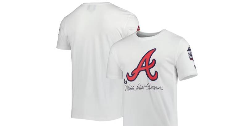
The Colors of the Atlanta Braves Logo
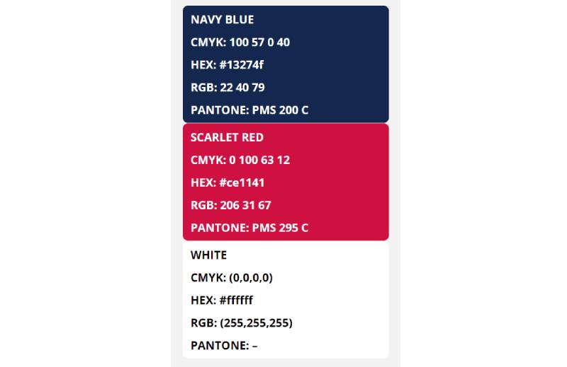
A Powerful Palette
The Atlanta Braves logo doesn’t shy away from flaunting some rad colors. Navy blue, red, and white dominate the scene.
Navy Blue: It’s deep, it’s sophisticated, it’s mysterious. It’s like the night sky just before a Braves game. It represents excellence and determination.
Red: Think energy, passion, and a burning desire to win. That’s what red brings to the plate.
White: Simplicity, purity, and clarity. It’s the balance in the chaos of the game.
The Font Used in the Atlanta Braves Logo
Styling and Profiling
Fonts, believe it or not, can be the unsung heroes of many iconic logos. The Atlanta Braves logo uses a custom, bold font that oozes confidence.
Expressive Typography
It’s thick, it’s assertive, and it’s unmistakably Braves. The letters feel like they’re charged up, ready for a homerun. It’s not just letters – it’s an attitude.
Impact on Pop Culture
With merch popping up everywhere from music videos to blockbuster movies, it’s evident that the Braves logo transcends the baseball field.
Influence on Streetwear
The Atlanta Braves cap, with its distinctive logo, has found its way into the world of fashion. Its versatile design makes it a staple piece for both the avid sports fan and the style-conscious individual.
A Symbol Beyond Sports
Beyond the realm of streetwear, the Braves logo has become a symbol of the city itself, representing Atlanta’s vibrant culture and history.
Design Lessons from the Braves Logo
If you ever fancy creating a logo or diving into design, there are lessons to be plucked right from the Braves emblem.
Evolution is Key
Just as the Braves logo evolved, so should your designs. Test, tweak, and transform until it feels right.
Less Can Be More
The Braves proved that simplifying can amplify a message. In design, it’s often the uncomplicated, clean look that stands out.
FAQ On The Atlanta Braves Logo
What is the history behind the Atlanta Braves logo?
The Atlanta Braves logo, a powerful symbol in Major League Baseball, has evolved with the team. From its inception, its design has encompassed a range of styles mirroring the Braves’ storied past—drawing from Native American imagery to the more recent Braves emblem featuring the iconic tomahawk.
How has the Braves logo changed over the years?
Transformations of the logo have aligned with changing times. Early variations included various depictions of a Native American figure, which shifted towards the “lowercase ‘a'” and then to the notable tomahawk.
Each change reflected a balance between tradition and modernity within the sporting universe.
Why does the Braves logo include a tomahawk?
Originally introduced in the 1950s, the tomahawk in the Atlanta Braves logo represents a warrior’s spirit—a nod to the team’s namesake.
It’s become a Braves insignia that signifies strength and competitive edge, encapsulating the baseball team’s identity on and off the Atlanta uniform.
Is the Atlanta Braves logo controversial?
Yes, the logo’s Native American themes have sparked debates on cultural sensitivity. The Braves have been scrutinized for the use of Native American imagery and the “Tomahawk Chop” fan gesture.
Dialogues have caused many to reconsider the appropriateness of such symbols in modern sports.
What do the colors of the Braves logo represent?
The Atlanta Braves logo boasts classic red, white, and blue hues—a patriotic palette that speaks to American baseball tradition. Red symbolizes passion and energy, blue reflects excellence and integrity, and white stands for purity and the team’s commitment to the game.
How does the Braves logo influence team merchandise?
The iconic logo boosts merchandise sales by offering fans a tangible connection to their team. It appears on everything from jerseys and hats to memorabilia, turning everyday items into collectibles infused with the Braves’ spirit, making sports fan culture part of personal identity.
Has the Braves logo ever been completely redesigned?
While the Braves logo has undergone tweaks and updates, no overhaul has completely erased its historical essence. Subtle redesigns maintain a thread of continuity, ensuring the logo still resonates with long-time supporters while appealing to modern aesthetics.
What role does the Braves logo play in branding?
As an element of sports logo history, the Braves logo is central to the team’s branding, offering instant recognition.
It’s strategically placed in marketing campaigns, merchandise, and digital platforms, strengthening the franchise’s identity within Major League Baseball and the broader sports merchandising industry.
How do people react to the Braves logo during games?
During games, the sight of the Braves logo elicits powerful emotions—a mix of pride, nostalgia, and camaraderie. Fans donning caps, shirts, and banners emblazoned with the logo look like a sea of solidarity, proof of the emblem’s capacity to unite and inspire.
What is the significance of the Braves logo to Atlanta’s culture?
Inextricable from Atlanta’s fabric, the logo is more than just a sports franchise symbol. It stands as a beacon of local pride, a centerpiece in sporting events, and a visual representation of Atlanta’s deep-rooted connection to its Major League Baseball representatives.
Conclusion
We’ve dissected, explored, and celebrated every curve and color of the Atlanta Braves logo—a symbol etched into the heart of baseball Americana. It’s a beacon, run through with threads of history, controversy, and culture; an emblem that’s become synonymous with Atlanta, an icon that soars far beyond the outfield.
In the clamor of the crowd, the logo stands resilient—a testament to the Braves’ enduring spirit. The tomahawk isn’t merely a piece of graphic design; it’s a storied vestige that’s witnessed epic World Series battles and has been immortalized on fan apparel, waved high on banners, obsidian sky be their canvas.
As the sun dips beyond the diamond, you now carry a deeper understanding of this crest—a Braves emblem representing not only a team but an entire community. It’s a logo that unites, inspires, and serves as a proud, indelible mark of the Atlanta Braves’ legacy within the grand narrative of Major League Baseball.
If you liked this article about the Atlanta Braves logo, you should check out this article about the Cleveland Indians logo.
There are also similar articles discussing the Milwaukee Brewers logo, the Chicago Cubs logo, the Minnesota Twins logo, and the New York Mets logo.
And let’s not forget about articles on the Washington Nationals logo, the Texas Rangers logo, the Baltimore Orioles logo, and the San Francisco Giants logo.
Bogdan Sandu, a seasoned designer with 15 years of diverse experience, has been designing websites since 2008.
Renowned for his expertise in logo design and visual branding, Bogdan has developed a multitude of logos for various clients.
His skills extend to creating posters, vector illustrations, business cards, and brochures. Additionally, Bogdan's UI kits were featured on marketplaces like Visual Hierarchy and UI8.
Latest posts by Bogdan Sandu (see all)
- After Dark: Night Color Palettes for Mysterious Designs - 27 April 2024
- The Capcom Logo History, Colors, Font, And Meaning - 26 April 2024
- Earth Color Palettes Grounded in Nature: 40 Examples - 26 April 2024