
Design Essentials: What Makes a Good Logo?
Ever wondered what makes a good logo? Think about the iconic Apple or the swoosh of Nike. Simple, right? But oh, there’s so much more beneath that simplicity.
I’m here to unravel the logo magic. It’s not just a pretty design; it’s the heartbeat of a brand. A good logo is a blend of psychology, art, and business savvy.
We’re talking color psychology, typography, and brand identity, all rolled into one.
In this journey, you’ll discover the nuts and bolts of a killer logo. From the thoughtful process behind the design to the way it speaks to its audience, we cover it all.
You’ll learn how a logo isn’t just about looking good; it’s about telling a story, your brand’s story.
Core Principles of Effective Logo Design
Simplicity
Okay, let’s talk simplicity in logos. Ever heard that less is more? It’s like the heartbeat of logo design.
Simplicity isn’t just about making things look neat; it’s about making your logo easily recognizable.
Benefits of a Simple Design
A simple design is like a breath of fresh air in a cluttered world. It cuts through the noise.
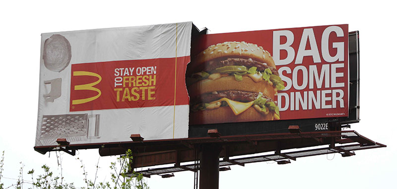
Think about the McDonald’s golden arches. Simple, right? That’s the power of minimalism.
It sticks in your head because it’s easy to remember and it stands out. Plus, it works everywhere – from a tiny mobile screen to a huge billboard.
Examples of Successful Simple Logos
Let’s dive into some iconic examples. The Nike swoosh, Apple’s apple, Twitter’s bird. These logos are simple but powerful.
They use basic shapes and minimal colors, yet they are instantly recognizable worldwide. This simplicity is what makes a good logo shine.
Relevance
Now, onto relevance. A logo should be like a mirror reflecting your brand’s soul. It’s not just about being pretty; it’s about being right for YOU.
Aligning Logo with Brand Identity
A logo needs to tell your story. It’s about matching your values, your vibe, and your mission.
For instance, if you’re all about eco-friendliness, earthy colors and natural motifs could be your thing. It’s like choosing the right outfit for an occasion – it should fit your brand’s personality.
Importance of Color and Font Selection
Colors and fonts speak volumes. They’re not just aesthetic choices; they’re emotional cues. Blue can be calming, red can be exciting, and yellow, full of optimism.
Fonts have their language too. A playful font might not suit a law firm, right? It’s all about finding that perfect match that resonates with your brand’s voice.
This is a crucial part of what makes a good logo.
Core Principles of Effective Logo Design

Memorability
So, what makes a logo not just good, but unforgettable?
It’s all about that spark that catches your eye and stays in your memory.
Creating Lasting Impressions
Think about it. When you see the golden arches, McDonald’s pops right into your mind, doesn’t it?
That’s memorability at work. It’s about crafting a logo that lingers in people’s minds long after they’ve seen it.
It’s like a catchy tune that you can’t get out of your head. It sticks because it’s unique and resonates with something familiar.
Balancing Visual and Textual Elements
Now, the trick is in the mix. You’ve got your visuals and your text, and they need to play nice together.
The visual part draws the eye, and the text part seals the deal. It’s like a dance, where both partners need to move in sync.
Too much of one and the other feels left out. The balance is key, and that balance is what makes a good logo.
Timelessness
Ever wonder why some logos seem to never get old? They’ve got this timeless vibe.
Avoiding Trends for Longevity
Here’s the thing about trends: they come and go. But a great logo? It stays. It’s like classic fashion versus fast fashion.
You want your logo to be the little black dress, not the fad that fades. Timelessness means your logo stays relevant and fresh, year after year.
Examples of Timeless Logos
Think Coca-Cola, IBM, or Nike. These logos have barely changed over the decades.
They’re simple, they resonate, and they don’t try to chase the latest style. They stand strong because they know who they are.
That self-assurance, that’s what makes a good logo.
Versatility
Alright, let’s talk about being versatile. A logo has to play many roles.
Adaptability Across Various Media
Your logo needs to look fab whether it’s on a tiny mobile screen or a massive billboard. It should work in black and white as well as in color.
This adaptability is crucial. It’s like having an outfit that’s perfect for both a casual brunch and a fancy dinner.
Design Considerations for Scalability
![]()
And then, think scale. Will your logo still look good when it’s the size of a postage stamp? Or when it’s as big as a basketball court?
This scalability is a huge part of what makes a good logo. It’s about creating a design that maintains its integrity, no matter the size or context.
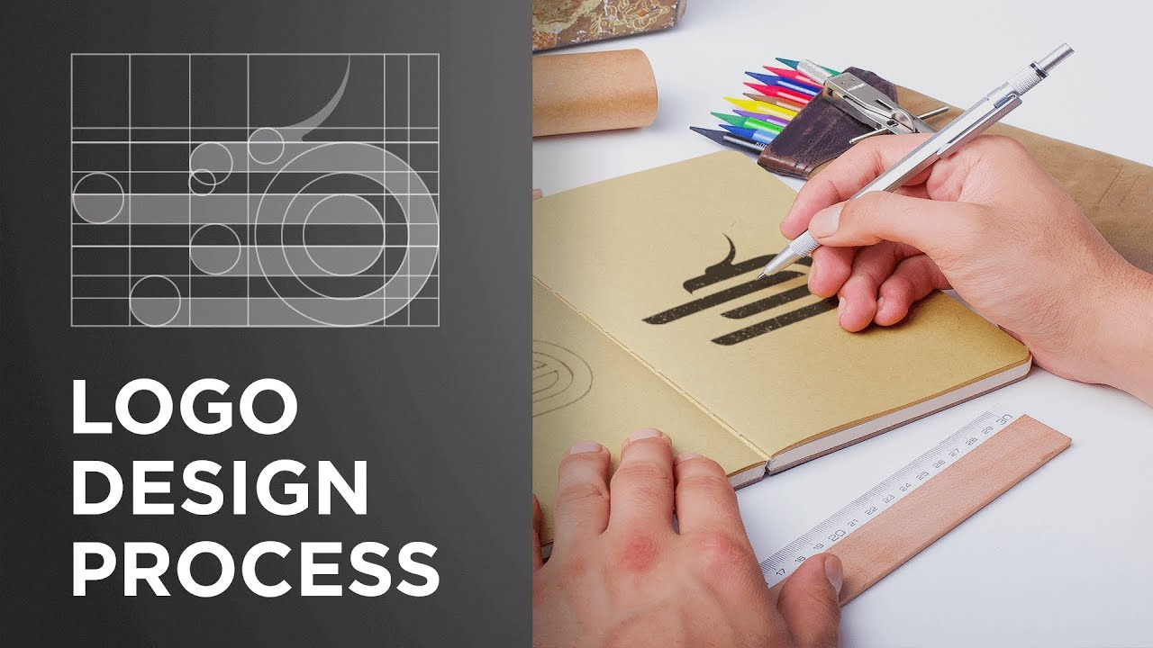
The Logo Design Process
Diving into the logo design process, it’s like a journey, a mix of discovery, creativity, and lots of coffee.
It’s not just about making something look cool; it’s about creating a symbol that carries the essence of a brand. That’s what makes a good logo.
Understanding the Brand
First up, getting to know the brand. It’s like detective work, but with more colors and sketches.
Conducting Client Interviews
Chatting with the client is key. It’s about digging deep into what they’re all about. What’s their story? Who’s their audience? What vibe are they going for?
It’s like piecing together a puzzle where each piece is a bit of info about the brand.
Researching Industry and Competitors
Then, there’s the research part. It’s crucial to know the playground. What’s happening in the industry? Who’s doing what?
It’s not about copying – no way. It’s about understanding the landscape. You don’t want to design a logo that’s too similar to a competitor’s. That’s a no-go in the world of what makes a good logo.
Conceptualization and Sketching
This is where the fun begins. Time to get those creative juices flowing.
Developing Creative Concepts
Brainstorming time. It’s like a storm, but with ideas. We’re throwing everything on the wall to see what sticks.
It’s about exploring different directions, playing with shapes, colors, and fonts. The aim? To find that unique concept that just feels right.
Importance of Sketching in Ideation
Sketching is like the unsung hero of logo design. It’s fast, it’s raw, and it’s where the magic starts taking shape.
Sketching helps to quickly experiment with ideas without getting bogged down by details. It’s about getting those concepts out of the head and onto paper.
Refinement and Feedback
Almost there. Now, it’s about refining and tuning.
Iterative Design Process
This part is like a loop. Design, get feedback, tweak, repeat. Each round sharpens the design a bit more.
It’s like sculpting, chipping away until you reveal the masterpiece within.
Incorporating Client and Audience Feedback
Feedback is crucial. It’s not just what you think looks good. It’s about what resonates with the client and their audience.
Sometimes, what you love might not hit the mark, and that’s okay. The goal is to create a logo that not only looks good but also feels right for the brand.
Advanced Logo Design Considerations
Alright, let’s dive deeper. Beyond the basics, there’s a whole world of advanced stuff that really makes a logo pop.
This is where we get into the nitty-gritty of what makes a good logo, the stuff that separates the okay logos from the truly great ones.
Psychological Impact of Colors and Shapes
Colors and shapes, they’re like the secret sauce in logo design.
They speak without words, you know?
Color Psychology in Branding
Colors are like mood rings for brands. Each color whispers something different.
Blue for trust, red for excitement, green for growth.
It’s about picking the right color that matches the vibe of the brand. It’s not just about looking pretty; it’s about feeling right.
Symbolism and Meaning in Shapes
Shapes tell stories too. Circles for unity, squares for stability, triangles for dynamism. It’s like choosing the right character for a story.
The shape of your logo can say a lot about your brand, sometimes even more than words.
Typography and Brand Tone
Fonts are not just fonts. They’re voices.
Choosing the Right Font

Picking a font is like casting the right actor for a movie role. You wouldn’t want a funny, bubbly font for a serious law firm, right?
Each font has a personality, and it’s all about matching it with the brand’s personality. That’s key in what makes a good logo.
Conveying Brand Personality Through Typography
A font can shout or whisper. It can be a friend or an authority.
It’s about finding that perfect voice that speaks for the brand, that makes the logo not just seen, but heard, in a way.
Balancing Innovation with Familiarity
This is where things get really interesting. It’s about striking that delicate balance.
Striking a Balance in Logo Design
Innovation keeps things fresh, but too much, and you lose relatability.
Familiarity breeds comfort, but too much, and you’re just boring. It’s like mixing a new cocktail – you want to surprise but not alienate.
Case Studies of Innovative Logos
![]()
Look at brands like Google or Airbnb. They’ve evolved their logos over time, keeping them fresh yet familiar.
It’s a dance, a fine line between the new and the known. And walking that line, that’s a big part of what makes a good logo.
Finalizing and Implementing the Logo
Alright, we’re in the home stretch now.
This part is all about polishing that gem of a logo and making it shine in the real world. It’s where all the hard work pays off.
Logo Testing and Finalization
So, you’ve got this cool logo design. Great! But hold on, it’s not party time yet.
We’ve got to test this baby out.
Testing The Logo in Different Contexts
![]()
Imagine your logo on everything – business cards, websites, billboards. Does it still look good? Is it still legible?
You gotta make sure it works in all sizes and situations. It’s like trying on clothes in different lighting – you want to look good everywhere, right?
Final Revisions and Approval
Feedback time. This is where you tweak and tune. Maybe the color needs adjusting, or the font isn’t quite right.
It’s like fine-tuning a song until it hits all the right notes. And once everyone’s nodding their heads to the beat, that’s when you know you’ve nailed it. That’s what makes a good logo.
Integration into Branding Materials
Now, let’s get that logo out there and show it off!
Consistent Application Across Platforms
Your logo needs to be the star on all platforms. Whether it’s a website, social media, or print, it should look consistently awesome.
It’s like having a signature style that you rock everywhere.
Branding Guidelines and Usage
Time to lay down some rules. Branding guidelines are like the rulebook. They tell everyone how to use the logo – the do’s and don’ts.
It’s about keeping the brand’s look consistent, no matter who’s using the logo. This consistency, this attention to detail, that’s what makes a good logo truly stand out.
FAQ On What Makes A Good Logo
What Defines a Good Logo?
A good logo? It’s the perfect mix of simplicity and memorability. Like, it should be easy to recognize and remember, you know?
It also needs to reflect the brand’s personality – like, does it scream ‘you’?
And it has to work across different mediums – big billboards, tiny phone screens, everywhere.
How Important Is Color in a Logo?
Super important! Colors are like the unsung heroes of logos. They convey emotions and messages without saying a word.
Blue for trust, red for energy – you get the drift.
It’s about picking colors that match the vibe of the brand while standing out. It’s not just decoration; it’s communication.
Does the Size of a Logo Matter?
Absolutely! Your logo needs to look sharp, whether it’s huge on a billboard or small on a business card. It’s all about scalability.
The design should be clear and legible, no matter the size. Think about the Nike swoosh – looks good big or small, right?
How Crucial Is Font Choice in a Logo?
Font choice in a logo? Majorly crucial. Fonts have personalities. A playful font for a kid’s brand, something sleek for a tech company.
The font sets the tone, kind of like how your voice shows your mood. It’s about matching the font’s vibe with the brand’s essence.
What Role Does Simplicity Play in Logo Design?
Simplicity is king in logo design. It’s like the secret to making your logo timeless and versatile. A simple logo is easy to remember and works anywhere, which is key.
You want something that’s clear and striking, not cluttered and confusing. Less is more, always.
How Can a Logo Reflect a Brand’s Identity?
A logo reflects a brand’s identity by being like a visual shorthand. It should capture the essence of the brand – its personality, values, and style.
It’s like a brand’s fingerprint, unique and telling. When someone sees your logo, they should get the gist of what your brand is all about.
What’s the Significance of Memorability in a Logo?
Memorability? It’s the thing that makes a logo stick in people’s minds. You want a design that people remember long after they’ve seen it.
It’s about creating an impact, leaving a mark. A memorable logo helps a brand stay top-of-mind, which is huge for brand recognition.
How Does a Logo Impact Brand Perception?
A logo massively impacts brand perception. It’s like the brand’s face – the first thing people see.
A well-designed logo can make a brand look professional, creative, reliable, you name it. It sets the tone for how people perceive the brand, before they know anything else about it.
Is It Important for a Logo to Be Timeless?
Going for timeless in a logo? Smart move. You want a logo that doesn’t go out of style. It’s about longevity, staying relevant through trends and time.
A timeless logo means you won’t have to redesign every few years. It’s an investment in your brand’s future.
Why Is Versatility Important in a Logo Design?
Versatility is vital because your logo needs to work in different contexts and platforms. Like, it should look good on a website, a T-shirt, a billboard, you name it.
A versatile logo adapts without losing its essence. It’s about making sure your logo fits in wherever it goes.
Conclusion
Wrapping it up, when you ask what makes a good logo, it’s like asking what makes a good story. A great logo tells a tale, not with words, but with colors, shapes, and imagination. It’s about creating a symbol that people can connect with, something that sticks in their minds.
- It’s the simplicity that catches the eye.
- The relevance that resonates with the heart.
- And that memorability? It’s like a catchy tune you can’t forget.
A logo isn’t just a piece of art; it’s the face of a brand. It should be versatile, adapting seamlessly across various media, from a tiny icon on a phone screen to a massive sign on a billboard. And above all, it should be timeless, standing strong and relevant through the years.
So, there you have it. A good logo is more than just a design; it’s the essence of a brand, distilled into a single, powerful image.
If you liked this article about what makes a good logo, you should check out this article about what is rebranding.
There are also similar articles discussing how to create a brand identity, how much a logo costs, brand typography, and logo design psychology.
And let’s not forget about articles on how much is the Nike logo worth, how to copyright a logo, why a logo is important, and why is there a bite in the Apple logo.
Bogdan Sandu, a seasoned designer with 15 years of diverse experience, has been designing websites since 2008.
Renowned for his expertise in logo design and visual branding, Bogdan has developed a multitude of logos for various clients.
His skills extend to creating posters, vector illustrations, business cards, and brochures. Additionally, Bogdan's UI kits were featured on marketplaces like Visual Hierarchy and UI8.
Latest posts by Bogdan Sandu (see all)
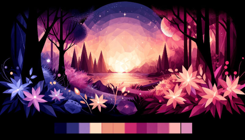
- Purple Color Palettes Fit for Royalty - 16 May 2024
- How To Find A Font: Top Font Finders To Use - 16 May 2024
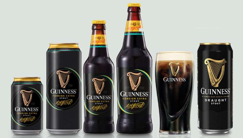
- The Guinness Logo History, Colors, Font, And Meaning - 15 May 2024